Conscious minimalism for successful life.
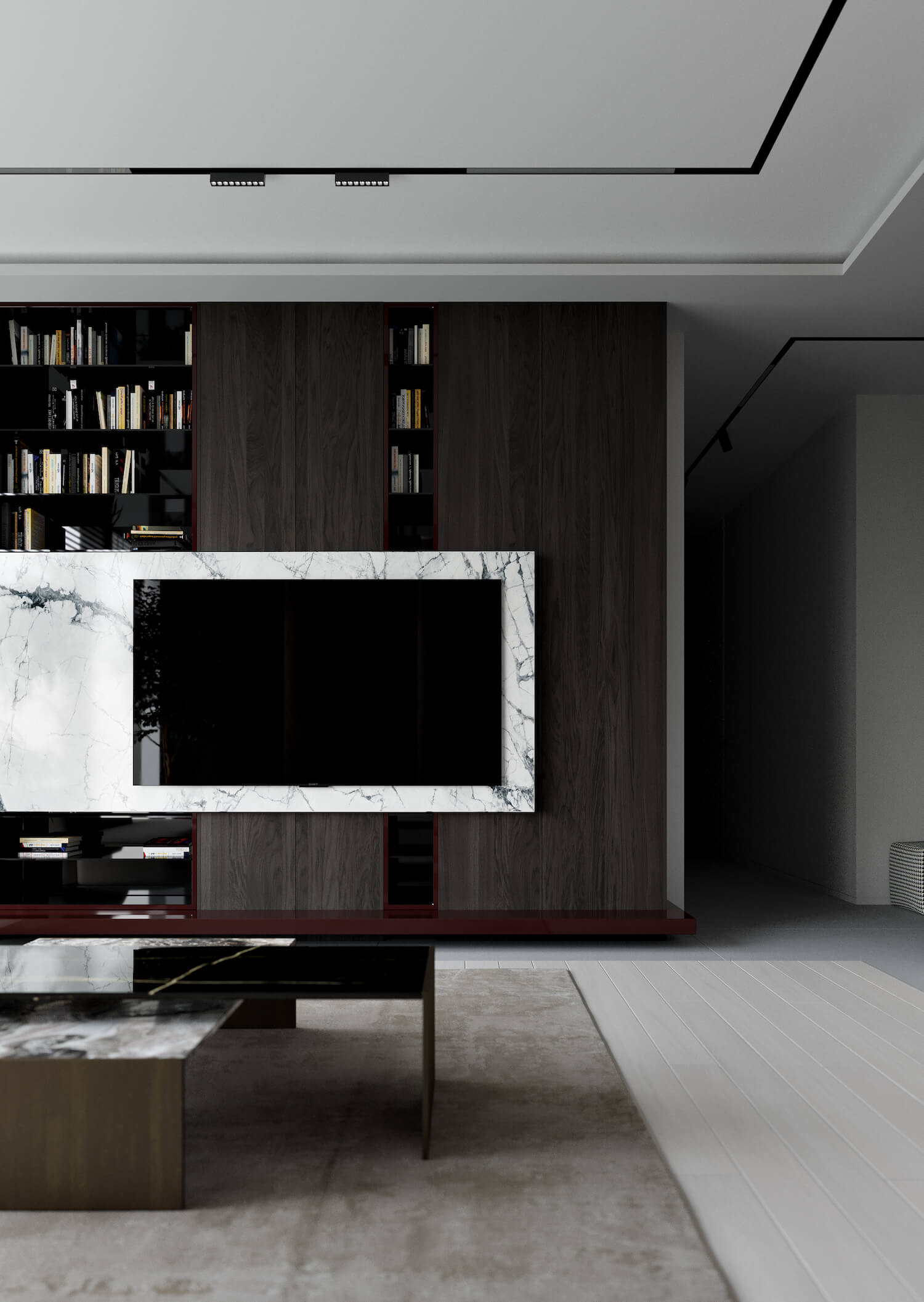
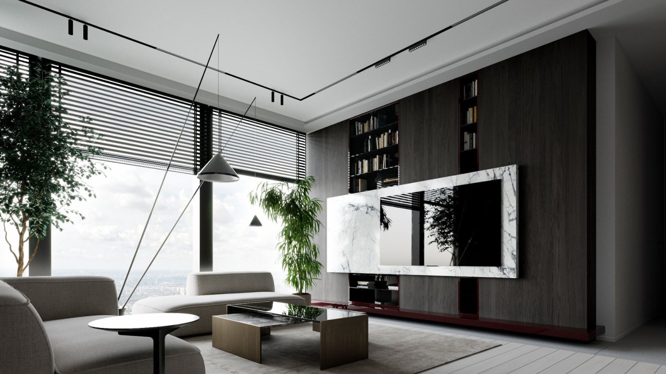
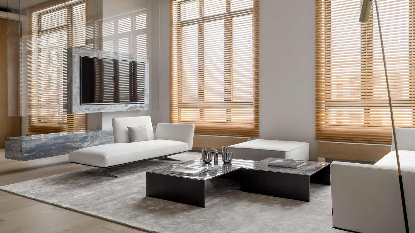
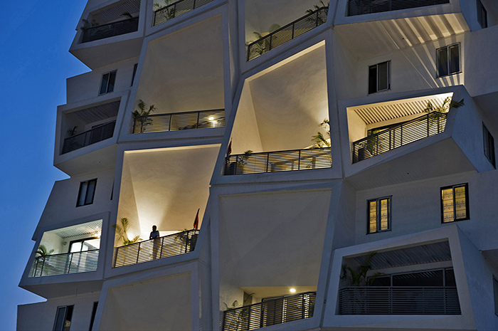
An apartment in the Neva towers premium-class residential complex in the Moscow-City international business district. Space as an investment in career development, status enhancement and children's future. Its own infrastructure, a park on the roof, the concept of "house without borders" and an interior in the style of conscious minimalism from the studio of architectural design and interior "Kvadrat Architects".
A few years earlier, the client had approached the designers for a classic interior, which he was drawn to at that time. But the studio creates objects exclusively in modern style, so the relationship did not develop. Two years later, he made a second attempt, realizing that he was ready to expand his taste preferences, and fully trusted the team. The apartment is designed for temporary accommodation when the client comes to Moscow for business negotiations and meetings. The space reflects the status of the environment and the owner, a high level of comfort and preferences.
The style of skyscrapers is continued in the interior - seamless integration of external into internal. The client has invested not only in his financial well-being, but also in the future of his children. When the time comes, the children will study in Moscow, and their student life will take place in the center of business activity, in an interior with a high concentration of aesthetics and architectural solutions.

While the living room is intended for meetings, receptions and relaxation, the private area combines a bedroom and a workspace. Functionality in dialog with impeccable aesthetics resulted in an interesting decision to separate the sleeping area and make it a separate independent construction with an integrated mattress. This concept made it possible to create a room with a regular shape.
Combining different systems into one architectural element is an example of how to build a small closet and make it visually larger. The ultimate goal is to build the right harmonious proportions. With this technique it was possible to dissolve the monolithic structure in space.
The bathroom in white tones is highlighted by light accents, the geometry is clearly readable, shadow seams give graphic appeal.


