ARTUGOL, Architecture and Design Studio: The ground floor includes an entrance hall, a coatroom for outerwear, a common space for joined kitchen and living room, and a guest bathroom. The first floor is the private area and comprises a master bedroom with a bathroom, a guest bedroom, a study or a second guest room, and a bathroom with a shower, and a laundry room. This apartment also has its own terrace and, what is the key moment, it commands a really fantastic view.
Initially, the space plan of the ground floor was different. The overall space of the kitchen-living room was smaller, and the entrance to the terrace was from the study. We removed all unnecessary partitions and made the space unified. The kitchen has become larger, and now the terrace is a part of it. The two floors of the apartment are different in the floor-to-ceiling height. The ground floor is quite low. Our core idea was to maximally make the space open and and common, however without separating the floor and ceiling. Thus, the wood laid on the floor was completely reflected on the ceiling. And further on, the parquet board moved to the floor of the first storey having formed a logical connection with the ground.
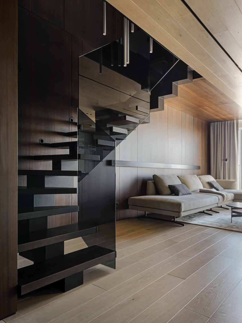
The staircase hall, which also interconnects 2 floors, has become the second global color filling in the interior. We chose dark stained eucalyptus veneer for its finishing, as this pattern contrasts with the color of the parquet boards. the staircase hall includes the staircase itself, doors to the bathrooms on each floor, and the sofa area. when entering the apartment you immediately see the interior of the living room. A dressing room, where you can keep your clothes, is hidden behind a mirrored door to the right of the entrance. It has also enough space for shoes and outerwear.
On the other hand, already there is a door hiding behind the veneer wall, it will lead you to the guest bathroom on the ground floor. There the core composition axis is the wall trimmed with a tinted mirror, and a floor-mounted white sink made from artificial stone according to our drawings. There is a lighting scenario in which you can have this lamp lit on and, in general, even this may be enough to illuminate this room. In addition to the main functions of the bathroom, it has a fairly large storage system. It is located behind doors made from the same large-format porcelain stoneware as on the adjacent walls, so we managed to make the doors as hidden as possible and an guest may not suspect anything. Here you can store various household supplies, which are often preferable to be at hand.

Living room
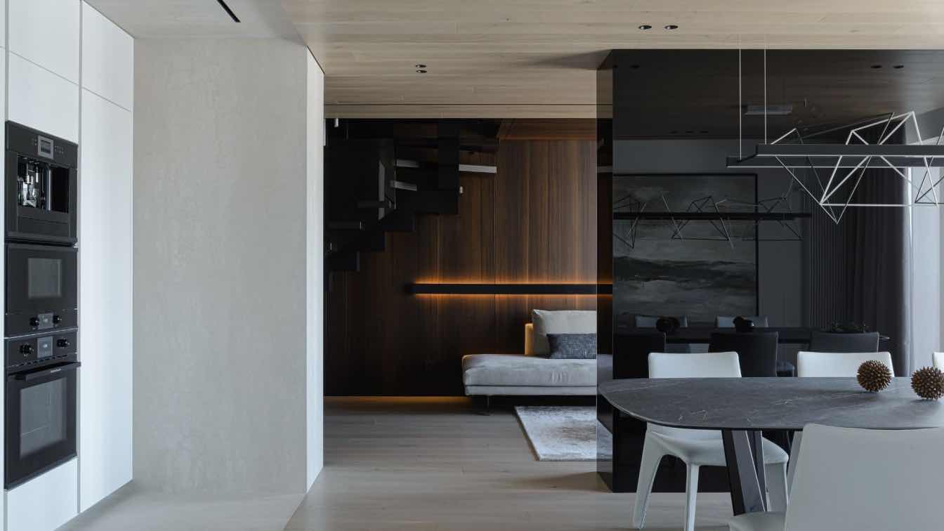
The sofa area is small and located opposite the entrance area. The sofa itself is placed against the dark veneered wall, and a long wall lamp illuminating this wall from below and from above makes this composition complete.
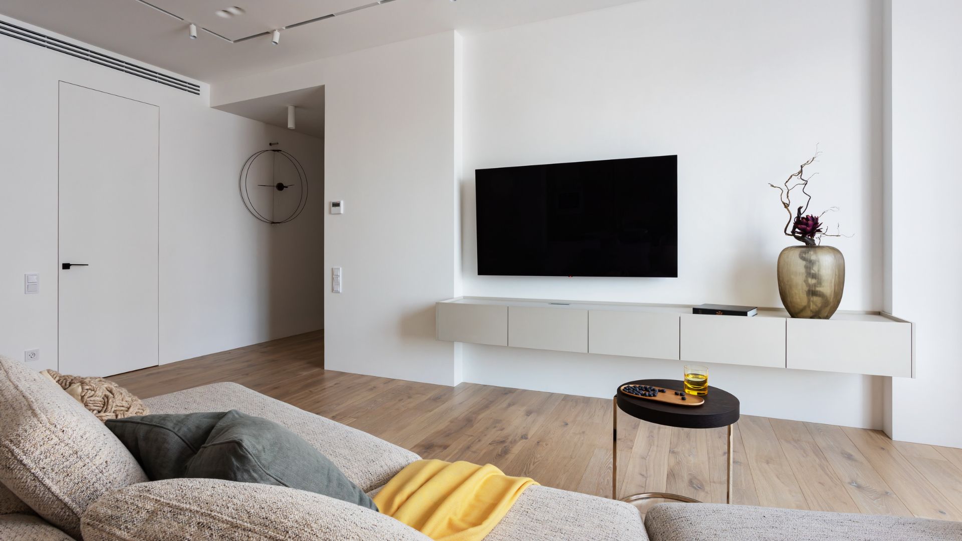
Opposite the sofa there is a monolithic pylon, which we built up a little in advance to integrate a TV into it. This wall is finished with black glass and actually represents a kind of a solid parallelepiped that generates a contrast, which interior needs both from the sofa area, and from the kitchen. It has also integrates loudspeaker system: this part under the TV is factually a soundbar installed into the wall, which is also leveled in one plane with the wall. The tables are quite functional, their countertops are made of natural stone.
Kitchen
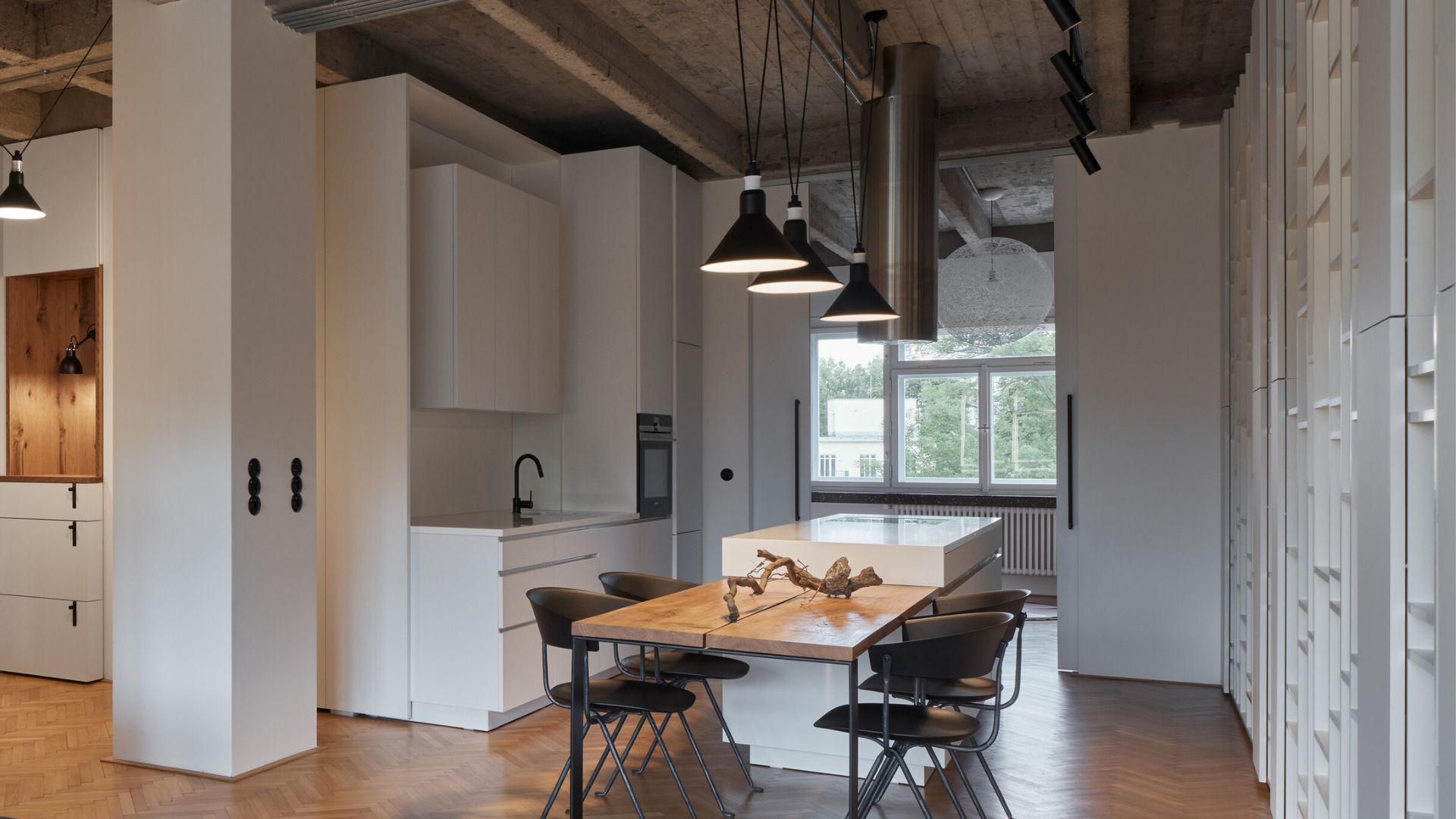
Most of the ground floor space is given over to the jointed kitchen and dining room area. The kitchen is slightly stretched and recessed into a niche. We decided to finish the floor, walls and ceiling around it with light, large-format porcelain tiles, and thus, to intensify the concept of spatial full-scale fills that will join various planes.
The kitchen has is quite a standard functional set that includes everything you may need: a couple of refrigerators, a narrow storage cabinet with appliances, a sink, a dishwasher, pull-out sections, drawers, quite a lot of storage units, and a separate narrow storage cabinet with a built-in wine cabinet. We, as you have probably already understood, also wrapped the apron and tabletop into one material. This frame is made from the warm light-gray artificial stone.
The kitchen completes with a semi-bar wooden countertop. To make it look as light as possible, its support was made of glass. It is convenient to have breakfast at it, and, as customers say, they use this place quite often in everyday life. The composition of this view from the living room, is finalized by a showcase with back-lights. We often use this technique and every time it makes a perfect effect to the interior.
The dining group took a fascinating place near the window. A large table, long enough for 8 people, has a porcelain stoneware top. This is a very functional countertop, which is not affected by scratching and will look like new for the really long time. Above the table there is an accentual Pollucho lamp, and the chairs, like those by the bar counter, are trimmed with leather from the Bonaldo factory. We cannot but mention the main feature of this apartment - its view characteristics, and the terrace, where you can enjoy the view to the fullest.

1st floor
Stairs
The staircase to the 1st floor is made with the dark wooden steps mounted on a black metal base. The fences are the tinted tempered glass. As you move, the steps are illuminated by special lights built into the wall. They can be turned on and off both from below and from above on the 1st floor. We accented this dark double-height space of the stairs flight with a cascading lamp made based on our parameters. Its base was integrated in the same plane with the ceiling panels, so that it would not stick out. The white tubes of the lamps generate really impressive effect against the dark veneer background. Going up the stairs you will notice that very transition of parquet from the ceiling of the ground floor to the first floor. It is completely wrapped through this end of the floor structure.
1st floor hall
The walls of the hall are painted white. The doors to the bedrooms are made of enamel in the same color as the walls. This way they look very united and do not split the planes into parts. From the 2nd floor hall we can get to the master bedroom.
Bedroom
When you enter the bedroom, we see a spectacular composition on the bedhead. The bed made with light textiles is fabricated on a custom-basis using our dimensions. the wall above the bedhead is finished with black glass. The room is quite small, but it fits a full-scale wardrobe. When we were designing it, we very carefully calculated all the distances in order to place the bed in exactly the right place and arrange the exact size of the wardrobe doors.
On the left, the composition is complemented by Vibia pendant lamps. The bedroom has its own bathroom. Getting into it, first of all you see a wall composition with a sink and a large round mirror. The mirror is cut by a black stripe, this is a shelf for accessories. To the right there is a free-standing bathtub and the wall lined with a tinted mirror on the opposite. Sidewise the bath we mounted additional shelves for various accessories and shampoos. They are not visible from the entrance point, so it prevents the visual purity from being destroyed.
Please note that this is a rare example, when the bathtub is not placed on an additional podium, and there is no step in front of it. it is due to the fact that the bathtub is on the 1st floor of the apartment and the water is drained into the lower sewer. Porcelain tiles from the Porcelanos factory, and Fantini faucets.

Guest room
The guest bedroom is the next room. Quite plain. The wall behind the bedhead is finished with veneer panels, the same as in the staircase hall. The bed is also custom-made. In addition to the bed, there is a small Ditre armchair, which is convenient, for example, to sit in and read a book or simply for keeping clothes.
Study
This room, although small, is really multifunctional. One call it a study, yet, actually it can be both a relax room, and a guest room; the sofa can be unfolded. The table can be used as a boudoir, or maybe as a place for working on a laptop. In general, this is a cozy space that is simply comfortable to be in. The table and the wall with the painting are interconnected into a unified composition. The picture hangs on the textile panels, and it also hides a block of sockets and a specially arranged place for a TV bracket, which, when necessary, can be hung here.
WC on the 1st floor
There is also a bathroom with a shower on the 1st floor. When you enter it, you see a sink and a drawer unit attached to a decorative wall framed with lighting. metal mortgages and brackets were made at the installation stage on the purpose to achieve such a light effect. So, you can safely lean your elbows on the panel and be never afraid that it might fall off. In the shower, the head is built into the ceiling, and there is a special graphics decorated shelf for storing various bottles on the wall. The walls are finished with the large-format porcelain tiles, the same as on the ground floor. And the sink zone is decorated with veneer panels.
Laundry room
The laundry room is behind a mirrored door. This room combines the function of a laundry room, and the space for storing various things.


