Alexander Tischler: Loft-style apartment for a couple with a cat in Moscow.
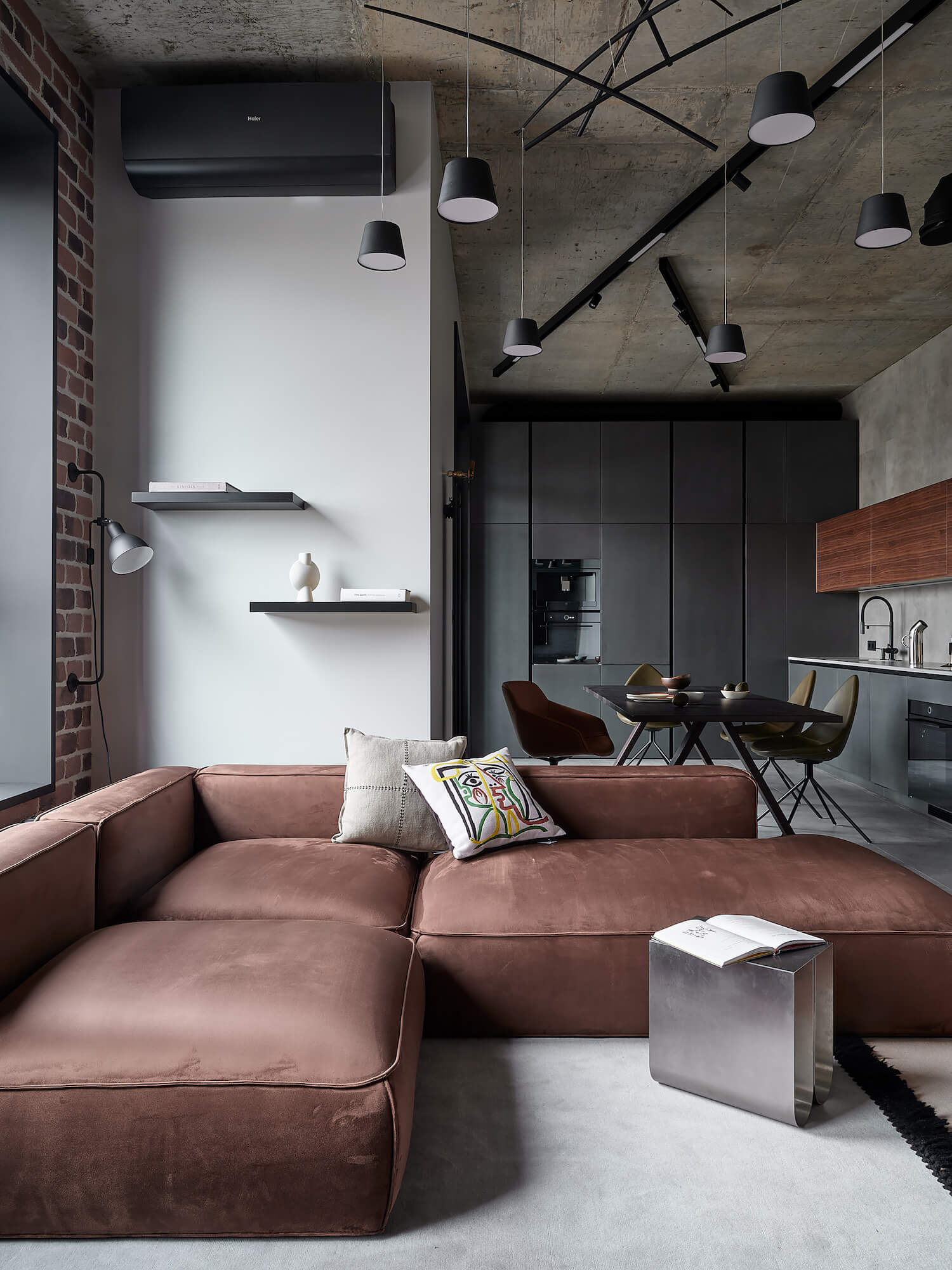
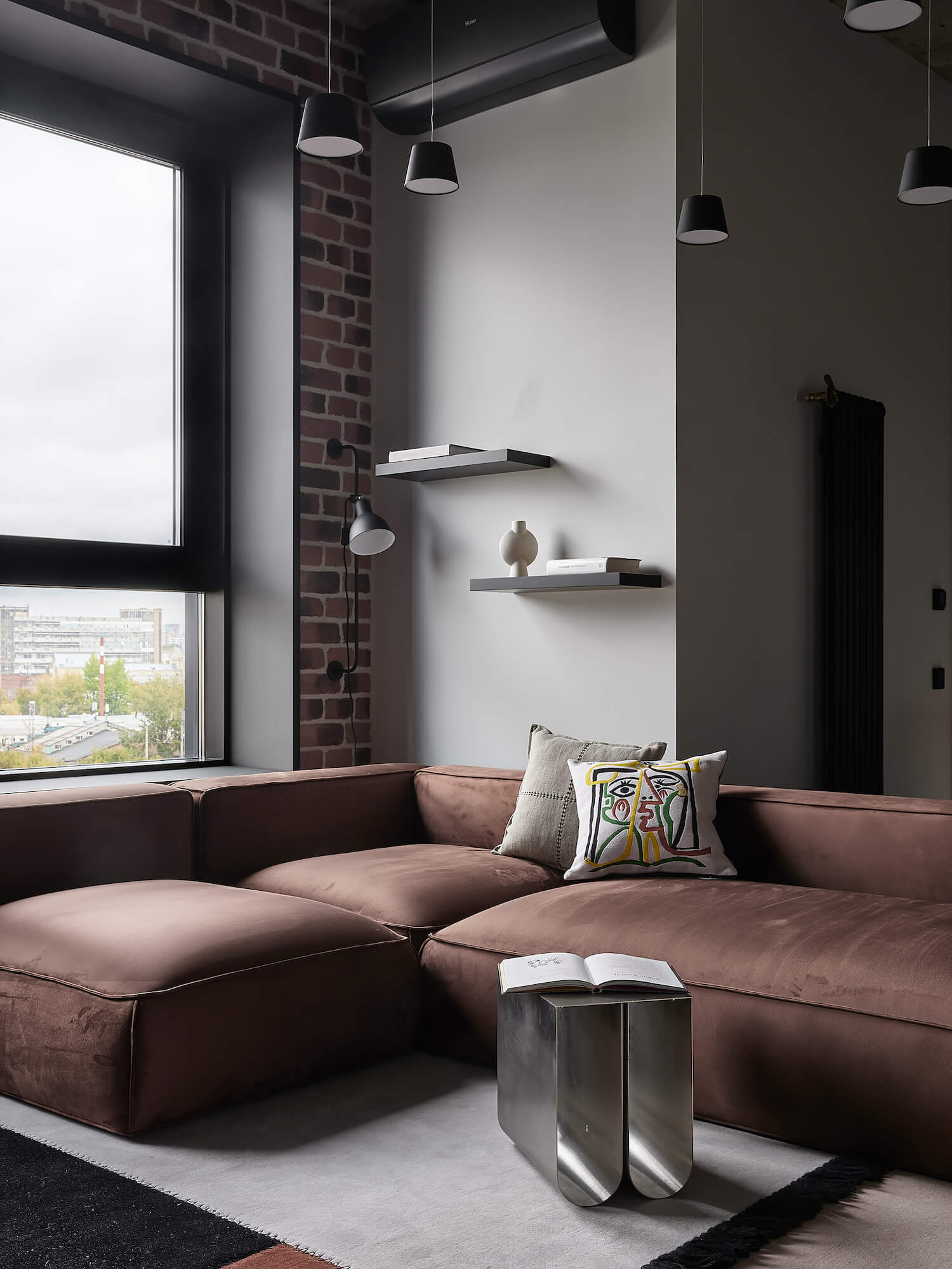
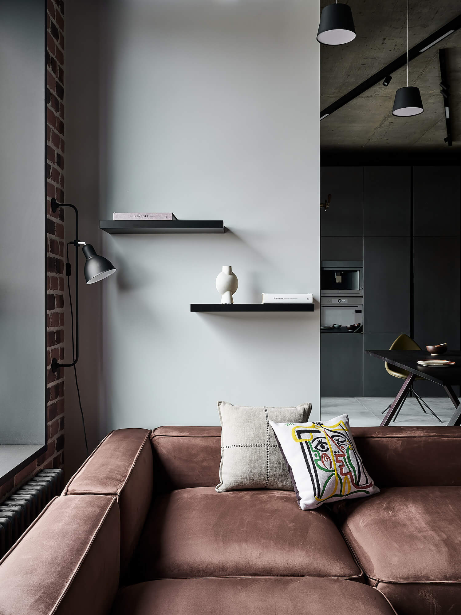
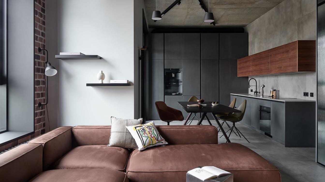
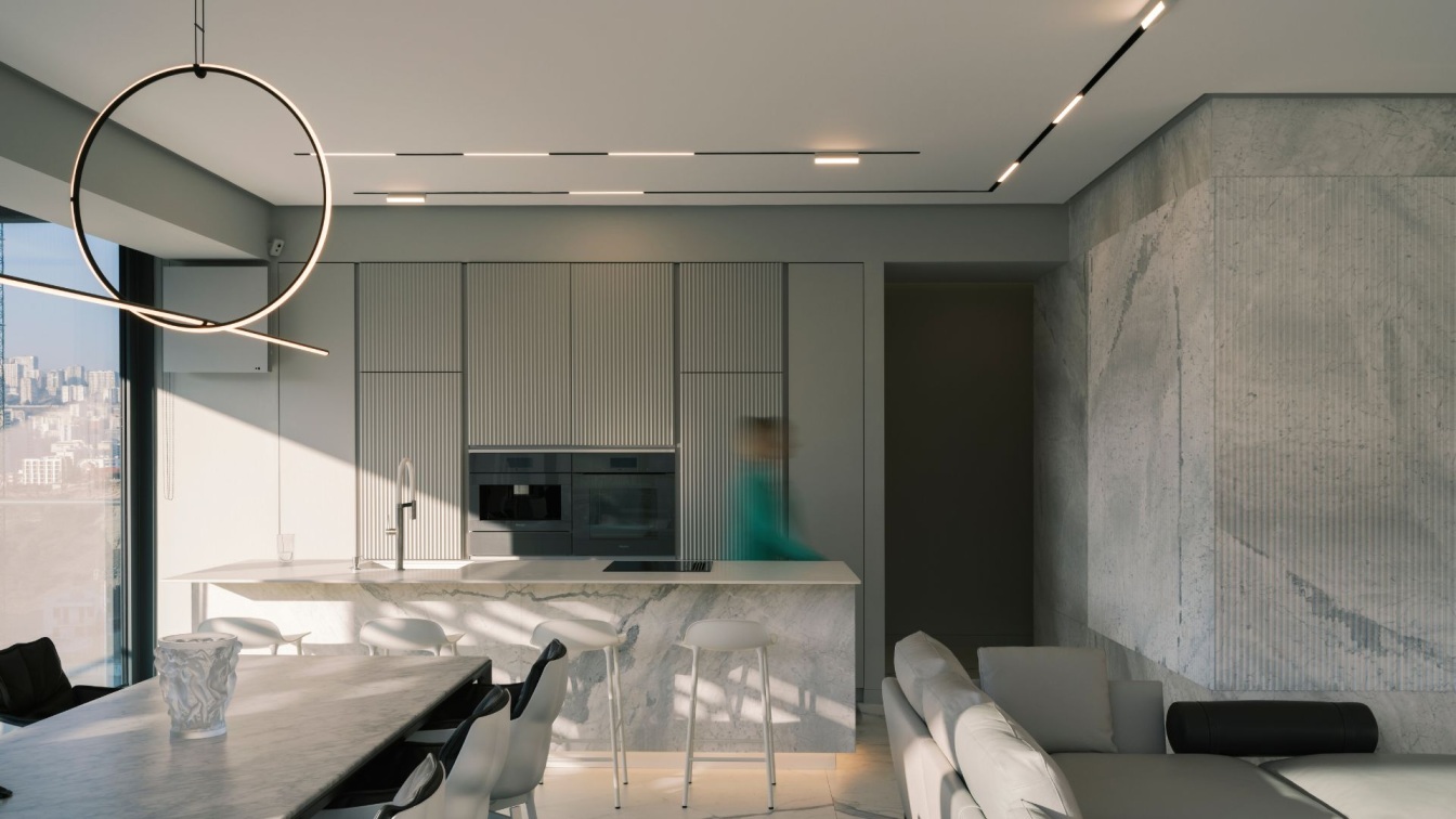
A corner apartment without load-bearing walls with two bathrooms and a narrow hallway. We designed this interior for a young couple. They wanted to have an apartment full of industrial elements and materials. It was also essential for them to have two workplaces and beautiful showcases for their memorabilia and collections. We designed a contemporary interior with loft-style details so that even a kitchen set looks like an industrial object. The clients like to host the guests, so we left a kitchen and a living room united.
We applied not ordinary finish to the kitchen so it did not stand out from the brutalist interior. We made the facades of column cabinets and lower modules of MDF with metalized matte enamel. We finished the upper modules with American walnut veneer that has an active texture nicely contrasting with the metal. We did not extend the upper modules to the ceiling to visually lighten the kitchen; they form a narrow strip.
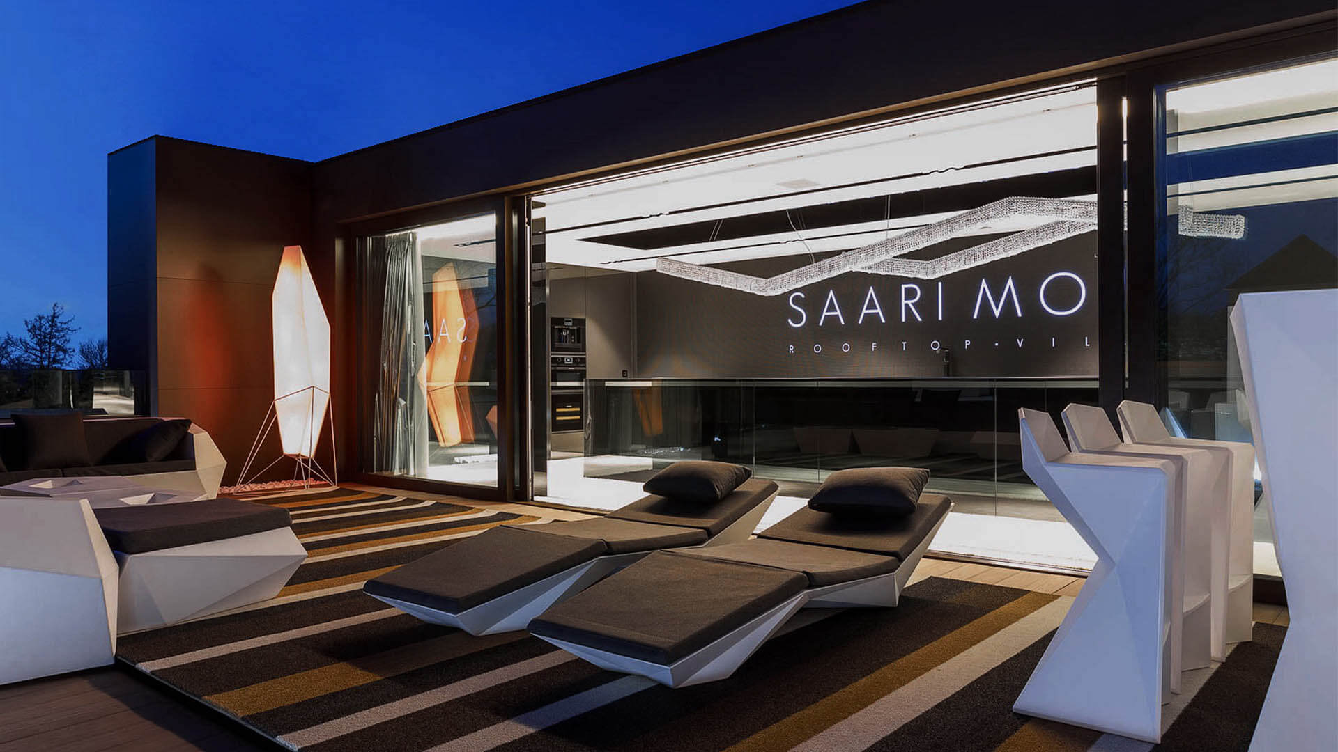
The wall along which the tabletop is located became longer after the redevelopment. But thanks to the layout, only the monolithic wall of column cabinet is visible from the living room, and the large countertop is not noticeable. We placed a wardrobe for rarely used items and an armchair with a coffee table on the balcony so that the homeowners could relax and enjoy the city view. The ceiling most strongly references the industrial-like design: as the clients asked, we left the ceiling panel open and did not change its anthropogenic texture in any way.
The supply ventilation air ducts remained visible because of this approach, and we chose black tin pipes. Such a ceiling significantly worsens sound insulation, but this apartment is located on the top floor, so there will be no noise from neighbors. We also pointed some lamps at the ceiling; they highlight its texture and illuminate the interior with reflected light.

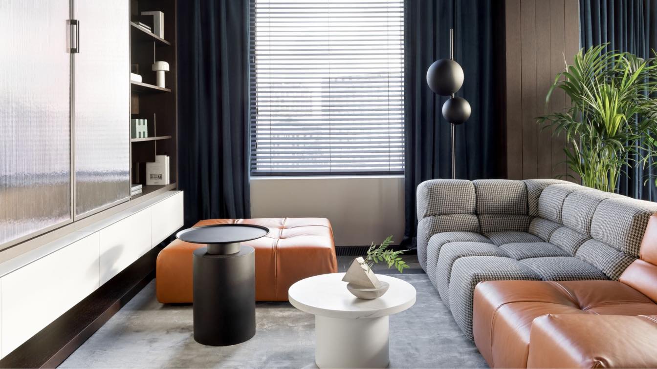
Brass retro valves on cast iron radiators are one more element in the factory-like aesthetics. We chose dark porcelain stoneware and decorative brick for the wall in the living room colored as the sofa upholstery and décor. We placed a double-sided wardrobe instead of a partition that divided a living room and a corridor left by a developer. Since this apartment doesn't have room for a separate walk-in closet, we designed several large closets.
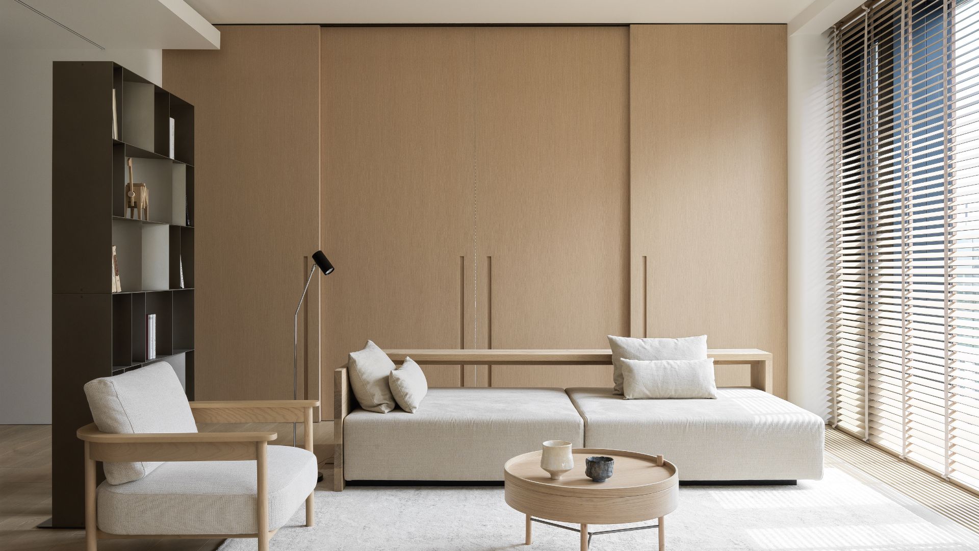
To prevent the closet from looking like a blank wall from the side of the living room, we decorated its central modules with ribbed panels, and we made showcases with ribbed glass and built-in lighting on the left and right sides. Behind the closet in the living room, there is a utility closet containing a washing machine and dryer. To the left, there is the door to the bathroom with a passage for the cat. One can access the bedroom from the living room. The doors leading there are painted in the same color as the walls on one side, and completely mirrored on the other.
We organized two workplaces in the bedroom; the first is located at the entrance. There is a hanging table with drawers and cabinets for storing documents and clothes. We placed the table here so that there is plenty of room next to it for movement in the VR helmet. The second workplace is located at the corner window overlooking the city. Next to the table, there are open shelves and a showcase for the client’s memorabilia.
We designed and manufactured a bed, which we placed in the center of the room; its frame is a single unit with cabinets and wall panels. We made the bed’s base in black and deepened it with the sides veneered with American walnut. This way, the bed seems floating. We supplemented the wall panels above the headboard with wood strips and complemented them with lamps that rhythmically hang from the ceiling.
We installed a mirrored cabinet with sockets and a hanging cabinet with a sink, under which there will be a litter tray for the cat in the bathroom. We chose an unusual porcelain tile decorating the bathroom that imitates the texture of metal sheets and rust. One can access the guest bathroom from the hallway. We enlarged the guest bathroom at the expense of the corridor. We were able to add a shower after the replanning; and now it’s separated by a ribbed partition, which unusually refracts the illumination of the niche for gels and shampoos.
