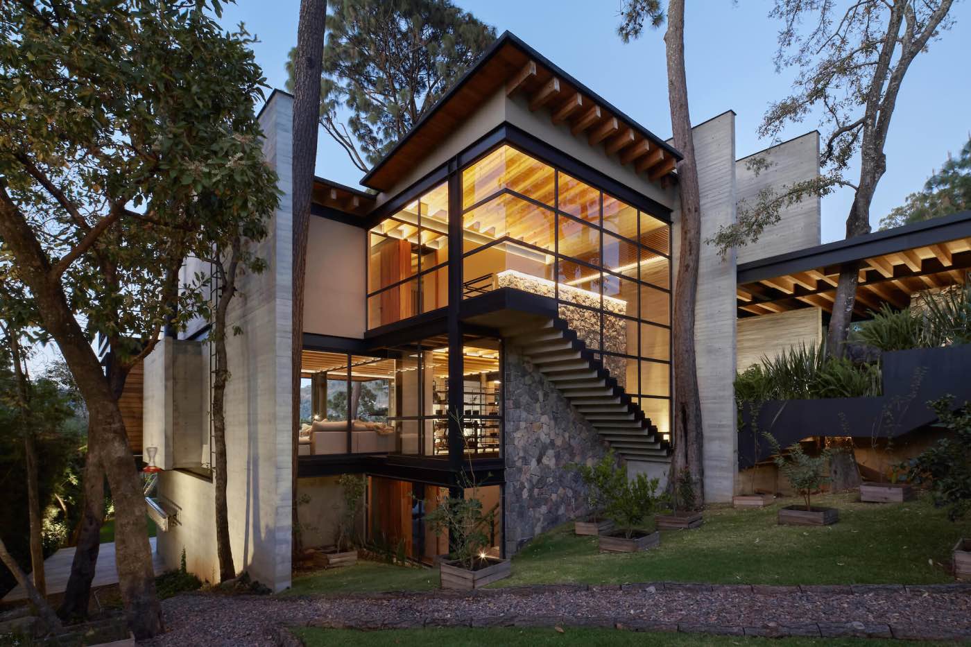
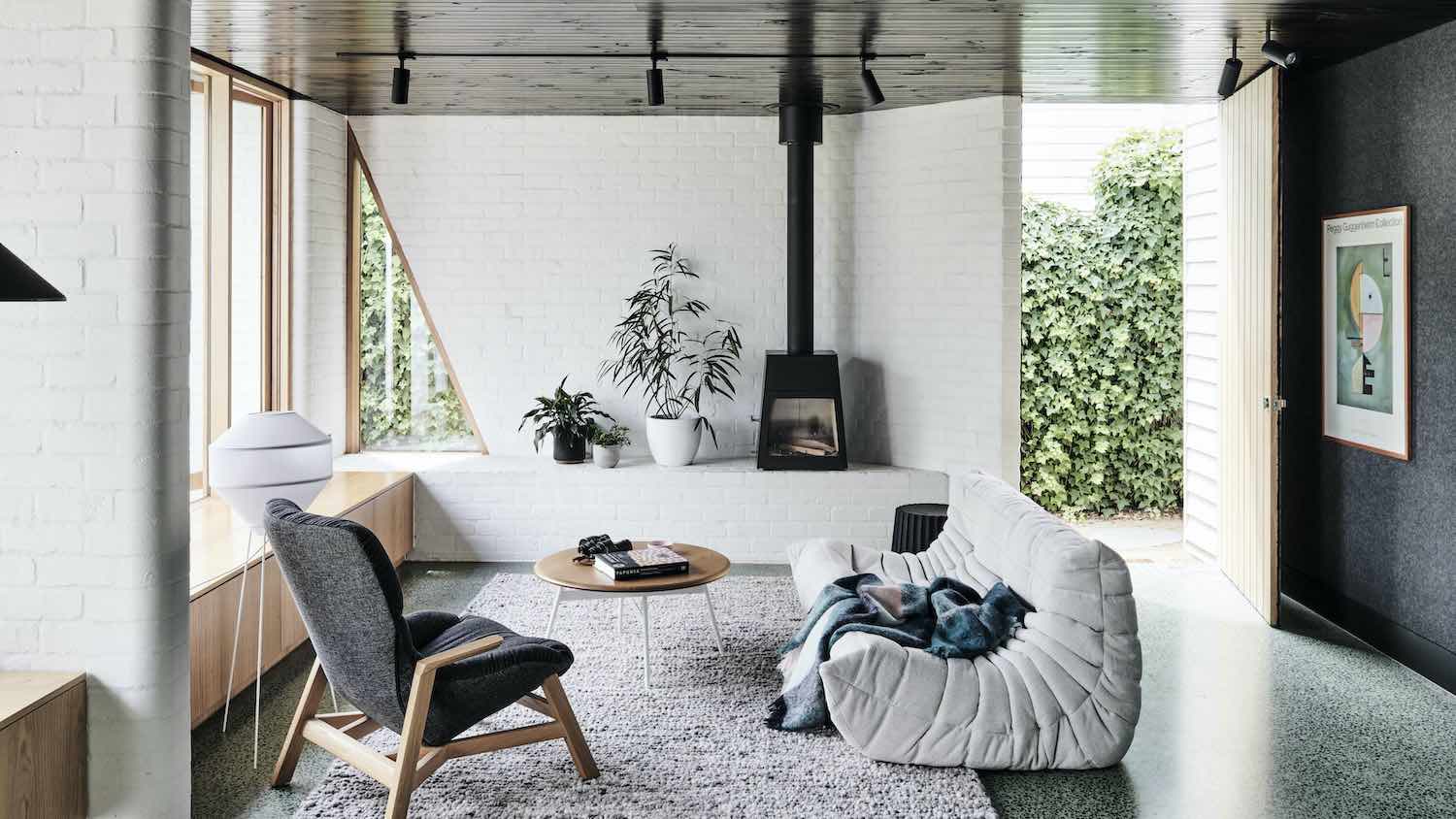
Archohm Consults: The ‘compactly luxurious’ home for the Gupta family has been designed to seek the creation of spaces the family has not experienced before; spaces that enhance their lives and create memories that they retain long after the present is over, spaces that build aspirations for the future. Architecture is envisaged as a tool to feed the mind, body and spirit in a polyvocal manner; enabling diverse readings rather than furthering a single prescribed one. The interior architecture is directed towards facilitating the discovery of autonomy, the happy experience of exploring silence even while encouraging the flow of people in generous communal spaces.
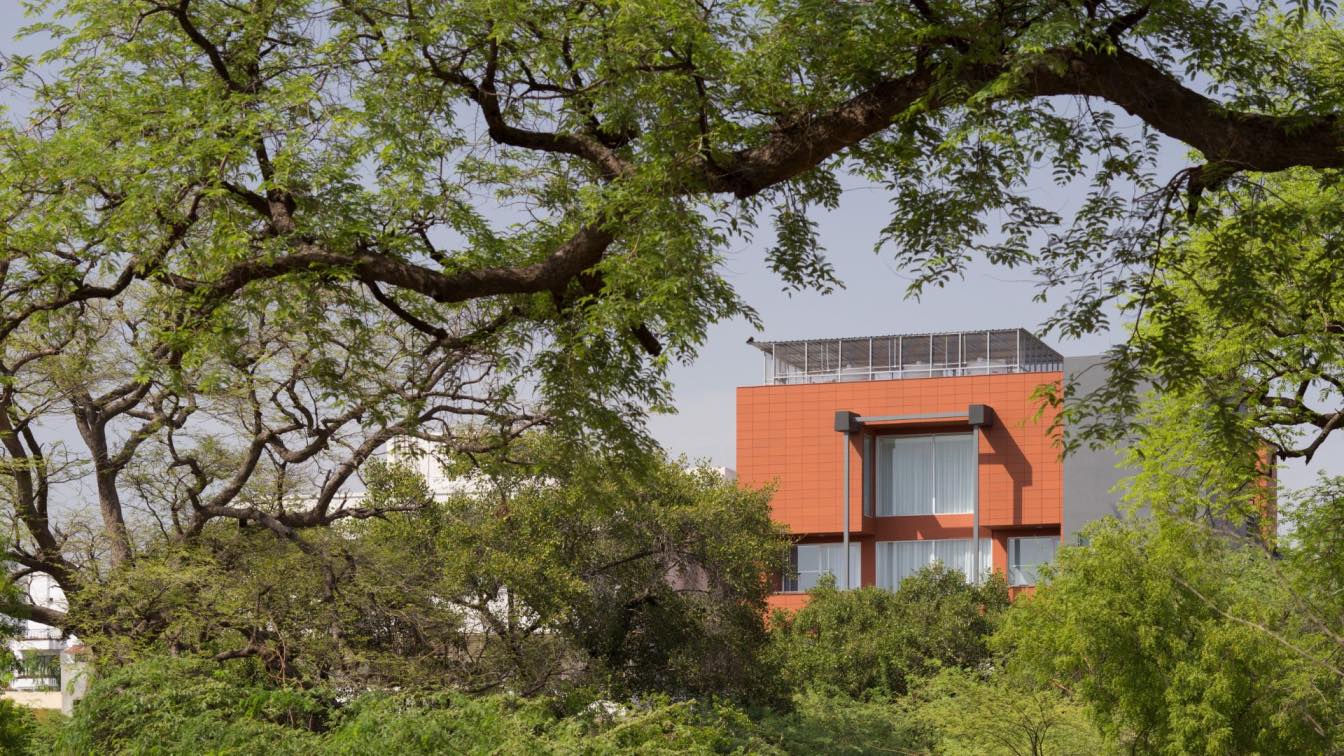
The simple cuboid evolves into a terracota house-the earthy material seen in a contemporary, bold Avataar; its unitary and humane scale providing the impression of being grounded but with a lightness of being. The living spaces-tripartite in nature, are private realms, the less private realms and buffer zones that dissolve the definitions between them in plan and by an easy and convenient usage of multiple levels; thus the house is spatially manipulated-vertically and horizontally, to create unity. The second floor is occupied by the elder couple, the floors above and below it by the families of the next generation. The vocabulary of design emerges from the same language but like with dialects, it adapts to the tastes, aspirations and needs of the respective family members. The aesthetics of materials is expressive of syncretism-reinterpreted old and new; creating the symbiotic heritage of today and ushering in social change.
The facade is designed on the basis of what the building desires to reveal to the outside world about its ‘other side’ and the life within. The terracotta louvers form a curtain in front of a ‘play’ of mass and voids. The strikingly different facade-its geometry, form and elemental expression make a statement of new aesthetics and social change.

The double volume entrance announces the dynamism of the house and its inhabitants. Enclosed by a glass roof-plane and a hard, cobbled floor plane, it is framed by a humongous door in one wall and reiterates terracota through an installation of a flock of birds(their number as many as that of the family members),poised to take flight into the open skies. Other than this, a waiting area, lift and stair lobby lead to the upper floor. Services and parking take up much of the stilt space.
A wall with butchwork in slate welcomes visitors on the first floor and introduces the theme of roughness and rawness to the interiors, both enhanced and softened by light from the suspended Gomaads concrete lamp. The wall-pattern continues from the stairwell to this lobby and moves on to wrap the Mandir. Gina armchairs by Paolo Vella flanking a Cassina cork stool adorn it.
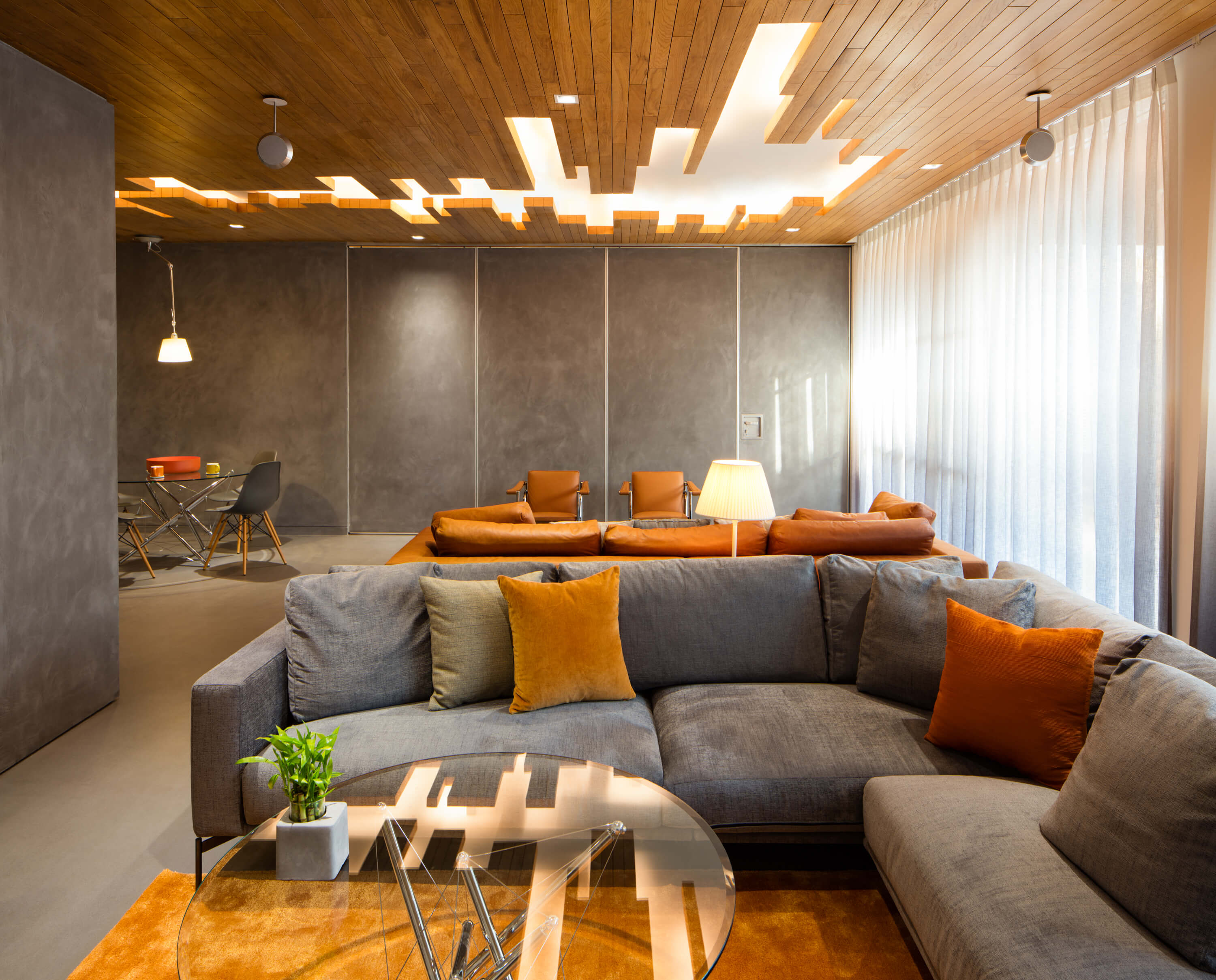
The first floor is centred around a spacious living area according to which are placed a guest room, a kitchen and two bedrooms with attached services. It is entered through a ‘door store’-a pivoted revolving door that holds a shelf of books. The living room encourages clusters of users, subtly divided by low-height cabinets even though the space is wholesome. The guest room is separated by a sliding Pandomo panel so that it can be integrated into the living space when desired so. The flooring in brushed oak and walls of Pondomo merge. Pandomo is a polished form of concrete that exudes sophistication and exclusivity even while looking raw and spartan-as defined by contemporary minimalism. To add to the unified grey/tan backdrop, the curtains are ombre-the fabric’s tonality shading from dark to light. The rhetoric lies in the ceiling; made from pieces of wood, it is three dimensional in that it either caves in or protrudes as suspended panels. The show stopper in the dining space is the bar and simulated fireplace. The simplicity of the contemporary dining table is offset by the famed Vitra DSW and DAW plastic chairs, one piece shells- seats that fit the contours of the human body and offer immense comfort. The former is also placed along with a glass top Cassina Centre table in the adjacent seating cluster. Hollywood Sofas from Arflex throw a hint of Scandinavian design tocomplete the picture.
The rear side sleeping quarters of the children and parents is separated and connected by a study and a double height volume-a balcony with a spread of glass offering enviable views of the outside greens. An Artemide floating lamp visible from outside punctuates the space; seen from the exterior as a visually arresting piece generating the quality of light around it.

The children’s space is playful and offers itself as an opportunity to learn and grow. The bed is placed on a wooden stepped platform ideal for prancing. The vinyl flooring takes care of wear and tear, expected in areas where children spend a lot of time. One wall plane is made of open shelves displaying collectibles and soft toys, the one behind the bed is a panelling in denim-a blue associated with boys! The edge of the room is a creative surface-lacquered glass and a pin board to express the trials and tribulations of growing up. Cove lights illuminate the room and imbue it with softness.
The master bedroom has a wall paper in natural cork behind the bed, while its opposite wall is panelled in wood and conceals a door. These complement the brown soft furnishings. A set of Cassina Utrecht chairs by De Stijl designer Gerrit Rietveld adds to the narrative of the intimate space.
The Second floor is minimalistic in demeanour- grey travertine offset by red terrazzo flooring that is earthy but projects an evolved modern self. Once again at the entrance, a largish onyx panel invites visitors into the understated lavishness of the floor. At the far end of the living space is the Mandir with its roughage of exposed concrete. The divine is juxtaposed with the humane- black and white photographs framed in white framing a white wall.
At the entry of the third floor itself, a grand piano defines the classic touch. The black and white palette reiterates it. The strips of black dominate the central lobby while the white ones take over. The Mandir enclosed in plain white when closed, seems abstract; it is when the doors are opened that the crafting detail traditionally associated with Indian temples is revealed.

On the front side, a curved glass encloses the dining area. The living room is a medley of formal Philippe Starck sofas interspersed with Cassina Vanity Fair chairs in pop-up style. As on the floor below, the guest room can be merged with the living/dining space, if need be, and is demarcated by sliding glass doors. A red coloured pop-up carpet reiterates the red of the sofa, which is seen in the mirror on the wall. A double height volume washed with light, once again separates the master bedroom and the children’s spaces, in the form of a lounge. An eye catching bookshelf-its lines defining the angular, attached to the white washed brick wall flanks the stair and even goes under it! Vibia’s wire-flow draws lines from the ceiling. An intimate sunken area in wooden flooring is demarcated for sitting.
The highlight of the master bedroom is the wall behind the bed-made of concrete panels; it is illuminated by a ten-inch slit of skylight. This has blinds so that the skylight can be closed for privacy. The bedroom is equipped with an additional dress space above it, accessed by a stair within it. The young lady’s room is designed around twin floating beds. The theme of lacquered glass, chalkboard and pin-board is reiterated and so is the green and orange theme.
On the top-most floor, the son’s bedroom (directly above the daughter’s) is designed similarly. A pair of chairs whose backs are made of mattresses organise sleeping arrangements for night-overs. The bathing space is luxurious, the refined feel given by grey tiles and wooden flooring on the borders. A stylish coat hanger and a bench define the aesthetics of space of a young man waiting in the wings to become a responsible adult. Circular ceiling lights however infuse lightness and fun into his domain. Just across this room is the reading space of the lounge with the very iconic LC4 by great master Le Corbusier and his partners, and the very lively Foscarini lamp springing from the floor. Facing the terrace is the semi-open seating. The terrace space is generated by a floating console/bar, raised on I sections and not touching the ground. An industrial looking metallic staircase set against the backdrop of a green wall leads to the terrace above and offers a suspended console underneath it! A massive mural symbolising the terrace as a gathering place adorns the lift lobby.
The house is designed for habitation that makes life attractive, meaningful and happy.


