Today, more than ever, our homes have the power to influence our mood, productivity, energy, and of course, the interaction between family members. An example of this is the home of a couple in their 30s who immigrated with their children from Canada several years ago and decided to adapt their private home in Israel precisely to the taste, needs, and lifestyle of their family members. For this purpose, they approached the 'Halel Architecture and Interior Design' team, who created an elegant, bright, and captivating living environment for them, paying great homage to North American design with an adaptation that fits the here and now. Architect Shira Muskal, one of the firm's owners, shares the work process and the choices made along the way to the final result.
Welcome to the home of a couple and their four children - a young family who decided to immigrate to Israel from Canada several years ago. The couple purchased a house in Ra'anana, Israel, that initially met many of their requirements and needs, and now, as years have passed and the children have grown a bit, it was time to upgrade, invest in both small and large details, and transform the living environment into one that precisely matches their character and the style they know and appreciate - American design, which thanks to the dedicated treatment of architect Shira Muskal, co-owner of 'Halel Architecture and Interior Design' and project managers Yael Frankel and Rotem Patilon, received a light, bright, and highly practical interpretation adapted to dynamic life in warm and sunny Israel.
"My partner Hadas and I have known this house well for nearly 15 years. Back then, we were hired by the previous owner, who has since sold the property to another couple. A few years ago, it was purchased by a lovely Canadian couple, and for them, we performed the current upgrade," says Muskal. "Aesthetics drove them to embark on this journey, and they approached us primarily to upgrade the entrance floor where the hosting functions are concentrated. The bedroom floor quite suited their needs, so the changes we made there were relatively minor and focused mainly on bathroom design."

"In general, this was a very well-maintained house from the start with no obvious planning flaws. However, over the years, it changed owners; the wall bordering their neighbor's house (it's a semi-detached) was covered in bricks, making it feel massive and clumsy, and the openings, in their original form, were small, so the indoor-outdoor connection definitely needed improvement. The yard, which had stood quite abandoned for years, also required attention, and in the new design, it forms an integral and very present part of the living experience."
"As part of our firm's activities, we are well-versed in working with foreign residents, particularly with clients from the USA. In most cases, we need to make the necessary adaptations between the conservative and classical style that is very common in their country of origin - with its bold colors and rich details - to the Israeli living environment, which is perceived as much more modern and lighter. The same applied to this house, where the property owners yearned to incorporate North American design values into the new design, which made the process especially fascinating and fruitful. We effectively bridged between the two approaches, refined the details, and found the right balances."
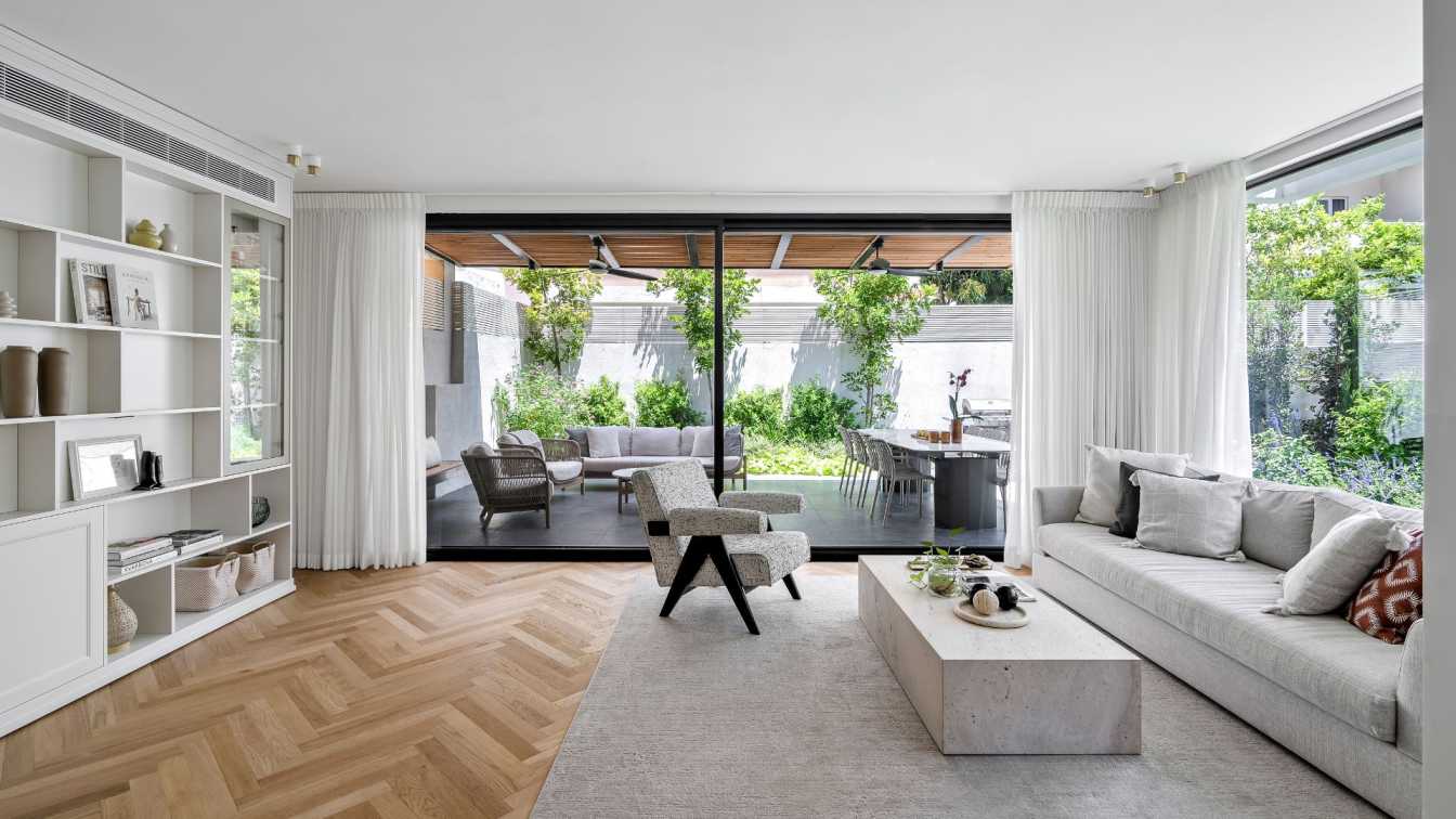
"In practice, we created a house purely in the fusion style and paid attention to proportions, volumes, and dimensions to preserve visual richness while keeping the space bright, dynamic, and open. We incorporated elements that were important to the couple, such as herringbone pattern parquet flooring, a stylish kitchen with a rich and dominant granite surface, and very prominent lighting fixtures. We simply toned down the volume a bit and maintained a more moderate envelope so that the flow in the space is optimal and the house is very authentic to its environment."

"Since the proportions and internal divisions of the spaces were quite precise, we focused on opening the house outward," explains the architect. "Together with the executing contractor Bar Mishael, we expanded and raised the original openings to ceiling height, and the staircase, which was originally wrapped in built walls, we opened as much as possible. We kept the structural columns in the perimeter, thus creating viewing openings that contribute greatly to the space in the architectural aspect and allow optimal interaction between the floors and different functions in the hosting floor."
"Another significant decision we made was to choose black aluminum profiles: the house is characterized by straight and classic architecture, so the dark windows create interest and emphasis, as well as the right contrast between the envelope and the rich materials we incorporated in the house. In the small openings, we created divisions that correspond with the style of windows typical to American homes, and those leading to the yards we left clean and minimalistic. For example, the large window in the living room that we planned as fixed and as such serves as a kind of glass wall."
"The clients are traditionally observant, and the lady of the house is super practical, meticulous about cleanliness and maintenance, and really loves to cook - food and hosting are very significant for the family members, and the kitchen became the heart of the project. The kitchen location remained the same, but we planned a different layout: we significantly enlarged it at the expense of the original dining area, which was enormous in size, and planned more effective divisions such as a significant pantry accessed through the tall cabinet wall. On this occasion, we also changed the structure of the adjacent guest bathroom and made it much more spacious."
"Besides aesthetics, we placed considerable emphasis on practicality in this kitchen: we created many storage places and large work surfaces and chose a Concepta system behind which electrical appliances are hidden. We planned the tall wall symmetrically, containing an integral refrigerator on one side, ovens on the opposite side, and in the center, the cooking unit that we Israelis usually see in international magazines. Above the stovetop, we planned a water tap for filling pots, and the surfaces were covered with unique natural granite stone that we were initially hesitant about but ultimately fell completely in love with, precisely because of its dominant shade and dynamic texture that gives it lots of presence in the space."

"The furniture we chose is classic, with presence, but in moderation. While here in Israel we tend toward Scandinavian style, in this case, items with presence were chosen, which we moderated with light fabrics and bright colors. For the living room, we planned a light, bright, and refined library behind which the air conditioning system is hidden. This piece of furniture anchors the hosting function where it is located, echoes the kitchen furniture found at the other end of the space, and contributes in its way to breaking up the mass of the long and continuous axis."
Around the house, two yards await the family and their guests, front and back: "We planned the front one to be experiential and pleasant, and it serves as the perfect place to drink afternoon coffee. We placed large planters throughout, and from there, there is also a descent to a large surface that serves as an outdoor play area for the children," says Muskal.
"The back yard is a direct continuation of the hosting experience in the house itself, and it is accessed through the living room's large window. We created a suspended pergola under which there is a large deck for the lounge area and outdoor dining area, centered around the dining table that served as the family's dining table before the renovation and continues to serve as a significant and important function for them after it. Around the deck, we made sure to create relatively minimalistic gardening, yet it is vibrant and colorful. This is not a conventional Israeli garden but rather a more stylized yard in its essence."
"Although the work focused almost entirely on the ground floor, we suggested to the couple to make a planning change in the bedroom that actually creates a fundamental change in the energies and flow in the space," says Muskal. "Before the renovation, the bed faced the wardrobe door, in a position that damaged the feeling and experience. For this purpose, we redesigned the wardrobe room and the furniture arrangement in the bedroom, so now the space is much more harmonious and complete. Just like on the ground floor, in the parts we handled on this floor, the details are evident in the carpentry items and the use of stylized elements such as handles and mirror frames - every detail is very characterized and carefully chosen. The same applies to the bathrooms, which might appear not entirely conventional for some Israelis, largely due to particularly dominant porcelain granite tiles resembling marble, with patterns that create movement on their surface."


