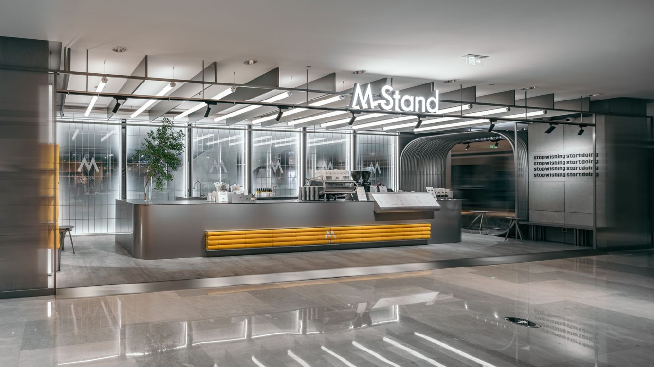
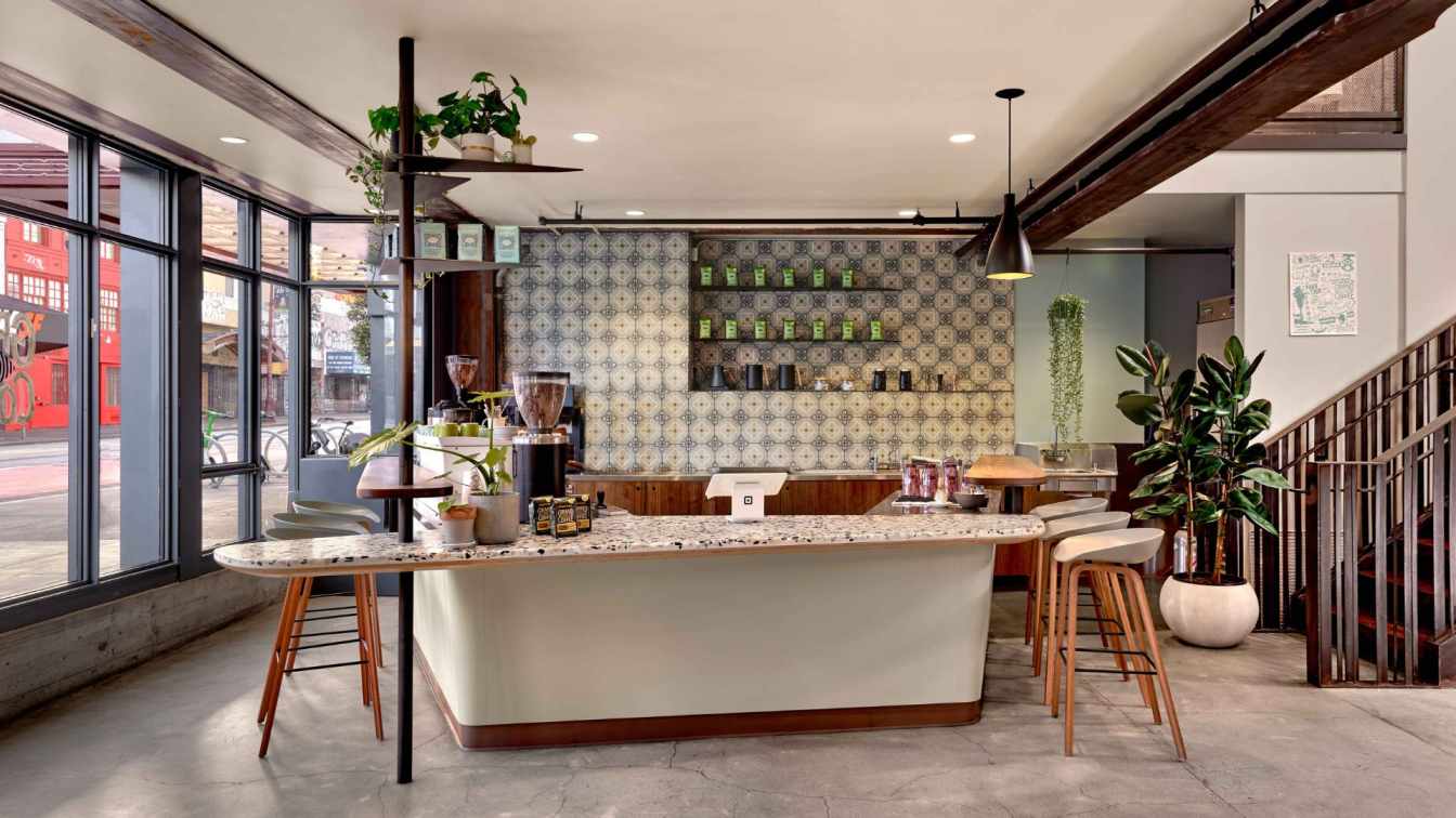
The project, designed by STILL YOUNG, is M Stand's second cafe opened in Wuhan International Plaza, which is one of the most iconic complexes in the CBD of Wuhan, a commercial center that integrates international trends, avant-garde culture and lifestyle inspiration. Located on the second floor of the mall, the project occupies a total area of about 88 square meters. The surrounding businesses in the mall are balanced and unified, making it difficult to highlight the identify of M Stand as a coffee brand.
As approaching the design, STILL YOUNG's main consideration was to create a unique sense of place relevant to coffee in the existing space and a relaxing destination for coffee drinking in the busy city.
1. A unique "field"
M Stand represents Mind Stand, which advocates an attitude of not being labeled or defined. With freedom, style and individuality rooted in its DNA, M Stand emphasizes on providing a distinctive "field" for customers. In the dynamic space-time dimension, a "field" with a sense of futuristic mystery emerges from the darkness, which tears, squeezes, splits, mutates and crashes into the city, becoming an indefinable "space station". As entering this place, customers become the explorers of this "field" and are encouraged to discover the secrets of the "space station" in every detail.
The project responds to M Stand's aesthetic concept of "creating a distinctive design for each store". STILL YOUNG combined lighting, a minimalist gray tone and metallic textures in the design, and preserved the original features of the building. At the same time, the design team attempted to break the silence and highlight the uniqueness of the space by extending the sight line from the inside to the outside.

2. Freedom and fluidity
The shopping mall in which this space station-themed M Stand cafe is located has various functional divisions. The second floor of the mall provides a luxurious shopping experience, and the light sources are mainly in warm tones. To distinguish M Stand from the surrounding businesses in the mall, STILL YOUNG envisioned it as a "space station" by adopting a minimalist grey tone and cool light sources. The cool white strip lights and matte metallic gray lines are like a space-time boundary, allowing customers to travel between reality and the future.
The design creates an inclusive, outward-facing form, and a fluid space centering around the metal bar counter. The translucent backdrop wall stimulates the imagination and desire of passers-by to explore the "space station". The designers expanded the depth of view as much as possible within the limited spatial scale, to create an experience of freely traveling through another space-time dimension. The existing columns on either sides of the space and the original ceiling couldn't be demolished. The design team made use of the original building structures with a unique design approach, and re-organized the space in an orderly manner within a limited area. The space is divided into a bar counter, a passage and seating areas. The design not only connects different functions, but also ensures integrity and consistency of the overall space.
The seating areas behind the columns are shaped by curvy stainless steel lines. The fluid lines and the unique circular form highlights a distinct social attribute and a sense of imagination, and meanwhile echoes with the brand's DNA through a spatial expression that features sense of freedom and infinite tension. To simulate the sponge-wrapped machinery of space station, sponge elements are scattered on interior surfaces. The warm orange hue of the sponge, together with the greenery on the bar counter, absorbs the coldness of the gray tone. The inherent coolness of stainless steel and concrete is softened in the balance, which adds a sense of affinity to the space.

3. Distinctive character
As customers leaving the bar counter and passing through the stainless-steel seating area and the mysterious corridor, a floating island will come into sight. The M-shaped acrylic installation is unique and striking, juxtaposing two seemingly parallel but separate places in the same dimension. Like a mysterious sign, it attracts explorers into another world.
Like a luminescent body, M Stand's logo is a cue, emitting a flood of white light that speaks for the brand's unique personality. Various details, such as the iconic storefront, the transparent glass finish, the orange sponge elements, the steel partitions in the seating area, the brand's catchphrase "Stop wishing start doing" on the concrete column, and the contemporary minimalist lines running through the top of the space, all manifest the brand’s distinct character.


About
Founded in 2007, STILL YOUNG is headquartered in Shanghai, and has offices in Guangzhou and Wuhan. The design practice is dedicated to delivering high-standard, customized spatial solutions to far-sighted leading commercial brands. Based on a holistic and systematic approach, STILL YOUNG works on full lifecycle design for commercial spaces. As consumption modes keep upgrading, the company's subdivided multi-disciplinary team guarantees the effective execution of creative ideas in all dimensions, to empower brand spaces to create everlasting commercial value adaptively.
Having been working in multiple sectors including catering, fashion, new retail and interactive entertainment and delving into lifestyles and business modes for 15 years, STILL YOUNG has established an international vision and gained rich practical experience. As a desirable design solution provider for Fortune Global 500 companies and emerging domestic brands, STILL YOUNG has been continuously engaging in business innovation in China. The practice is equipped with an experienced professional team, with a clear division of work in varied aspects including design, material techniques, VI, site survey, MEP, and HVAC, etc. STILL YOUNG approaches commercial design through logical thinking, and manages to create differentiated, innovative spatial scenes, hoping to convey the value of design to clients and end users.
The innovation of commercial design is relevant to the future of cities and public life. As the development of economy, technology and culture in China has been breeding infinite possibilities for commercial space, STILL YOUNG established a LAB team dedicated to chain brands, to deliver differentiated designs for each project. The LAB team adopts a work approach that effectively combines standardized practice with experimental original design.
STILL YOUNG strives to develop into a leading original design platform that gathers emerging design talents based on a philosophy of inclusiveness and diversity, to build a Chinese design community with strong global presence, and to seek mutual growth with the staff and the clients.

