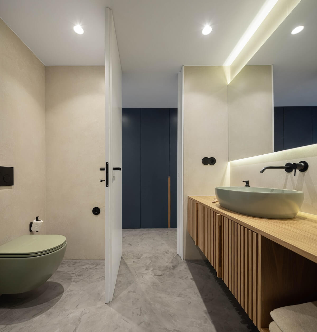
arQB arquitectura: The “wave Apartment” project’s main challenge was the reorganization and hierarchization of spaces.Located on the seafront, on the eighth floor of a typical 70s building, and with fantastic views. However, it did not take advantage of this due to the excessive compartmentalization that conveyed a complex environment that was difficult to interpret. In this way, in the first moment to respond to the program, we defined and hierarchized the spaces: arrival area, social area and intimate area.
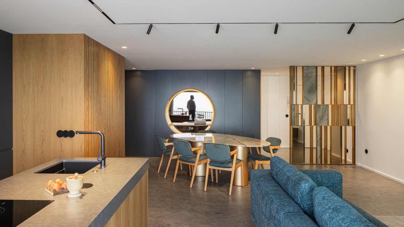
This attitude created some difficulties for us due to the essential technical and structural elements such as pillars and beams, which affected the process. It was then that we created a structuring and fundamental element for this reorganization, an organic “wave” wall that takes us from the social area to the intimate area in a fluid and intuitive way, another fundamental element is the furniture that separates the service area from the social area. and houses a large circular mirror that works like a typical boat window. This “window” reflects the ocean and its horizon, transporting the exterior views to the interior of the apartment, namely to the dining area.
All the furniture was designed using the same concepts, transmitting both formal and chromatic coherence, the “ocean” blue color conveys tranquility. As for the materials and following the coherence of the place, we opted for microcement throughout the floor in a continuous manner, similar to the sand and beaches there. In the atrium of the rooms where there is no natural lighting, we chose to remove the ovoid ceiling and place indirect lighting there, resulting in a pleasant and natural environment that eliminates the lack of natural light.


