Studio Fruktov Interiors: When we met with the client for discuss the future project he had a lot of ideas on style and lighting. We got involved in the project at the most important stage and partially implemented his ideas, but at the same time some of them were for objective reasons. The main task was to create a comfortable and spacious apartment for a large family. The client especially liked the industrial style of the loft, the New York subway and modern interiors too. He wanted a juicy, positively-charged family space.The owner of the apartment himself is a very positive, modern young man. Thanks to his relaxation and complete trust, the process of creation and implementation was easy and pleasant, we did not feel any fatigue and were insanely happy to create such a space for a wonderful family.
Layout
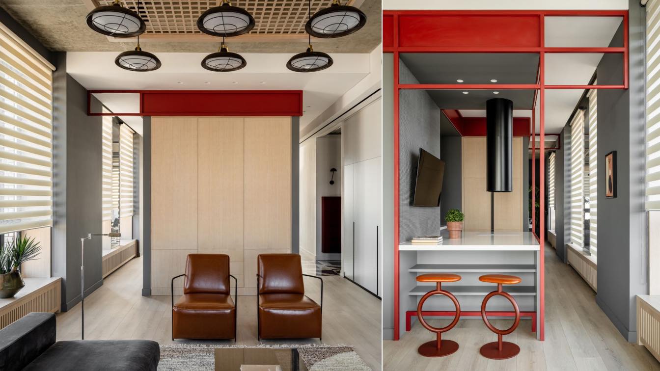
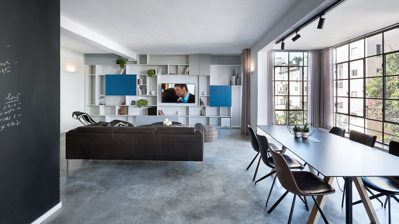
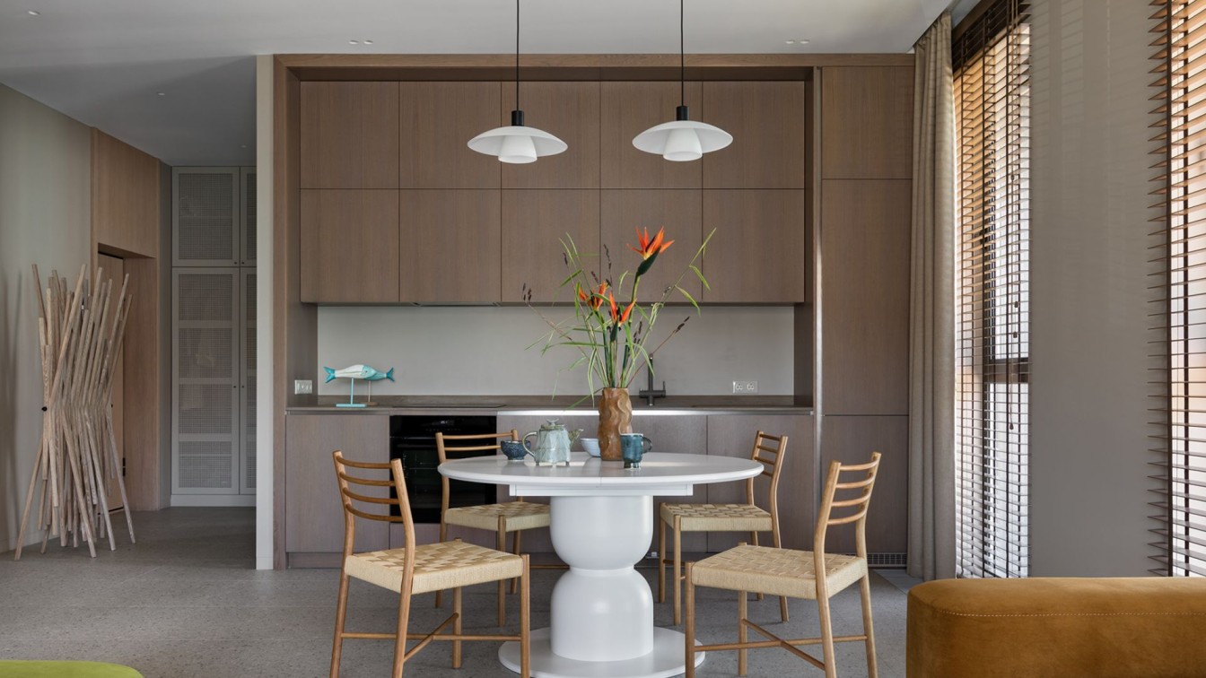
The apartment of 204 m² occupies the upper floor of one of the sections of a modern residential building. Initially, it was an impressive square space with several supporting columns in the middle, with a ceiling height of 4 meters and a large number of windows that overlook three sides of the building. In the center of the apartment, directly opposite the entrance, we have located the common zone with the dining room, kitchen and living room. This solution allowed us to preserve the stunning panoramic view of Moscow, opening from the windows on three facades. Along the kitchen, which is located between the dining room and the living room, a circular passage with windows has been preserved so that children can run freely, while the kitchen is perceived as a separate island volume.
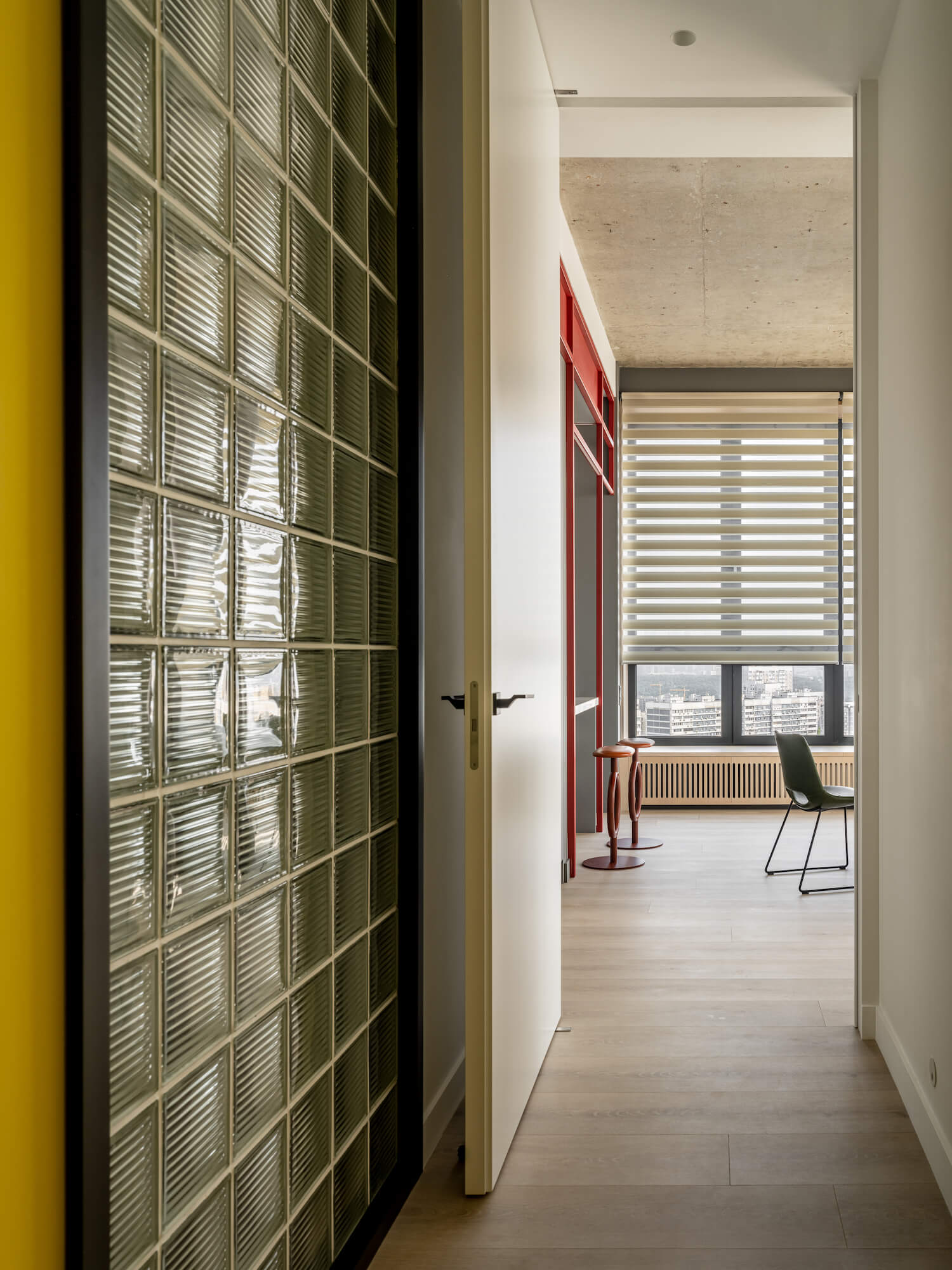
We are proud of how we managed to organize the kitchen, dining room and living room. We discussed various options with the client for a long time, and in the end we managed to convince them to accept this one with the open space. At the same time, we have made it cozy and partially isolated, where necessary. To the right of the hallway there are kid's rooms, a kid's bathroom, a guest room and a laundry with a dressing room, which are united by a bright yellow corridor. On the left, there is a private space with a master bedroom, a master bathroom, a home office and a dressing room. Each of these parts is separated by huge swing doors, from which you can get into the living room and dining room. Children from their part of the apartment get through these doors into the dining room, and parents, respectively, into the living room.

Interior mood and color scheme
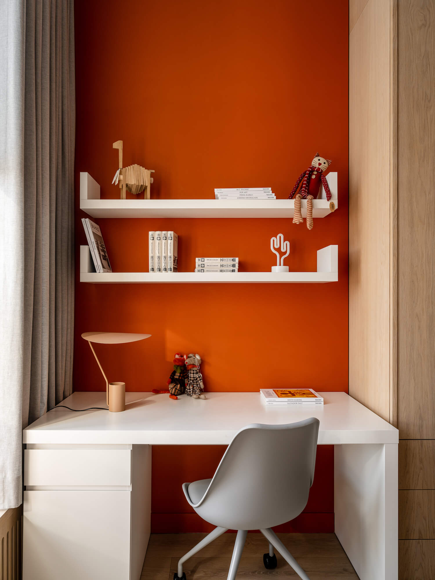
We balanced between the use of bright colors, the style of the loft and the modern interior. It is worth noting that we usually use minimal color in our projects and avoid bright shades, preferring a natural gray-white-beige scale. But, after getting to know the family, we realized that in this case the bright colors are necessary. With the color we added juiciness and cheerfulness, we determined the color identity of the main zones, we visually separated the children's part from the adult and we added more drama to the master bedroom, home office and master bathroom. At the same time, we created a fresh and sunny mood in the children's part. So we can say that color was our inspiration.
Finishing and decoration materials
We combined various textures, such as the rough surface of concrete and formwork in combination with smooth painted surfaces and natural wood textures. We also added graphic details in black and red. So a metal red structural frame appeared around the kitchen. Floral wallpaper has been added to the master bedroom and guest room.
Architectural and design techniques
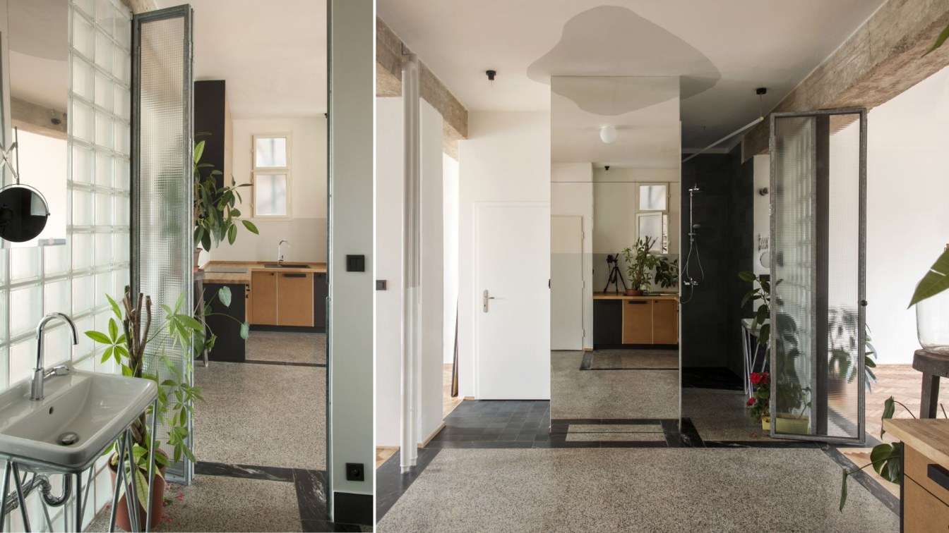
We worked with scale and volumes. Since the apartment is quite large, we were looking for solutions and techniques that will look harmoniously in it, creating the necessary visual effect and forming points of attraction and accents. So there was a huge lampshade in the dining room, a red structure that unites the kitchen, color accents that run like a thread through the entire apartment. We are also fans of the black and white patterns that appeared in the hallway and the children's bathroom.
Furniture and decor items
We always start from the convenience, functionality and quality of furniture. Our clients, too, rarely choose interior elements based only on aesthetics. The same requirements were applied to all items that were designed and made by our studio. A lot of joinery was made to order, all built-in wardrobes, dressing rooms, kitchen furniture, etc. Also, according to our sketches a brutal metal shelving in the dining room, a lampshade in the form of an inverted truncated cone and a metal brutal table and shelving in the dining room, a red structure around the kitchen, furniture for the kid's rooms and much more were made.


