Sarah Mikhailova: The “Joy” project is my vision of the mid-century modern style, which is experiencing a new wave of popularity today. The vision is not formulaic, not glossy or textbook, but maximally personalized, taking into account the character and personal wishes of the customer. The owner of the apartment is a young woman who understands fashion and respects the past, understanding its beauty. So one of the important tasks for me was the merging of modern trends and elements of history, the creation of a harmonious aesthetic that unites them.
Today, mid-century modern is precisely a combination of current design ideas, laconicism and functionality, characteristic of the style of canonical colors and textures, as well as (the most interesting thing) the addition of vintage, antique or artificially aged pieces of furniture and decor to this cocktail. I implemented the last part in lighting, including: I chose all the chandeliers, lamps, floor lamps and even candlesticks from the funds of past eras.
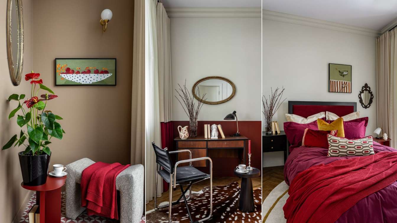
Mirror, Germany, 50s of the 20th century, standing in the hallway, was literally restored from ruins. Look at this luxurious ebony in perfect varnish now, how much chic it has! A round carved mirror with a gold frame above the coffee table, an oval one above the bureau, a small one in a dark frame and a similar one in blue - also vintage finds from the Soviet era of the 60-70s, fit perfectly into the overall picture. Contrary to fears, they do not “age” the interior at all, but on the contrary give it expensive gloss and intelligence.
I also had fun playing with materials, paying tribute to the traditions of mid-century modern. Futuristic shapes of armchairs and ottomans, calmed by cozy textile upholstery, a chair from the GDR from the 60s with a metal frame and fabric seat, a transparent plastic plate curved into a coffee table... And next to them is a classic desk Eton Factory Czechoslovakia, 1960s (oak/walnut) with wooden drawers of a noble color, a large glossy highboard Romania 1970s from the Vneshposyltorg catalog on slanting legs in an amber shade of wood and a black bedside table. The initial incompatibility of genres turns all these objects into a completely friendly family, in which, moreover, each is individual.

The main color scheme is a combination of warm ocher and mustard tones, with ripe cherry accents. Classic white walls contrast with the berry color especially advantageously; I repeated this duet in textiles - curtains, and also added cherry to the design with blankets, bed linen, the head of a large soft bed and pillows. The sweet berries themselves can also be found in one of the paintings, neatly arranged in a charming white saucer against a green background.
Here the duet turns into a trio of “red, green and white”; it is also repeated in the decor and enhanced by the living plants chosen for this apartment. This is not a coincidence; every detail has its own weight. Thus, the paintings were painted by the artist specifically for the project. I would like to especially highlight the playful canvas in the living room, which depicts a white armchair with a print of cherry crayfish. The blue background clings to a vintage mirror framed in the same shade. This heavenly tone is not duplicated anywhere else and is not justified by anything, since it simply does not need justification. It gives even more air to the space and flirts with the viewer with its brightness.
According to the canons of style, the apartment is divided into zones, but it is not obvious. The layout, as the customer also wanted, turned out to be as open as possible, with a feeling of erased boundaries. In the living room alone, without walls, I arranged three separate functional spaces at once: a few meters near the desk, a soft area and a kitchen. The ensemble is bright and expressive, slightly eclectic, while in the room you can literally feel the warmth and comfort. It’s comfortable here, the furniture is arranged conveniently and without clutter - you’d like to ask the hostess for another cup of coffee and stay longer.
The small area and the idea of a limitless room required neutrality in some areas. So, so as not to distract the public from the main thing, the kitchen practically merges with the walls, although it remains a full-fledged food preparation area with spacious cabinets for dishes and everything necessary. There is a hob and an oven, and the microwave and refrigerator are modestly hidden behind the doors so as not to attract attention to themselves. The dressing room in the hallway is also unpretentious.

Without violating the given style of the 60s, it disappears into the walls, while fulfilling its task - all the dresses and shoes of the beautiful owner of the house will fit in this part of the apartment, but will not catch anyone’s eye, clutter is excluded. All zones seamlessly flow into each other, there is no redundancy in the setting, which is also important, even fundamentally important with a small footage. It's easy for residents not only to move around the space, but also to transform it themselves, simply by adding new accents or moving furniture.
I have already mentioned that the chosen design direction involves a mixture of materials and aesthetics from different eras. This is just a gift for the designer! Cold metal, shiny plastic and glass, warm and heavy carved wood, prints, patterns and textures, enveloping textiles - all this forms a unique style; projects are never similar to each other. Only one thing in such interiors is read equally and intuitively - the feeling that you are in the house of the main character of the series “Mad Men”. Or “Why women kill.” Or maybe a film by the genius of the French “new wave” Jean-Luc Godard?
I also played color games, allowed to me by the generous 60s, in the bathroom, but not wild, but graceful and intelligent. A laconic white room with a cabinet built into the wall looks neutral. But add a bouquet of fresh flowers next to the sink, a couple of black candles in vintage glass candlesticks and colorful grout to the tiles - and voila, the prank is a success! Another confirmation of the importance of every detail in the interior.
I also did this trick with textiles on the floors. In the cozy living room and bedroom, they are, of course, made in a herringbone layout. Classic. There I decided to put large handmade carpets, fashionable, relevant, but at the same time exactly fitting into the concept and adding coziness. And near the desk there is a deer skin (faux): despite the pretentiousness of the accent, it does not stick out visually, it only sets the rhythm and mood. The aesthetics of the mesmerizing mid-20th century in all its glory. The place where, without a doubt, the main character lives!