The Project
Rina Lovko Studio: The apartment is located on the 4th floor of a residential house, which was built in 1905, in the historical area of Kyiv. The space itself is luminous: all the windows overlook a quiet green park, and the light freely streams through them. Because of the state of the building, a massive renovation of the flat was required. The process of dismantling revealed the rotten slabs and large cracks in the walls, and that flooring replacement is needed.
The Client’s Vision
Our client is a young woman, a fashion insider with a strong vision. This project is all about aesthetics, so it was entirely designed to meet her requirements and standards of beauty. Our client is fascinated with Paris, so our target was to recreate a flair of a vintage apartment. Our solution was not to copy the “Parisian chic” tricks, avoiding the ornamental plaster and other obvious elements of direct quotation of this style. The focus was shifted to natural textures, a combination of softness and determined details, and an overall airiness, and nuanced sophistication instead.
Renovation
The state of the structure of the building made us renovate the apartment, and enhance the slabs and the walls. The old wooden inner walls were damaged by humidity and wood pests, so we had to remove them completely. The original parquet was also disassembled, and the floor was upgraded with a welded structure poured with concrete. Furthermore, we enhanced the balcony, and the walls were strengthened with special ties to pull together the frame.

Design process
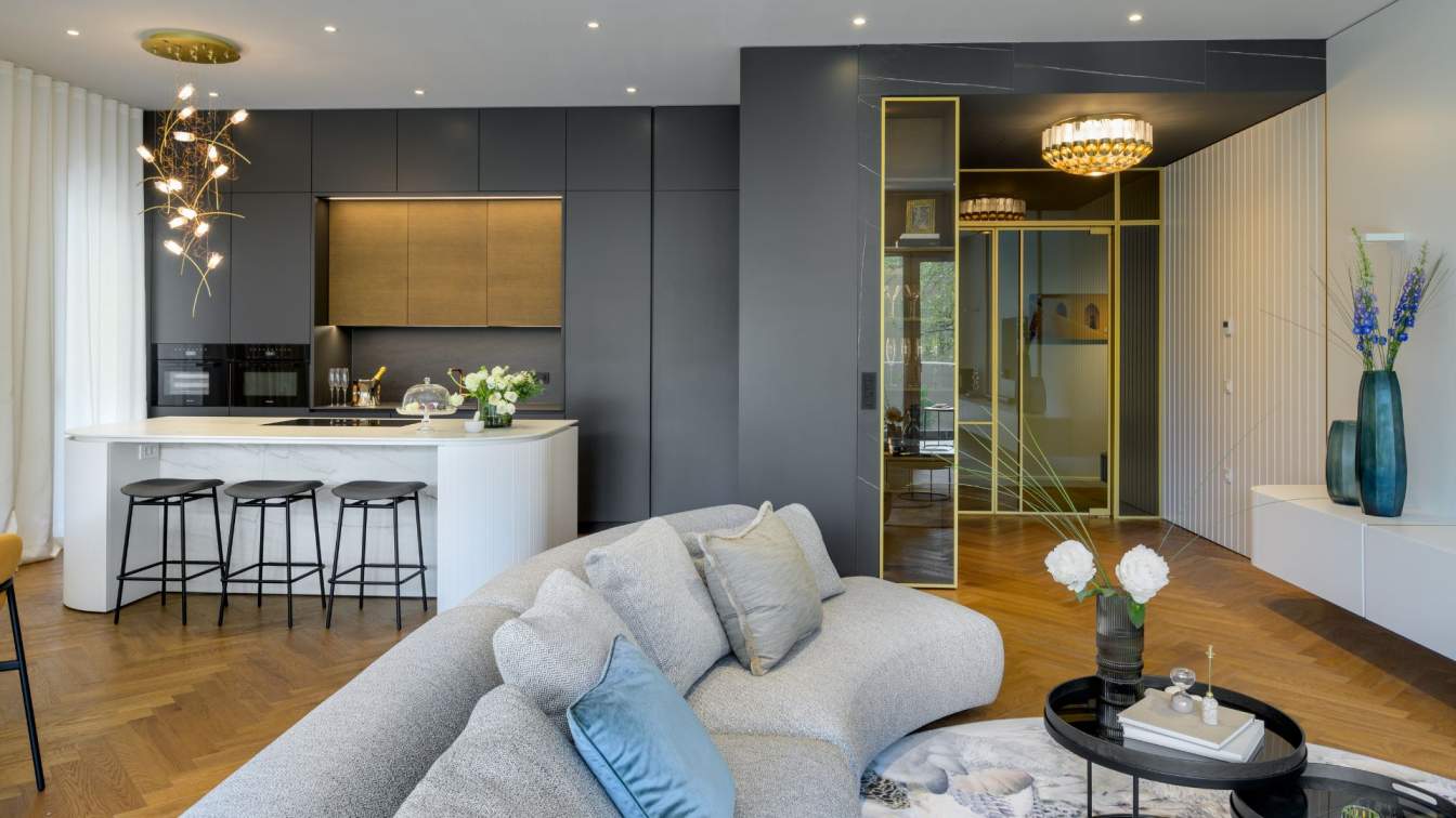
We opted for the time-tested scheme of the space arrangement, which is an enfilade. Given that the apartment is one-sided, we decided to design a long and functional hallway, containing an entrance wardrobe, a guest restroom, and a laundry area. The kitchen is located near the living room entrance, and a cabinet with a refrigerator and an oven is a stand-alone element of this space. We managed to eschew the standardized modern solutions for the kitchen area when all the elements are built-in wall units. The bedroom can be seen through the double door from the living room, and the bedroom and the bathroom are separated with a glass partition. There is always a private zone at the end of an enfilade, and this time the bathroom fulfills this role. Consequently, the whole living area turned out to be bright and roomy, and the enfilade principle makes one area open to another, creating a coherent space. The airiness visually extends the apartment.
The Walls
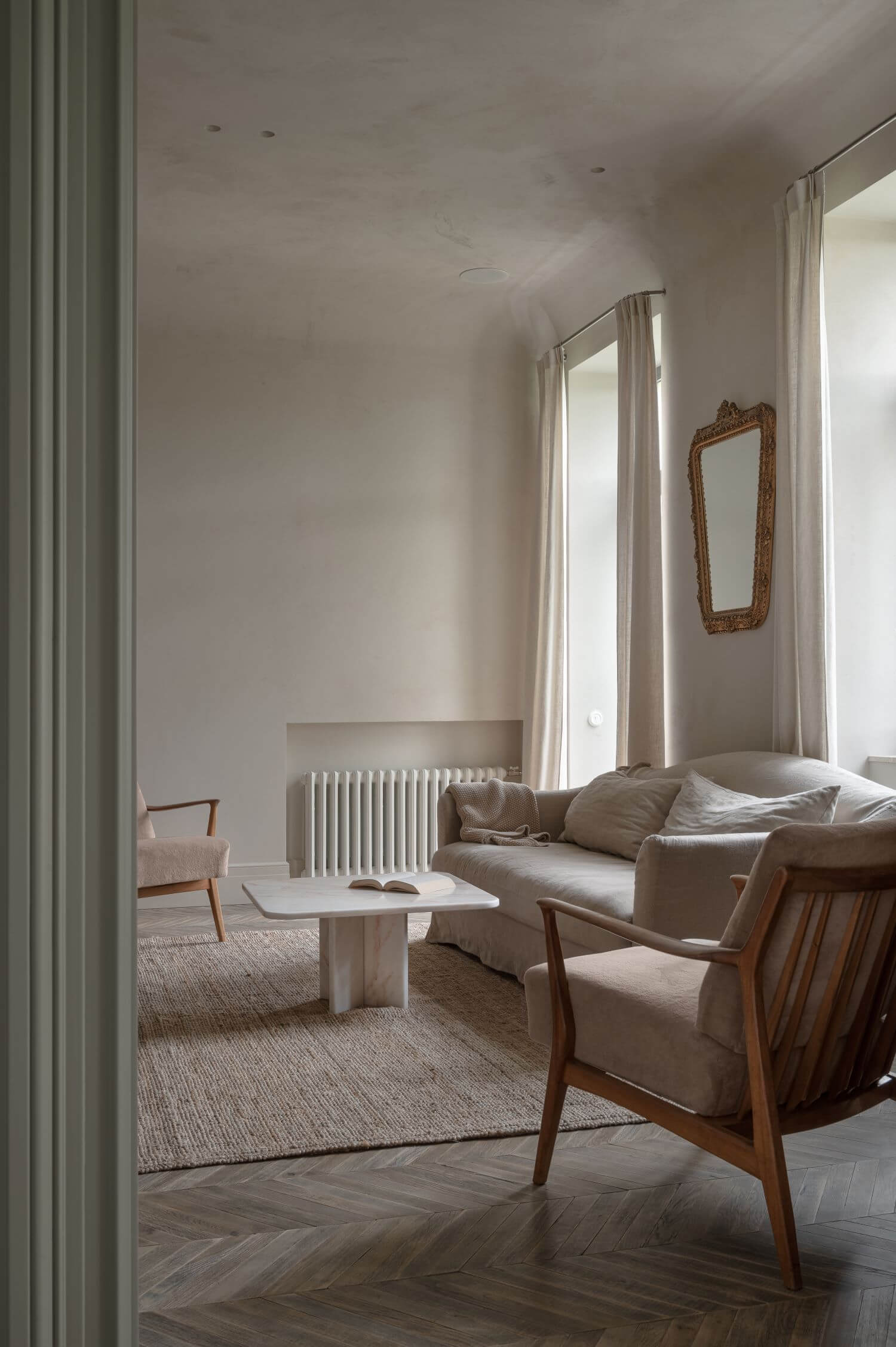
The walls were painted on top of plaster, with the deep texture being left as it is. The angle between walls and ceiling was smoothed out — this was a popular solution for the old flats in Kyiv.
The Floor
We had to disassemble the original parquet, but a wooden floor still was an essential part of this interior. We found an authentic alternative, namely an oak parquet, which is about 100 years old. We did the restoration part at our facility and assembled the herringbone pattern in the apartment. The toning part was done in the flat right away. Our goal was to achieve a particular shade, and to highlight the naturalness and antiqueness of the parquet, leaving its marks of time — the imperfections — unaltered.

Vintage Furniture
The marble table — vintage, Spain
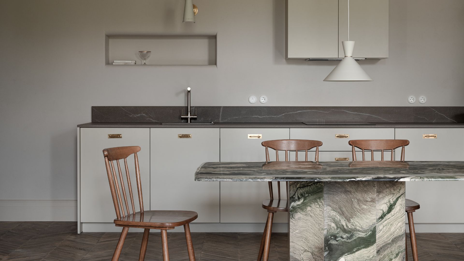
The chairs — Ilmari Tapiovaara for Asko, 1960s
The armchairs — Denmark, 1960 (the frame is teak wood, the pillows are covered with velvet)
Living room wall scones — midcentury, Germany
The mirror — vintage, France
The dresser next to the bed — midcentury, Denmark
The Doors
Produced from solid wood, according to original Austrian door drawing, by the craftsmen from Lviv.

The Bathroom
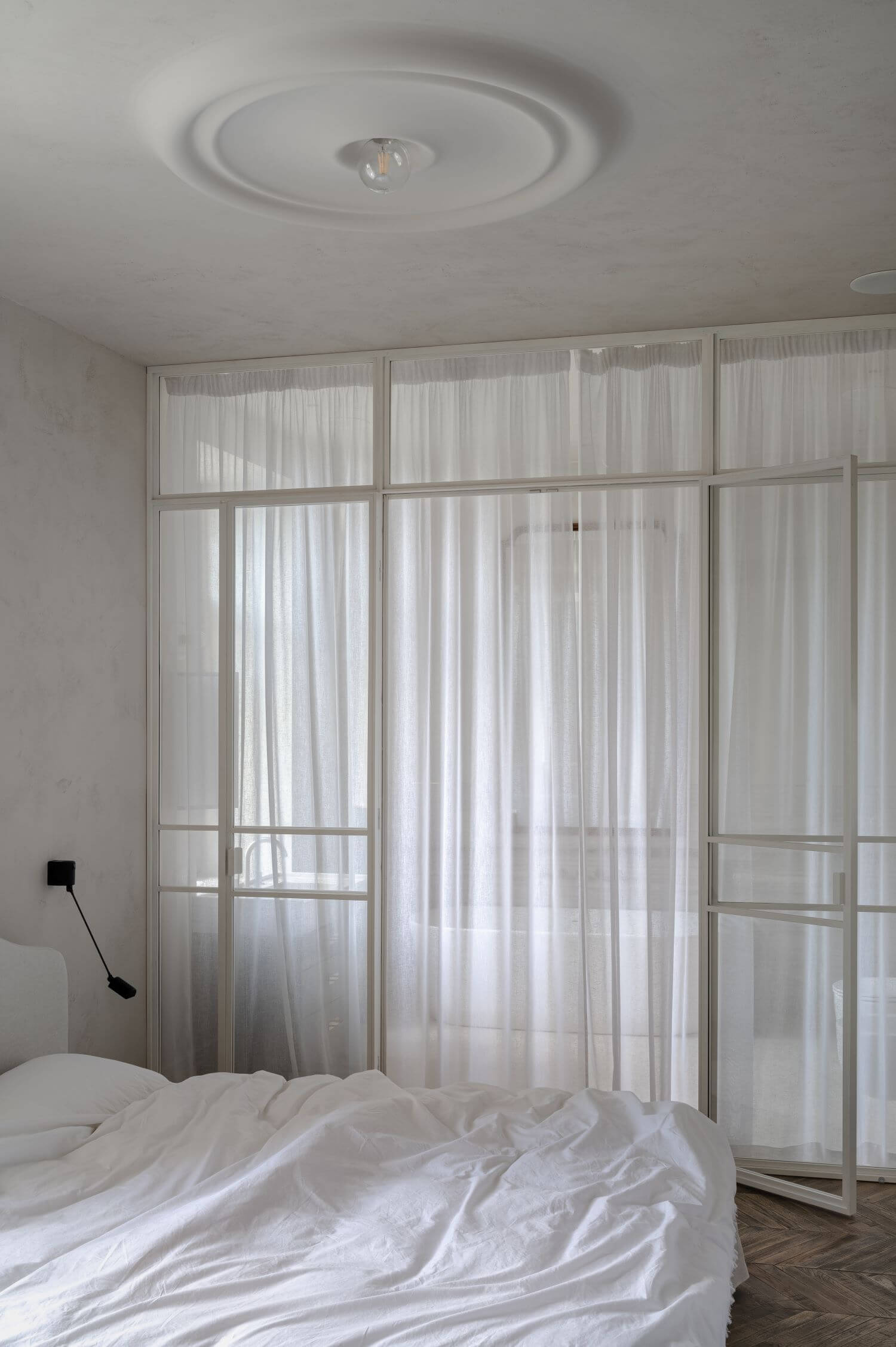
The Bathroom turned out to be a special place in this apartment. The marble for the shower walls was picked with precision, the sink was manufactured from the same marble, and the cabinet was made to measure. The mirror above the sink was also designed at our studio and produced according to our drawings. The window in the bathroom was one of the special requests from our client. The cabinet is placed right in front of the mirror, so the client could do her morning beauty routine with a view. Another big mirror, produced by craftsmen from Lviv, is placed above the bath. The bathroom is separated from the bedroom with a glass partition and a soft tulle, creating a continuous space. The walls and the floor in the bathroom are made from micro concrete.
Furniture and Lighting
The sofa — Maisons du Monde
The wall scone near the bed – Lumina
The wall scone above the kitchen sink — Antonio Adjustable
The pendant above the dinner table — Warm Nordic, Bloom (1950)

Details
The elongated window in a wardrobe is one of the details which recall the historical design schemes. There used to be the light windows — the ones behind the inner rooms — in the houses back in the days. For this interior, we reinterpreted and simplified the traditional design of the frame. The minimalist shape is perfectly doing its thing, which is to create extra light in the hallway. The Wall Niche Above the Kitchen Sink
We always take full advantage of the space in our design process. While doing so, we ended up with a wall niche with streamlined angles, inspired by the process of smoothing out a cornice and a ceiling. Such angles make the room softer, adding to its special atmosphere. Apart from being an aesthetical solution, this wall niche is useful for storing glasses or home decor, as it is based just above the kitchen sink.
The Cornices
The cornices for the curtains were made to measure. Their minimalistic design rhymes with the idea of the smoothed angles between the ceiling and the walls.
The Plaster
The plaster on the ceiling above the bed is one of the most romantic details, which brings the vintage interiors to mind. This is our hint on the classic plaster, reimagined in terms of modern minimalism. This decorative element was produced by hand from gypsum, according to our 3D model.


