Designer Albina Mukhametshina has a fondness for Parisian interiors and reflected their inherent eclecticism in the design of her own apartment, piecing together the interior bit by bit.
Albina created the interior of this apartment in Kazan for herself and her family. According to the designer, she and her spouse spent a long time searching for accommodation that would correspond to her vision of space organization, eventually settling on two adjacent apartments located in a premium residential complex. "According to the developer's plan, it was supposed to be one large apartment, but the previous owners divided it into two. “I immediately saw the potential in combining the adjacent areas and decided to dismantle all the walls except for the load-bearing ones: thus, a spacious apartment with a functional layout for our family of four was created," recalls Albina.
The entire interior is executed in intricate shades from Little Greene. In addition to these, the designer actively used the color black. "Clients often fear black, but I, on the contrary, love it for its contrast and expressiveness. As in most of my projects, there are no white ceilings here - this allowed me to create a more harmonious and color-unified space," notes the designer.
According to the new layout solution, the apartment was divided into common and private areas. The darkest and most distant area from the windows was allocated for the entrance hall, guest bathroom, and laundry room; the open space in the center of the apartment was occupied by the kitchen-living room, while the largest part of the apartment housed the block of private rooms, consisting of a hallway, master bedroom, two children's rooms, bathrooms, and a walk-in closet — delicately separated from the rest of the space by glass doors.
"I had many different ideas about the interior style, but the final vision came together during the process. From the very beginning, only two elements were predetermined — oak floors laid in a herringbone pattern and marble in the bathroom," explains the project author, Albina Mukhametshina. "Interestingly, the use of vintage items was not initially part of my plans. However, during the finishing works, I remembered that we had a couple of excellent grandmother's armchairs stored in our country attic, so I decided to try them out in the interior. Shortly after, I came across a coffee table from the Soviet era at one of my sites, which the owners were planning to discard. I took it for restoration and later placed it in our living room. In this way, vintage items with a history almost magically began to appear in our interior. Interestingly, after this project, I started suggesting the inclusion of vintage and antique items in my clients' projects and completely fell in love with the blending of different eras and styles in one interior!"
On the floor of the living room, like in all residential spaces, lies Tantum Quercus French oak parquet. Natural wood always creates a special atmosphere, evoking warmth, coziness, timelessness, and the beautiful aging of this material.

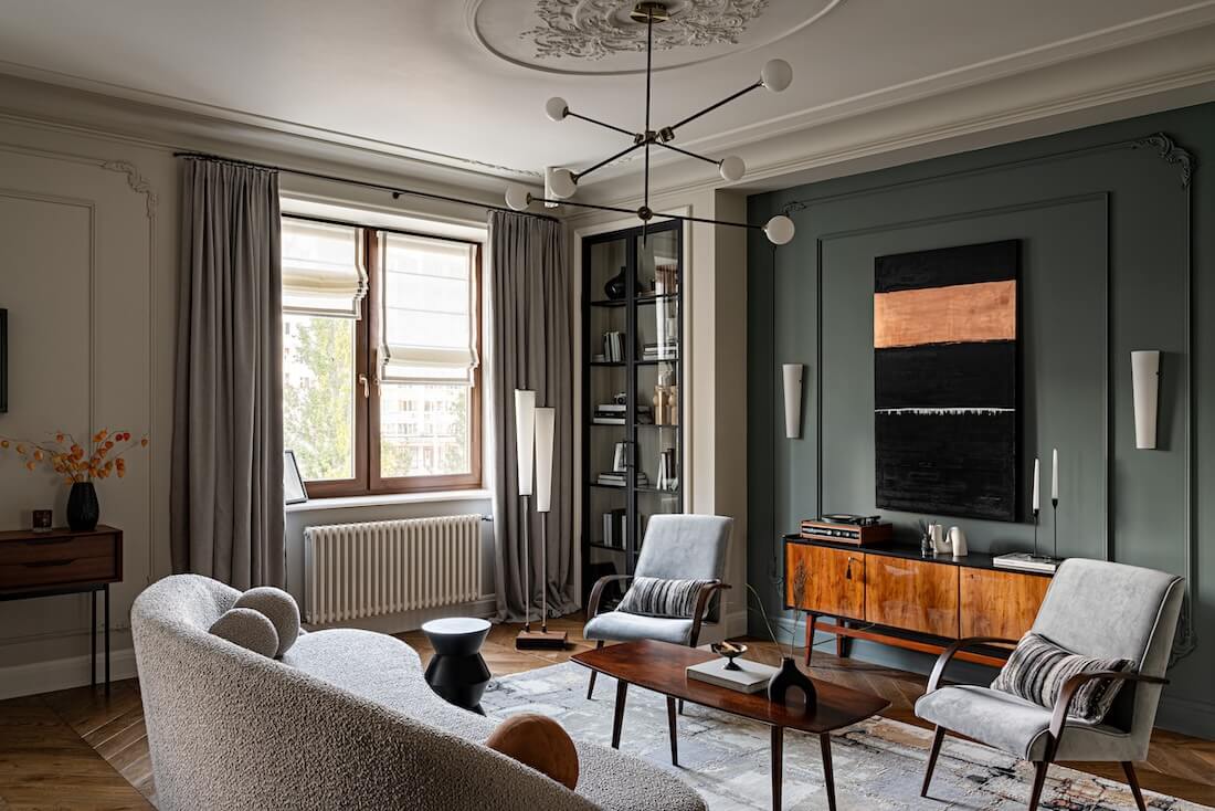
The highlight of the living room is a 1970s tapestry titled "Cranes." The designer stumbled upon it at a flea market and immediately fell in love. In some cultures, cranes symbolize longevity and prosperity. To slightly enlarge the area of the tapestry and emphasize its significance, Albina decided to encase it in art glass on both sides, thus separating it from the frame. As a result, the cranes appear to hover in the air. Additionally, one of the walls of the living room is adorned with a panel made of aged handmade mirrors by the company "Decor Factory." Each element is unique, framed with a copper ribbon around the perimeter and patinated using the Tiffany-stained glass technique. The aged mirrored wall added depth and a sense of drama to the living room.
On either side of the living room center, tall glass and metal doors are positioned. One divides the public area of the apartment from the private, while the other is purely for symmetry and serves as facades for the shelving unit.
A light, airy sofa with high legs (SHIKANA furniture factory) is complemented by two vintage armchairs upholstered in gray-blue velvet. Their curved armrests echo the shape of the sofa, while the legs harmonize with the coffee table. A low vintage chest of drawers completes the furniture composition in the living room and emphasizes the shade of the wall behind it.
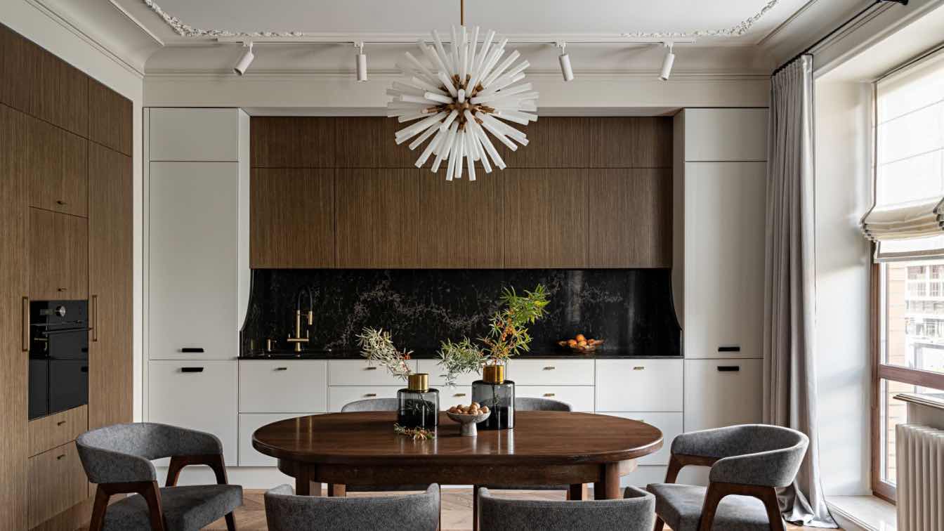
The coffee table and console are modern (La Redoute), yet they harmonize with the rest of the furniture. Open curtain rods with rounded edges and soft curtain panels lying on the floor add touches of Parisian mood to the kitchen-living room interior. Bringing the entire living room composition together is an Indian carpet from Persepol Carpet Studio, handmade from wool and silk. The apartment owners opted for a small kitchen island and a modest dining table.

The dining group for six persons was custom-made by a local carpentry workshop. The kitchen-dining-living areas, each with different functions, are unified by the Little Greene color palette — the walls and ceiling are painted with this manufacturer's paints. The cool colors of the walls contrast with the honey tone of the oak plank parquet floor, creating a backdrop for the furniture and artworks.
The apartment comprises three bedrooms intended for the parents and their children — a boy and a girl. All the private rooms have approximately equal areas but are decorated according to the tastes of their owners. According to the apartment owner, they struggled to decide whether to create one large bathroom for the entire family or divide the common space into two smaller ones. Ultimately, her long-standing desire for a small but personal bathroom prevailed.
The room with a balcony was chosen for the master bedroom. The bed is fitted into a small recess, which appeared due to a protruding load-bearing column on one side of the wall. This feature was symmetrically replicated, thereby aligning the room's geometry. It turned out to be quite a convenient arrangement: the bed slightly recessed into the wall makes the use of bedside tables more comfortable. The bedroom also features a work area for the homeowner — a vintage desk and chair (La Redoute) are cleverly positioned in a niche slightly less than one and a half meters wide. To create an enveloping atmosphere, the walls and ceiling in the bedroom are painted in a single shade from the Little Greene palette.

The apartment owner always wanted to have a personal bathroom: she realized her dream in the new apartment by placing a separate shower room next to the bedroom. Marble for finishing — Bianco Carrara and Black Wood. The shower walls are made of handmade ceramic with an aged effect. The atmosphere is complemented by a painting depicting boats and wall sconces with glass shades. The walls and ceiling are painted with paint from the Little Greene collection.
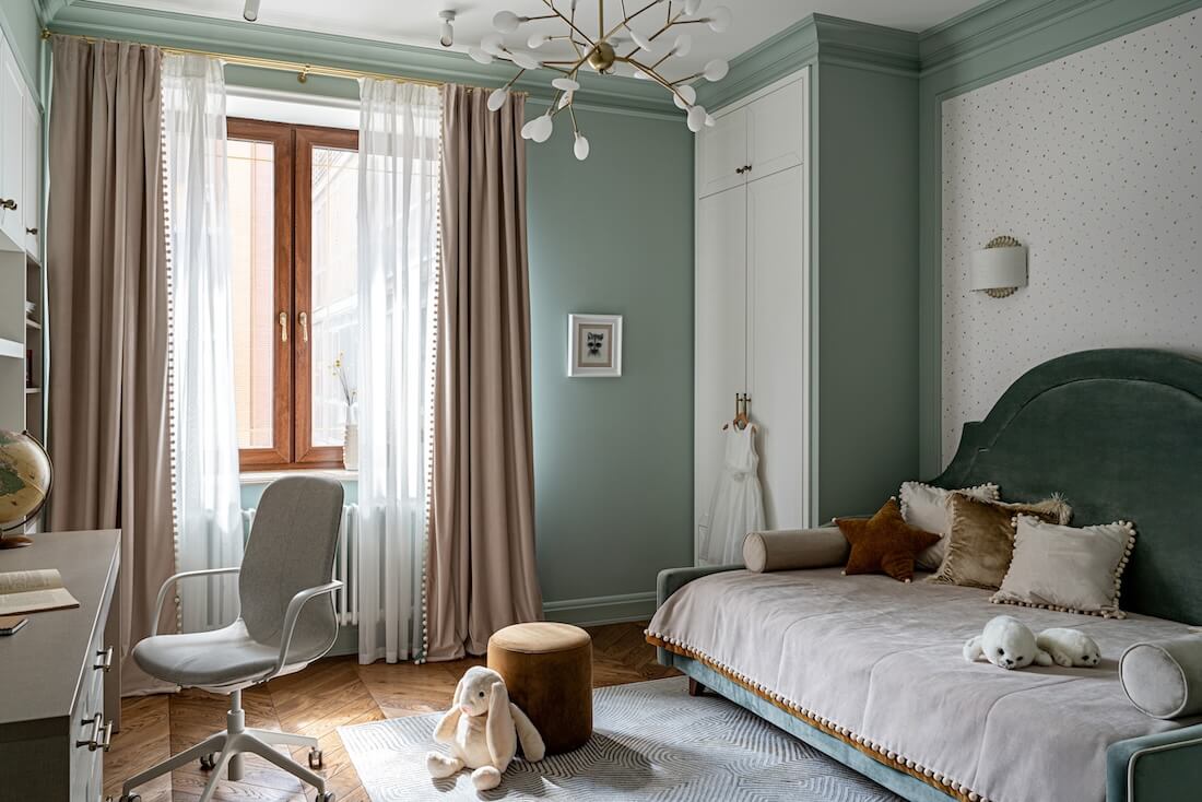
The apartment owner's son had two main requests — a bed on the second tier and a specific color scheme: he asked for a room in yellow, gray, and black tones. The girl's room is designed in soft pastel colors: mint green, milky white, and muted pink tones make the room very delicate yet not boring. In both children's rooms, in addition to resting areas, there are also workspaces and spacious storage systems for clothes, books, toys, and school supplies.
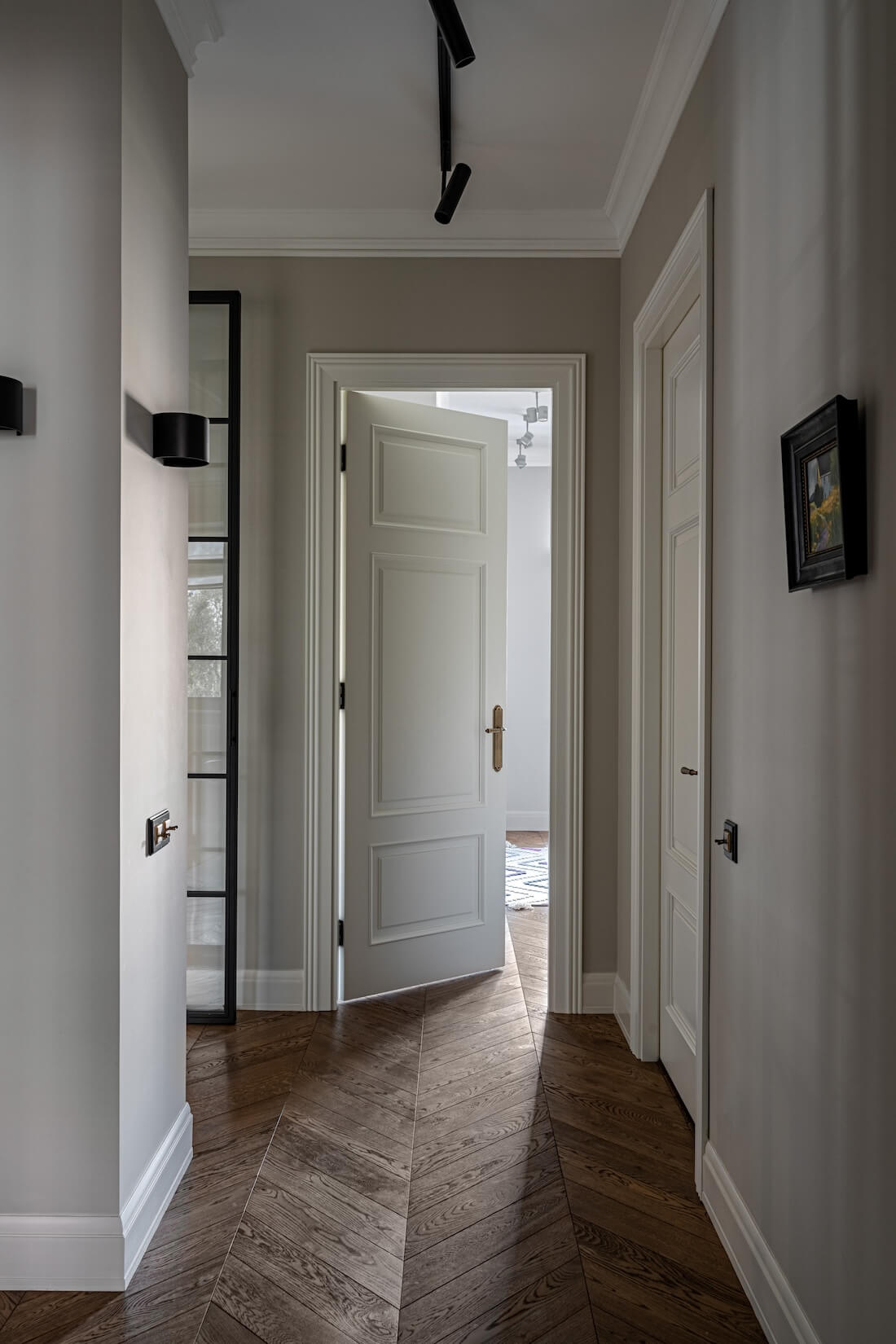
Albina Mukhametshina: "I gravitate towards Parisian interiors and undoubtedly wanted to bring something of them into this project. Tall doors with moldings, intricate plasterwork, and herringbone parquet coexist with modern lighting fixtures and simple forms. I'm not very fond of minimalism because, for me, an interior without baseboards and cornices is like a woman without accessories. But I do love color and know how to work with it. I sincerely believe that design has the power to influence the perception of the world for those for whom it is created."






.jpg)
.jpg)