Alexander Tischler: The clients are a young family. At the time of designing, a couple had one child, but they were planning a second one and asked us to design two separate bedrooms for kids. The clients also wanted a master bedroom and a dressing room, three bathrooms (master one, for children and for guests), a laundry room with some storage for all the household appliances and utensils and a spacious open-plan living room suitable for hosting friends.
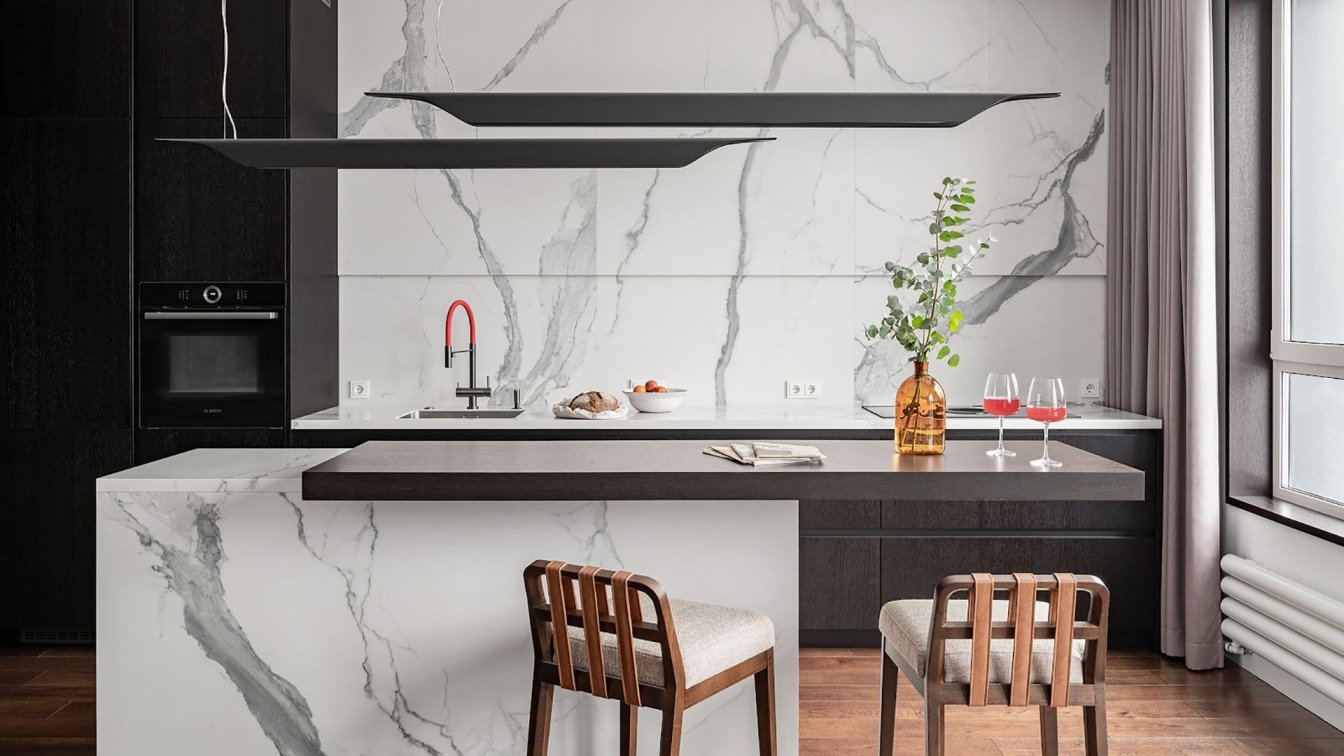
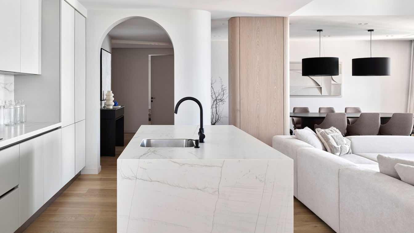
Our team developed this project from scratch, supervised all deliveries and finishing works, and designed and produced the cabinet furniture.We combined the kitchen and the living room to get a spacious multipurpose great room. The cooking area has been fitted with a marble island looking like a monumental monolith with a zephyrous tabletop. The island, the backsplash, and the kitchen worktop were made of the Rex large-format porcelain stoneware. We decided not to use the upper modules: things can be stored in the lower drawers, inside the island or in the column cupboards.
Additional lighting was installed in a small niche above the work surface, and Foscarini solid wood lamps matching the furniture were hung above the island. We used a hob with a built-in extractor hood, so that the kitchen wall looks like a flat panel. The large wall of the living room was decorated with bichromatic Italon ceramic tiles composing a panel with accent lighting around the perimeter. Under the TV, there is a hanging cabinet with drawers and a shelf for a speaker. Four other speakers are directed to the sofa: two stand by the TV; two are attached to the ceiling.
The bookcase is the accent of the whole interior. Its dark elements of different widths and textures are combined with a backdrop of the same porcelain stoneware as in the kitchen. This piece of furniture definitely brings a lot of dynamics into the room. In the bedroom, the same wall panels were used as in the open-plan living room, but a few elements of a bronze matte mirror were added. The bedside tables were also made with the same design. We removed the windowsill separating the bedroom and the balcony and installed there a sash window. It can be opened completely; there will be no rack in the middle of it.

The master bedroom includes a bathroom and walk-in wardrobe that was transformed from a narrow corridor. The dressing room has several rails for the shirts and trousers’ open storage, a wardrobe with glass fronts for long clothes and a shelving unit with drawers for accessories. Moreover, the dressing room has an additional function: it is a buffer zone between the public area and the private one. We also designed and made several convenient items for the master bathroom: a small bench in the shower room, a mirror with built-in lighting that turns on detecting the hand movement, and a cabinet with a laundry basket hiding behind its facade. Once the basket is full, it is easy to bring everything up right into the laundry.
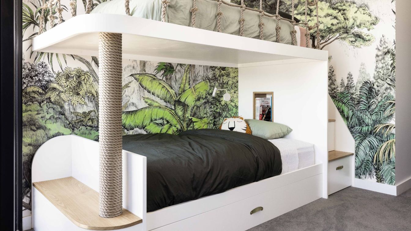
When we were designing the kids’ room, the clients did not yet know what kind of furniture they wanted to put in it and how it could be placed. We kept the colors neutral and added several magnetic track lights that can be easily rearranged and aimed at the necessary place. For the children's dressing room, we designed and produced a whole storage system with drawers, shelves, and rails. In the children's bathroom, we made a niche for shower accessories, put a mirror (also with built-in lighting) and hid the laundry basket behind the folding facade of a cabinet as well.
At the request of the clients, we did not remake the guest bathroom into a dressing room. There is some place for storing on both sides of the hallway: on the left, there is a large wardrobe with access hatches to the electrical and low-voltage shields on the back wall. On the right, there are cabinets with glass facades for bags and shoes. In the laundry room, we organized a full-fledged amenities place: there are washing and drying machines, a water heater and water filters above them. Customers made a list of large things that they would like to store there, so we designed and produced appropriately sized furniture. There is enough space for a stroller, vacuum cleaners and suitcases, and there is also room for ironing clothes.


