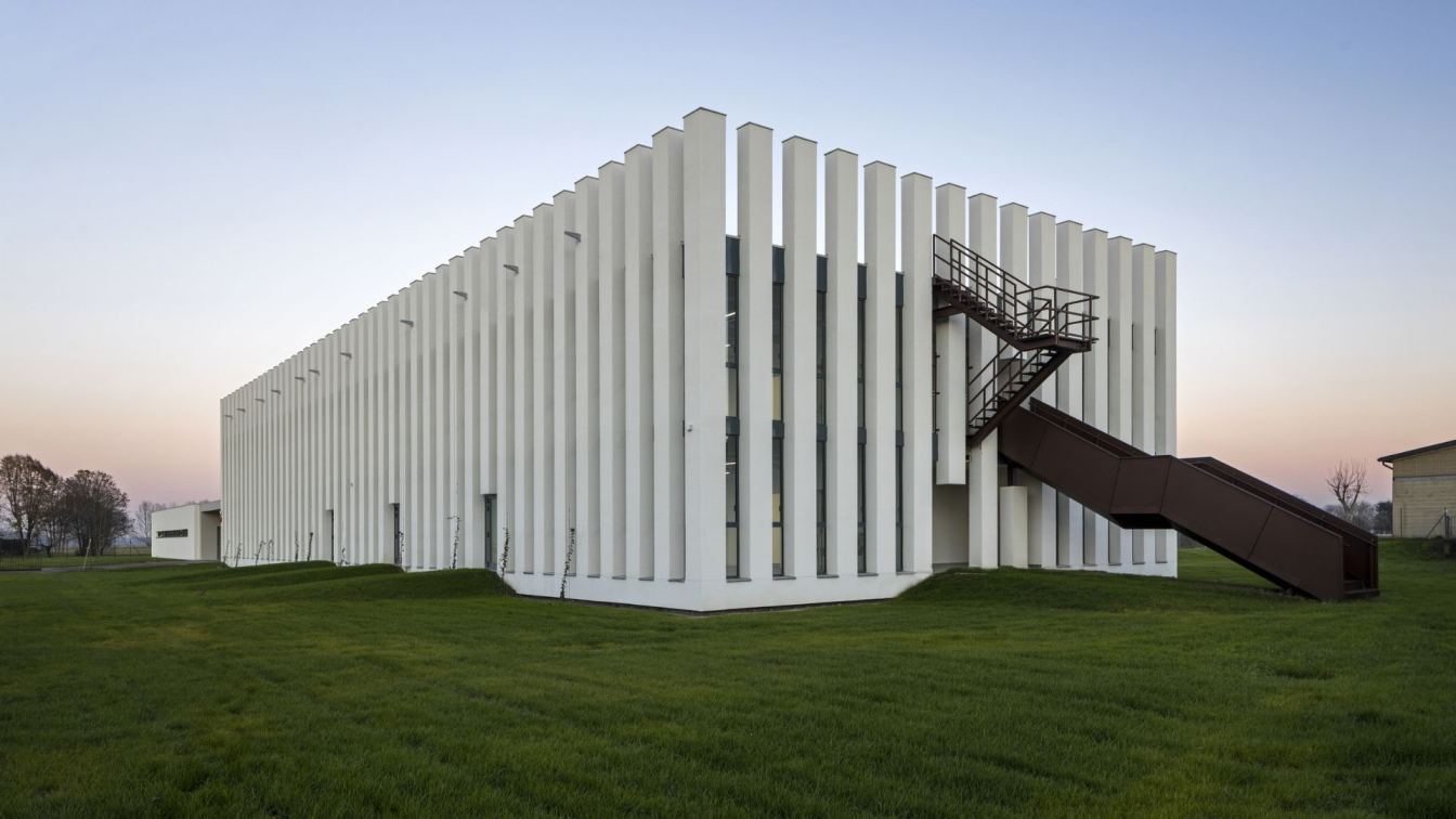
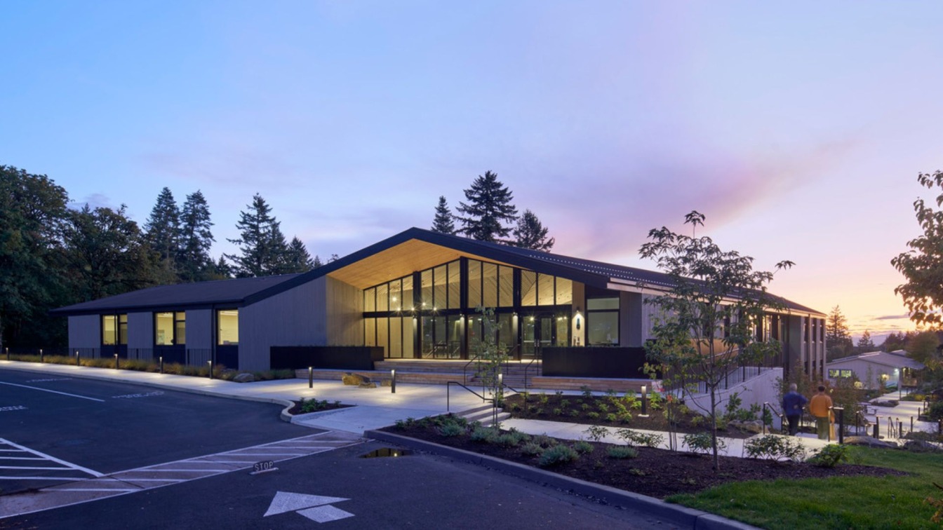
AAA Office: The construction of the new primary school complex in Sissa (Province of Parma) was completed in October 2023. The architects Lucio Serpagli and Alessandro Gattara - already first prize in 2017 at the National Ideas Competition of the Ministry of Education for the creation of Innovative Schools - drafted the project in its executive phase of development, modifying the project as requested by the tender notice previously approved final.
Located on a plot of approximately 16,000 m² adjacent to the nursery school, the complex includes 10 classrooms and 6 laboratories (4 of which can be subdivided, for a total of 10) and can accommodate up to 250 students. A canteen with 90 seats and a B1 type gymnasium (700 m² in addition to services) were also created, which can also be used by the extra-scholastic community. The above-ground structure is made entirely of wood with X-Lam technology (Cisanova Srl) and reaches the best energy efficiency standards (Near Zero Energy Building Nzeb).
Without changing the minimum contents of the final project, the architects modified the design of the facade and part of the roof to obtain a series of improvements in terms of thermal, hygrometric, acoustic (with improvement of the passive acoustic climate of the building), visual (natural light and artificial lighting, diffusion, reflection, refraction, absorption, texture and grain, transparencies, spatiality and orientation, dynamism, contrast, controls and adjustments), color and surface treatments and tactile qualities of materials.
The double input volume has been lowered (from double volume to single volume), in order to improve the acoustic comfort of the environment and reduce the energy requirement for heating. The façades of the building which houses the classrooms and laboratories have been modified with the aim of significantly improving the visual well-being of the pupils and teachers in this part of the complex, considered the most important for school needs and at the same time the most lacking in requirements in the tender-based project. The glass surfaces were therefore enlarged, adopting a vertical ribbon window and door solution. Steel structures have been installed above the west and east facades for the growth of climbing greenery.

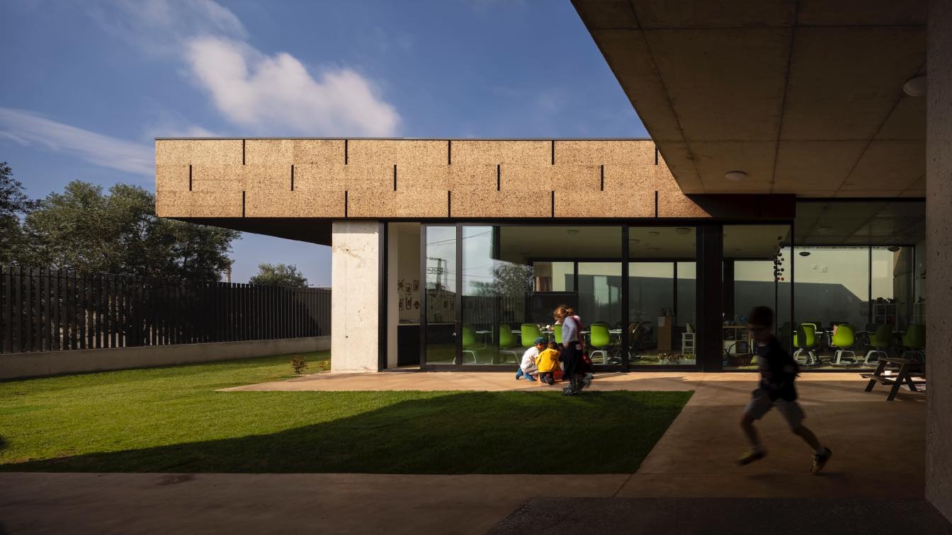
Furthermore, the classrooms located on the ground floor have an exit directly onto the garden, to facilitate and encourage the use of outdoor spaces for educational activities. In the tender-based project, the design of the greenery within the school area was limited to the provision of creating a lawn arrangement.
A paved courtyard area of approximately 200 m² was created adjacent to the canteen. This courtyard area is functional both for the use of the canteen (ideal for recreation after the meal) and for the use of the garden. The garden has been divided into areas delimited by paved connecting and crossing paths along which new furniture, vegetation or trees can then be placed.Th e project integrates carefully into the typical surrounding agricultural landscape: fields, rows of trees, vines, drainage ditches and driveways.
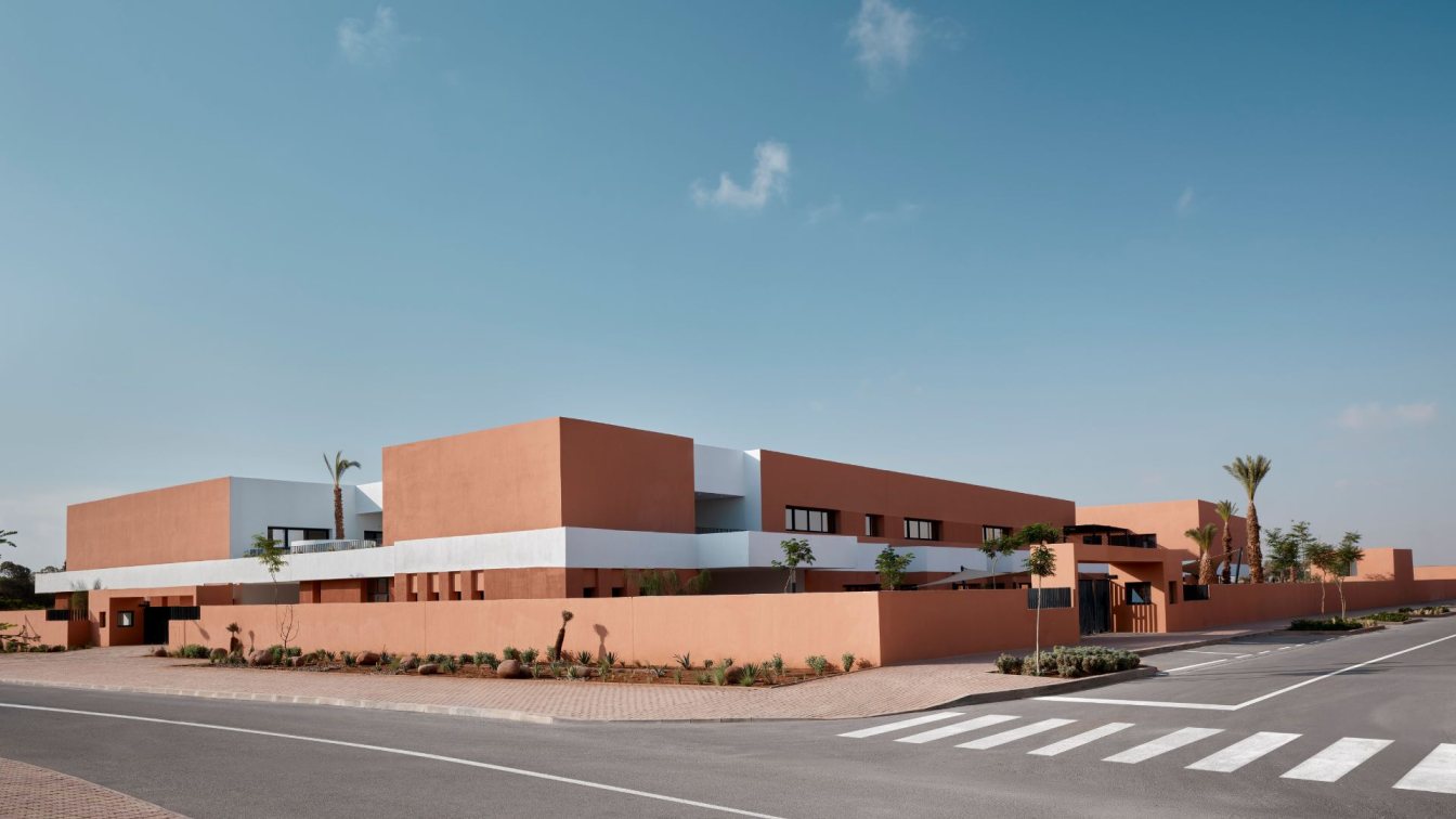
The simple geometry of the volumes, the essential design of the facades and the use of finishing materials, as well as the choice of colors of the facades, do not reflect the traditional elements of school buildings, but rather the most characteristic features of the landscape in which the The building is inserted.
The interior spaces are mainly finished in shades close to white, occasionally with pink, light blue or pastel green. No environment has bright or flashy colours. However, various environments can be customized with works created annually by students for educational purposes.


