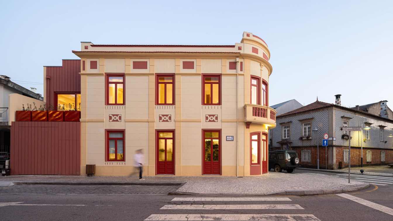
REM’A: The property under consideration, a historically significant building in Póvoa de Varzim, not only carried the weight of its classification restrictions but also held a special place in the hearts of local residents, serving as a collective memory of the city. Our research unveiled a fascinating backstory - the previous owner was a well-traveled individual who poured their worldly experiences into the conceptualization of this edifice, resulting in a uniquely eclectic and neo-Renaissance architectural masterpiece. We like to describe this as a form of "reactive" architecture.
This architectural endeavor aimed to create a subtle interplay between preservation and innovation, not as a critique of the pre-existing structure but as a celebration of the two distinct eras of the building's construction.
The intervention can be defined by its meticulous preservation of the property's façade, paying utmost respect to its formal and aesthetic integrity. Every ornamental and chromatic detail was carefully safeguarded. In addition, a discrete expansion was introduced to accommodate the new program for the building, comprising commercial space on the ground floor and local lodging on the first floor and in the attic. The expansion was conceived to embrace the less prominent color of the original building (red) while introducing a contrasting vertical rhythm to the existing horizontal lines, creating a clear visual distinction between the two construction periods. Given the dual purposes of the space, separate entrances were paramount. The main entrance to the commercial area is gracefully positioned at the corner axis, while access to the lodging is thoughtfully arranged along the quieter side street. Furthermore, for the convenience of the commercial space, vehicular access is discreetly incorporated into the expansion's façade for hassle-free loading and unloading.
The functional organization of the intermediate level, with its irregular geometry, is facilitated by a longitudinal axis for distribution and a transverse axis for vertical movement. This transverse axis elegantly bridges the gap between the bedroom area and the communal space of the lodging while providing access to the attic suite. In contrast to the building's striking exterior, which boasts an intense chromatic palette, the interior design adopts a more nuanced approach. Spaces of transition, whether programmatic or on different levels, are highlighted with tasteful chromatic accents in a calming sea of white, allowing for a hierarchy of design element.