Between The Walls: Single malt is one of our most interesting projects we have ever developed. 160 square meters, 3.7 meters ceilings, rounded wall in the living room, is all very non-trivial initial data for the beginning of the project. When designing the interior, we needed to apply all the accumulated knowledge and experience, as well as spend dozens of hours of consultations with engineers and contractors to create an unprecedented space where each element catches the eye, does not overload the environment but is its integral part.
First of all, as in all our works, we filled the apartment with functionality to make it as comfortable as possible. The entourage of the whole apartment breathes with natural textures, that's why stone and wood are so common. One of the primary tasks was the need to separate the private and guest areas, so the left side of the apartment was given to the bedrooms, and the central part was made for spending time with guests.
To fully immerse yourself in the interior designed by us, you should start your journey from the hallway and walk through each room. So, here is the input group.
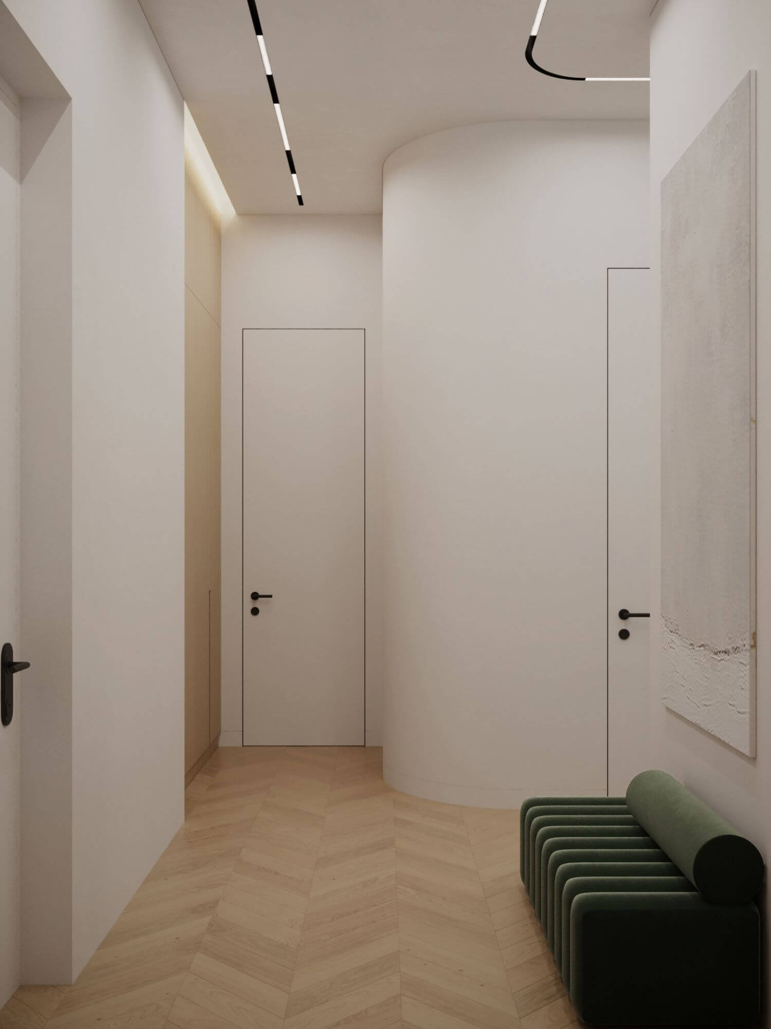
The minimalist spacious entrance group is made in a combination of light wood, white colour (which expands the space and highlights all the elements of other colours) and accent green pouf. The height of all doors in the general area of the apartment is 2800 mm, as well as the front door. The central accent wall is designed so that there is a feeling that the apartment does not end but has a continuation, due to light wood similar to the area of cabinets and mirrors. All of them expand the space and give the opportunity to examine yourself in full. The white hanging shelf can be a place for keys, various trifles, or for an additional decor as, for example, a flowerpot with dried flowers.
Linear light with a radial wall immediately make it clear where to go next, and a wardrobe that is made of light veneer with additional lighting, perfectly complements and extends the wall with a mirror.

The picture with a pouf is the central accent element of the whole entrance composition and it immediately catches the eye from the door to the laundry.
The next room is the guest bathroom. Despite its minor role, it can compete with the main bathroom. The combination of copper plumbing and green tiles create a special entourage in this room.
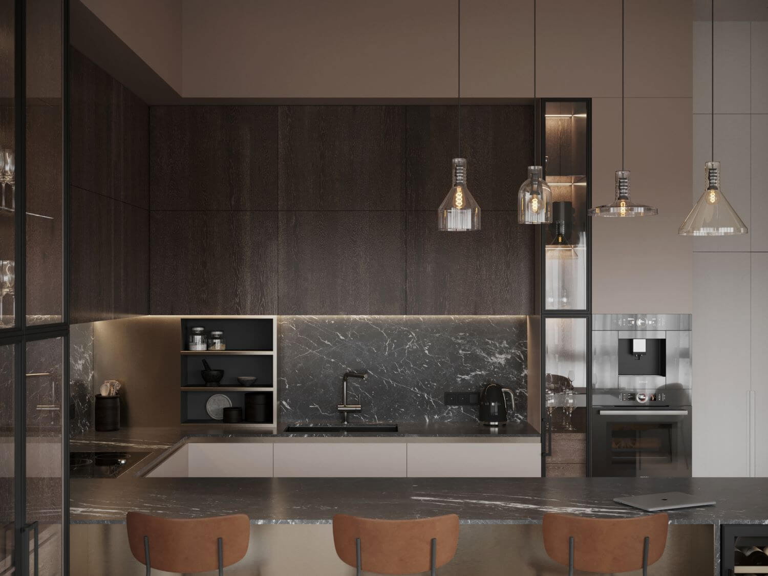
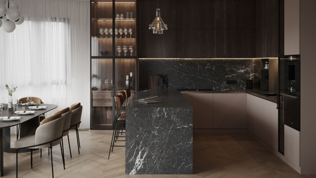
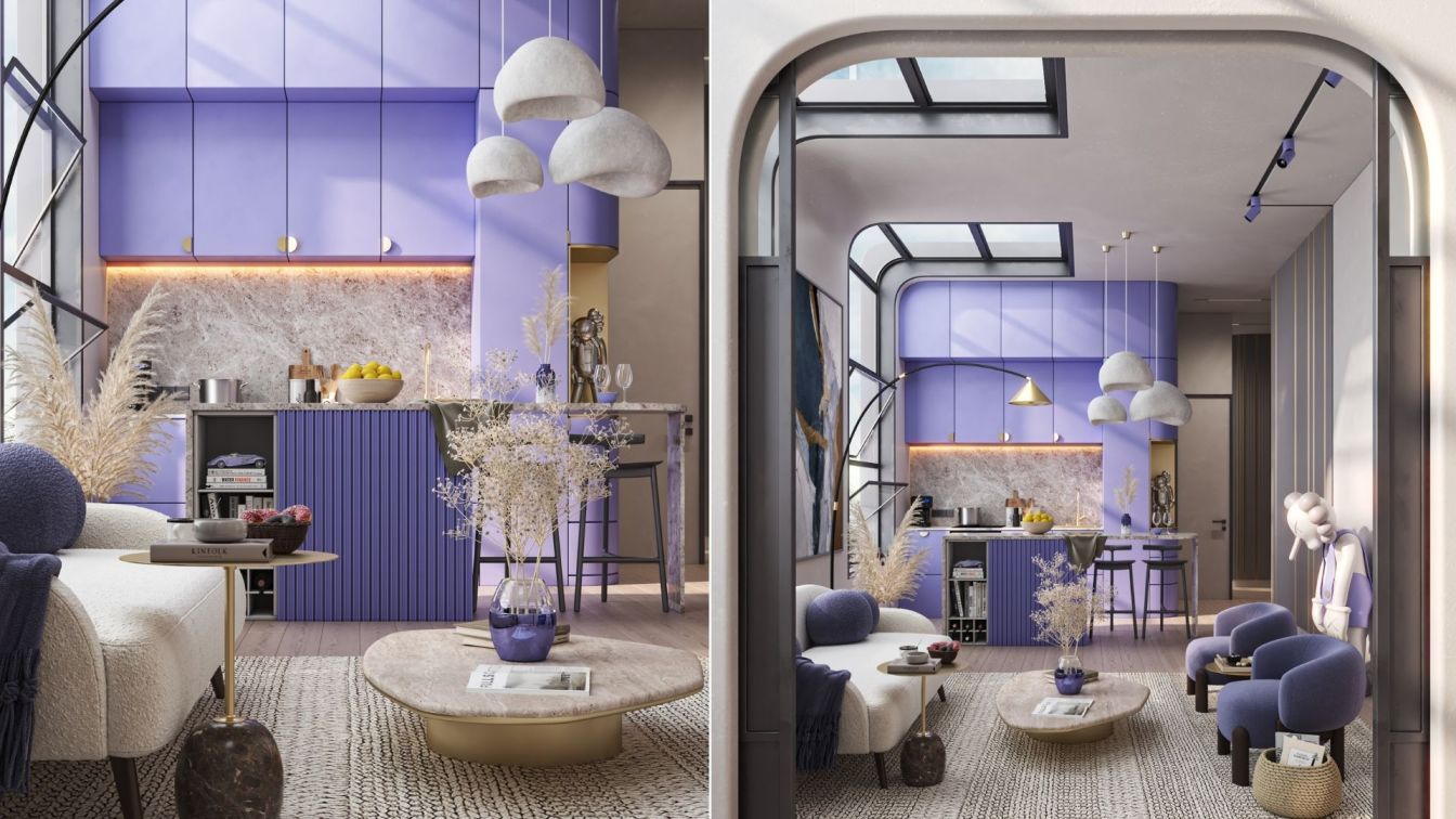
The most visited place of this apartment will be a spacious kitchen combined with living room. We divided it into cooking zones, a dining group and a seating area. The outer radial wall of the building played the key role in the design, it dictated some rules of the game and we emphasized it with a rounded domed ceiling. The island stands out in the kitchen, the lower part of it is made of metal, and the upper part is covered with stone, which is repeated on the apron, working surface and even on coffee tables near the sofa. The light above the island can be turned on by a touch switch hidden under the countertop.
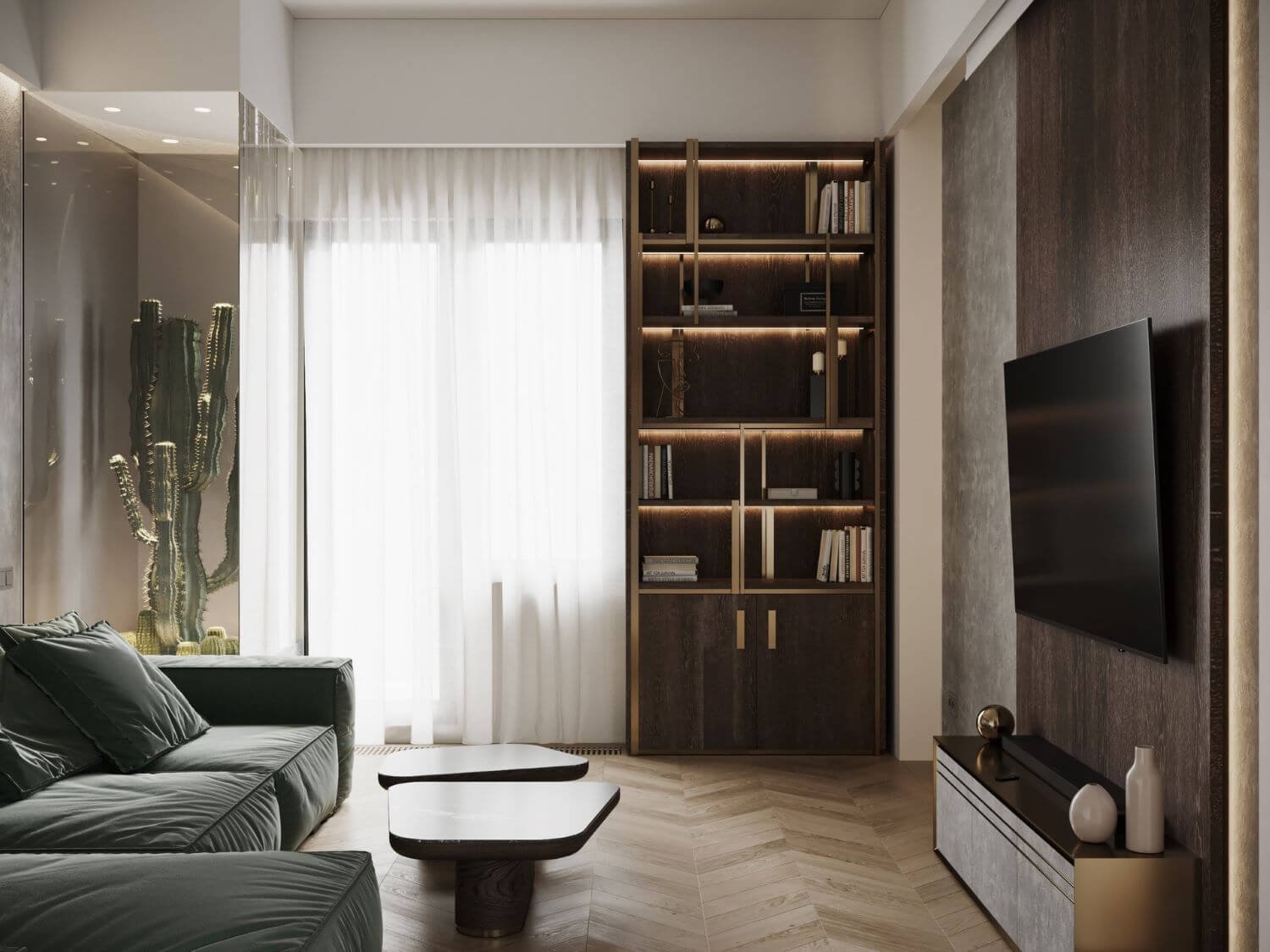
When entering the guest room, we immediately notice a rack with metal elements and a bonsai. Thanks to the lighting, the tree serves not only as a decorative element, but also as a floor lamp in the evening. The quintessence of the functionality of the living room is a sliding panel with a TV, which can close the window so that light does not interfere when watching it. And in order to arrange evening film screenings at home, we have provided a projector.
If we look into the private part of the apartment, we will get into the guest bedroom. This is a concise room which plays an accompanying part in the ensemble of rooms, but it does not inferior to any of them functionally. In addition to the main function, here you can work or just relax.
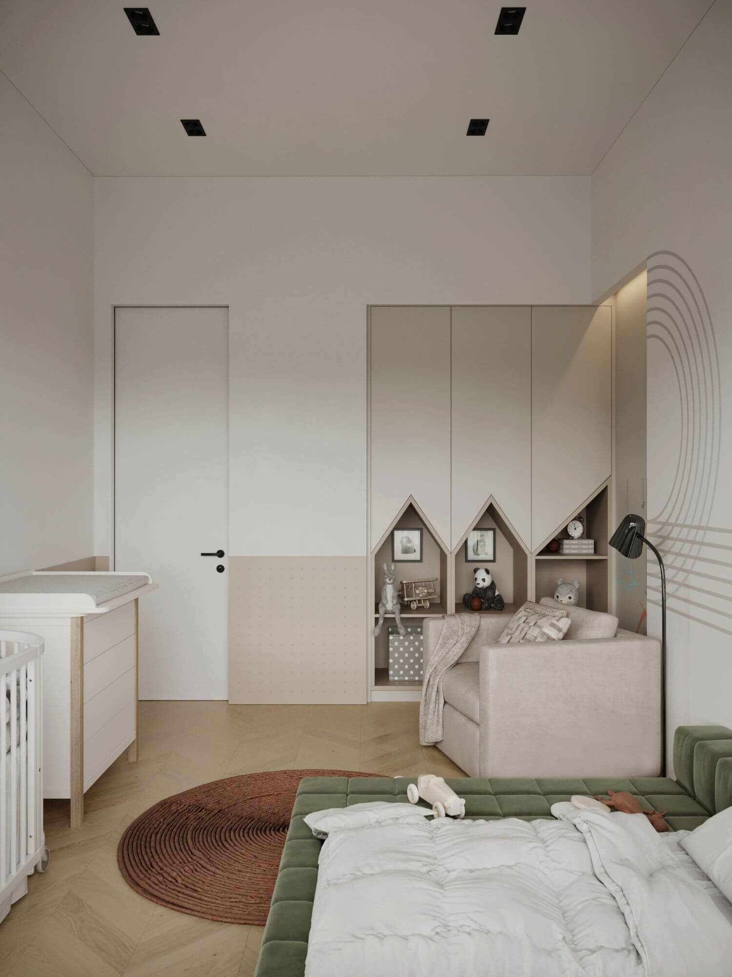
Since the owners of the apartment are just planning to have a child and do not know its gender yet, children's bedroom and children's bathroom were designed in such a way that they would suit anyone - especially children from 0 to 5 years.
The culmination of the project and the most important place in the apartment is a full-fledged master bedroom.Transit is made with all the possible minimalism. The tinted asymmetrical glazing of the wardrobe seems to invite to the bedroom and linear light is wrapping the ceiling in the same direction.
The conceptuality of the sleeping area is that instead of an accent picture and a calm wall, we decided to make an inversion and highlight the wall, putting lights to its soaring part and adding stone decoration.
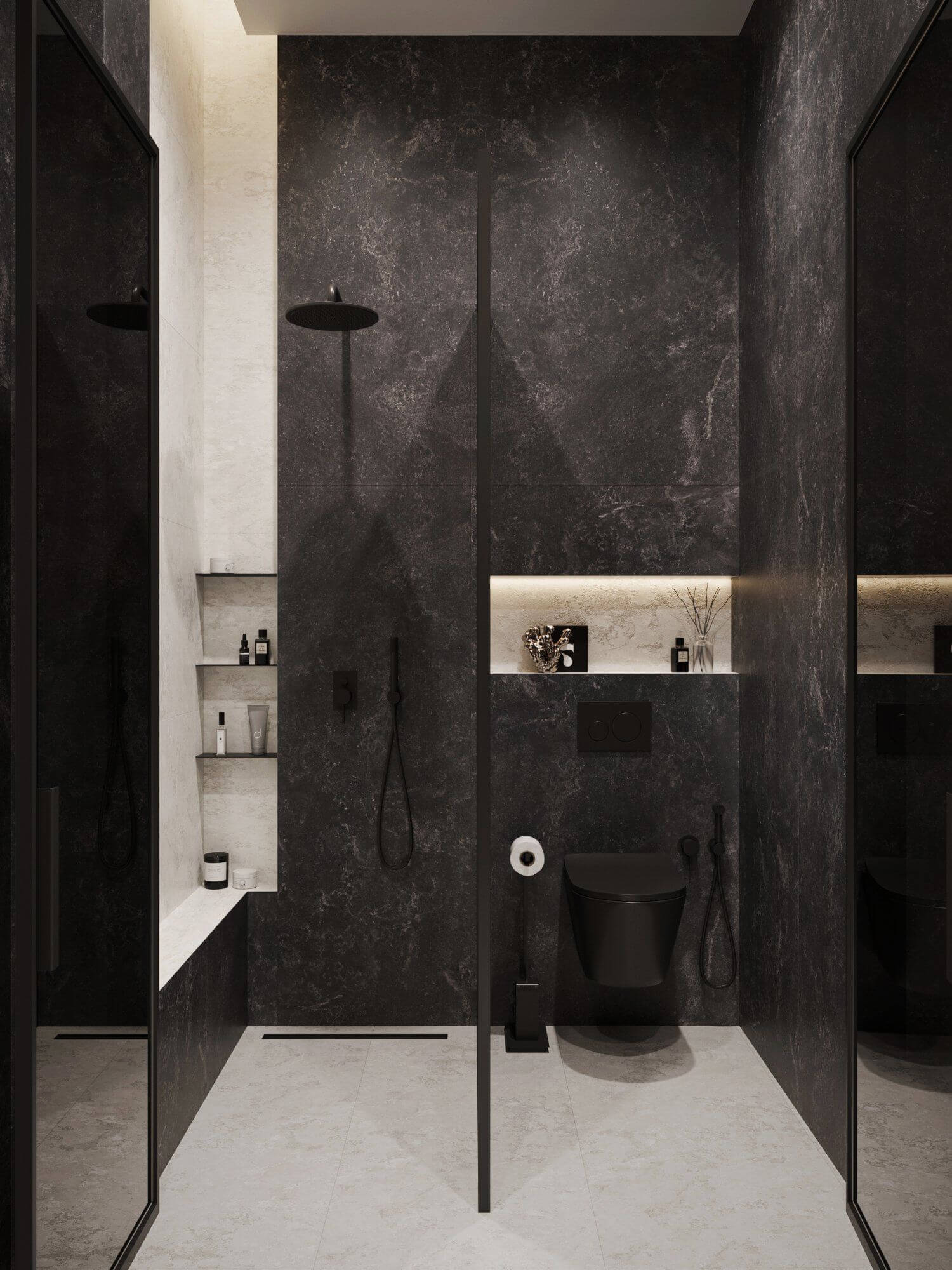
Continuation of the bedroom is a spacious bathroom which has the elements of a light filled bedroom, although the room itself has a dark dominant.
We are sincerely grateful to our customers for the opportunity to create such interior and for their attention to our recommendations. This is another proof that best projects are created with full confidence in designers.


