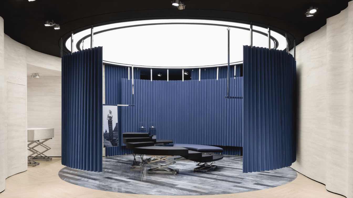
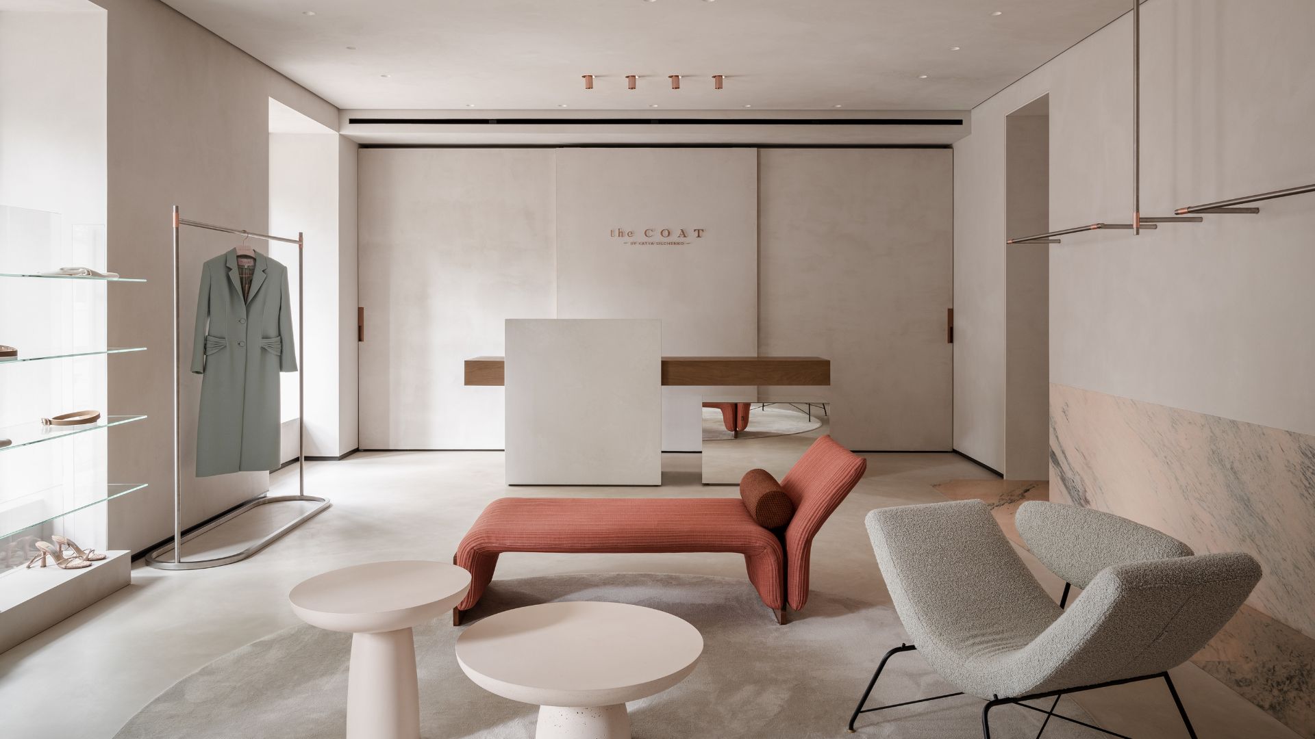
Vang Studios: Iman stands for magnet, a material or object that creates a magnetic field. Dedicated to fashion design, it proposes pieces that stand out for their full, intense, and vibrant colors, prints, textures, and shapes. The project addresses the creation of the new image for the brand, under the premise of a conceptual and contemporary spatiality.
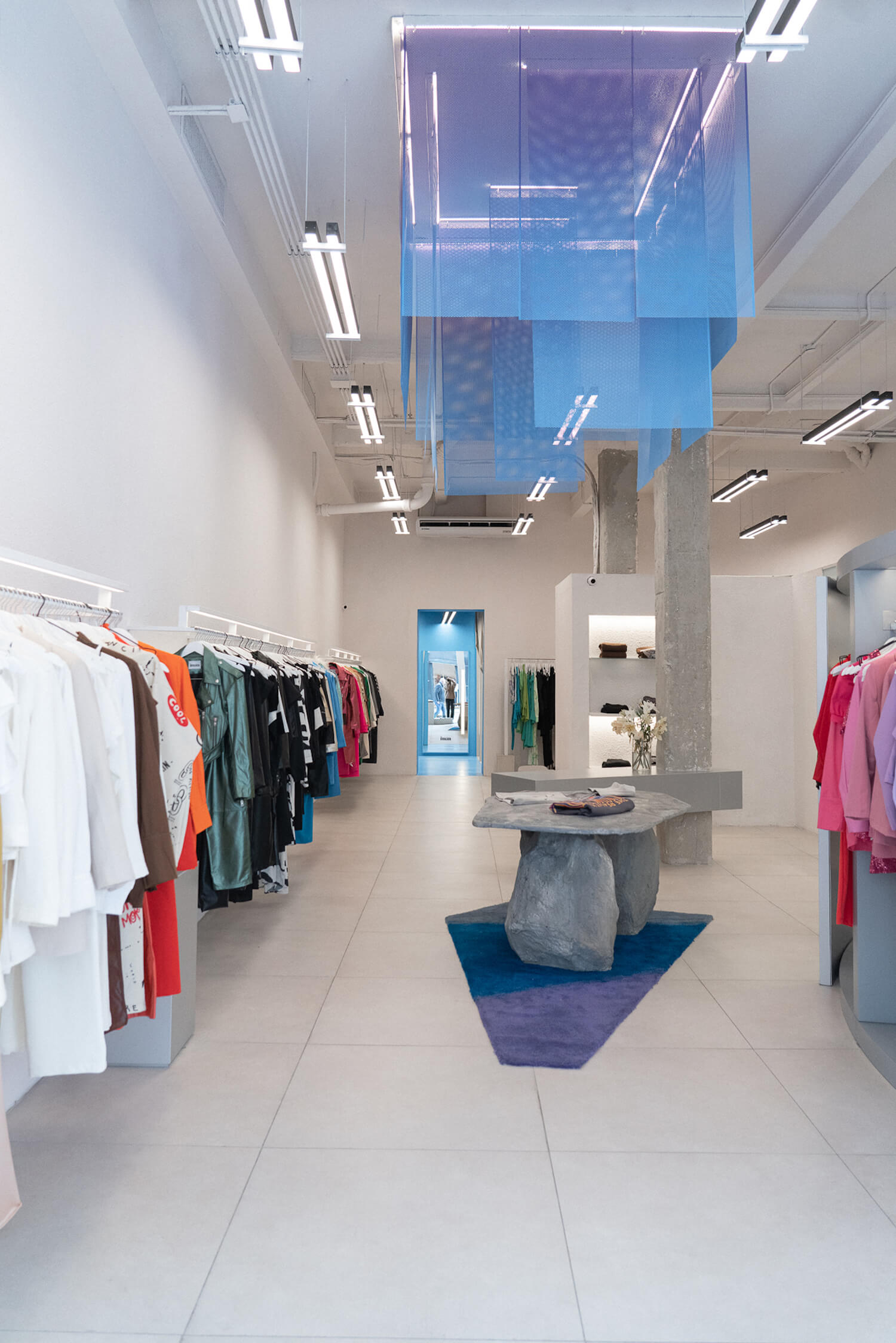
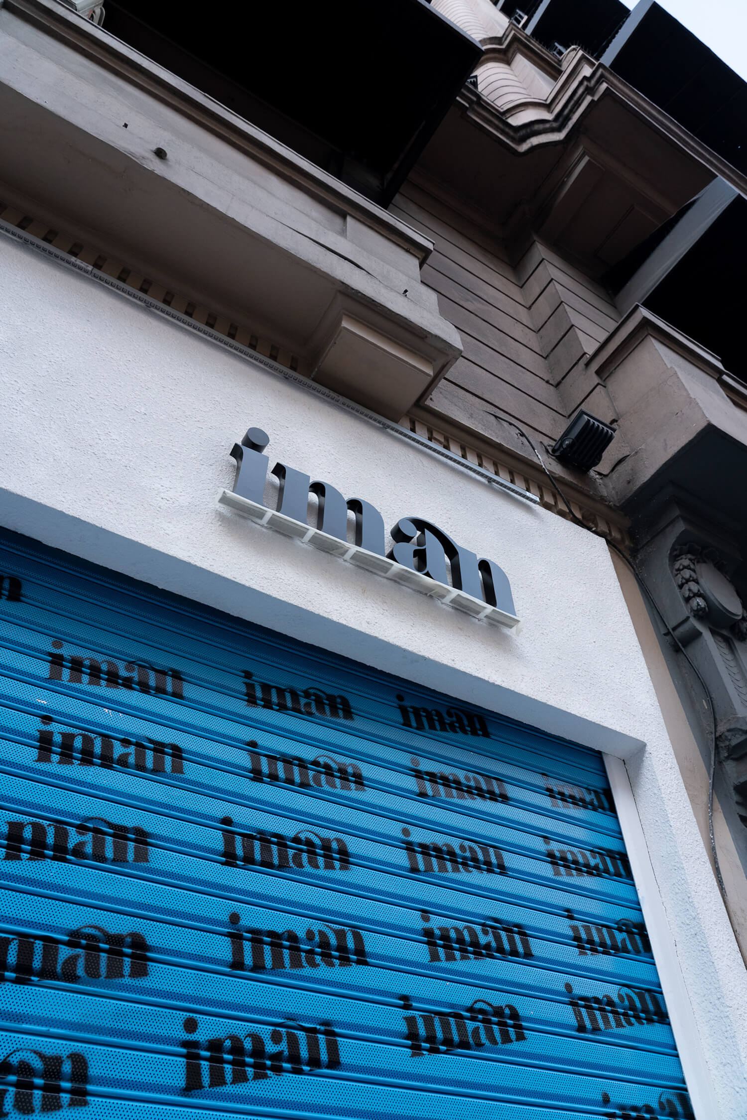
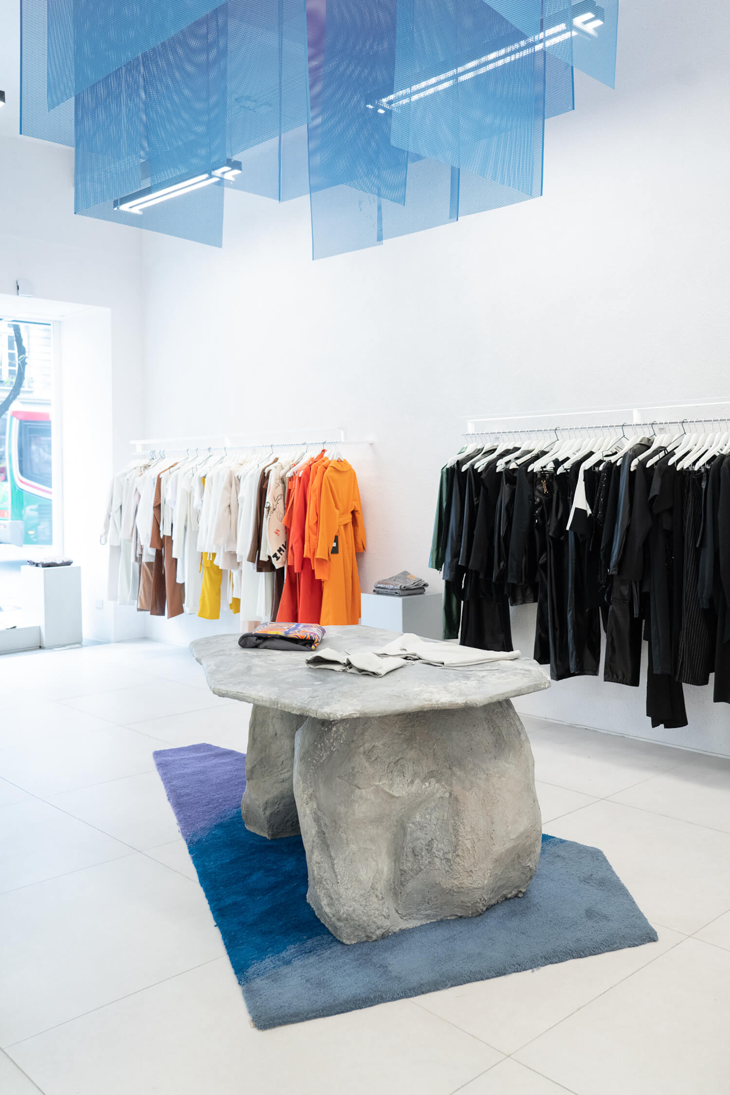
In its purest abstraction, this project is conceived as a magnetic field. The aesthetics of the spatiality already refer to the elements that attract each other; the opposite poles, positive-negative. From the outside, the large Magnet is perceived suspended from the ceiling, and all the other surfaces are subordinated to this concept. A cold atmosphere, with metallic elements, and a clear envelope serve as a support to create a force that can attract.
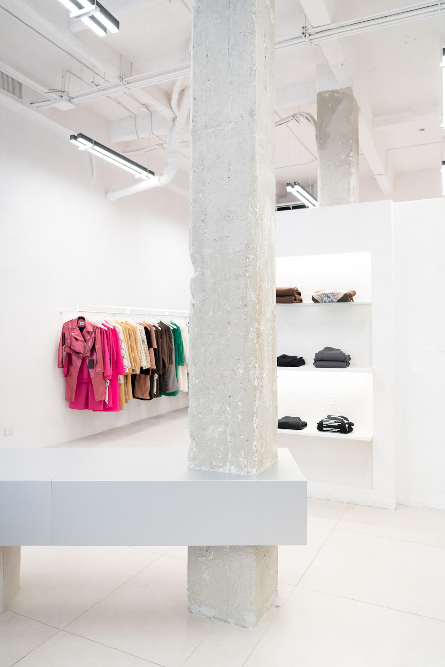
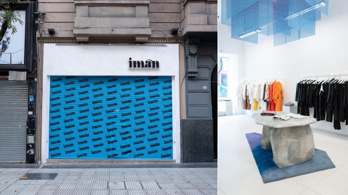
Once the dialogue between opposites is established, its presence is enhanced in the encounter between the oversaturation of the garments and the clear support; the large stone display counter and the suspended magnet; the chipped columns and the pure prisms that cross them, the rough and the polished. The brand's identity colors, blue and violet, are used in a system that highlights certain elements of the project, combined with achromatic and gray tones.
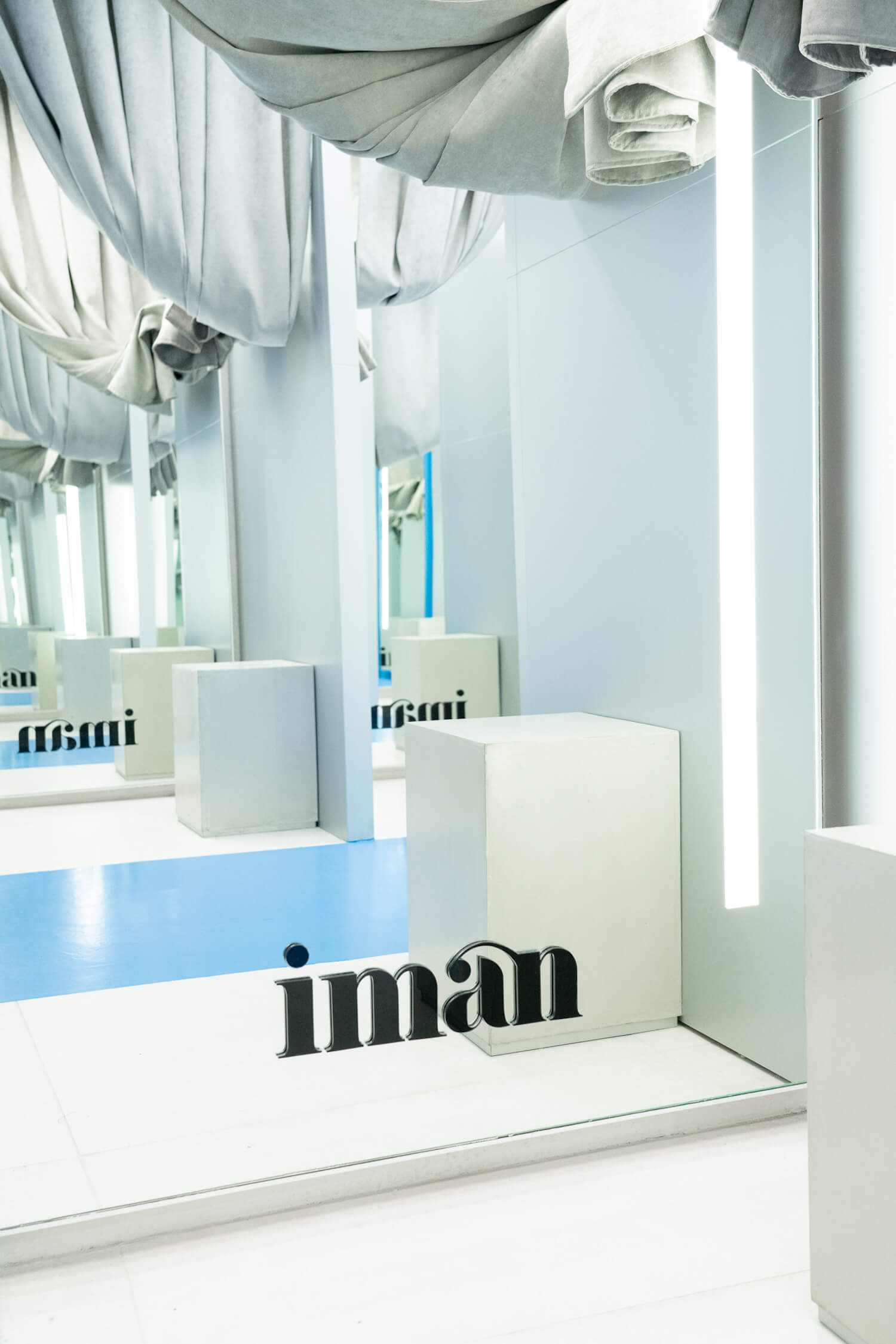
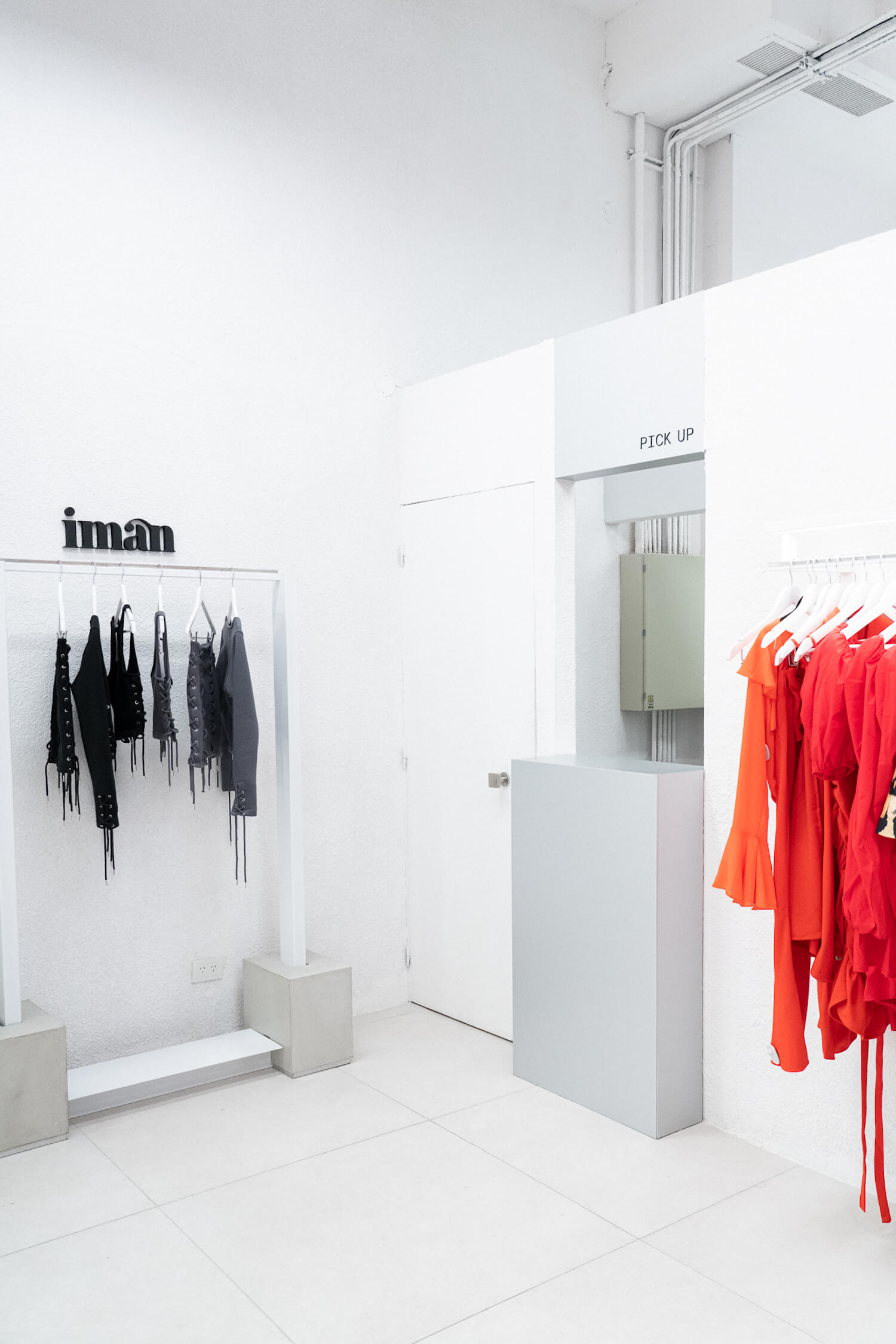
It subscribes to an aesthetic inspired by a technological laboratory, where uses that respond to this same setting are incorporated. From its architecture, the space participates in the virtual spectrum inhabited by the brand's users, incorporating a pick-up point and an area for creating content. Frosted glass, full illumination, metals, and the saturation present in some elements condense this ideal.
The design of this store is conceptually based on the search for a timeless and avant-garde atmosphere. Magnet transcends conventional limits, becoming a space that not only houses fashionable garments but also serves as a dynamic and versatile stage. Architecture and design merge to generate an inescapable magnetism in the eyes of the user.
Key products used:
Within the elements incorporated into the project, a duality is always sought, conceptualized from the opposing poles that attract each other in magnetic fields. The raw and the polished can be appreciated in the encounter between the rough-hewn columns and the perfect prisms, as well as the suspended magnet above the stone counter, among others. Similarly, industrialized materials such as steel, perforated sheet metal, and frosted glass are used, evoking a technological and laboratory aesthetic.
What was the brief?
The client involved Vang Studios during the brands makeover process. Ww were engaged to design a new image for their commercial store simultaneously with a rebranding and an update of the brand's internal social media presence. The goal was to achieve a contemporary and cutting-edge aesthetic, where color and chromatic scales took center stage, and the space should evoke an advanced technological vibe.
Who are the clients and what's interesting about them?
The client had a particular interest in incorporating the "magnet" as a conceptual element in the architecture of the project. They also wanted to integrate the online virtual experience into the project.
What were the key challenges?
Calibrating the use of color in the main architectural elements to make them stand out without competing with the brand's garments presents itself as a distinctive challenge. On the other hand, the store has a very imposing interior height; the scale posed a problem for the user experience and the brand's vision.
How is the project unique?
The combination of the conceptual approach, the incorporation of the "box" as a capsule, and the use of custom-made artistic pieces elevates the project to a level of distinction, making it truly one-of-a-kind and reflecting the brand's identity and vision in a profound way.
What were the solutions?
The space is designed as a white box, akin to a canvas, where different focal points are created with chromatic highlights. This is achieved by strategically using furniture and garments as resources. As the central coordinating element in the architecture, the large suspended magnet hangs under a carpet in shades of blue to violet, while the fitting rooms are painted in a vibrant sky blue, representative of the brand's identity.
What building methods were used?
The project was carried out using dry construction techniques, employing stud walls and metal structures, with a sprayed-on coating. Dry construction involves assembling components off-site and then assembling them on-site, which allows for faster construction and reduced on-site mess. In this case, tabiquerías (partition walls) and metal structures were used, and a sprayed-on coating was applied to the surfaces as the final finish.


