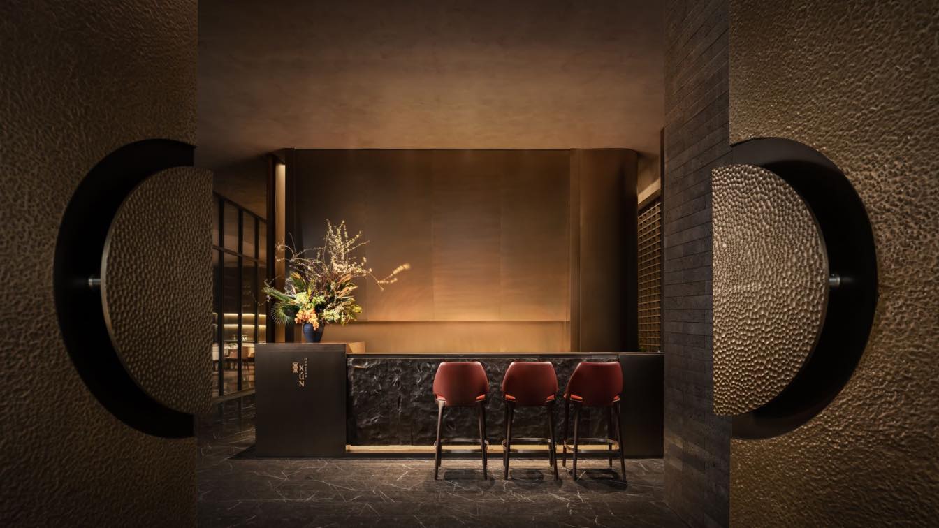
Ignacio Urquiza & Ana Paula de Alba: Located in the Juárez neighborhood of Mexico City, Ninyas is a small restaurant specializing in rib eye tacos served together with sake. The idea originated in the fondness a father and son had for hosting visitors in their home and their desire to expand this hospitality to more people. They loved to invite people over, put on a delicious meal and spend time together.
In their home they had several rooms dedicated to this purpose, in each of which the tables were more like bars fitted with a grill. The meals were organized around these. There, the hosts and their guests sought to perfect their famous rib eye taco in wheat tortillas. Transforming this experience into a restaurant was a dream present from the outset; it was long discussed among the family. After many years, the project finally took shape when the same group of friends who had tested their recipes and enjoyed this experience came together to make it a reality.
This is the origin story of the design intentions for a space. A project that aims to give shape to the cuisine and hospitality concept through architecture and interior design, in this case through an intervention in a 100-square-meter premises situated in the ground floor of a building dating from the 1950s. The goal: to reflect the twin culinary traditions that infuse it, while bearing in mind its own origin.
In Ninyas, Mexico and Japan come together: two very different cultures that, nevertheless, present similarities in certain customs and in their cuisine. To find and express in the project the necessary elements, we analyzed trends in both Mexico City and Tokyo, in the street life and in the materials found in their kitchens as well as in street food stalls.
For example, sushi bars and teppanyaki griddles, made from stainless steel, remind us of Mexican fast food joints, classic Mexican eateries or taco restaurants with their high tables and bars. We also thought about warmer materials like wood, and were struck by Japanese lacquered finishes, as well as Mexican ceramics with their shine, reflections and colors. Then there is the lighting design: reflections and shadows, and partitions or lightweight shelving to divide spaces.

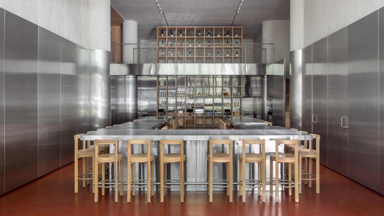
To simplify the proposed intervention, we employed a dominant material: cold and reflective stainless steel. With panels measuring 1 x 3 meters we covered the perimeter walls and also designed the kitchen furniture and equipment, along with three bars for diners, which are high, shared tables that form the main eating space.
The sensation upon entering the restaurant is more like arriving in a kitchen, emphasized by the non-slip ocher-colored epoxy floor. Paradoxically, the cool and neutral finish is the element that fills the space with color and life, since it diffusely reflects each diner and everything that happens inside.
In this space, eating and sharing are the main activities. In parallel to the stainless steel, three further elements coexist in the project, with a contrasting material quality. In the mezzanine, a small cozy bar, whose floors, walls and ceiling are all made from wood. The utilitarian shelving that divides the kitchen from the seating area, without cutting it off, allows the passage of plates to and from the kitchen, and also stores the crockery, cutlery, bottles and utensils.
The third element comprises the stools custom-designed for this project. Made of solid oak and with a circular footprint, they stand out from the other elements and soften the spatial relations of the whole. The stainless steel footrests integrate them directly with the rest of the design, while ensuring comfort for the users. A stainless steel bridge connects the staircase with the mezzanine. Here, the upper part of the shelving is transformed into racks for the sake bottles
Finally, the façade, comprising six pivoting and folding sheets of glass, offers multiple options for comfort and connection between the exterior and interior. Both physically and visually, this large doorway integrates the dining space with the sidewalk, immediate vegetation, and pedestrians.


