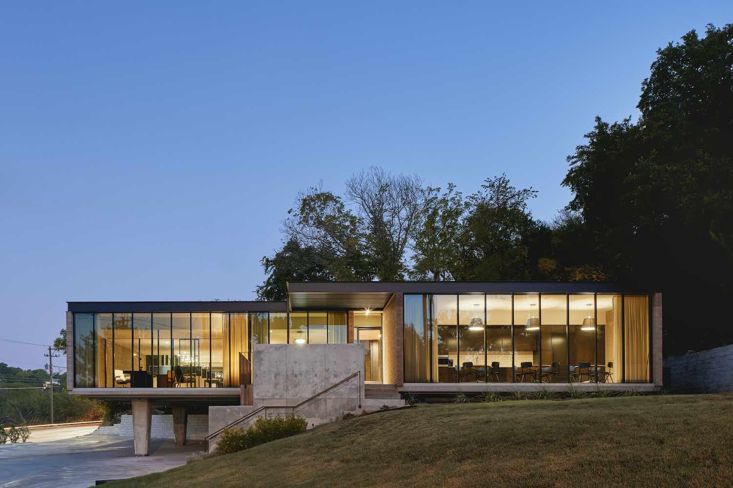
An iconic Austin office building, built in 1960, has undergone a complete renovation by local architecture firm, Mark Odom Studio. Cantilevering towards North Lamar Blvd, this mid-century structure is nestled along a main Austin thoroughfare and integral midtown park district.
Meredith and Tyler Spears, owners of the heritage and family operated insurance company BKCW, bought the building for its iconic mid-century architecture which they felt reflected their company culture, attitude, and goals. The project then began not only as a full renovation of the 3,000 square foot office building built in 1960 (by architects Pendley & Day), but also as an adaptive reuse, ensuring the true preservation of the original building.
 image © Leonid Furmansky
Over the years, the project had been internally subdivided, limiting the experience of the original building stature. Mark Odom Studio quickly set out to fully open the space, a nod to the open office layout seen in insurance and advertising companies in the mid-1960s. This approach fully expressed the entire building volume by not only opening up the interior, but by allowing the prominent glass facades to flood the space with natural light.
 image © Leonid Furmansky
To accomplish many of the reuse portions, the project salvaged as much existing brick as possible and replaced existing storefront windows with new energy efficient glazing, framed with steel mullions to match the original window pattern. Internally and externally, the use of mid-century materials, such as vintage brick, stained wood paneling, and cork flooring, brought this project back to is former life. The careful resourcing of these details made it possible to update the original low ceiling, raising it one foot to achieve eight-foot ceiling heights throughout, with a seamless transition inside and out.
 image © Leonid Furmansky
“For our office, the most exciting part of this design process was treating this more like an adaptive reuse project rather than just a renovation. Preserving this iconic 60-year-old building was of course a must—but tricky to pull off. Raising the roof and ceiling, opening the interior, and finding vintage brick were just a few of the big design choices that helped it really come to life.” says Mark Odom, of Mark Odom Studio.
 image © Leonid Furmansky
Keeping the dedicated views towards downtown Austin and Pease District Park was critical, both for the client and for the visual experience for the employees. Complimenting the very public southern and western views, the eastern windows now face a revitalized subterranean back courtyard, which acts as a respite from the North Lamar traffic. On the exterior, both the front, park facing deck and the southern, down-town facing deck were added and expanded to accentuate the horizontality of the original structure while also providing more generous entry points for visitors and employees.
 image © Leonid Furmansky
The end result is a preserved but updated, mid-century building that remains an Austin landmark.
The build was completed by Franklin-Alan. Mod mid-century furnishings and vintage art in collaboration with The Renner Project for selected interior finishes.
 image © Leonid Furmansky
 image © Leonid Furmansky
 image © Leonid Furmansky
 image © Leonid Furmansky
 image © Leonid Furmansky
 image © Leonid Furmansky
 image © Leonid Furmansky
 image © Leonid Furmansky
 image © Leonid Furmansky
 image © Leonid Furmansky
 image © Leonid Furmansky
 image © Leonid Furmansky
 image © Leonid Furmansky
 image © Leonid Furmansky
 image © Leonid Furmansky
 image © Leonid Furmansky
 image © Leonid Furmansky
 image © Leonid Furmansky
 image © Leonid Furmansky
 image © Leonid Furmansky
 image © Leonid Furmansky
 image © Leonid Furmansky
 image © Leonid Furmansky
 image © Leonid Furmansky
Connect with the Mark Odom Studio

