Align Design and Architecture has completed a high-spec 11,000 sq ft scheme for a leading global insurance company, high up in a glass-and-steel tower in the heart of the City of London. The scheme includes evocative cues inspired by the company’s Bermuda HQ location, as well as incorporating many wisdoms from the 3,000-year-old practice of Feng Shui. The latter finds form in the site plan and the placing of key activities within that, as well as through intriguing curved wall and ‘dragon’s tail’ corridor shapes. Many bespoke fixtures and features, meanwhile, from sand and sea blue colouring to ripple-effect glass and wall treatments, scallop-edged bespoke joinery and bespoke, stalactite-inspired lights, refer to the colours, shapes and textures of Bermuda’s natural environment.
‘The client came to us with the task of creating an office of 11,000 sq ft of net internal space from a site that had been delivered in standard Cat A condition. We were delighted to form part of the team on this exciting and highly-creative project, together with lead fit-out contractor Overbury and project managers Savills’ Nigel Tresise, Director of Align Design and Architecture commented.
Brief: The new space needed to have two functionally-separate office areas, incorporating 50 desk spaces each, plus an additional 10 executive desks in the south-facing section. The scheme also needed to include a suite of shared meeting facilities and support areas, ranging from tearooms and print rooms to washrooms and a yoga studio. Align Design and Architecture were given a very open brief when it came to the look and feel of the new scheme – and took part in a highly creative conceptualising process with the client on this. There were also a number of simple and subtle references to the interior of the floor below, to ensure a holistic feel, though the majority of the scheme is unique to this space. A second requirement of the brief was to ensure a high-quality working environment by specifying only materials and finishes with either ultra-low or zero VOC emissions, including paint finishes, adhesives, sealants, flooring, acoustic insulations, furniture and furnishings. Align Design and Architecture sought to achieve this by working in conjunction with guidelines laid out by the Green Building Council, International Well Building Institute and the International Standards Organisation.

A third major element of the brief was to incorporate the principles of Feng Shui into the design. Align Design and Architecture welcomed the chance of working with this fascinating and ancient art once again, having had previous experience of its principles when designing the London offices for Cathay Pacific in 2017.
‘The fundamental axes of Feng Shui inspired the space plan from the outset’ Nigel Tresise explained. ‘Whilst the South in Feng Shui philosophy represents the capacity for vision and creativity and the South-East wealth and prosperity, the North governs career and business success and is one of the prime directions for achieving career goals. The East governs health, growth and family and therefore was a natural choice for the reception and guest welcome area, whilst the Western aspect is traditionally less linked to business and therefore needed to be well-connected to the rest of the space.’ The practice looked in detail at the eight points on the Feng Shui compass, ensuring it determined not only the location of certain functions, but also the softening of the overall geometry with as many as possible curved elements, limiting sharp corners.
Space Plan Elements:
The brief asked for the following to be incorporated into the scheme:
- One open-plan office with 50-55 open plan desks and an executive office with 10 desks.
- A second office with 50-55 open plan desks.
- A reception with visitor waiting and drinks area.
- A boardroom housing 15-20 people.
- Two 6-person and two 4-person meeting rooms.
- Quiet focus areas and collaboration areas within both office neighbourhoods.
- Water points, as well as a print and resource area.
- A comms room and storage spaces
- A gym or fitness studio
- A breakout space
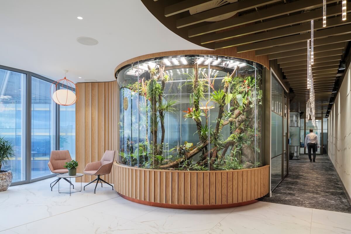
Design Approach: ‘As well as applying Feng Shui principles to the space plan, this was a hugely enjoyable project for the design team when it came to working in subtle references to Bermuda’ Haroulla Georgiou, Associate at Align Design and Architecture commented. ‘This informed both the colour scheme with its blues and sandy shades, but also the natural references throughout, referenced via timber and planting. In addition, shapes and textures were designed with a Bermudian influence, from the ripples of sand and water, which find form in the bespoke corridor wall treatment and meeting suite acoustic panels, as well as in the use of ridged tiling, rippled glass and scalloped edges to the bespoke joinery. Two of the scheme’s most stand-out features resulted directly from this line of exploration – the tropical terrarium in the reception and the bespoke feature lighting that hangs from the corridor ceilings, which references the stalactites of Bermuda’s famous Crystal Caves.’
Design Walk Through: Reception and Welcome Area
Visitors arrive into a reception area that immediately sets the tone, featuring smooth curved shapes to the ceiling, floor and joinery, inspired by the form of seashells. The reception desk straight ahead has a Corian top that swoops down into a lower, wheelchair-accessible level at one end. The desk can accommodate two colleagues with space for storage and equipment, enabling this to be a functional administrative position as well as a meet and greet service. The desk features a bronze mirrored base plinth with the front clad in vertical ridged oak veneer panels, a treatment repeated for the wall directly behind, with inset LED lighting strips at intervals and an inset screen for corporate announcements. The reception area flooring is in a ceramic tile with an organic pattern, including a touch of bronze colouring, whilst the waiting area furniture includes large swivel chairs by Brunner.
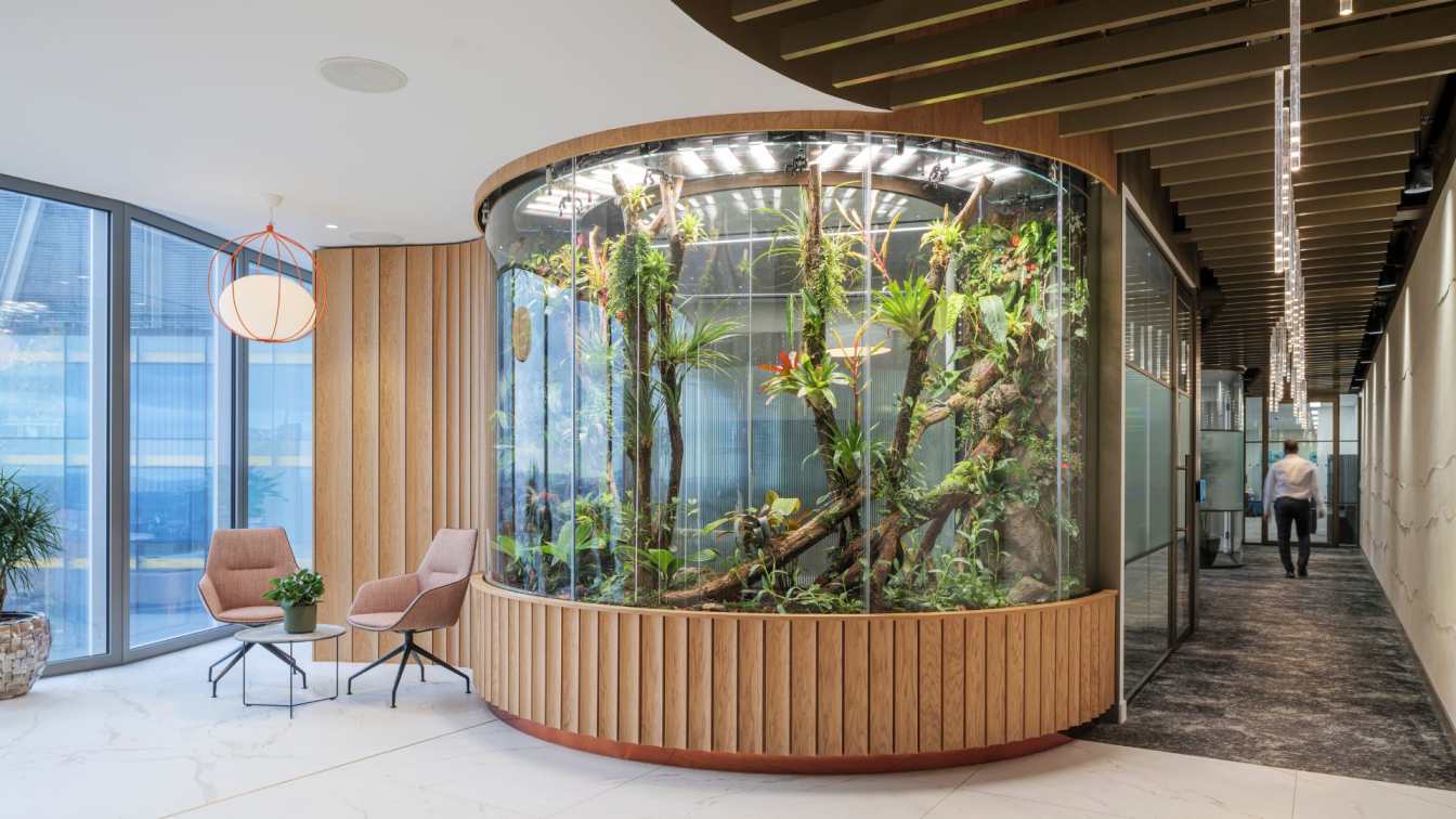
To the right is a floor-to-ceiling semi-circular terrarium, featuring plants native to Bermuda and created for the scheme by Grow Tropicals. This was a very technically-challenging installation with, for example, an inbuilt misting system, reverse osmosis filtration and a deep base to hold all the necessary technology. Sliding doors allow for monthly maintenance access. The terrarium is in a bronze finish to the top and bottom, with vertical ridged timber panels directly below the glazed frontage. The scheme throughout features planting that is all real and either naturally-preserved or freeze-dried, with its integration developed with planting consultants Exubia.

Two hidden areas sit behind the reception desk and the terrarium. First, directly behind reception, a teapoint / drinks facility for visitors, featuring ridged wall tiling in a deep metallic blue, a recycled glass worktop by Stoneville, rippled glass cupboard fronts with timber frames and scalloped-edge bespoke joinery. Secondly, directly behind the terrarium, a seating area for semi-private meetings. This stylish small space features a purple, semi-circular banquette and a white, Chinese-lantern style pendant by Zero Lighting enclosed in an orange metal finish for a shot of bold colour and a striking contemporary feel. The space has a small table at its centre and features back walls with thin inset metal rods set against white paintwork. The rods match the bronze-coloured frames to the building’s glazing throughout and this material use is picked up on wherever possible to harmonise with the core fit-out, used for joinery handles and mirrors in the washrooms, as well as the bronze treatment to the corridor and studio ceilings.
Corridors
‘It’s unusual for corridors to be the kind of design feature area they are in this scheme’ Nigel Tresise commented, ‘with drama coming from their curved, Feng Shui dragon’s-tail shape, as well as from the Clayworks ridged walls and a dramatic curved ceiling with bronze ridges that houses bespoke stalactite-inspired lights in three different sizes, creating a wave-inspired formation.’
The corridor lights were specially-made for the project by Atrium, after the design team couldn’t find the sizes and lux levels they wanted within existing product ranges. Atrium proved to be a very flexible manufacturer/supplier, able to create the lights at the exact size the design team wanted, with a routed detail at the base of each light to increase diffusion. Inset can lights to the edges of the bronze ceiling panels wash light down over the ridged stoney-cream walls. The corridors are in a forest green and white dappled pattern carpet from Quadrant.

Meeting Suite
Meeting rooms are located the full length of the corridors and are named after locations in Bermuda, from Whale Bay and Turtle Bay to Astwood Cove and Jobson’s Cove. The rooms feature good acoustic separation, with ridged acoustic panels inset into ceilings that echo the ridged finish of the Clayworks corridor walls, made specially for the project by Kvadrat and featuring edge-lighting along the perimeter. All rooms include microphones and speakers mounted within the ceilings, with an AV cupboard adjacent to the meeting suite serving all AV needs. The meeting room external walls feature curved metal edges and glazed sections, with the centre section rippled for privacy.
The suite of rooms includes two 6-person and two 4-person meeting rooms, one of which, bordering the terrarium, features a relaxed, lounge styling, whilst the other is a more traditional meeting room. The suite also includes a boardroom, arranged as two rooms with a folding wall that can be opened up for town-hall-type events, seating 15-20 people and with enough space for perimeter seating when needed. The boardroom’s demountable table is by Brunner, whilst all other meeting tables were bespoke-made for the project by Specialist Group, who made all the bespoke meeting suite tables, as well as the small table in the ‘hidden’ meeting area behind reception. The bespoke ceiling panel in the boardroom, which references the sandy ripples on a beach, was designed by Align Design and Architecture and manufactured by Acufelt.
Open Plan Offices
The open-plan offices are located at opposite ends of the overall space, with a shared breakout area. The room naming system reverts to functional names only for the breakout space and again for the studio fitness and wellbeing space. Small printer and resource areas feature within both office neighbourhoods, whilst staff lockers feature a mix of colours to the front, from white and pale blue to petrol blue in an eye-catching random pattern.

Breakout
The breakout space includes worktops with high stools and a banquette seating area upholstered in two tones of sea blue, backed by feature Trailing Orchid wallpaper by Osborne & Little. Ceiling panels are by Devorm, whilst lighting is a mix between can lights, spotlights and LED and lights for increased visual interest. Pendant lighting features over the bar area, with all the furniture in this area by Brunner, including shell blue chairs. The blue cupboard fronts are in a Formica laminate.
Studio
The Studio area is a zen space, featuring a full-height joinery wall with inset bench with storage drawers, lockers and plenty of timber for a warm, relaxing feel. The full-height glazed wall here, as elsewhere throughout the scheme, offers jaw-dropping views over the landmark buildings of the City and surrounding area, from the ‘Gherkin’ and St Paul’s to Tower Bridge. A large corner tree features for an added biophilic feel, as well as preserved planting. The flooring, by Quadrant, is in cork and the ceiling is sprayed in bronze with bespoke inset oval looped lighting by Formation.
Washrooms
The scheme also features high-spec washrooms to complete the scheme’s luxurious feel, with three unisex toilets provided, one of which is accessible. Two have a pink ripple-texture Solus tile and a shower unit, whilst the third washroom is in green, though using the same tile range. Ceramic floor tiles in all washrooms have a timber look and the cupboards and mirror feature a bronze metal trim, whilst vanity units also include storage drawers.


About Align Design and Architecture:
Align Design and Architecture is a dynamic and innovative multi-award-winning practice, founded in 2014 and led by original Co-founder and Director Nigel Tresise, RSA Fellow, Member of the Sustainable Design Collective and Design Insider Ambassador.
We work across architecture, interior design and placemaking and specialise in workplace strategy and design, along with hospitality, private and developer residential schemes and urban regeneration projects.
Align Design and Architecture works both nationally and internationally and is based in London in the burgeoning Clerkenwell area. Our projects are regularly published around the world and both our projects and the studio itself have won awards - a total of nineteen national and international design and creative awards to date.

