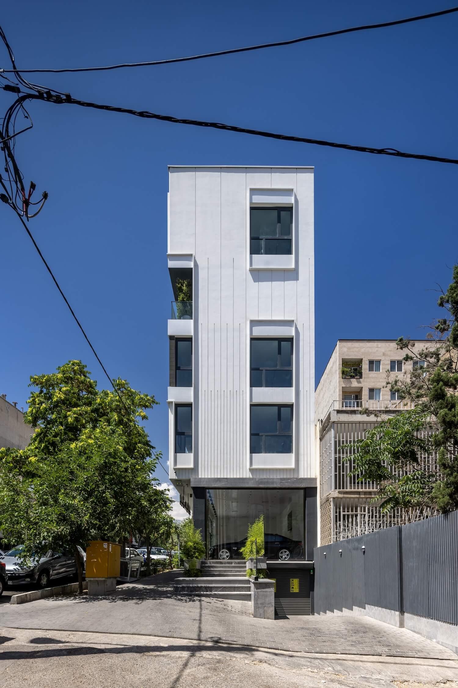
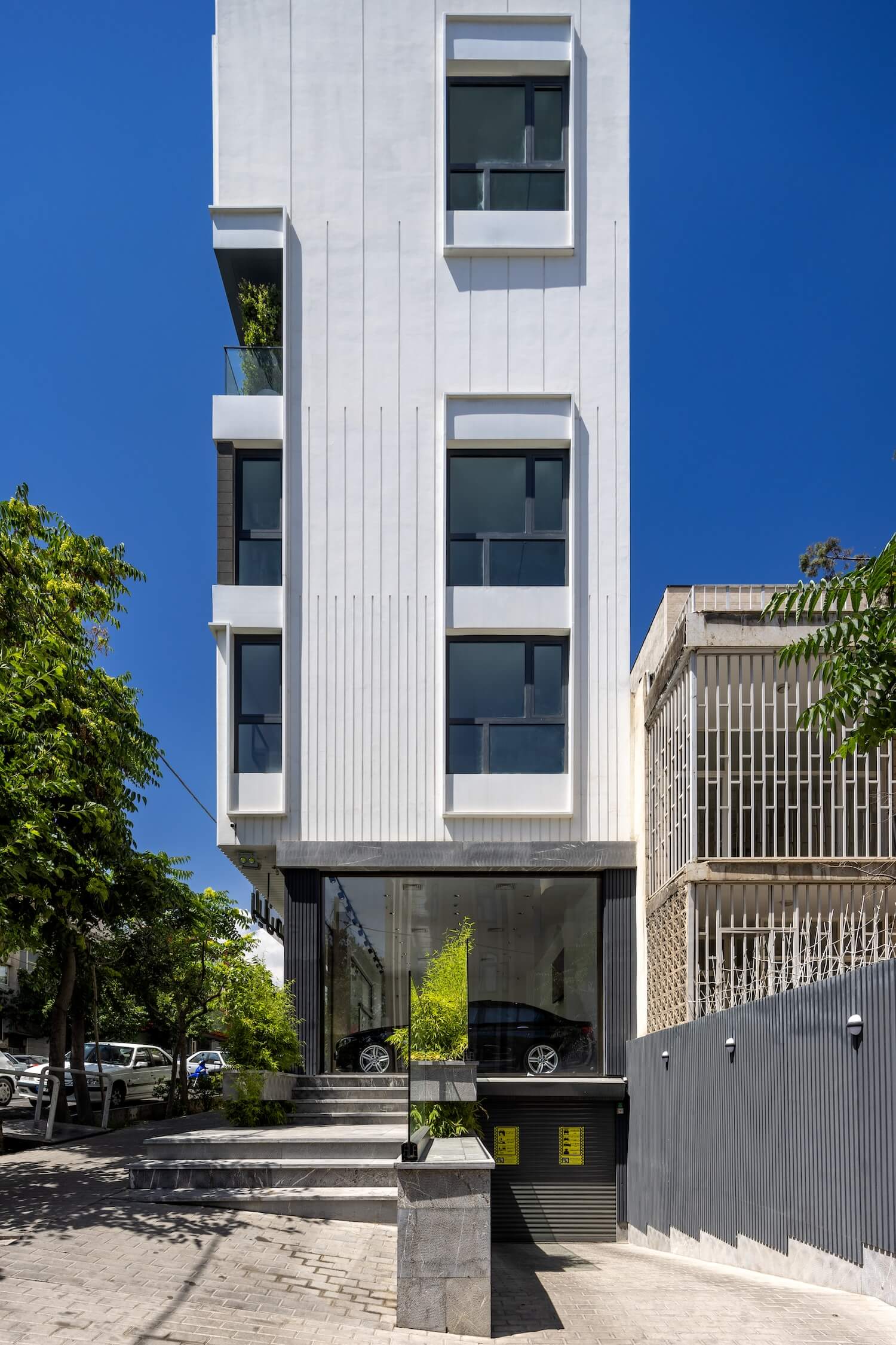
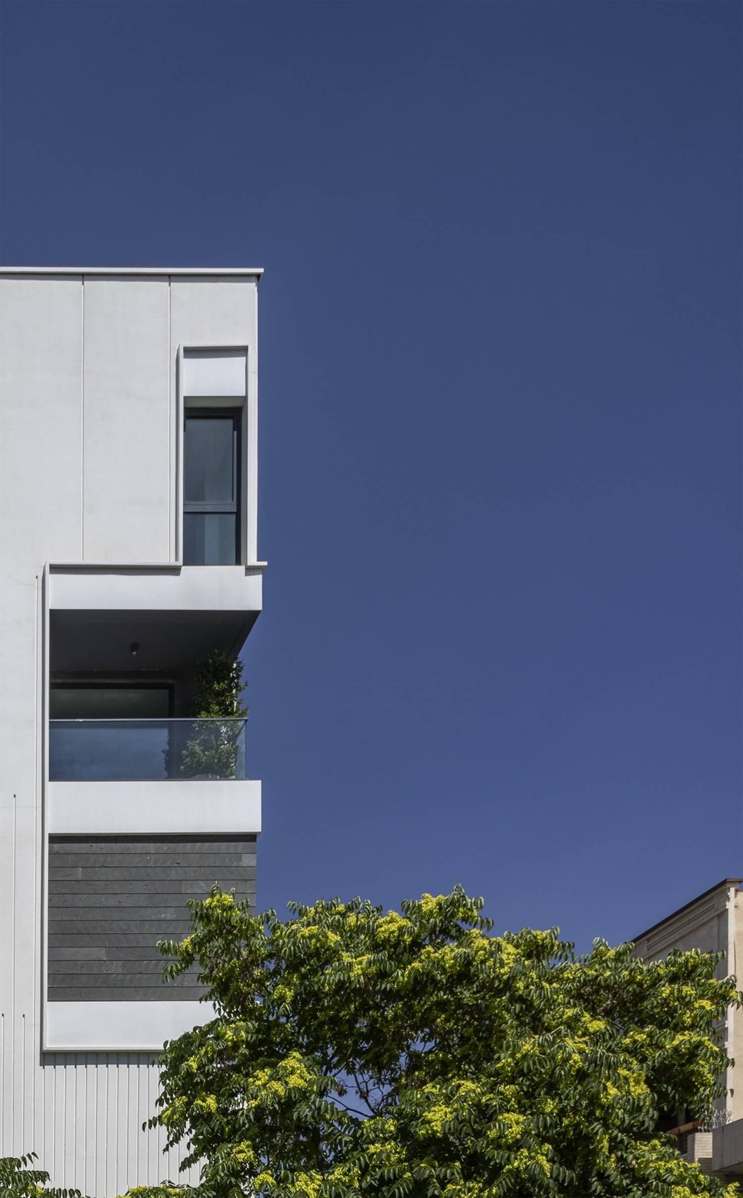
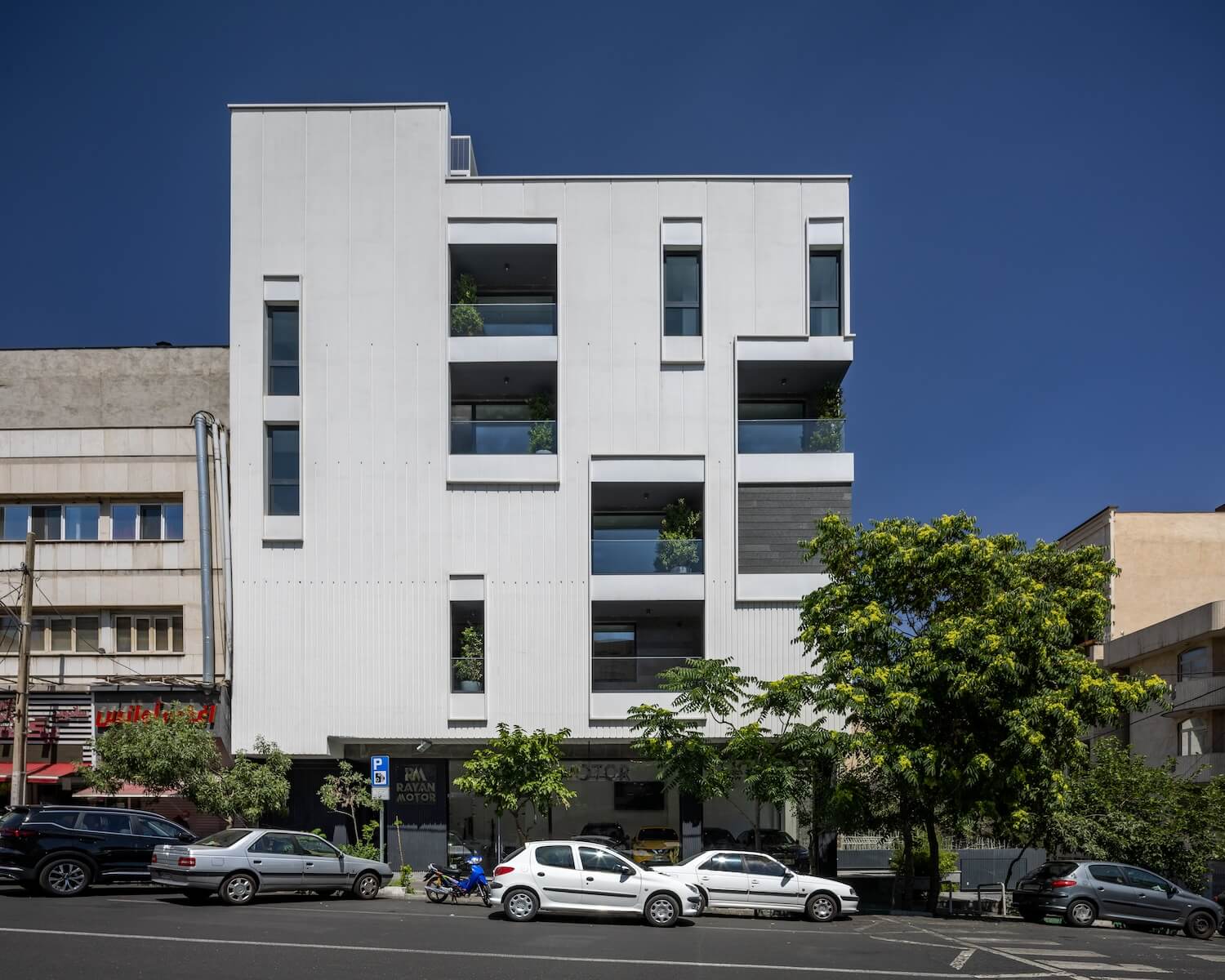
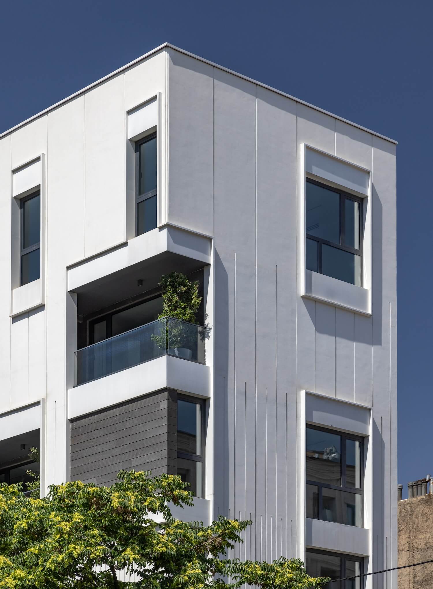
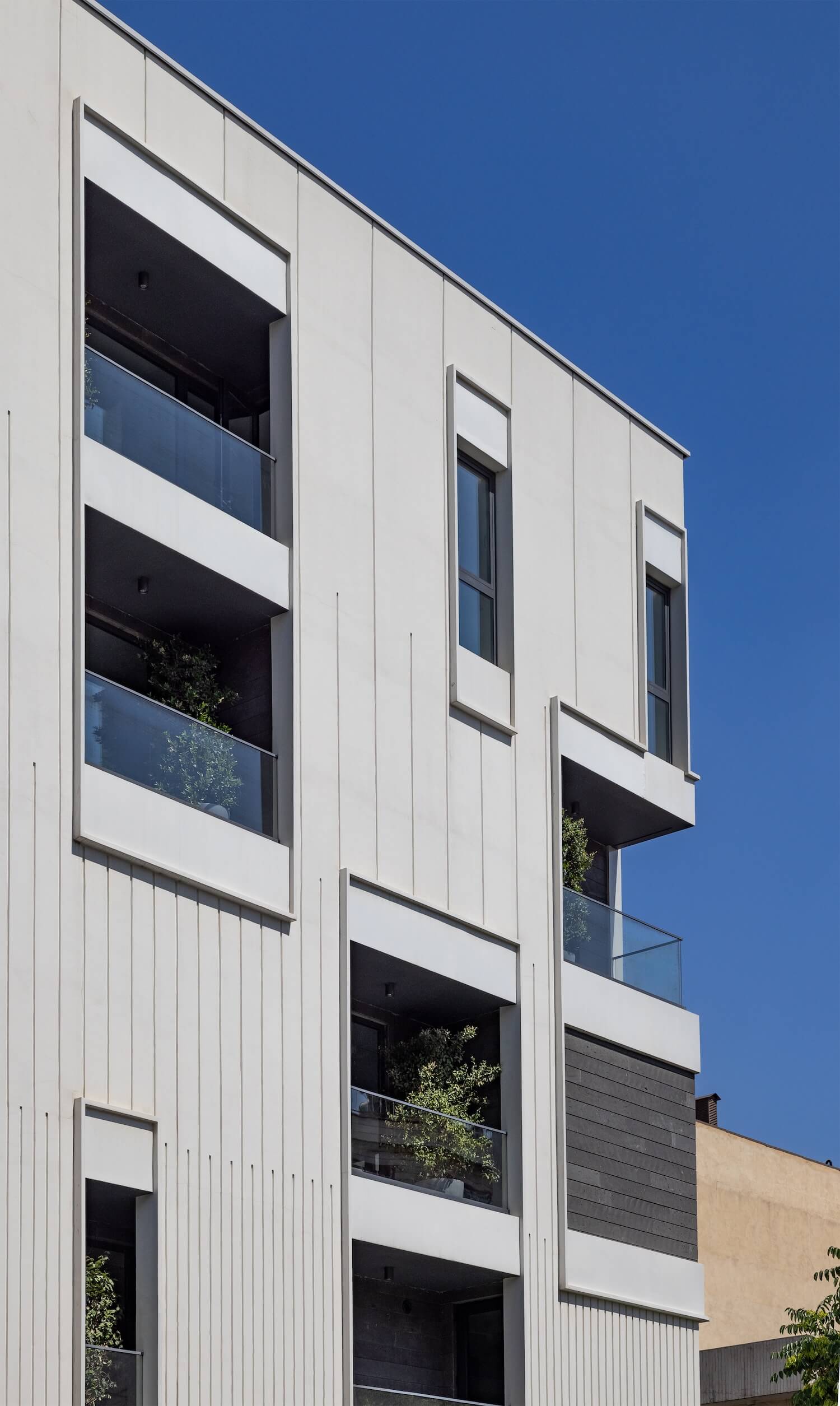
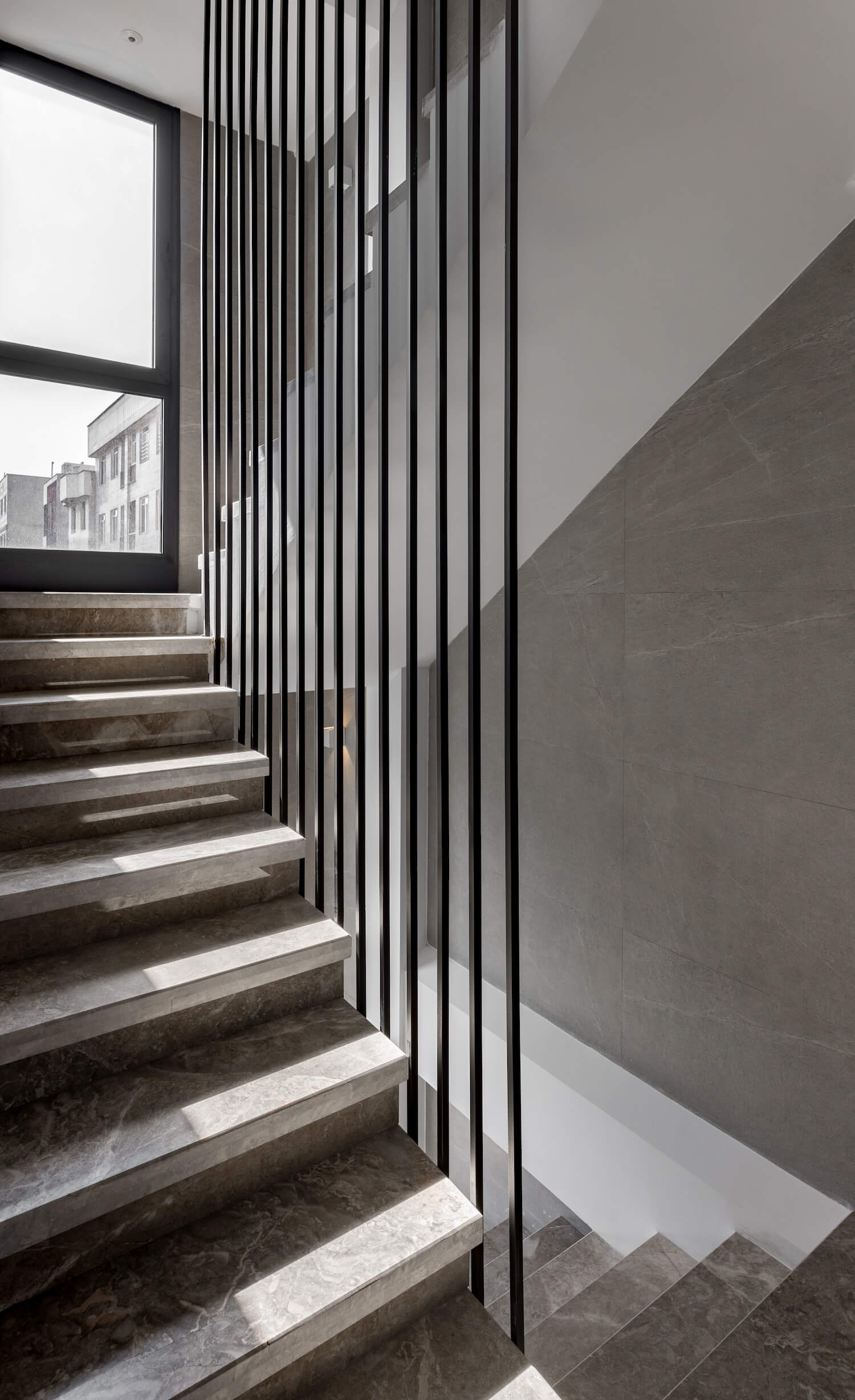
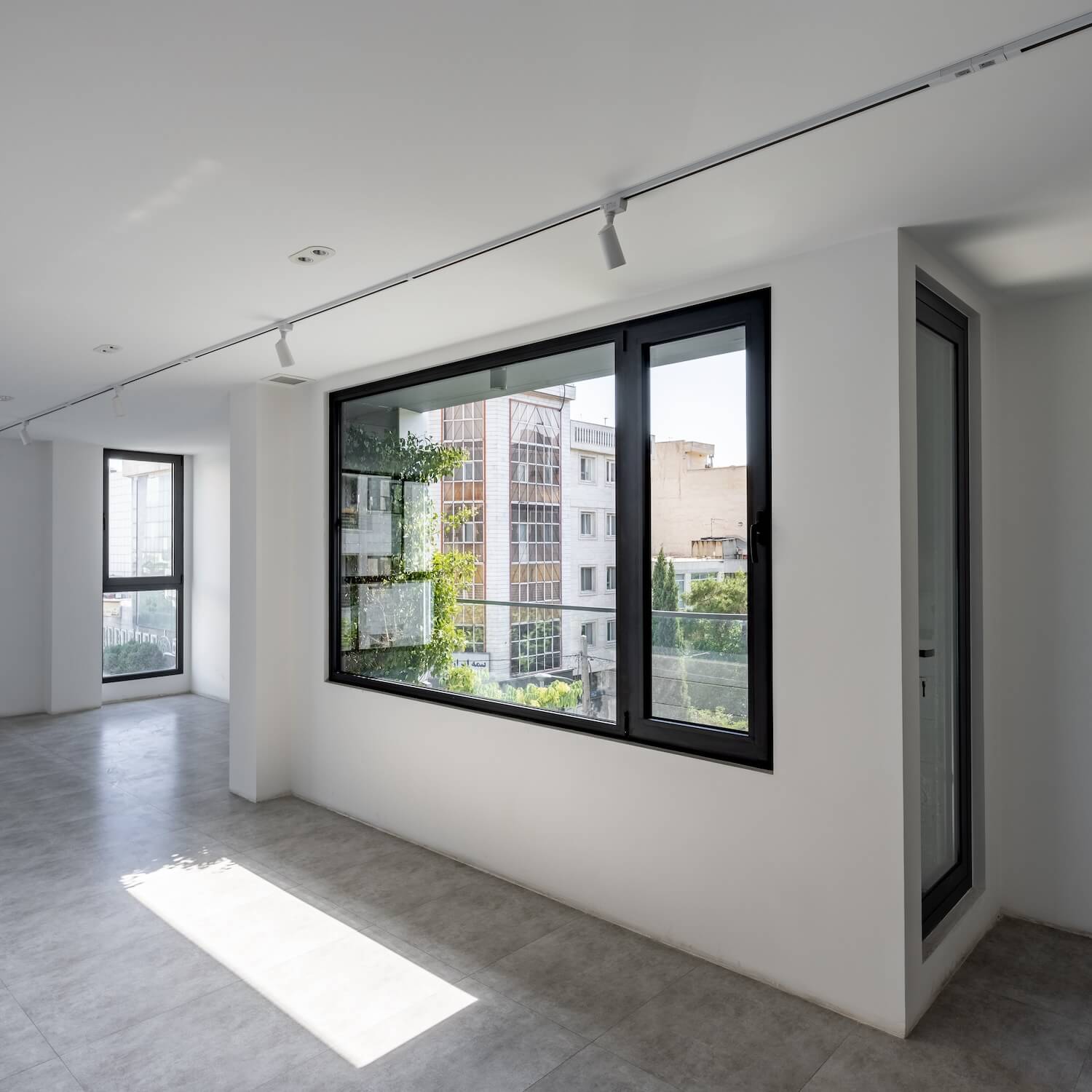
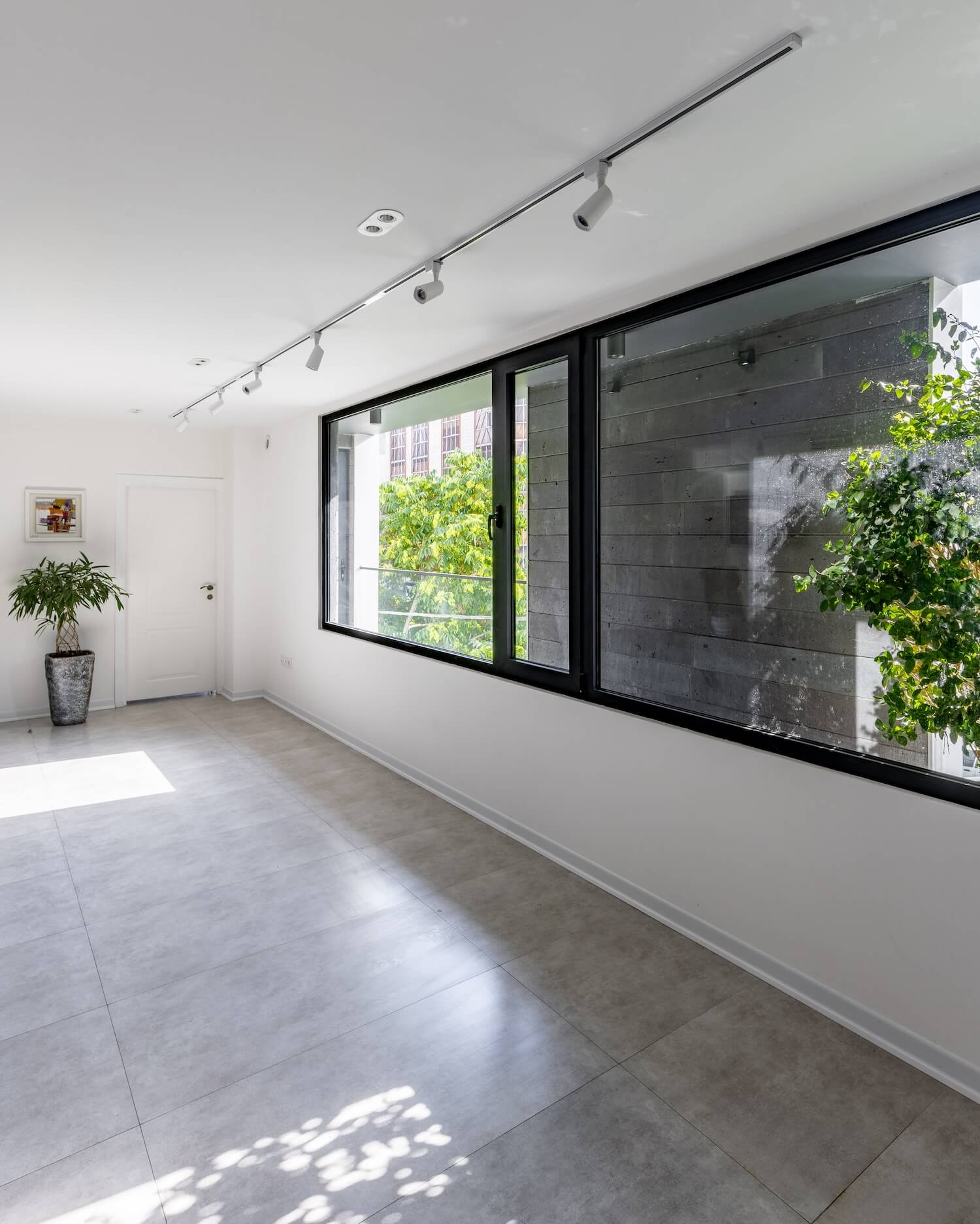
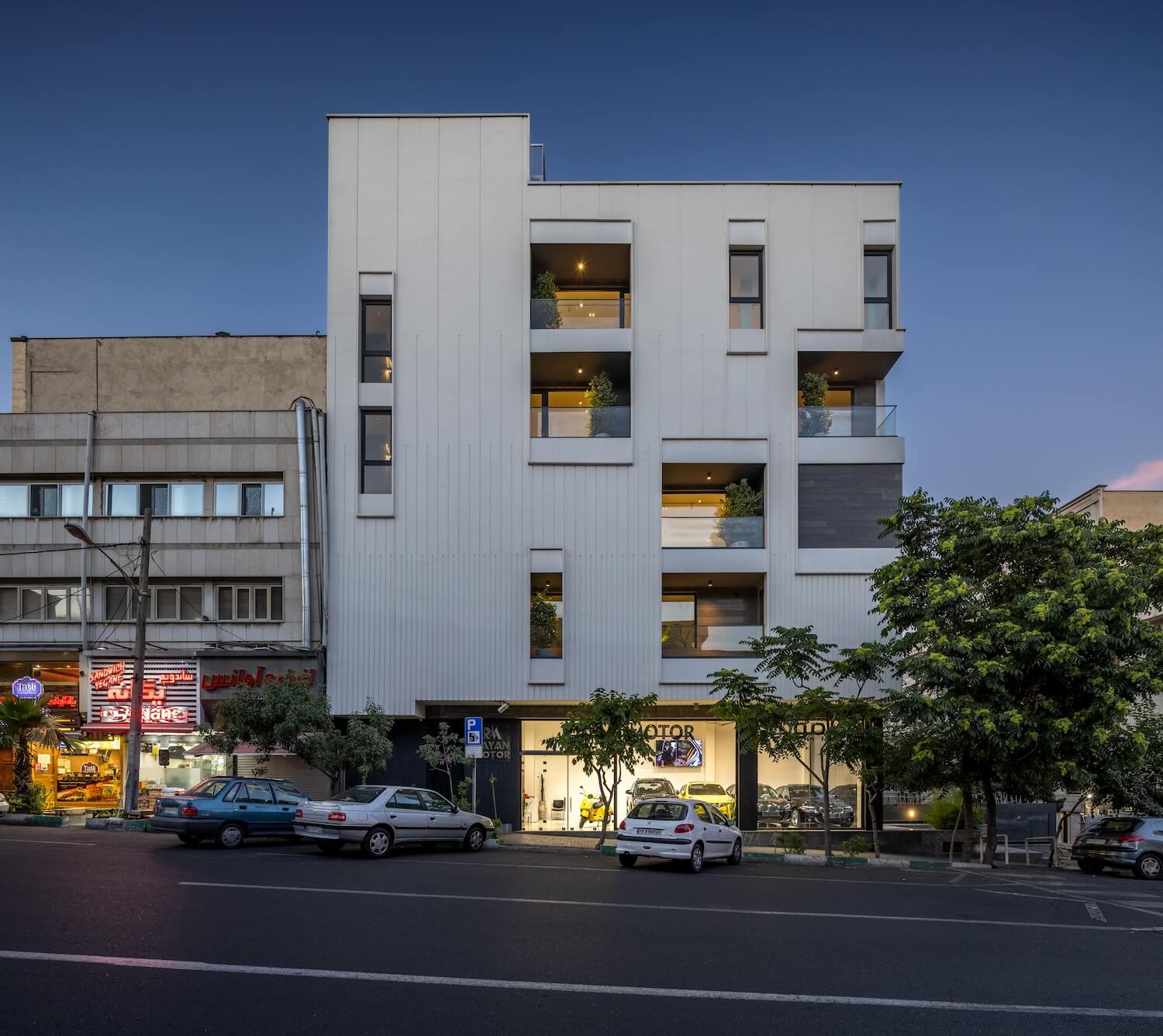
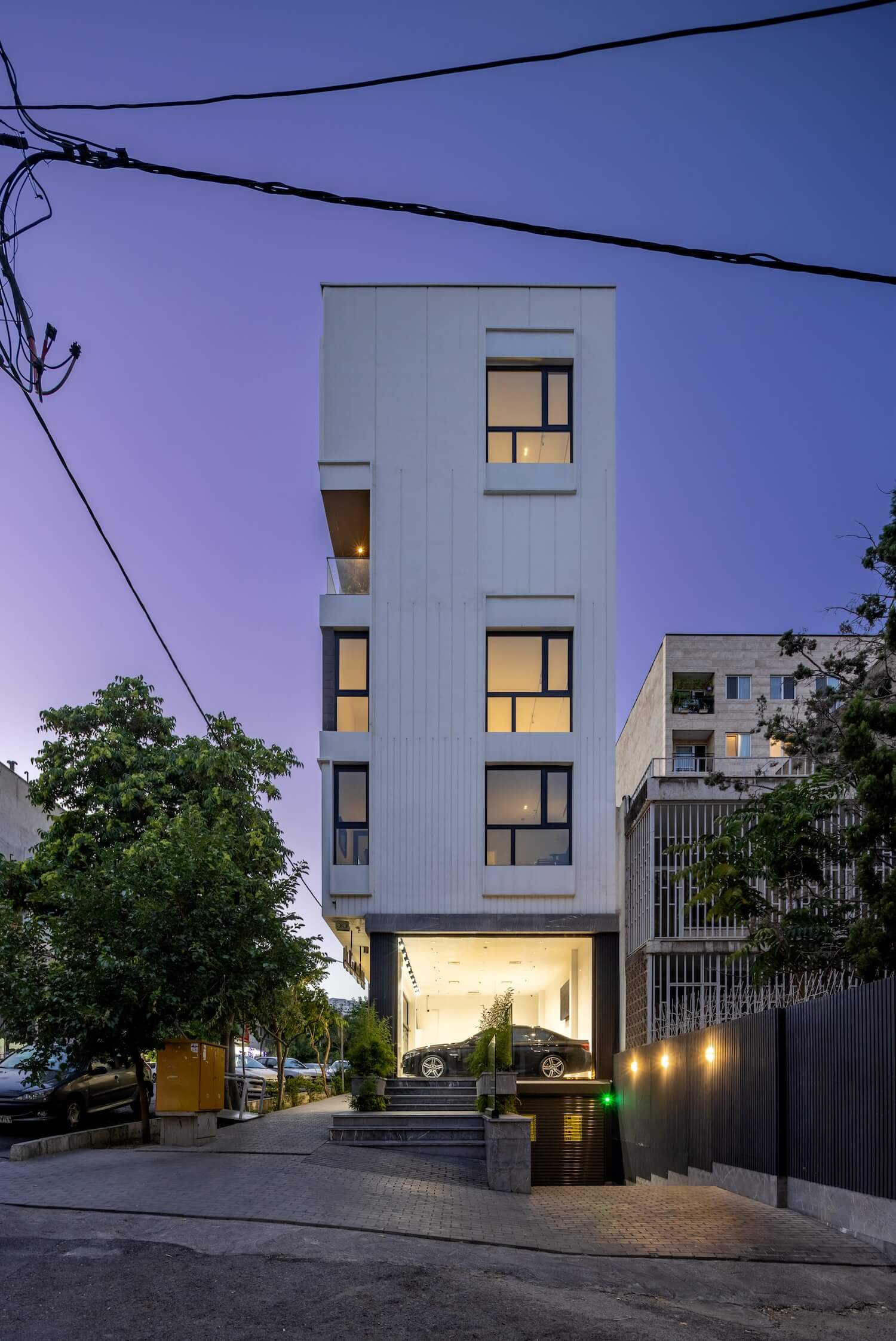
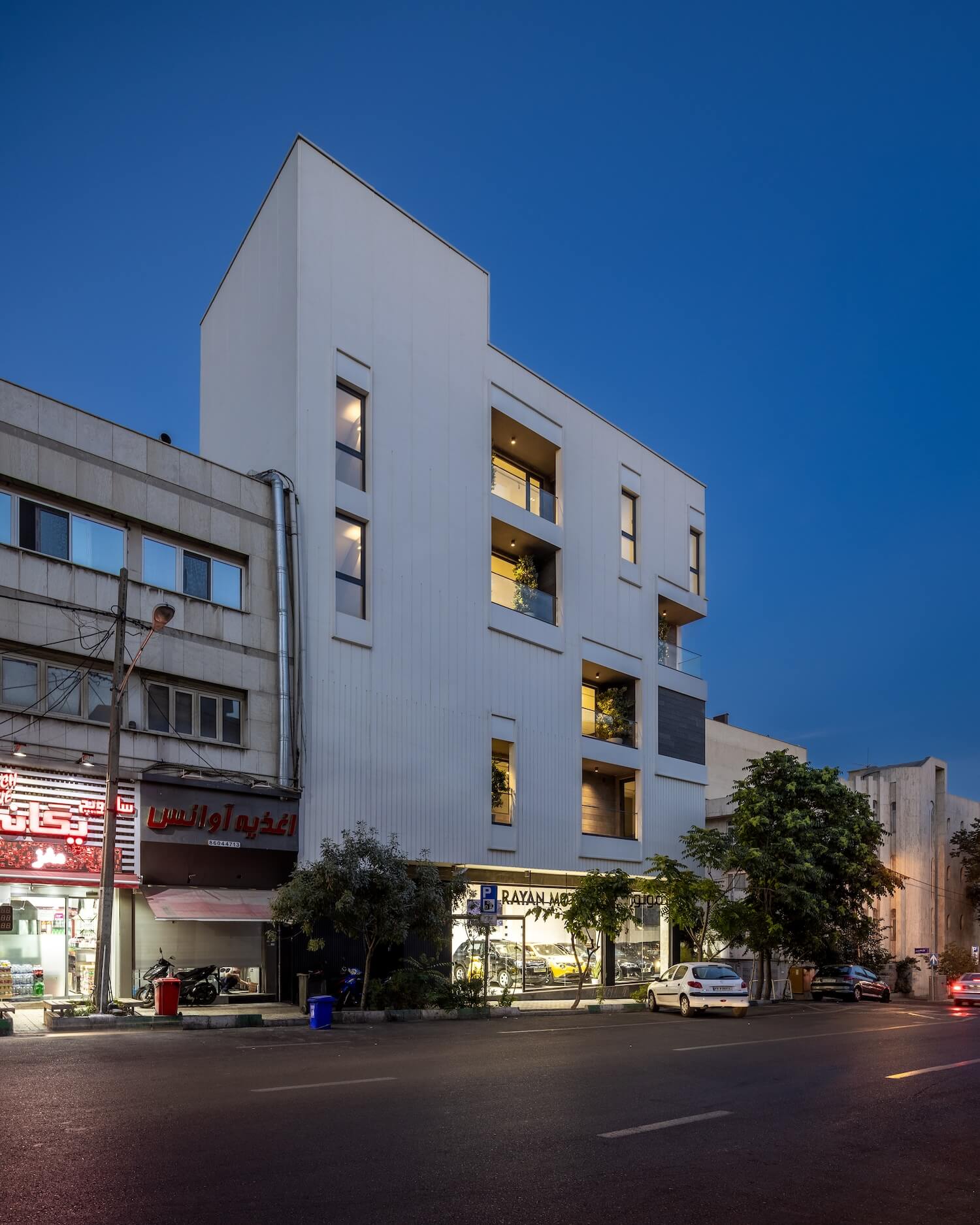
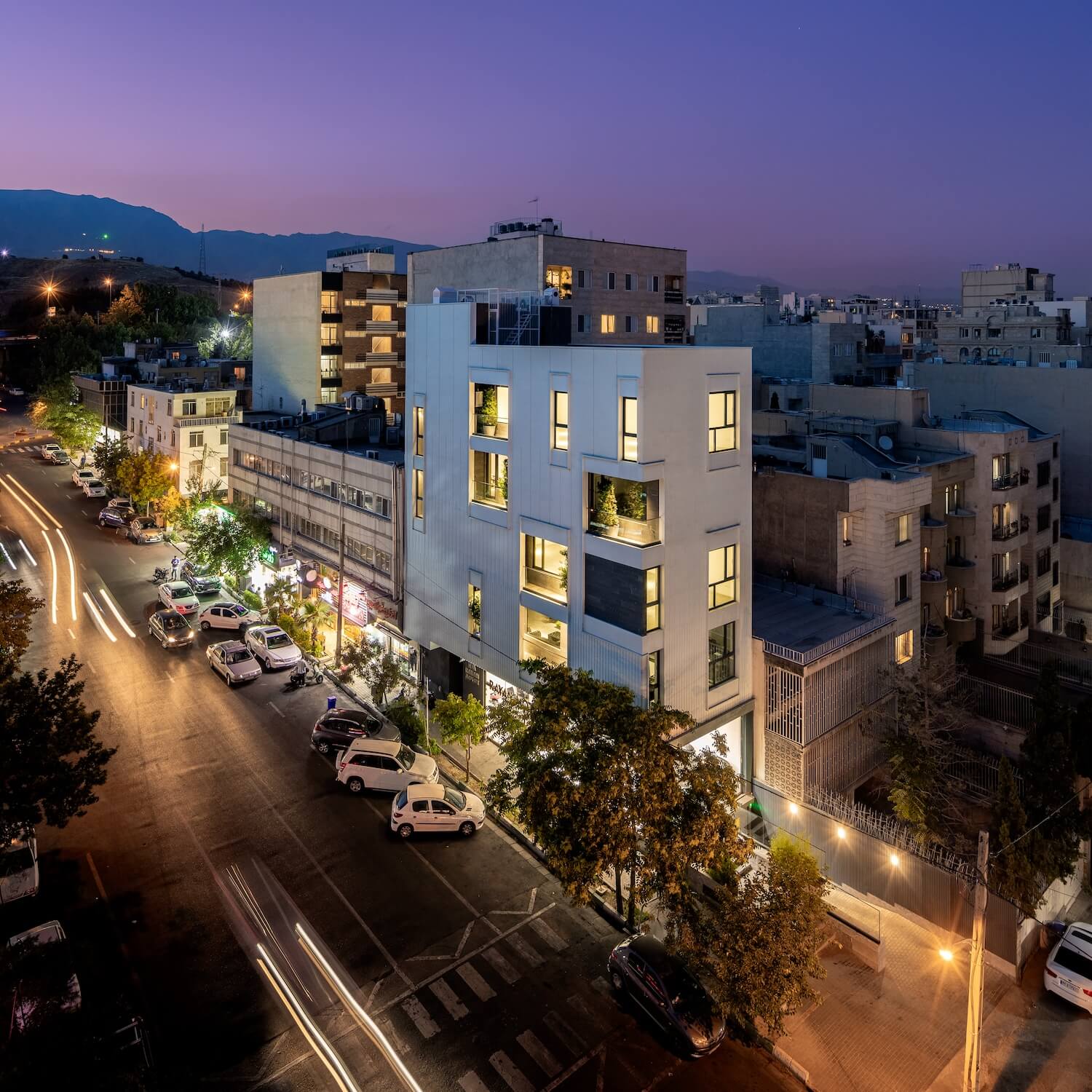
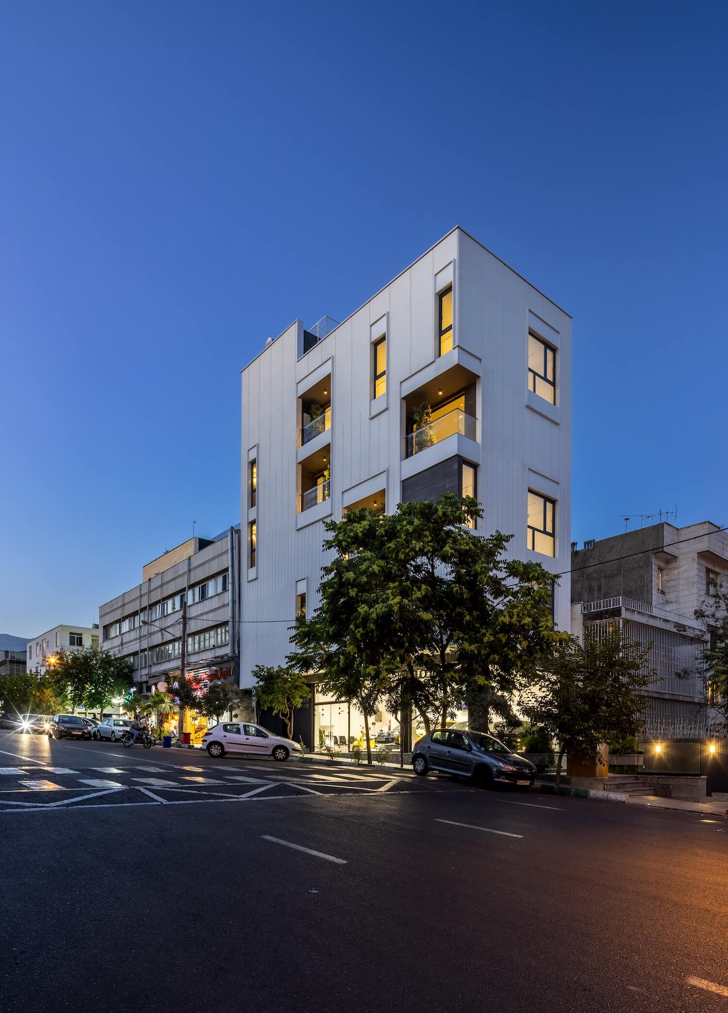
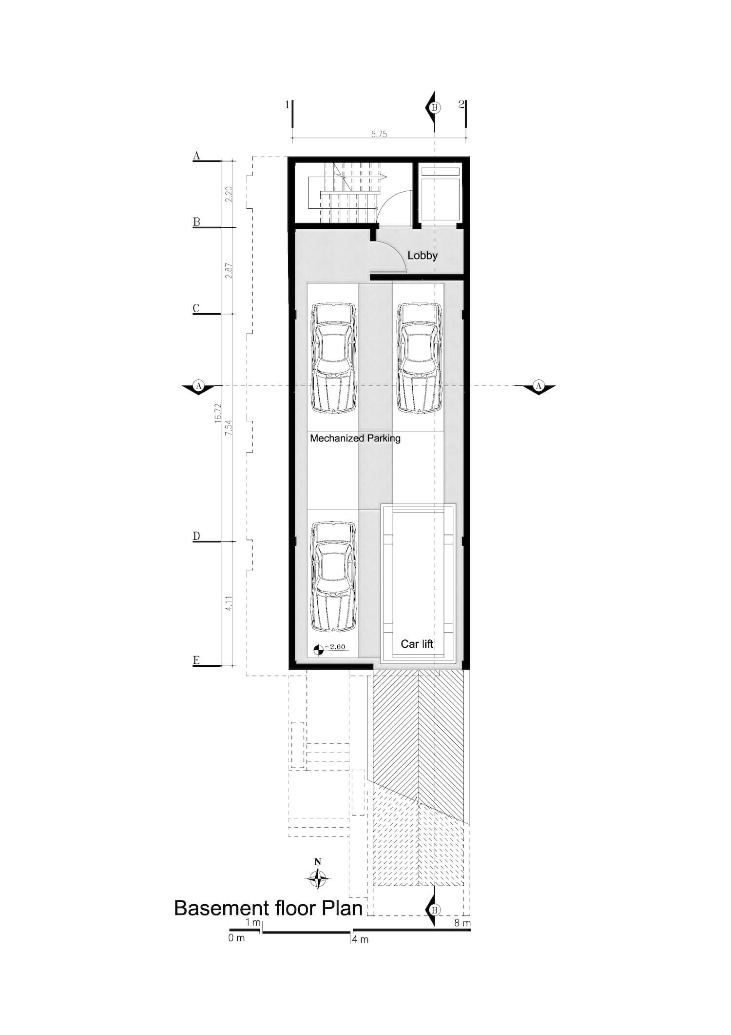
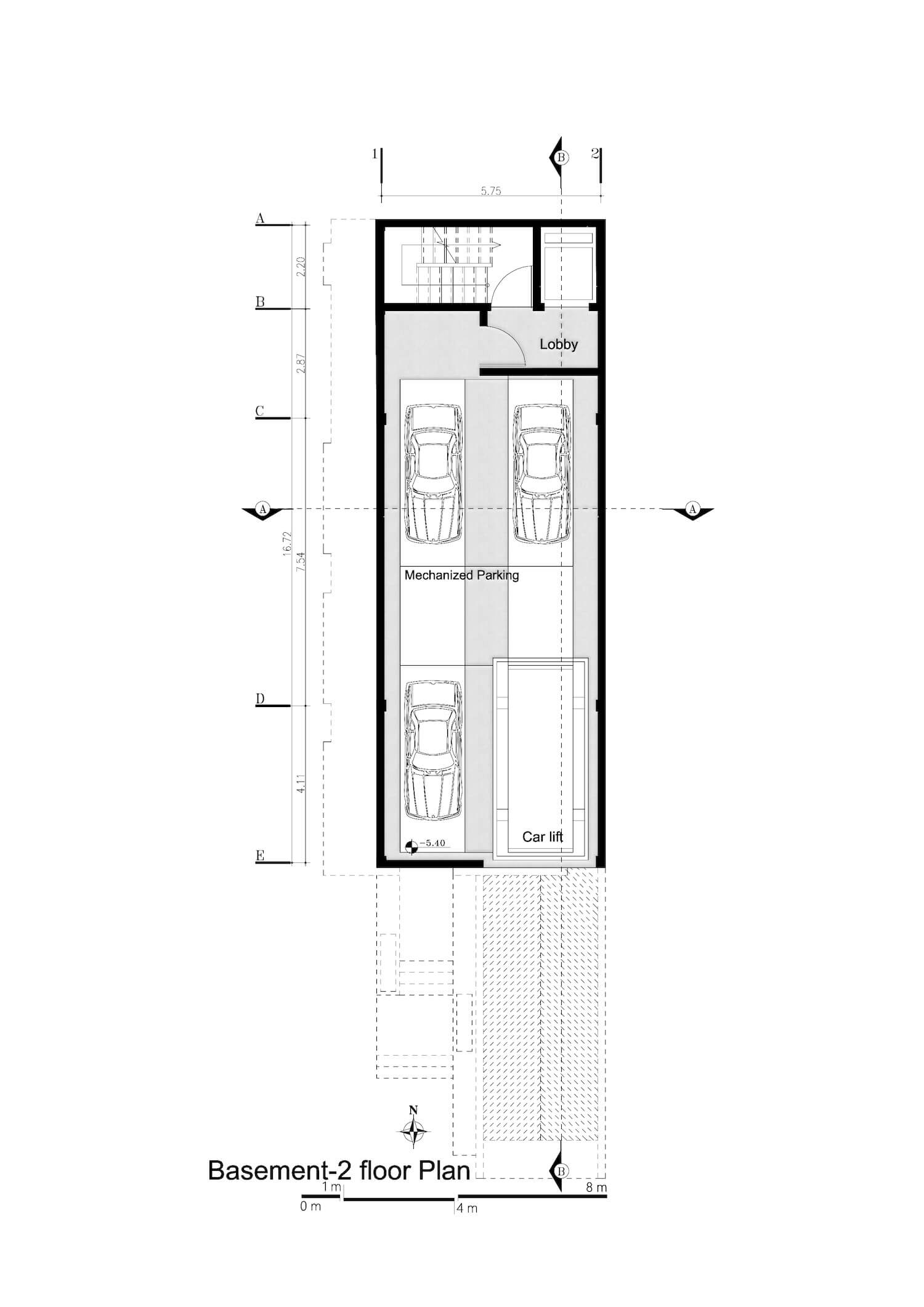
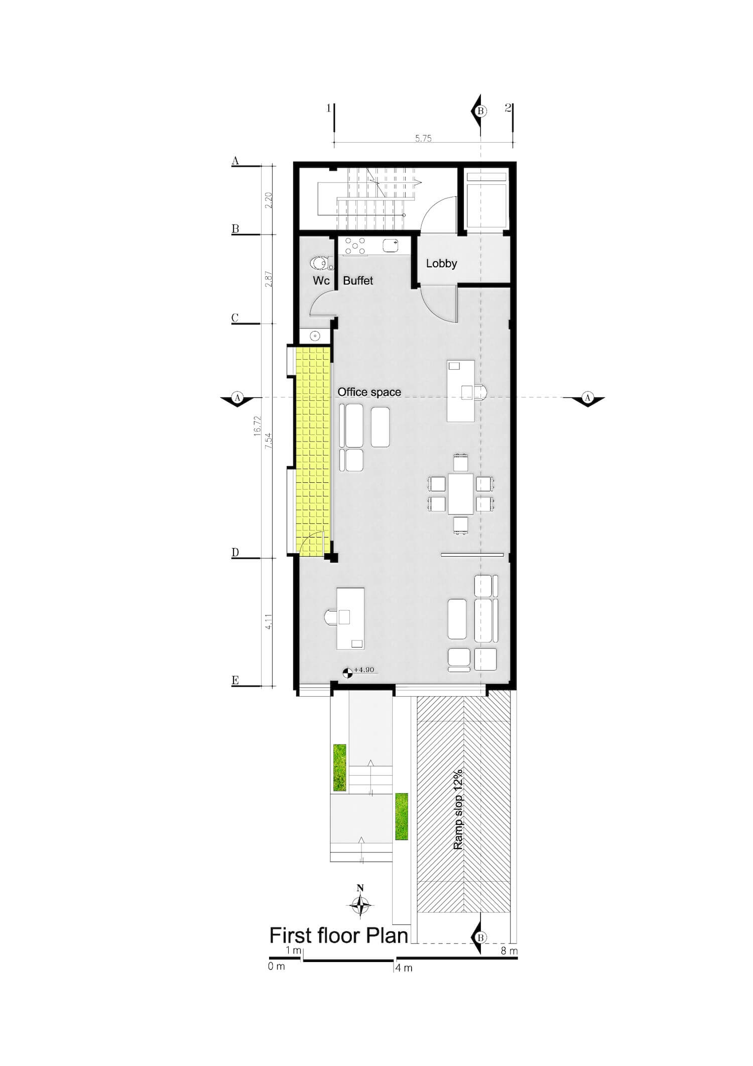
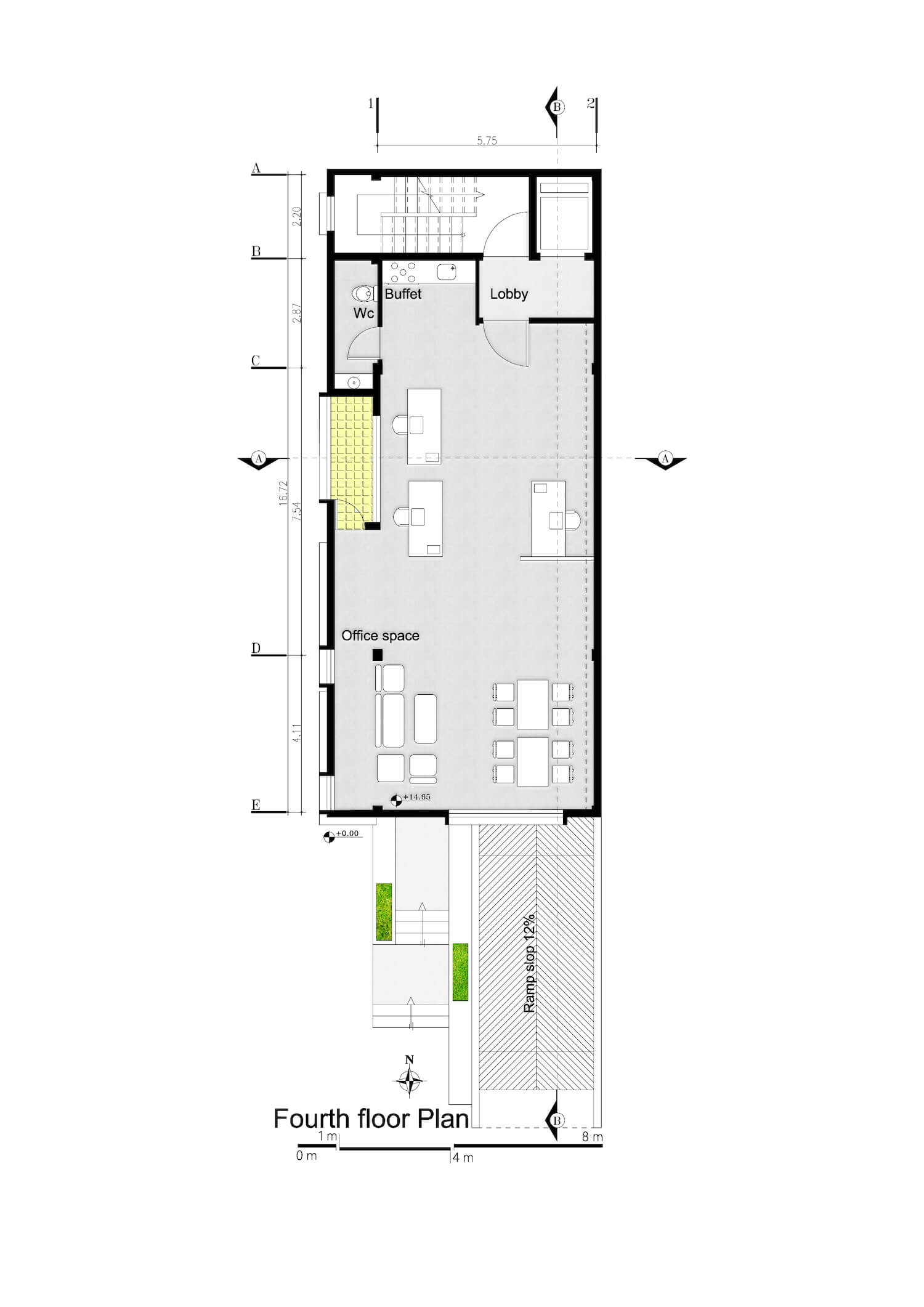
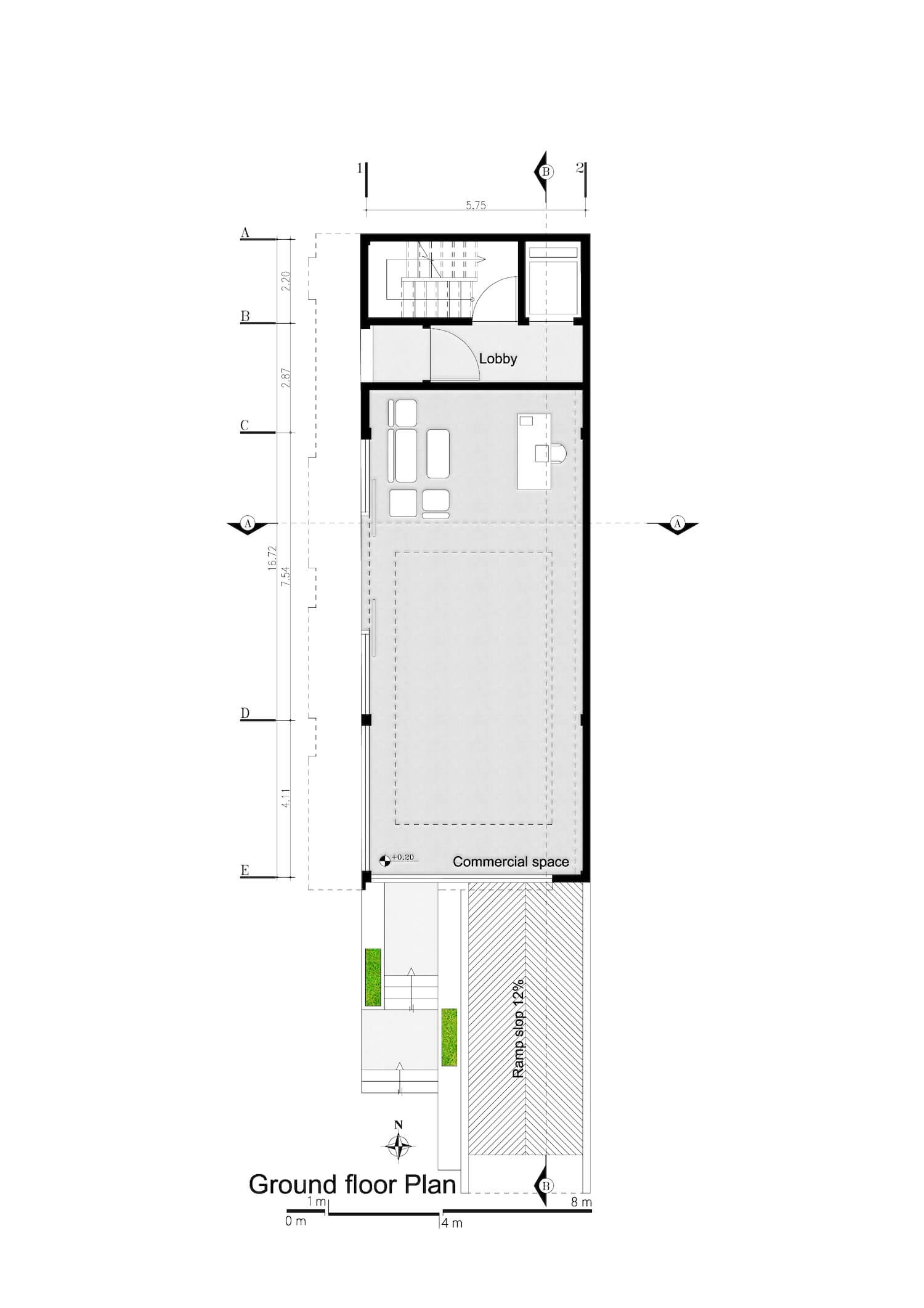
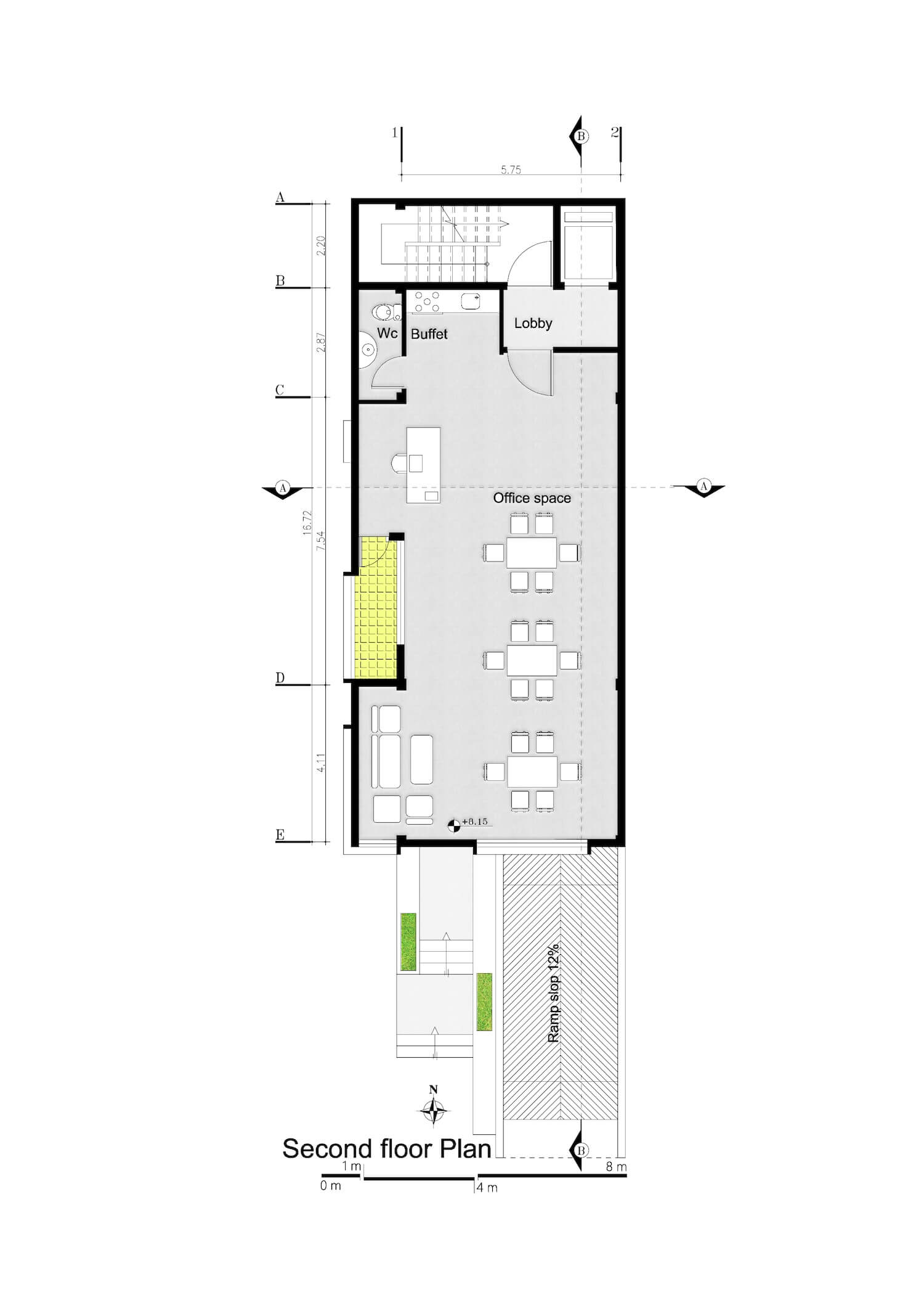
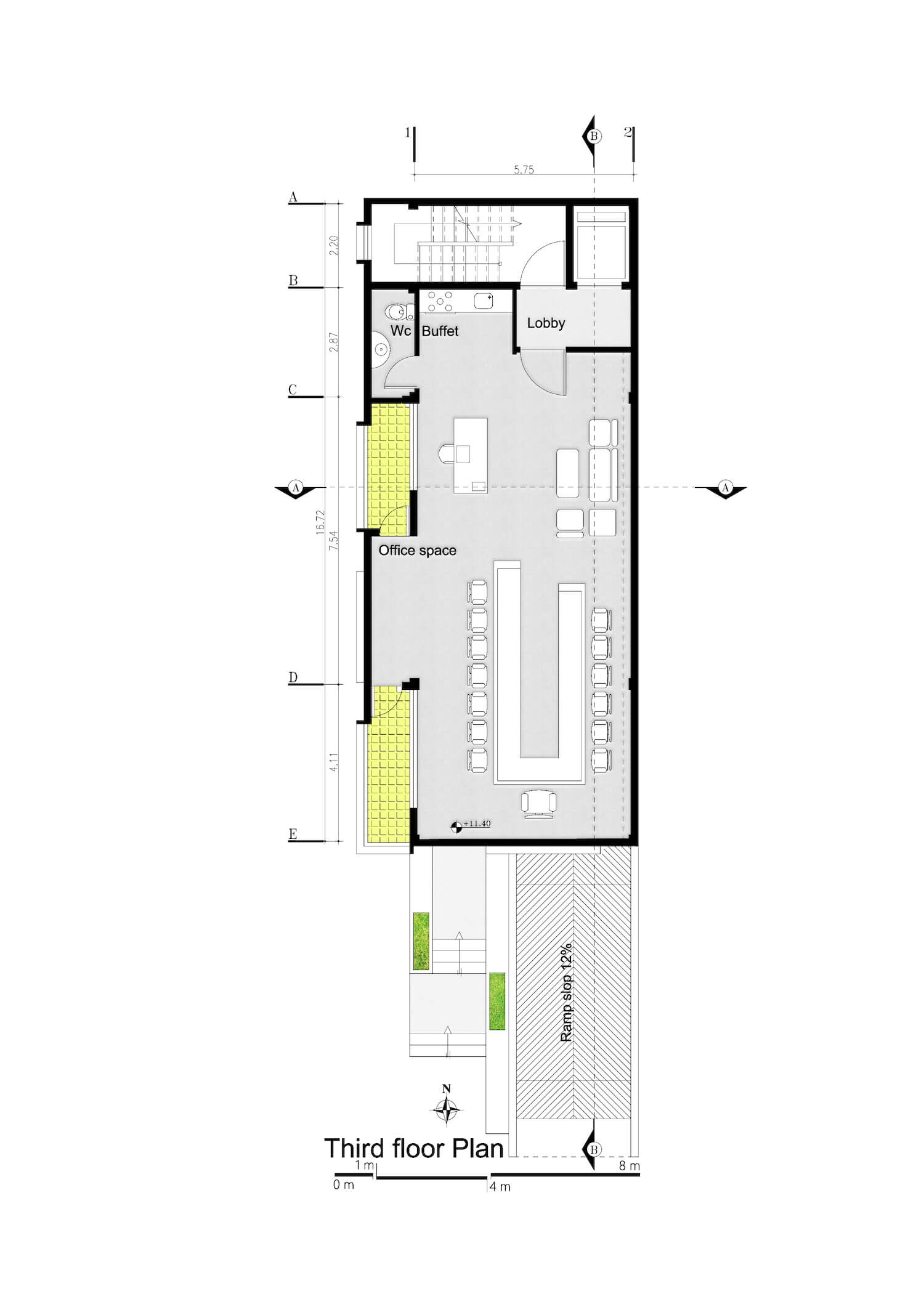
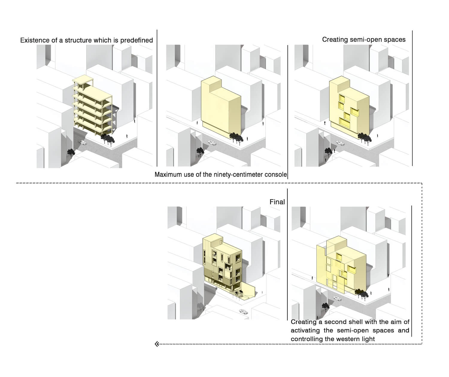
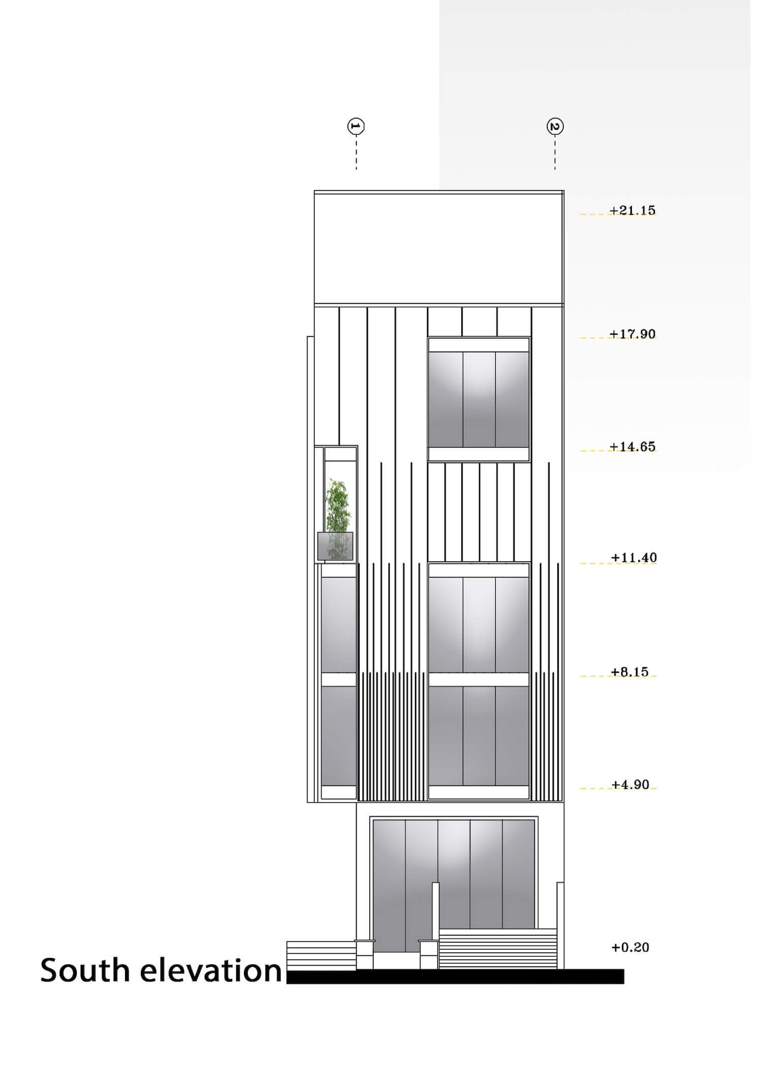
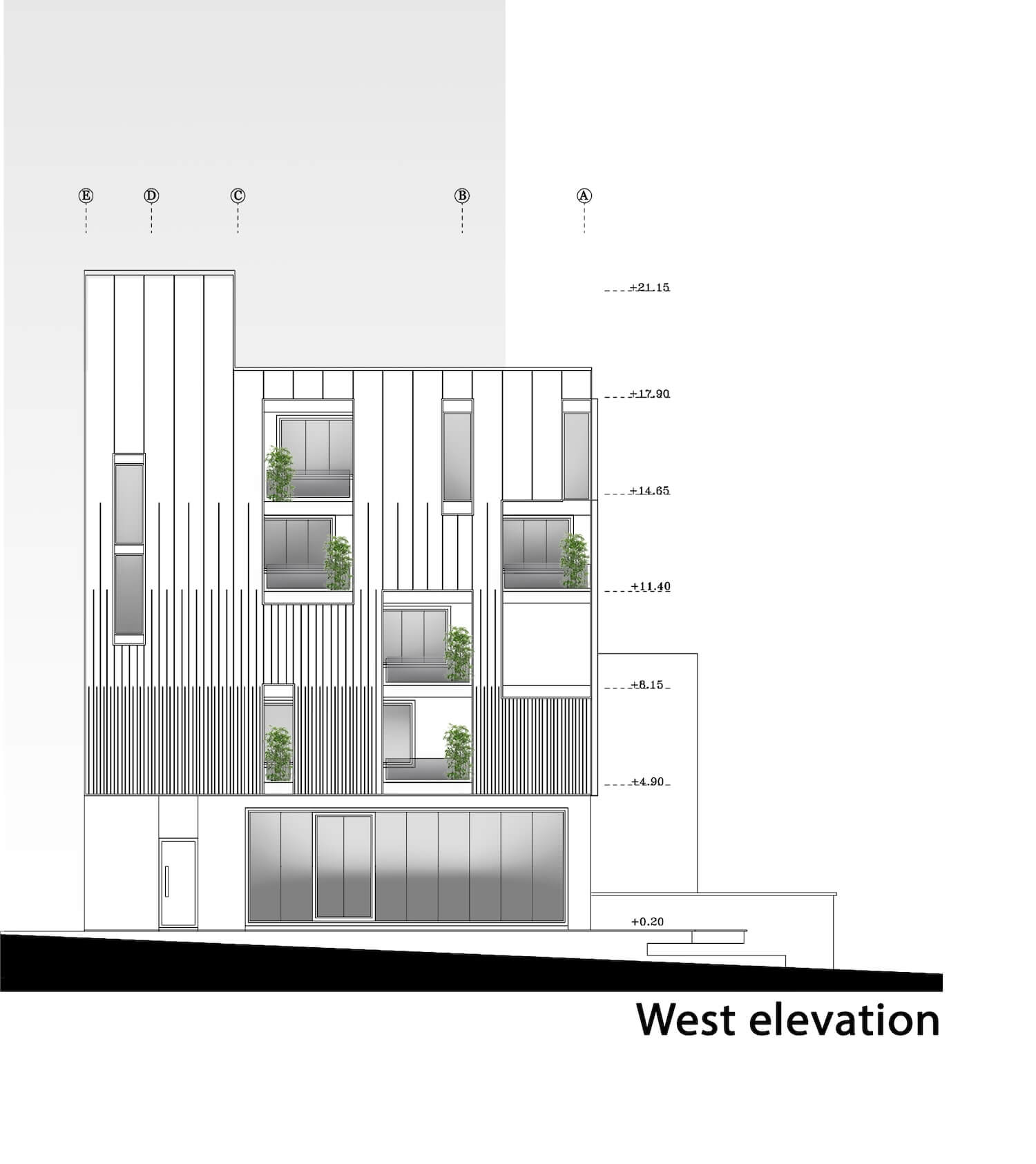
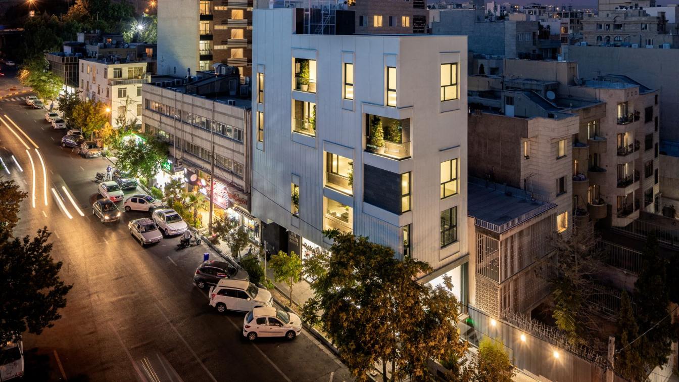
Mohat Office: Nilufar, a commercial/office project, was assigned to us after its structure had been completed. During our initial visit to the project site, we encountered certain limitations that led us to consider the project as an opportunity to demonstrate responsible single-aspect architecture and its impact on the city's landscape. These limitations were as follows:The structure had already been predetermined.
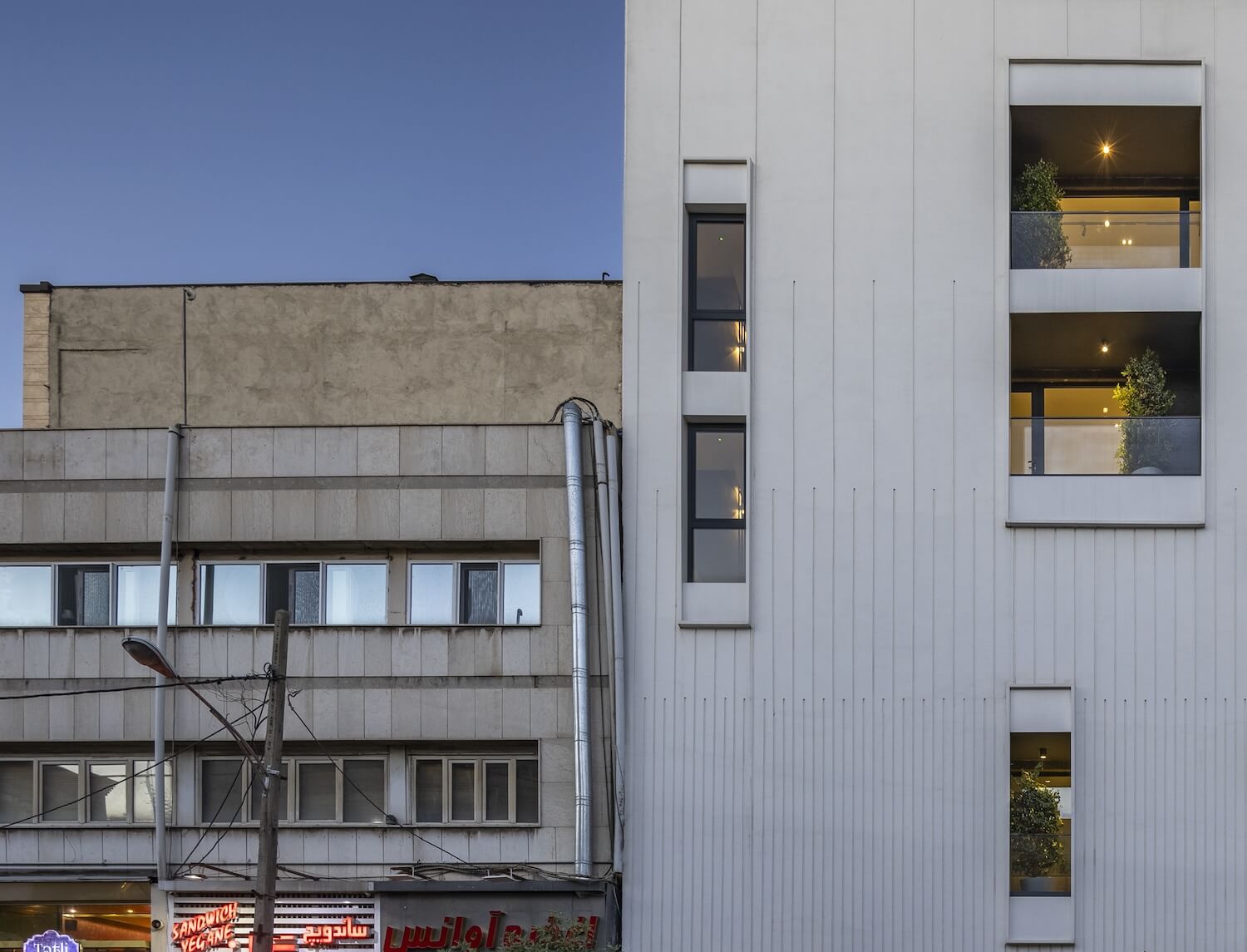
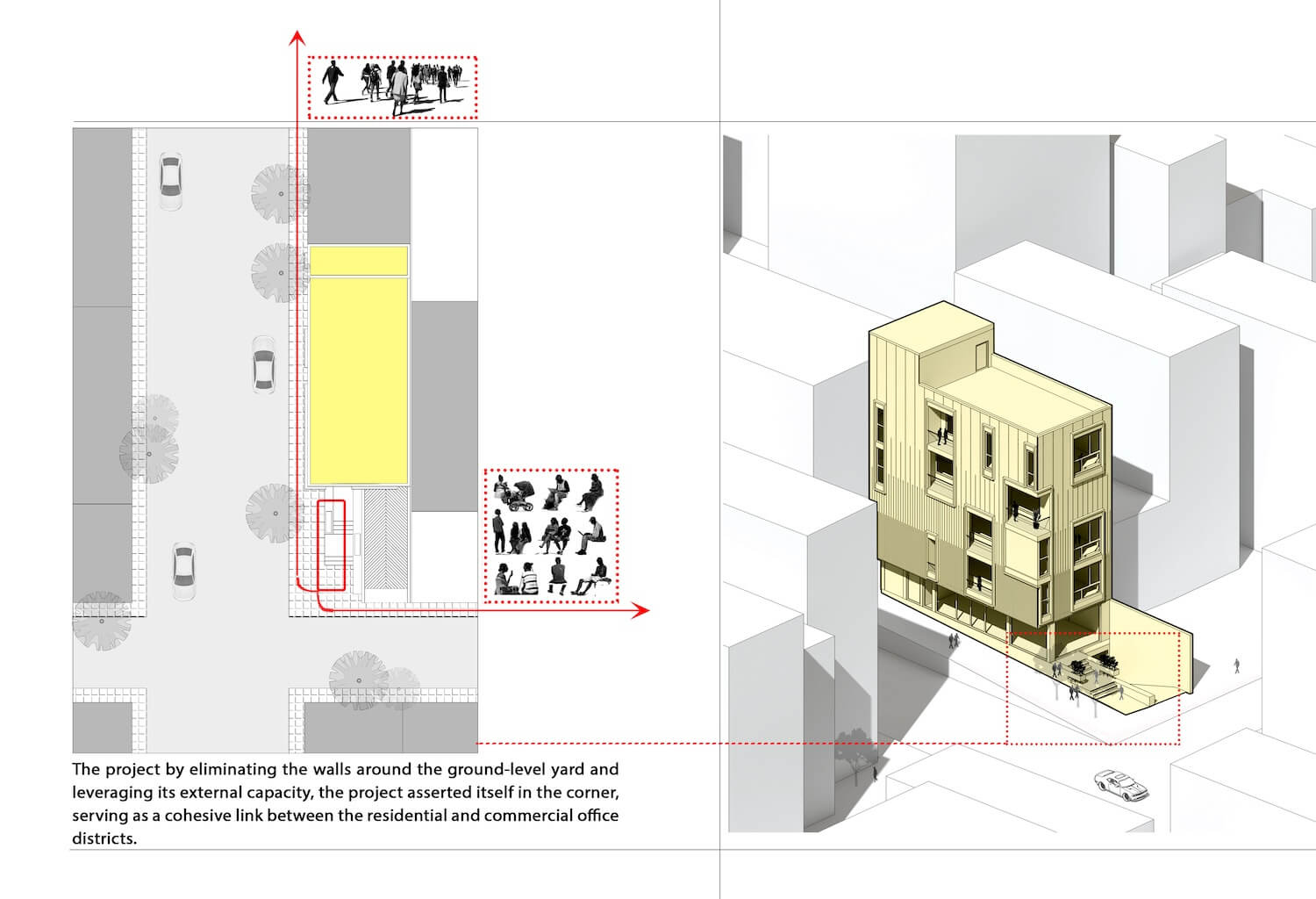
1. The project site was situated in a narrow area between a commercial office district and a residential zone.
2. The project area was relatively small in width.
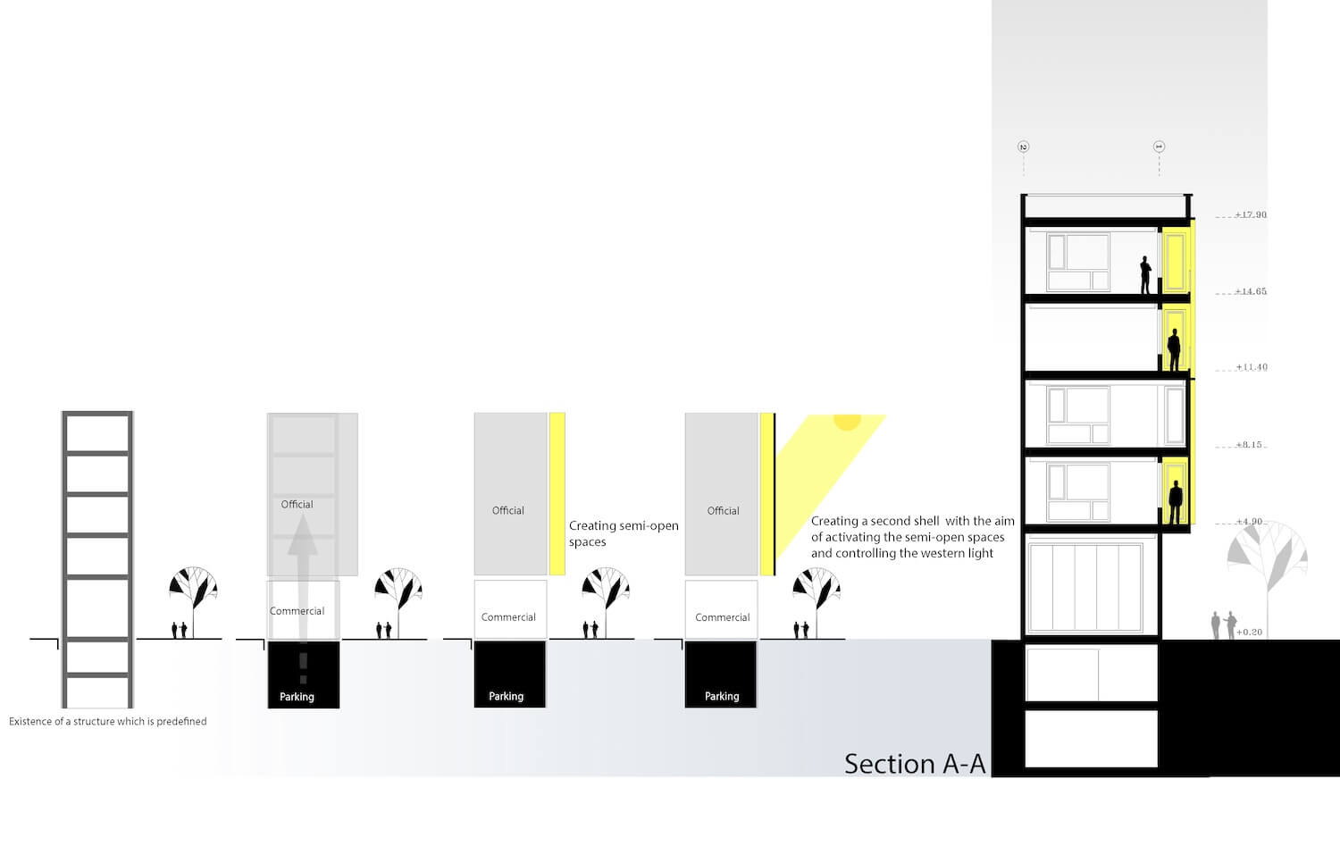
3. The primary building shell was exposed to the western sunlight.
4. The client emphasized maximizing the use of available space for construction and disregarding semi-open areas.
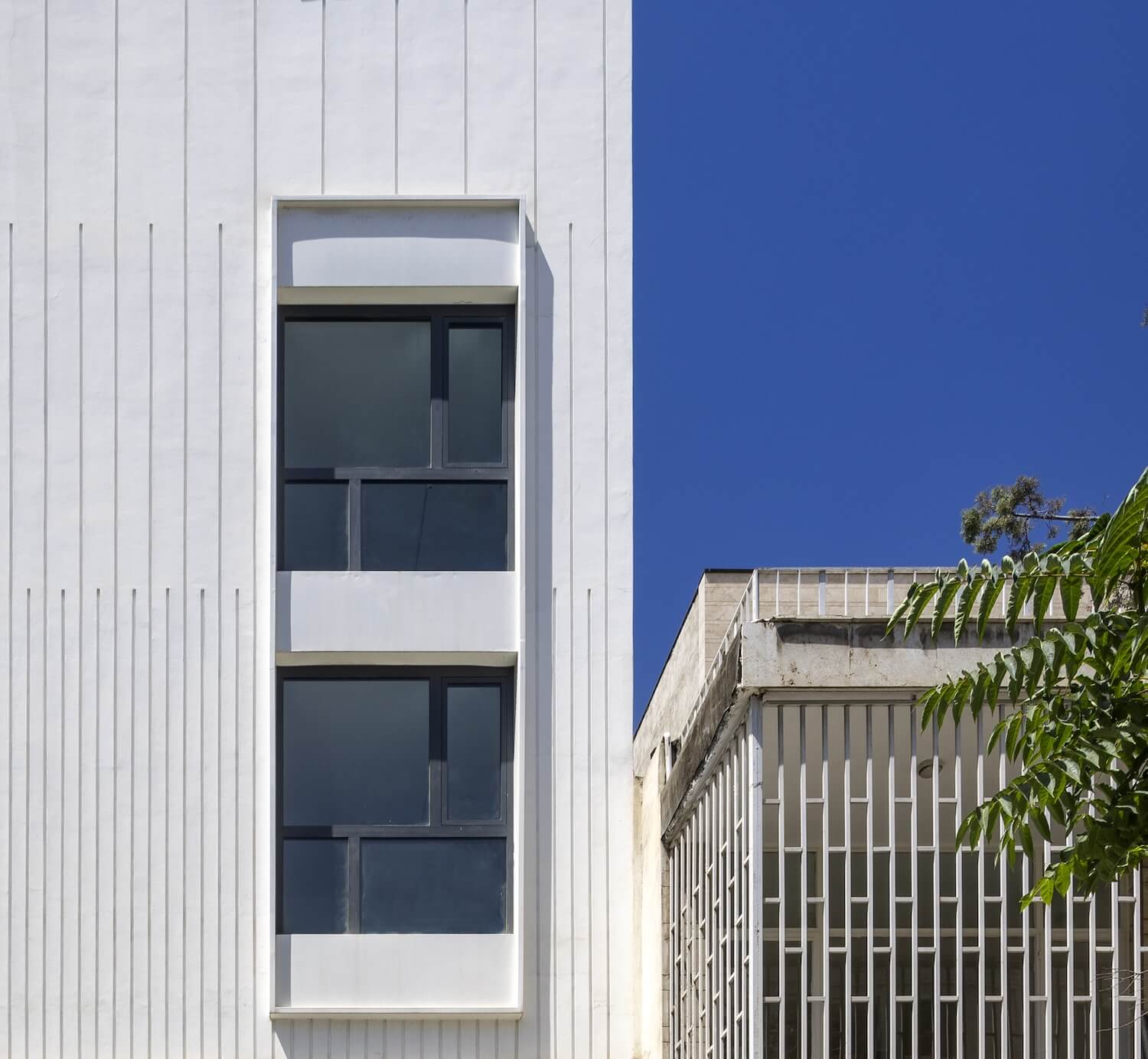
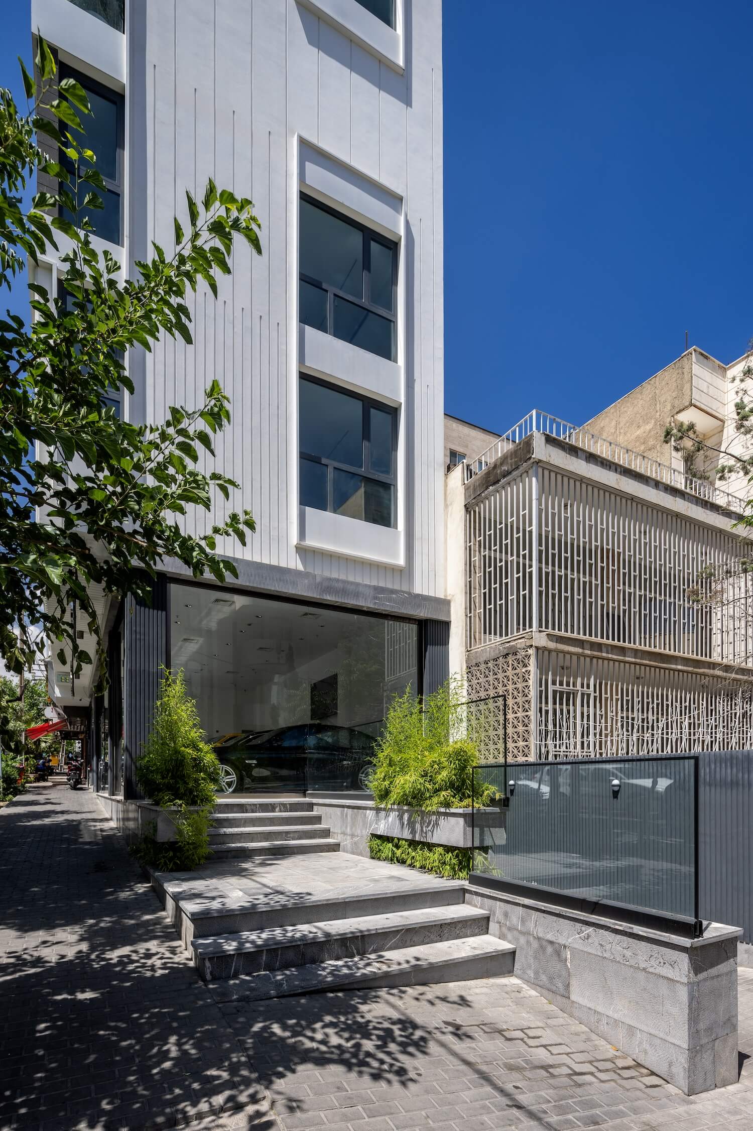
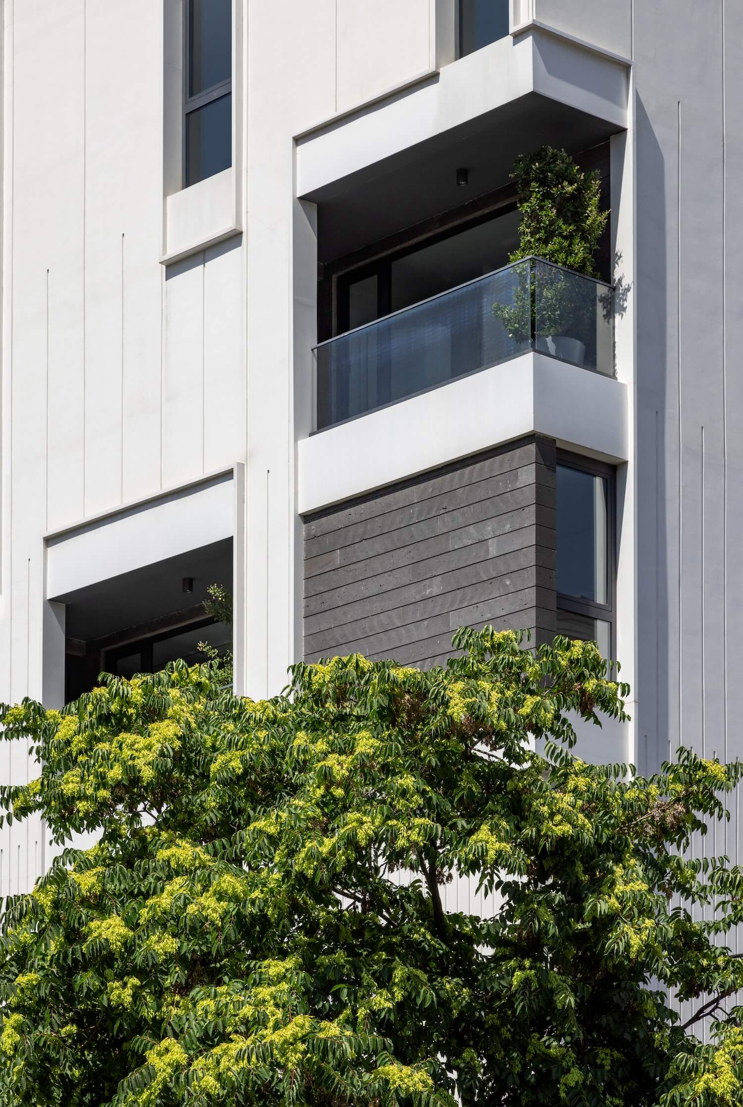
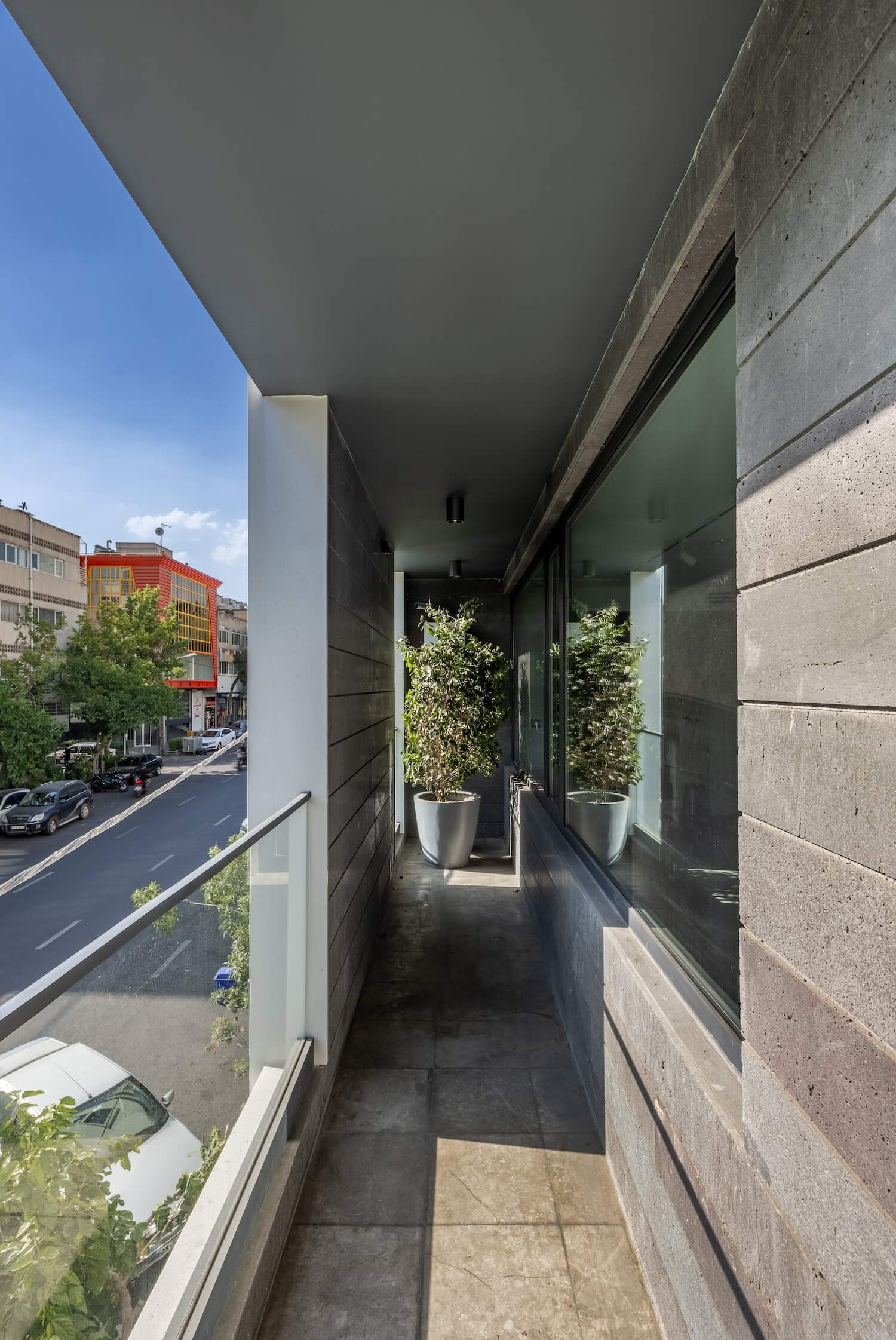
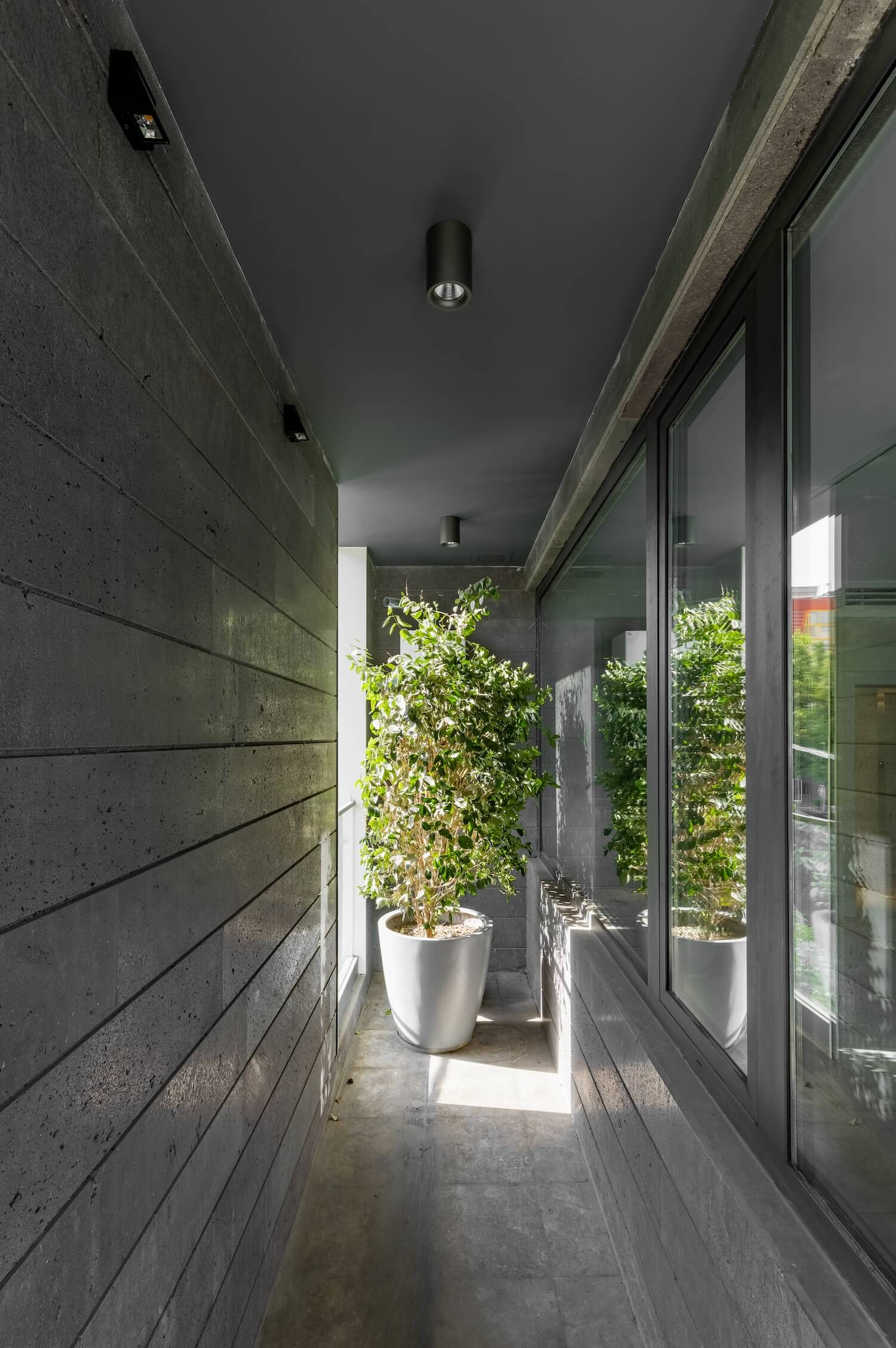
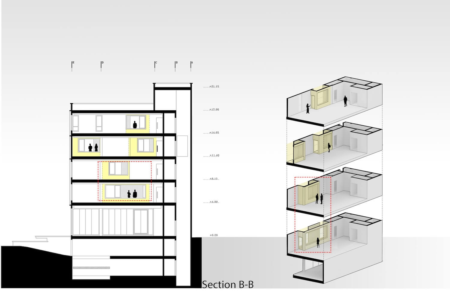
Given these constraints, our goal was to elevate the project beyond merely designing the facade to a solution that effectively utilized and incorporated spaces. This approach ensured that the project harmonized with the city's overall aesthetic and integrated well with both the adjacent residential district and its inhabitants. One key feature available to us was a 90cm corbelling in the western section. We designed the project with two shells, designating the outer shell as a dynamic and interconnected structure that interacted with the western sector.
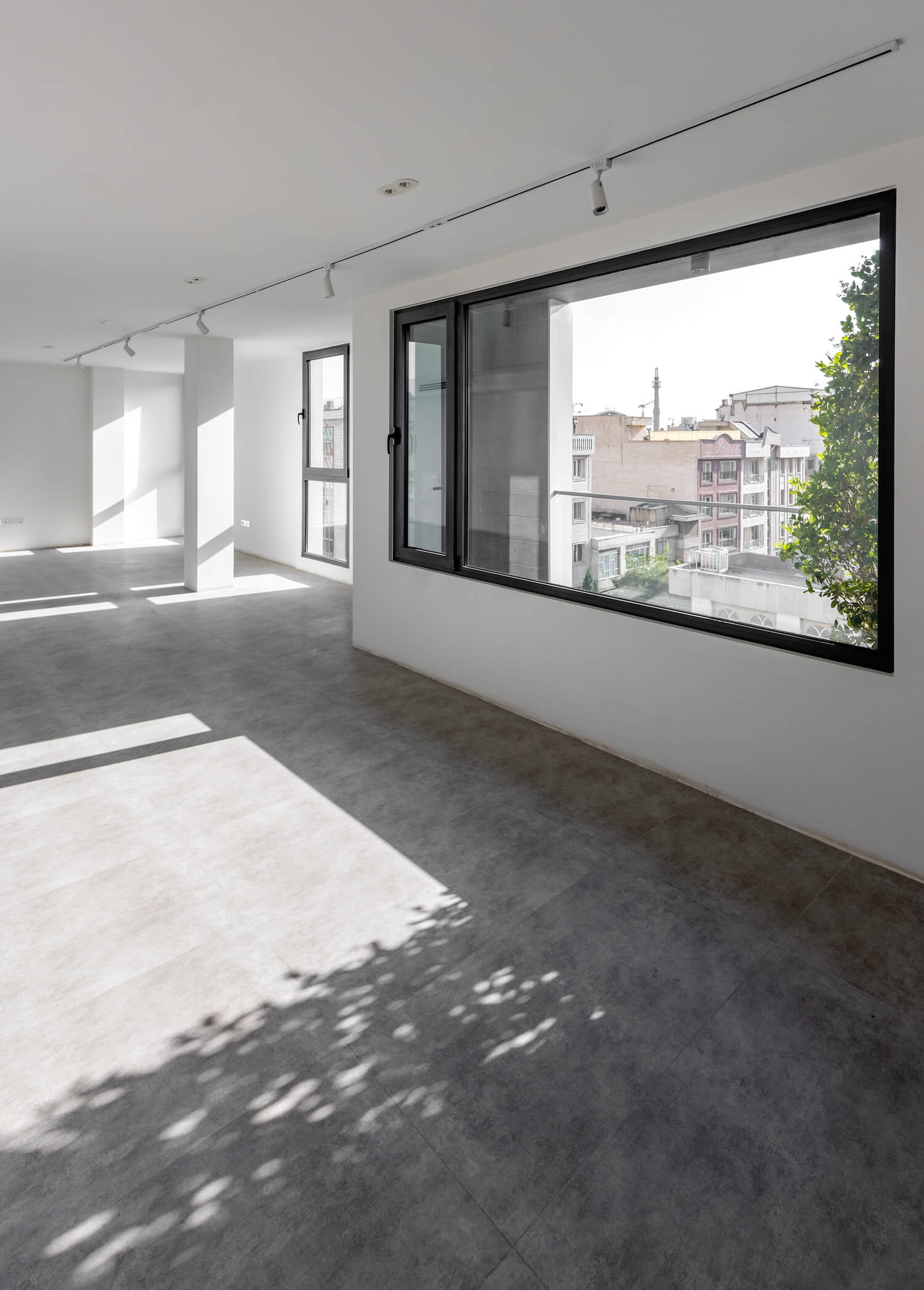
This arrangement allowed for optimal utilization of semi-open spaces for ventilation and facilitated controlled exposure to western sunlight within the interior areas. Additionally, by eliminating the walls around the ground-level yard and leveraging its external capacity, the project asserted itself in the corner, serving as a cohesive link between the residential and commercial office districts.
