EskewDumezRipple: The Bruce Museum is a regional cultural institution located in Greenwich, Connecticut with a multi-disciplinary collection and exhibition program bringing together art, science, and natural history. In 2014, following a national design competition, the Bruce embarked on a journey to revitalize its campus to carry the institution into the future. Following the competition, the design team led a rigorous initial programming study to dig deep into the needs of the museum and support its ability to serve as a community resource.
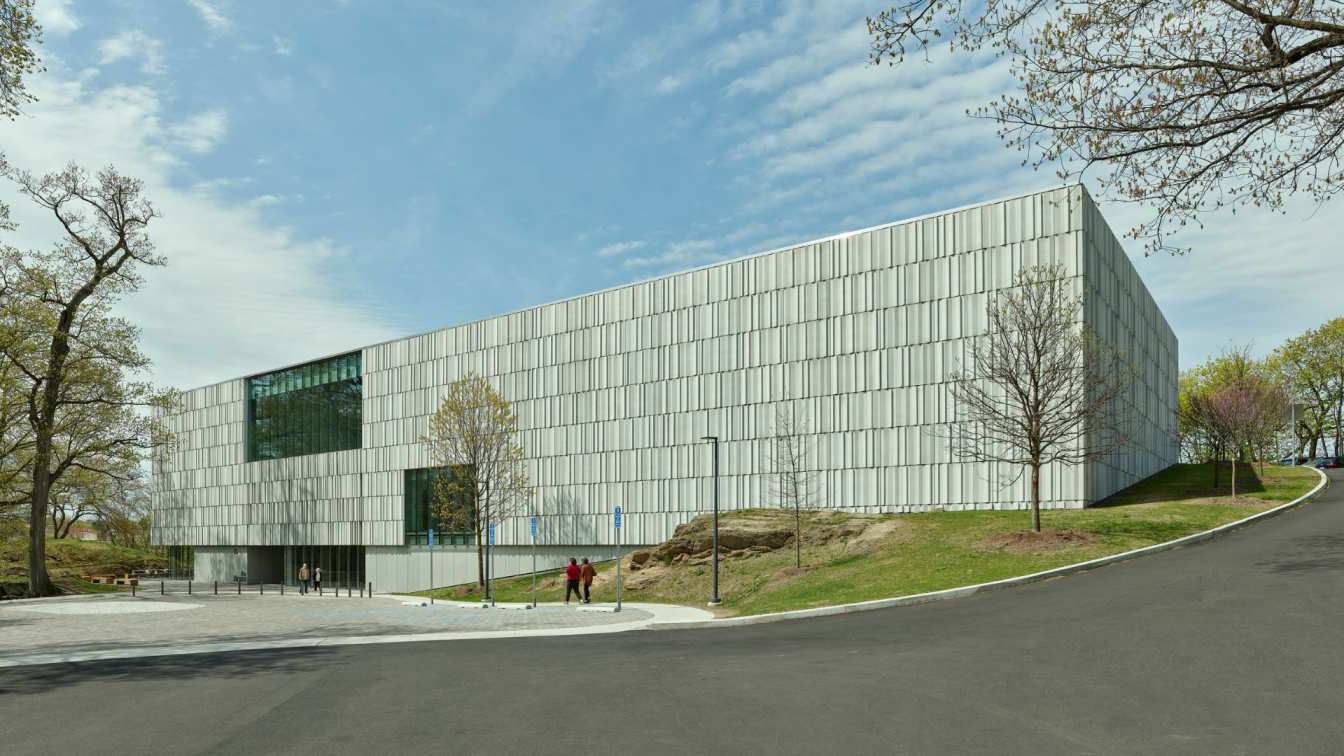
The resulting project is a comprehensive renovation of the existing museum’s 32,500-square-foot structure along with a 42,000-square-foot addition, providing permanent and changing gallery space, expanded collection storage, and a new public entrance lobby and lecture hall for the museum. Comprising three floors, the expansion more than doubles the existing area of the facility and creates a welcoming visitor experience with clear circulation, generous galleries, and sufficient exhibition, storage, and archival spaces for the Museum’s growing collection.
The new design addresses the problematic visitor wayfinding of the previous museum design. Prior to this expansion, the museum entry faced north towards noisy Interstate-95, located at the top of a hill and hidden from view of visitors arriving to the site. The new design reorientates the entrance to face the adjoining Bruce Park, providing visitors with an immersive landscape experience prior to their entrance into the museum. Because the addition primarily stands apart from the existing house, the design team worked to develop a courtyard space between the two structures, one that serves to extend the park into the footprint of the museum to orient visitors as they move throughout the space.

Since opening, the museum’s new spaces have quickly become a catalyst for diverse forms of engagement. The double height lobby, café and gift shop seamlessly merge to create an open and free-flowing public space. The new lecture hall has become a hub for community programming, celebratory gatherings, and public lectures and receptions. New changing and permanent galleries enable the museum to host new, ambitious exhibitions and provide opportunities for engagement and education.
“We can host the community in a way we’ve never been able to before,” Bruce Museum Executive Director Robert Wolterstorff says. “In the past, we had no permanent collections galleries.” By adding these spaces, the museum is able to showcase works that local collectors have generously donated, providing the impetus for other collectors to do the same. Natural daylighting was fundamental to the design concept. Openings in the façade suffuse the interior spaces with light, gradually receding in intensity as one moves into the collection galleries.
Drawing inspiration from the unique geology of its site and surrounding region, the design team developed a delicately striated façade of cast stone and glass inspired by stone quarries found along the Connecticut coast. This exterior, animated by the play of light across the façade, dramatically changes appearance as the sun traverses the sky over the course of the day and time of year.

Project History
The Bruce Museum was originally built as a private home in 1853. An imposing stone structure built in the Victorian style, the house was sited high on a hill overlooking Greenwich Harbor. In 1908, owner Robert Moffat Bruce deeded the property to the Town of Greenwich, stipulating that it be used as “a natural history, historical, and art museum for the use and benefit of the public.” The first exhibition ever at the Bruce Museum took place in 1912 and featured works by local artists known as the Greenwich Society of Artists. Over the ensuing decades, the museum functioned primarily as a natural history museum, with dioramas, specimens and geologic artifacts as the focus of the collection.
In the 1950s, Interstate-95 was built immediately adjacent to the museum front door, fundamentally altering the experience of the museum and its ability to relate to the surrounding community—in essence severing it from its context. In 1993, the museum undertook an expansion and renovation that resulted in the previous 33,000 square foot structure. While built on time and budget, the project was modest in scope, and the outcome was not one that could sustain the museum into the future. In 1995, the Bruce hired its first museum director with an art or art history background, who began to raise its profile in the community as a place for both art and science education. During his tenure, the museum received accreditation from the American Association of Museums and became the second most visited art museum in Connecticut, after the Wadsworth Atheneum.
Even so, the existing museum lacked adequate exhibition space for both art and science—containing a very small gallery for changing science exhibitions and no permanent art galleries, even as art collectors in the local community were promising gifts to the museum. Public spaces for gathering were limited, with no café or food service to extend visitors stay. Additional education classrooms and a multi-purpose lecture hall were needed to support the museum’s outreach to students and the community.

The new Bruce expansion has more than doubled the size of the museum. Emphasizing new education spaces, places for public gathering, and exhibition galleries, these spaces were prioritized over program deemed less critical to the Bruce’s mission.
Today, the Bruce is a beacon of culture and exploration. Beyond its nominal role as a museum—a place for appreciating and understanding art and science—the museum has hosted community gatherings and lectures, visiting writer talks, a resurrection of its annual outdoor crafts festival, and features a regularly rotating schedule of educational programming for K-12 and university students alike.
The design of the new Bruce represents a physical commitment by the museum to more fully serve the community of which it is a part. In this, the museum serves as a welcoming “beacon on the hill,” a place for a diverse array of users to visit and appreciate all it has to offer—a world-class destination for culture, education and community.

Design for Integration
At the outset of the project, the client set out several strategic objectives:
1. Community: Create a cultural center that serves as a regional magnet and create a new, more welcoming public and community presence.
2. Exhibitions: Provide state-of-the-art galleries to exhibit world-class science and art exhibitions at once.
3. Education: Provide greatly expanded educational programs that serve diverse audiences and create new and renovated spaces that support both art and science education.
4. Sustainability: Provide new revenue opportunities to ensure the new museum is sustainable into the future and reduce operational costs by improving building infrastructure.
The Bruce’s concept is unique in the museum world, distinct when compared to an organization like the Smithsonian, where buildings exploring different topics exist under the umbrella of the institution but are housed in separate facilities. In short, the Bruce bills itself as the place “where art meets science,” and combines the two under one roof, with unique opportunities for curation and interaction between galleries dedicated to each. Today, revitalized galleries provide expanded space for hosting both art and science exhibitions. The art collection now includes pieces by Pablo Picasso, Henri Matisse, Pierre-Auguste Renoir and Paul Cézanne, American painters such as John Singer Sargent, Winslow Homer and Andrew Wyeth, as well as the last painting attributed to Edward Hopper. On opening weekend, its changing galleries featured a rich exhibit of contemporary Black Art in America, and a career retrospective on the American painter Lois Dodd.

A renewed home for its science exhibits and instruction space were simultaneous additions. The Bruce maintains a world-class collection of minerals and gems, and permanent exhibits dedicated to the rich life of penguins and dinosaurs. Educationally, the museum already hosted around 25,000 student visits per year for science education. With its new facility, the Bruce expects to double that number.
In designing a project that would spark wonder in visitors, the team naturally drew inspiration from the museum’s surroundings, both the landscape of its site with its exposed stone outcroppings and the material quality of the historic stone house. The design concept melds two precedents using stone as a common denominator—coined “quarry” and “lace.” First, the stone quarries that dot the regional landscape became the precept from which to “carve” the monolithic massing of the building. At night, these cut apertures glow from within, providing a clear beacon to the community of the museum’s presence.
Second, fences built by New England farmers as they cleared their fields of rocks and boulders served as the inspiration for creating voids in the façade to filter light into the interior in a surprising and unexpected way. As these differently sized and shaped stones were stacked together, the resulting openness led to them being referred to as “lace walls.” The design reinterprets these two local precedents to create a rich interplay of texture and contrast across the façade. The faceted texture of the precast panels was carefully orchestrated to create striking effects of light and shadow across the building, both day and night.

Design for Equitable Communities
Museums are vital community infrastructure. In turn, this project became as much an anthropological exercise as an architectural one. The team pored over the history of the museum, its humble beginnings as the former home of Robert Bruce and its donation to the town under the stipulation that it be used as “a natural history, historical, and art museum for the use and benefit of the public.”
The team looked at what the museum had become in its modern incarnation, serving the public through local and regional outreach, educational offerings, and its unique blend of art and science. And lastly the team looked at what quality of transformation would empower it to continue serving the public in this capacity, holding numerous, productive conversations about the nature of spaces within and how a museum’s aesthetic might be inspired by the landscape that surrounds it. Today the Bruce is able to play host to a wide array of community programming. The expansion enabled the Bruce to allocate a large portion of its previous wing to dedicate educational outreach. Partnerships with nearby schools and universities have been strengthened to foster a deep understanding of art, science and natural history.
Design for Ecosystem
The Bruce Museum, located within the free and public Bruce Park, exemplifies the seamless integration of architecture with natural landscape. As conscientious stewards of the environment, the design team created a symbiotic relationship between the museum and its surrounding ecosystem. The addition was mindfully designed to orient the new entrance towards neighboring Bruce Park, inviting visitors on an immersive journey through nature before stepping into the museum.
Within, the connection remains. A courtyard between the existing and new building mirrors the park's verdant beauty, a captured space the design team coined a "diorama"—an extension of the park into the museum. This green space unfolds elegantly as one enters the lobby, with a sweeping stairway tracing the hill's natural slope to the gallery level above. The result is a design that allows visitors to engage with the regional ecosystem, fostering a profound sense of place.

In efforts to nurture regional habitat restoration, the Bruce integrates native flora in its grounds, bolstering local biodiversity, providing habitats for local wildlife, and playing a key role in the ecological health of the area over time—a living example of the Bruce’s mission to showcase the intricate relationship between natural sciences and the arts.
Design for Water
Careful selection of regional vegetation effectively minimizes water usage, with native plants requiring less irrigation. A thoughtful stormwater management system ensures that 100% of rainwater is collected on-site, preventing runoff and potential negative impacts on neighboring Greenwich Harbor. The design does not just conserve water but also supports the health of the regional watershed. By ensuring that all water falling on the site is absorbed or held on site, the museum contributes to a more sustainable water ecosystem and aligns with principles of responsible water stewardship.
Design for Economy
Naturally, no project is without its hurdles, and the team realized early in the process that a number of scope and budget alignments were required. The design team worked closely with the museum to ensure that, first and foremost, the program needs of the institution would still be met while maintaining the integrity of the initial design concept.
In this case the team refrained from decreasing scope or square footage—those were critical to the museum’s mission—and instead looked to transforming the skin of the building from a natural stone to a cast stone. The architects performed several studies to express this new result, and how it might still relate closely to the original design concept, one celebrating a contextual response, with opportunities to reflect the place and landscape in which the project was built.

Given the museum's siting, strategic decisions were made to leverage the natural landscape and hill. This approach significantly reduced the need for extensive earthwork and excavation, thereby reducing costs. This design strategy minimized disruption to the natural geology, highlighting a project commitment to environmental sensitivity while addressing budget constraints while maintaining a clear design vision.
Design for Energy
The Bruce Museum's energy-efficient design is a testament to forward-thinking strategies marrying aesthetic and performance. A prominent example is the facade's "lace wall"—one of the big architectural moves that functions as a thermally-broken enclosure, thanks to structural thermal isolators. These precast pieces, hung from a stainless-steel frame, maintain an airtight, energy-efficient facade, reducing the museum's overall energy demand.The museum's predicted Energy Use Intensity (EUI) stands at 63, in contrast to an EUI of 182 for similar museums located in the northeast US. This indicates an energy reduction of 65% better than the regional benchmark, demonstrating how the project surpasses building code efficiency standards.
Moreover, the museum employs state-of-the-art, highly energy-efficient air handling units and a dehumidification system. These systems ensure optimal building performance, occupant comfort and enjoyment, all while keeping energy consumption to a minimum. In many of these design interventions, the team not only lowered the museum’s prior energy consumption but also outlined opportunities for continuous performance improvements over its lifetime.

Design for Well-being
The Bruce’s design sought to actively foster health and wellness for all visitors. Its adjacency to Bruce Park offers an active, family-friendly setting, enhanced by new walking trails and strategically placed sculptures. These features incentivize exploration, encourage physical activity, and deepen the connection to the museum's natural setting. The design incorporates an interior courtyard that follows the natural site grade, reinforcing the relationship between architecture and nature. This courtyard bathes various spaces within the museum with beautiful indirect sunlight, providing visitors with a healthy dose of biophilia while illuminating galleries and public spaces. The primary circulation stairs are prioritized and are designed to encourage use, with elevators available but less apparent to visitors upon entry. The unique spatial experience provided by the vertical circulation encourages visitors to utilize the stairs. This design element not only contributes to physical well-being but also enhances the visitor journey through the museum. Further ensuring occupant comfort, the mechanical system uses MERV 14 filters and features gaseous carbon filtration. This system purifies air in all interior spaces, benefiting both art and science collections and the visitors themselves.
Design for Resources
The design for the Bruce demonstrates a careful, informed material selection process and a commitment to minimizing environmental impacts. From the outset, the design team carried out multiple energy modeling and embodied carbon calculations to guide decisions across all phases of the project. The resultant design achieved a significant EUI reduction of 65% better than the regional museum benchmark. An essential tool in the material selection process was a materials red list, which helped the team avoid hazardous substances and materials lacking environmental declarations. This approach not only reduced potential hazards but also supported equitable labor practices in the supply chain. In addition to ensuring health and safety, the museum's design incorporates durable materials, ensuring longevity and thereby reducing resource demand over the project's lifecycle. With these measures, the museum exemplifies the responsible use of resources, reducing negative impacts on the planet, and promoting a sustainable, safe, and healthy built environment.

Design for Change
The Bruce Museum, in its design, places a strong emphasis on adaptability, resilience, and reuse. It acknowledges that the future is fluid and subject to a range of potential changes, from social and economic shifts to environmental transformations. A key part of the museum's resilience strategy lies in its flexible design, which allows for adaptation for future uses or changing market conditions. Galleries and exhibition spaces have been designed to accommodate a variety of uses, supporting a diverse range of exhibitions and events. This flexibility not only adds value to the museum but also ensures its ongoing relevance, regardless of how arts and culture may evolve.
The museum’s sustainable design principles also contribute to its resilience against environmental change. By prioritizing energy efficiency and resource conservation, the museum demonstrates a commitment to minimizing its environmental footprint. These design elements, including energy-efficient systems and sustainable water management, support the museum's passive survivability, ensuring that it can continue operating efficiently in the face of environmental or infrastructure challenges.
Design for Discovery
The Bruce Museum embodies the principles of Design for Discovery, with a design process and outreach efforts that foster long-term relationships and continual learning. The project's architects and stakeholders have established a proactive and ongoing dialogue with both users and operators to ensure the realization of long-term design intentions and improvement of the project's performance over time. An extensive educational outreach program amplifies this dialogue, providing rich opportunities for sharing experiential stories and performance data. This outreach includes regular tours of the museum for local schools and community groups. These tours emphasize the integrated vision of art, science, the natural landscape, and architecture, promoting a sense of discovery and delight among attendees.
In addition to these local efforts, the architectural team has shared lessons learned from the project at a broader level. Through their presentations at the Mid-Atlantic Association of Museums Conference and Building Museums sessions, the team has contributed to the wider museum community's understanding and knowledge.


