Discussions about art in the past focused on advocating for its integration into everyday life. Nowadays, it's widely acknowledged that art plays a crucial role in enhancing the quality of life for individuals. The question now becomes: how can we incorporate art into our daily routines and create individual artistic practices?
Martin Heidegger regarded art as a source of truth. Thus, creating objects with culture is not just about design but also about art.
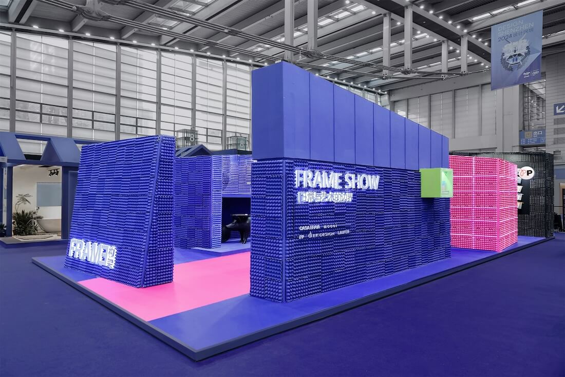
A recent example of this integration was seen at Design Shenzhen, where EK Design collaborated with FRAME to curate a booth centered around the theme of "Show", in partnership with PP Design Gallery, Moooi, CASA BRAVA, and LAUFEN. This collaboration aimed to explore the essence of living an artistic life within the sustainability framework.
1. Crossover of art and life fostered by design
Design is a fundamental medium for introducing art into everyday life. Designers play a pivotal role in bringing art to the masses by translating its essence into tangible products and spaces that are part of our daily lives.
In the collaborative effort between EK Design and FRAME, the key themes of everyday life, art, and sustainability were carefully considered. And they posed three thought-provoking questions:
Can furniture be a work of art?
Can works of art have everyday functions?
What is the collection value of contemporary furniture?
EK Design collaborated with FRAME to create an "Art Show" by using common and sustainable materials. It displayed furniture, ceramic tiles, sanitary ware, and other everyday products, showcasing their avant-garde artistic expressions. The booth design and the curation of exhibits were carefully executed to provide a visually captivating and thought-provoking experience for visitors.
Departing from conventional exhibitions where visitors select among rows of displayed products and furniture, this exhibition brought all furniture to life by presenting the design concept of a "Runway Show". The innovative concept allowed furniture to transcend its static nature and become imbued with personality and interactivity.
As visitors navigate through the exhibition space, they are immersed in an ambiance reminiscent of a runway show, where furniture appeared sentient and responsive to their presence. Though stationary, the exhibits seemed like an audience, calmly taking note of every gesture and expression of the individuals, as if they can understand the visitors' preferences and interests.This concept not only added an element of fun and engagement to the exhibition but also provided a deeper understanding of the design concepts and craftsmanship behind each piece of furniture.
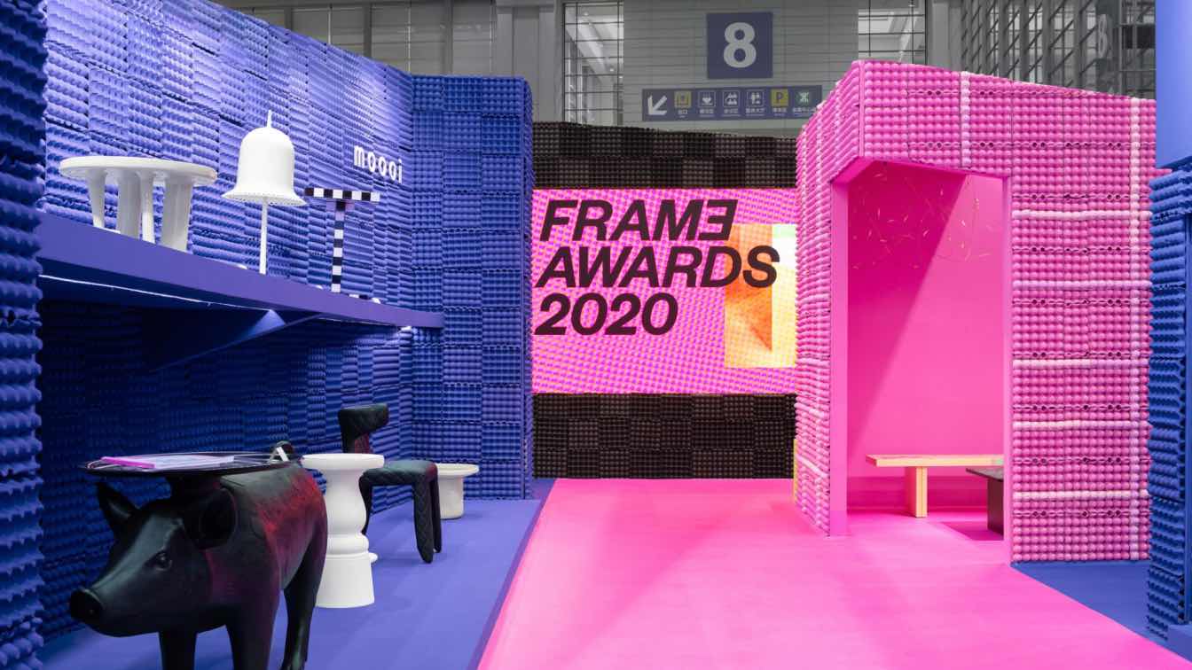
The exhibition evokes a novel "dialogue" between the visitors and the furniture. In this show, visitors were invited to walk on the striking pink stage that ran through the booth, exchanging the role of visitors and exhibits.

During the exhibition, Marcel Wanders, the founder of Moooi, visited the booth and shared his perspective on creation. He emphasized that the value of creative works goes beyond economic value and includes the impact on people's lives, happening to coincide with Martin Heidegger's view of art as a source of truth. The bold, playful and artistic Moooi products undoubtedly inspired the design of the exhibition booth.
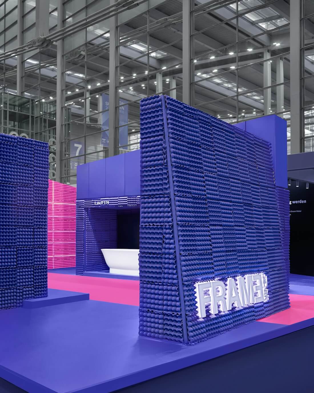
The exhibition sparked lively discussions among visitors, not only because of the exquisite exhibits but also the materiality of the booth, which was made of paper egg trays commonly seen in daily life.
Under the trend of art creation using recycled materials, the use of paper egg trays responded to sustainability and showed an artistic exploration of everyday materials. It inspired and encouraged people to utilize materials efficiently and make the most of the things to be abandoned.
Despite a limited design timeframe, EK Design intended to create distinctive features in the exhibition space using egg trays, which not only embraced sustainability but also sparked industry reflection. By spraying bold colors on egg trays and subtly combining structural patterns of their front and back sides, the design team created a distinctive texture on the walls, resulting in a strong visual impact.
Additionally, this "show"-themed exhibition space featured a bold color scheme, and the products on display were given a special role—as silent spectators, focusing on visitor behaviors.
The deliberate choice of black-and-white exhibits aimed to form a contrast and highlight the visitors as the focus. The low-key colors of furniture were chosen to emphasize "human behaviors". As a result, the furniture on display became an indispensable yet unassuming part of the show.
The theme colors were a result of the design team's step-by-step analysis and deduction. Pink aligns with the brand colors of PP Design Gallery and FRAME, as well as the personal preferences of the design team. Furthermore, pink is widely recognized as a feminine color, while blue is often associated with masculinity. Additionally, black is used in combination with the screen to provide a neutral setting.
Three distinct volumes in blue, pink, and black, were arranged along the "runway", showcasing artistic products from PP Design Gallery, Moooi, CASA BRAVA, and LAUFEN, demonstrating to visitors the artistic nature of everyday objects.
Every visitor who stepped into the booth became the protagonist of the show, whether they stopped to take photos or engage in discussions. The exhibits served as inspiration and starting points for meaningful conversations.

2. Extremely tight timeframe of 13 days
The process of design brainstorming and execution within a short period is a common challenge in exhibition planning, and this project is no exception.
For this project, the exhibition booth's design and construction had to completed within just 13 days, leaving only a few days for the EK Design team to work their magic. The design team faced numerous challenges, from conception to material selection and construction.
Working closely with the curatorial team, the design team quickly finalized the form of the booth after determining the curatorial theme. Mao Hua, the founder of EK Design, humorously referred to this project as an extreme game of rapid-fire questions. Only years of design experience can make this breakthrough under such pressure.
The use of special non-standard cladding materials posed additional challenges during the construction phase. Mao Hua described the construction process as a co-creation effort, noting that the workers were not given specific instructions regarding which side of the egg tray was the front or the back. Instead, they were encouraged to freely engage with the tray during installation and contribute to its design. This collaborative construction approach was both engaging and rewarding for all involved.
"Initially, the construction workers rigidly adhered to a checkerboard-style installation pattern, despite being given creative freedom. However, after encouraging them to relax and be more casual, the final effect turned out to be surprisingly impressive. Every member of the construction team participated in the design, and their involvement made the design even more interesting." said Mao Hua.
This kind of co-creation is another type of daily art.
3. The collection value of contemporary furniture
This exhibition aimed to delve into the boundary between art and everyday furniture, featuring a bench series collaboratively designed by Mao Hua and artist Jacky Tsai. From Mao Hua's perspective, the question of whether furniture holds collection value is quite extensive. One approach is to consider its longevity; a piece of furniture must endure the passage of time to be regarded as a collectible work of art.
The current lack of market recognition for its artistic value does not diminish its potential to become a collectible work of art in the future. Similar to Ming-style furniture or antiques, the appreciation and desirability of an artistic piece can grow over time. As long as the design maintains its integrity, it has the potential to be a valuable and sought-after item in the future.
Another important aspect to consider is the definition of artwork, which varies greatly from person to person. Mao Hua emphasizes the significance of originality in art. For instance, Moooi's lamps and chairs, particularly the Carbon Chair, embody a distinctive artistic tension in their design. The innovative use of high-tech materials like carbon fibers in furniture design reflects a novel approach. These pioneering concepts result in pieces that blend vision and functionality while prompting contemplation on the fundamental nature of originality and design.
Designer Mao Hua is also the founder of the PP Design Gallery. Over the years, she has gained unique insights into customers' evolving perceptions of brands and art within the high-end home furnishings market.
Reflecting on the challenges faced by PP Design Gallery in its early days around 2011, Mao Hua noted that brand promotion was particularly difficult during that time as the wealthy class showed a preference for luxury cars, housing, and watches, investing very little in furniture. There was a belief that furniture did not need to be too expensive, and well-known big brands were favored. This made it challenging for PP Design Gallery to gain brand recognition among the public.

As society develops, upscale groups have gradually become more open to niche brands. However, they still tend to favor well-known furniture brands, believing that it represents their status and identity. Over time, designers have started to advise them against blindly pursuing big brands, suggesting that the mix and match of furniture and investment in art might be a better choice. PP Design Gallery aims to encourage the high-end market to embrace individuality and uniqueness, promoting the idea that they don't have to conform to others. Instead, they can have their unique works of art and customized furniture.
Investing in works of art has become a growing trend in modern society, and their presence in home design is anticipated to continue rising. Mao Hua predicts that the art investment market will thrive in the future, and this growth is unavoidable. Artworks not only embody culture but also mirror the owner's taste and preferences.
In disussing the relationship between art, taste, and quality, Mao Hua believes that while these three aspects are independent, they are interconnected, emanating a unique charm in home design.
She said that having a deep understanding of art does not necessarily equate to having good taste or living a high-quality life. Taste and art are related but distinct concepts. Similarly, leading a high-quality life does not automatically make someone an artist or indicate extraordinary taste. Sometimes, choices are made based on other qualities or elements being pursued, rather than solely on artistic merit. It is important to differentiate these three aspects in order to better understand the relationship between art and quality of life.

