Naoshi Kondo Studio: Japan as a gasshukujo, or a “dormitory” in Japanese. It is a renovation project by Naoshi Kondo, the owner, architect, and interior designer – but not the usual gasshukujo nor renovation project you would expect. It embodies the creative attitude of Kondo, who is active in multidisciplinary design fields and always combines a unique sense of humor and edge to his works. He also questions the “renovation design” standards that are thought a means to leave “what was there” in the best way possible. Yutorie’s identity is established through spontaneous traces of intuitive decisions, something that could not be realized within structural creative logic or consideration of necessities, leading to a surprising accumulation of exquisite balance.
The main one-storied wooden house was built in the 1950s as a second house for Kondo’s grandfather-in-law, with a natural hot spring bath and a studio space to focus on paintings. It was abandoned for a decade until the project construction started at the beginning of 2021. Besides the main building, a two-storied annex which was used as a residence is facing the steep slope. After renovation, the former building became a studio space with one guest room, and the latter a lodge with three guest rooms capable of six persons, plus a café space on the second floor.

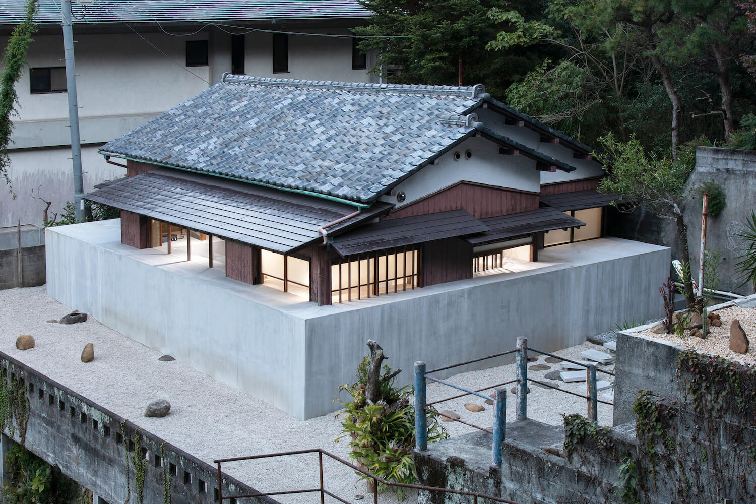
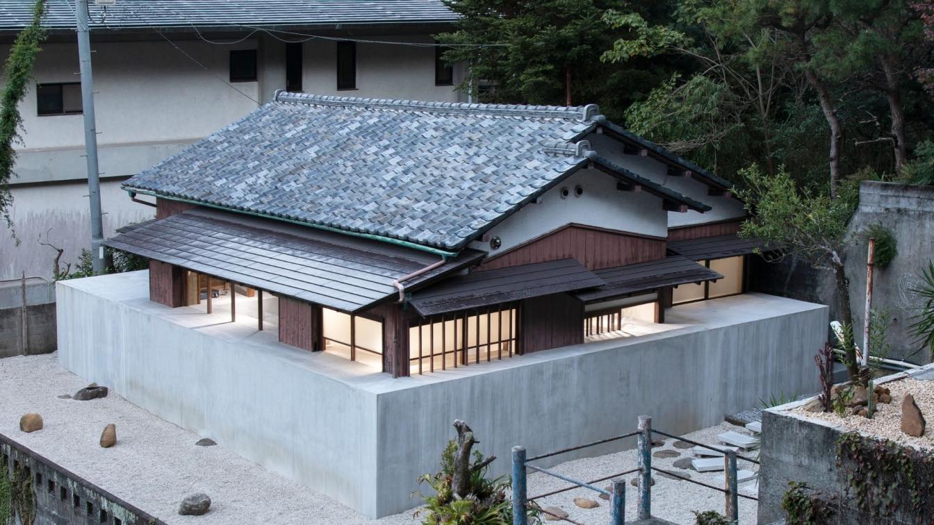
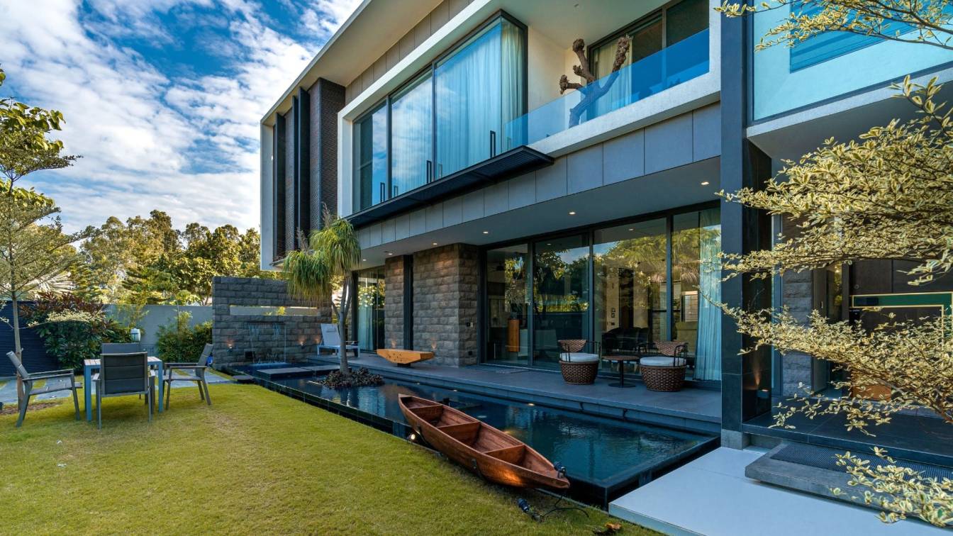
What jumps out first with strange impact is an old-style wooden house amid a court filled with stones opposite of the annex, half-buried with mortar mass in a brutalist manner. Upon designing, Kondo came up with an illogical idea of “filling the house with mortar”. Eventually, all sides of the wooden house were clung with 100 centimeters width mortar block. From the inside, the mortar mass fills along the walls and leaves the guest to find its function or how they could interact with it. Recalling the process, Kondo says he is “still finding reasons to adjust what he did”. Though the purpose or function was far from intention in the beginning or even until the present, the mortar mass plays a maximum effect on the identity of the space. Furthermore, when glancing back at the annex from the wooden house, what we see is the modern interior through the glass façade, contradicting the frontside features.
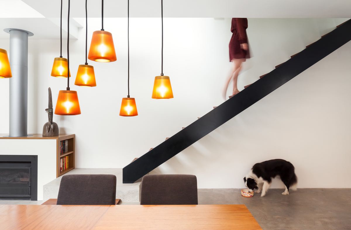
Unlike averagely bland gasshukujos, Yutorie’s guest rooms are semi-luxurious. In the built-in shelves, bed headboards, opening parts, and furniture are round-shape elements rarely seen in old Japanese housings; the gold-plated details fail our expectations brought by the exterior. The cross-structured handrails are nothing that follows function but somehow makes a visual rhythm to the scene speaking of shape and material, which makes sense to the point that Kondo is also active in the field of graphic design.

A similar approach is made in the studio space, too, where the mortal bisects the space. The upper part remains as an old folk house with urethane insulation and ceiling structures exposed, left as it is from the dismantling process. On the contrary, the lower part is completely minimal and modern in the monochrome color scheme. The visual continuity may be abruptly cut, while three wooden pillars were left to make partial continuity from the ceiling to the floor. The white concrete wall by the kitchen area does not adjoin the ceiling nor other walls, rather standing out as an object. Overall, the contrast of old and new, differing materials, and its arrangement is adapted to the space through a two-dimensional cut-and-paste, layering/zapping idea – visitors are left to enjoy a tricky, yet refined and inspirational stay at Yutorie to trigger their sense.


