Rerucha Studio: This mid-century home held promise, despite having endured a series of clumsy additions, including a 1980s sunroom addition and years of disrepair and neglect. The home takes its name from a family of starlings that nested in the home’s wall cavities, which were left open from previously abandoned repairs.
Originally designed in 1952 by noted Seattle architect Perry Johanson, the home had strong bones and was well located within the city with views of Lake Washington. The guiding principle for the remodel was to fully embrace the relationships between inside and outside.

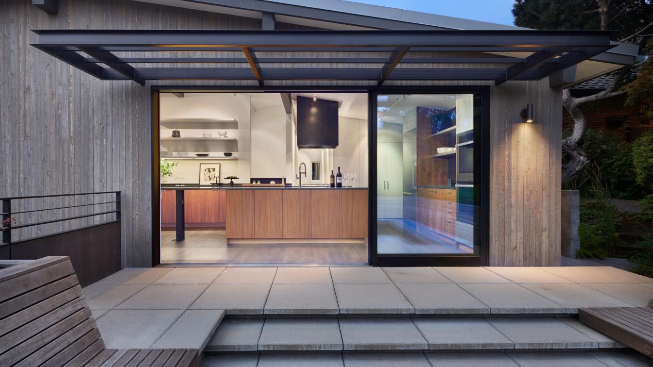
The first step of construction was to strip the interior and exterior down to their essentials, carefully preserving the integral mid-century features. Small, inefficient rooms were removed, and spaces opened to create better flow and a more contemporary, open-floor plan. Exposed car-decking ceilings, heavy timber beams, and rimless moldings were preserved and refinished while old windows were replaced with new, period-authentic windows. The kitchen, located on the second floor along with the rest of the primary living spaces, was expanded and redesigned. Glass doors open the kitchen up to a now accessible garage roof, featuring a cozy, built-in conversation pit. Wood seating with cement-clad planters and pavers combine with steel elements for a look that’s organic rather than industrial, light rather than heavy. The home’s first floor currently serves as a self-contained, secondary space for guests.
The well-proportioned, east-facing facade was preserved while new black steel doors and sunshades were added for definition. Without expanding the footprint of the house, it was transformed from modest to impactful—open, modern, and complete.


