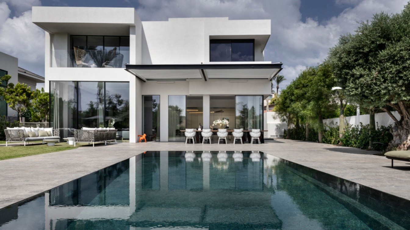
This is an existing house that has undergone extensive and thorough renovation. 'We stripped the envelope, and within that, the interior design underwent a significant change. However, no structural changes or building additions were made,' explains Dorit Sela, owner of an architecture, planning, and design office. The house, built in the 1990s, is located in one of the Sharon cities in Israel. The plot area is approximately [size], and the house area is around 450 square meters, spread over three floors (approximately 150 square meters each). A family plus three children in their teens reside here.
In the basement, with English courtyards that bring in plenty of light and natural air, a spacious family room, a gym, a home theater, and a bedroom suite for one of the children were planned, including an attached bathroom. On the entrance floor, the public space includes the living room, kitchen, dining area, and guest facilities. On the bedroom floor, two suites were designed for the two younger children, a family corner, and a master bedroom spanning about 85 square meters.
"The rationale guiding all aspects of this was to preserve the unique original architecture of the house while giving it a modern and updated look. Before the renovation, the house's facades were clad in stone, and the interior spaces were characterized by stone and sand tones. In the new design, we created powerful combinations of natural materials (such as various types of stone, metals, and iron) with a bold monochromatic color scheme in shades of gray, white, and black, adding splashes of color expressed in textiles and furniture. The existing openings were replaced with modern aluminum systems that create a seamless connection between the outside and inside. We reconfigured the functional layouts, creating optimal flow between them, and additionally established a conceptual, colorful, and material connection between the various wings, giving this large house an inviting, intimate, enveloping, and cultured feeling," explains Dorit Sela.

The process took about a year, during which the family rented another house. The family, who lived in the house before the renovation, decided it was time for a significant facelift. The original house, designed by architect Yaakov Winter, was renowned for its remarkable architectural features, yet over time, certain elements naturally aged and required an update. For instance, the Hillel stone flooring in a beige hue, numerous molded ceilings in various spaces, gypsum moldings, and stone cladding on the facades.
Within the renovation scope, all of these elements were updated, while also repositioning functional areas without altering existing structural elements, aiming for the house to be a contemporary, up-to-date space that honors the building's architecture and connects it to the 21st century. Each area of the house was meticulously treated, and almost nothing of the original elements remained - both externally and internally. We replaced the aluminum systems, air conditioning systems, bathrooms, kitchen, flooring, and as mentioned, the interior design changed according to the family's modern needs.
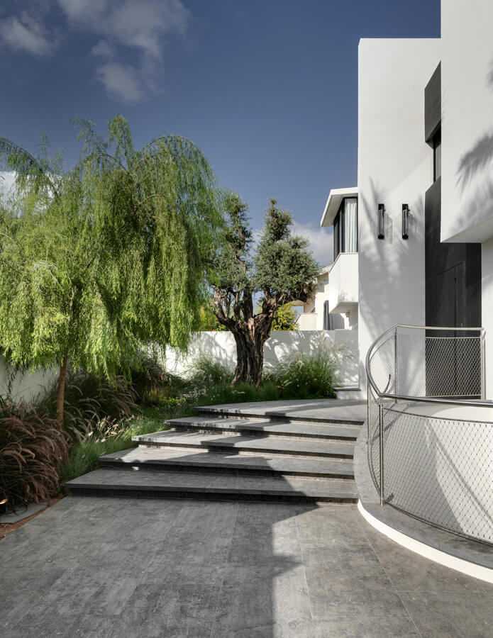
An amorphous staircase, resembling the opening of a deck of cards, leads to the renewed entrance courtyard, paved anew with Blue Stone tiles. Upon opening the black iron entrance door, visitors are exposed to a powerful entrance foyer, showcasing the ultimate display of what will characterize every area of this house: meticulous craftsmanship of connections between carefully selected materials and pieces, creating an elegant, rich, visually stunning, and unique space. Each area looks different, yet despite each element having its character and form, all pieces connect to create a harmonious and inviting space.

The console at the entrance blends straight and circular geometric shapes. Its deep dark blue color and the front circular façade covered in stone form the main entrance's base. Above it hangs a mirror in the shape of a bubble, a creation by Israeli artist Gal Gaon, with additional items of his integrated throughout the house. Opposite the corner stands a large wall cabinet painted in a wall tone, with integral handles, concealing within it technical systems and plenty of storage space. Like the entire entrance area, the foyer floor is covered in Nero Marquina slate, its deep black color interspersed with bright veins, giving the space a dramatic and powerful look while creating dynamism and movement.
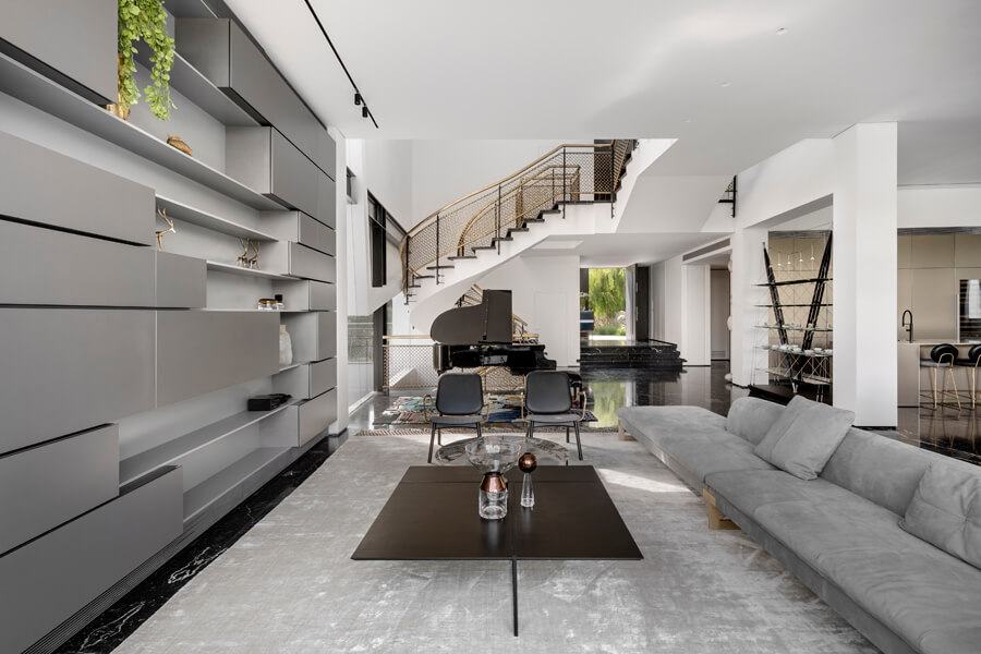
In the wide public space, original architectural elements such as the amorphous-sculptural staircase and an iron railings façade, integrated with a square in an inclined position, were preserved and highlighted. The original element was upgraded by adding slate cheekpieces and a railing made of chain links that form a kind of jewelry on-site itself. The transparent elevator connecting the floors is encased in bronze panels. Next to it is a ceramic creek distribution monument, another creation by Gal Gaon.
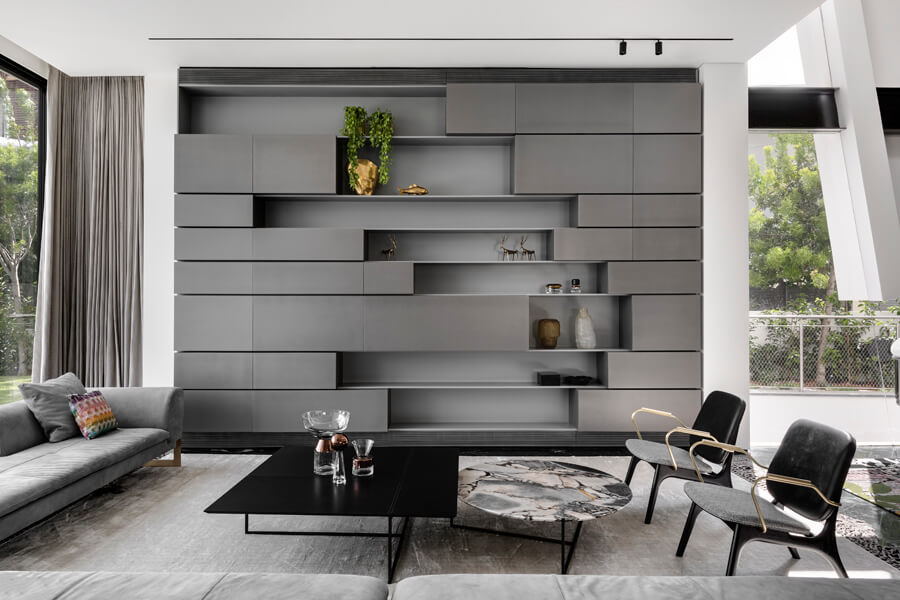
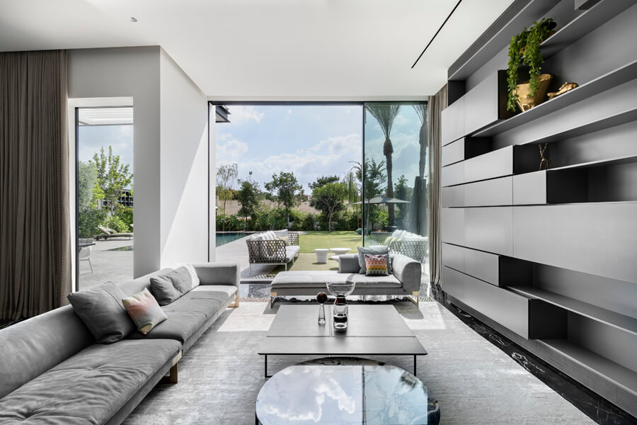
The power wall in the living room is a carpentry piece designed by Sela, concealing a VRF air conditioning system behind it. The asymmetrical furniture combines painted airtight facades in a metallic gray tone used for storage and open shelves displaying elegant items. Opposite stands a large, deep, luxurious sofa upholstered in a luxurious gray fabric. Two minimalist leather-upholstered chairs accompany it, and in the center, a modern and clean-designed table. This living room primarily serves as an entertaining area, while if the family wants to watch TV, they can do so in the family area on the lower floor or the bedroom floor's family area.

A similar carpentry unit to the one in the living room is integrated into the formal dining area. At its center stands a banquet table measuring no less than 5 meters long, comfortably accommodating at least 12 diners. The dining table features geometric golden metal legs with varying angles supporting a top that combines three materials: wood, metal, and stone. The dining chairs, lightweight and rounded, made of brass and leather, soften the straight geometrical mass of the table.
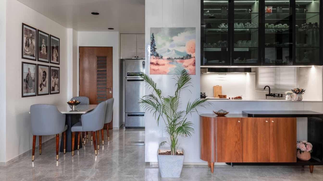
Adjacent is the formal kitchen, with a hidden door leading to a fully equipped working kitchen. The main kitchen includes a floor-to-ceiling unit clad in golden aluminum plates, which Sela also used to cover the island's facades. For the surface, she chose natural Patagonia stone, with which, in collaboration with a skilled carpenter, she created a console unit adjacent to it used for storage.
One of the highlights in the public space is the grand piano, which has its corner and is frequently used by the family. Between this corner and the new kitchen stands two constructive pillars, which Sela adorned with Nero Marquina slate and bright natural stone within. The basement floor of this house is experiential and includes a spacious family area with a hidden kitchenette behind a carpentry unit, a well-equipped gym, a home theater, and a large, well-lit master suite.

The floor is adorned with old, weathered oak parquet flooring in a herringbone pattern. Along with the family, Sela chose to use red sofas in this space, serving as a unique and bold color spot in the monochromatic area, which stood before the renovation in the home's salon. They are beautiful, incredibly comfortable, in excellent condition, and blend wonderfully with the wool rug beneath them. Further into the space, another, more intimate sitting area was created, with two rounded pouf armchairs that were previously in the original family area. In a separate alcove, two deep and comfortable lounge chairs were combined, symmetrically embracing a piece of furniture within a niche.
Through the facades, the kitchenette is hidden, and at the center of the furniture, an open wine rack serves as a display for wine bottles and books. The home theater is designed in shades of dark gray that give the space an elegant look, allowing viewers to focus on the plot of the film. The wall leading from the entrance downward is an angled wall that Sela accentuated with vertical lighting strips in a constant rhythm. Hanging from the grand ceiling are optical fibers in a random composition, simulating stars.
The children's rooms on the living floor were planned and designed according to their taste, hobbies, and needs. Similar to the basement floor, this floor is floored with old and weathered oak parquet. The master parents' suite spans over no less than 85 square meters and includes a well-lit and spacious bedroom where Sela created a balcony-like internal area surrounded by a vitrine overlooking the well-kept garden and pool. The master suite combines numerous textured items that give the space a soft and richly textured appearance.

In the center of the bedroom is a large, modern-designed canopy bed that emphasizes the height dimension in the space. Next to it, an intimate seating area in an amorphous silhouette resembling a floating sphere, designed by Marcel Wanders, stands. Facing the bed is a concealed door leading to the closet and bathroom. The closet, covering 20 square meters, is extremely indulgent and likely fulfills every woman's dream. Sela created a carpentry unit with facades made of baked enamel combined with laminate, iron, and leather. For the homeowner, she designed a makeup area in this space and an island for accessories and jewelry.
The master bathroom is well-lit and spacious, also combining Sela between marble surfaces and bright natural stone. In addition to the double shower, this space features a free-standing oval bathtub adorned with a monument of birds above it and a bench nearby, creating a color spot in the monochromatic space. The double sink cabinet is also made of marble.
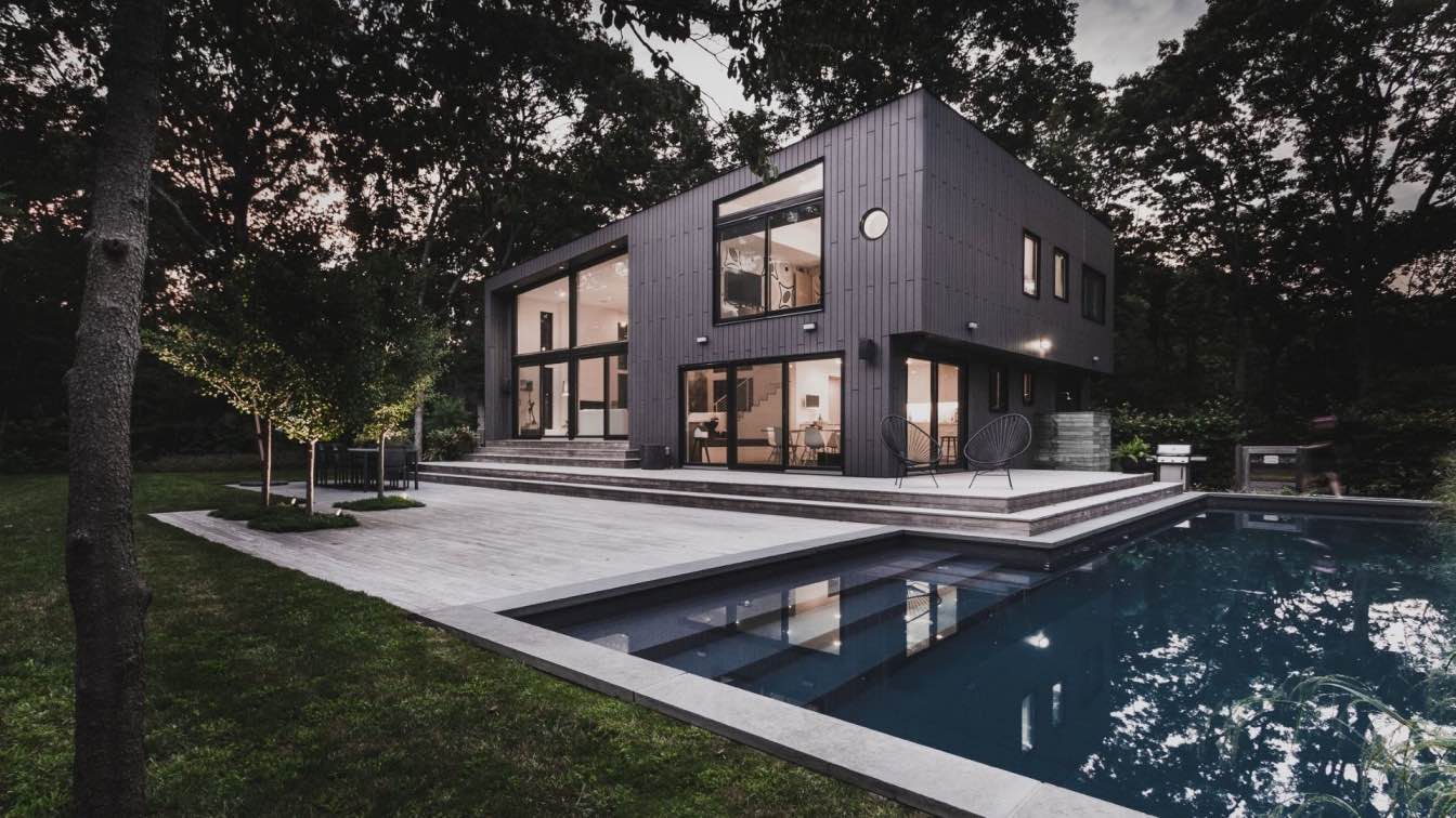
The house's facades and existing pergolas were removed, and a large pergola was installed in their place, defining the outdoor entertaining area. The original pool was replaced with a lap pool, and apart from it, the family enjoys an equipped outdoor kitchen, a lounge area, a seating area facing the garden, and a dining area that is about 5 meters long, similar to the one indoors. Sela divided the outdoor surroundings into zones and also created a large lawn.


