Project History / Anecdote
Stanaćev Granados: Casa Morla was commissioned to us in 2021 for a popular locality of Matanzas on the Chilean coast, while residing in Andalucia, Spain. At the time travel restrictions still applied, and although the idea was for us to move back to Chile as soon as possible, we ended up not only designing but supervising the project construction 100 per cent remotely.
Although we’d worked in Chile for a number of years (we are Spanish and Serbian), by the time our first independently designed project was due for construction, we’d already moved to Spain. The same week the lockdown was announced in the country, the earthworks were being performed on site on the other side of the globe.
Stemming from this first project, we ended up being commissioned a series of other projects during the pandemics without ever visiting their respective sites (we’d never even met some of our clients in person), and supervising their construction by means of daily calls, emails and text messages.
Despite the fact that we were eventually able to relocate mid-2022, most of these projects are permanently occupied by their lessees and Casa Morla is the only one that we could actually visit and photograph to the date and all the photos are exclusive and previously unpublished.

Project Description
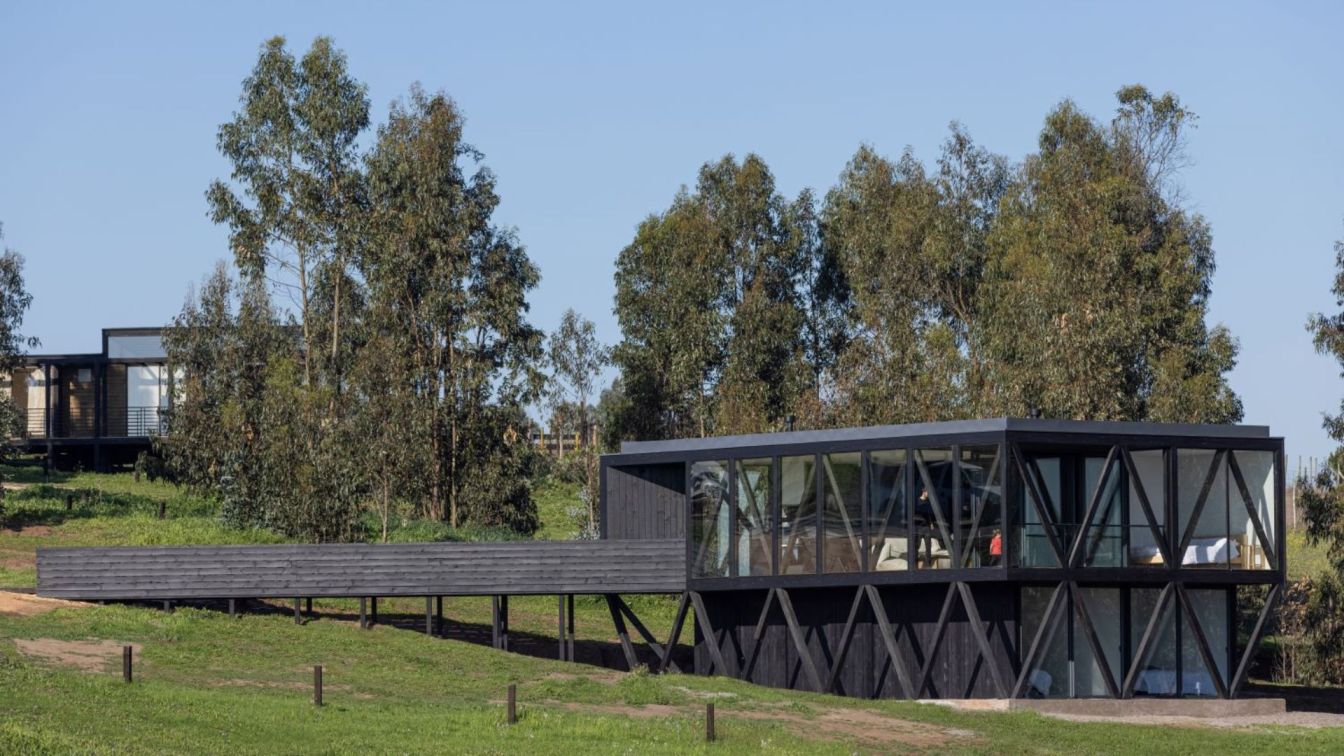
Casa Morla sits on a sloping terrain of just over 1000 m2 overlooking the Pacific Ocean in the increasingly popular coastal village Matanzas, known as a Mecca for water and wind sports. It sets to resolve the brief of a single family house designated to long term rental. The brief called for a compact and rather optimized small scale unit that could house up to eight people, two bathrooms, and a large storage unit, all within 120 m2 maximum of interior spaces and on a relatively tight budget.
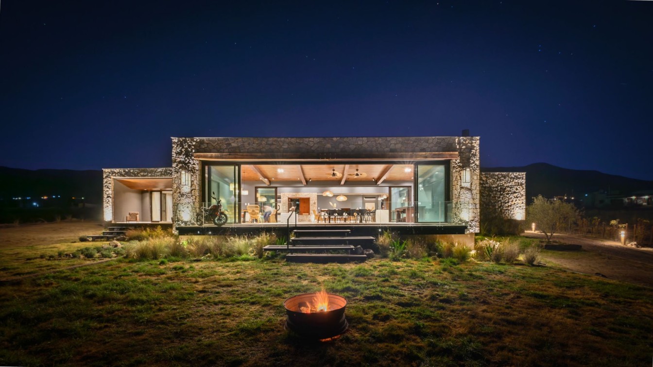
Formally the house responds to a rather unique and harsh climate: with strong winds and glaring sun that reflects off of the vast ocean horizon, the local conditions favor some orientations while others need to be heavily shielded from. Casa Morla’s volume opens and wards off accordingly to create an expression that is either fully transparent or absolutely mute, depending on the orientation.
Also, anticipating the positioning of the constructions on the neighboring sites to secure the views in the future; creating a distance to the street and compacting the program, all contributed to shape its volume.
Materially and structurally the house is designed with the local, mainly unqualified, workforce in mind. It employs timber and wood for structure and cladding as these are the only materials the local construction workers handle with confidence. For the same reason the detailing is rather basic and the aesthetics raw and unpolished.

Divided volume
The body of the house unfolds to form two distinct and diverging faces. While its southwest is abstract, closed off, and mysterious, the north and the east are conceived as figurative, extroverted and almost irreverent. The unity is achieved through its materiality - a sole material, pine wood tinted black, acts to close off when used as cladding and to open up when the structure is left exposed behind and in between window panes.
Liquid space
Just as in García Marquez’s tale, in order to dilute the dichotomy of the inside/outside, a sort of fluid state is created. The interior is clad with the same dark wood creating a neutral frame that withdraws to the backdrop to allow the outside colors and views to take the spotlight, while at the same time softening the intensity of the light, the reflections and the shadows. Equally a certain contrast is created between the luminosity contained in the main living spaces and the other spaces, dedicated to the transit and connections. These are purposefully darkened to work as buffers and intermediaries. The dark interior skin, the secluded skylight, the open staircase and the protagonist sliding door versus the white horizontal planes of the ceilings and vast glazed surfaces bring into life this play of nuances.
Promenade
A whole series of gestures is carried out in order to enhance this fluidity of space. It begins with the elevated walkway which turns entering the house into an experience similar to that of embarking while simultaneously establishing the main living areas on the upper floor and thereby securing the views to the ocean. Upon entering one is faced with the interior staircase which draws the view towards the garden situated on the lower level while the entire main living area unwraps simultaneously in its totality and can be grasped at a glance. The front terrace extends the interior space belonging to the living and main bedroom area and inciting the circulation and the use of the house’s exteriors.
Dual uses
While compact in its layout (three comfortable bedrooms, two full bathrooms, living-dining-kitchen, a storage and a separate pantry were fitted within 110 m² of interior spaces), the house makes the most of the available space and provides the users with various plurifunctional elements. Thus, the kitchen serves as the stair ledge, the pantry while at hand is secluded behind the sliding door in a circulation that distributes to the main bedroom and bathroom, the lower level circulation is widened just enough to fit an area for children’s play, and the walkway bridge serves as an alternative terrace.


