Daniel Canda Architect: The project is developed in a very low-density suburban environment, with uniform architecture and lush vegetation as a distinctive feature.
Do or Redo
Fifty years later, a house no longer meets the demand for which it was created. If, then, we must choose between transforming an existing suburban house or building a new one, there is an ethical question that surpasses the merely economic equation. As architects we must rethink the impact that generates replacing a piece where it can be refunctionalized. And that decision comes prior to the project. Having then made the decision to readapt a construction, the search was oriented towards a structure that was as basic as possible, which would allow a certain freedom for a programmatic readjustment. An existing house was then chosen, made up of a pure brick volume with a gable roof, with a 9 x 9 square geometric plan, and two adjacent service bodies as independent volumes.
The project
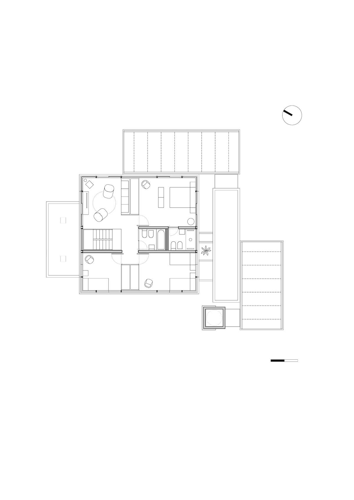
Having defined that the wall box was going to remain as a container for the space, all the interior walls of the ground floor were replaced by a single central support materialized in a concrete volume. This freed up the floor plan and allowed a spatial flow that was a premise of the project. Similarly, and in order to increase the surface area on the upper floor, the gable roof was replaced by a flat roof supported by a light metal structure, which, like a cage, contains the carpentry. This allowed two bedrooms and an additional bathroom to be configured, required by the needs program.
The interior was organized based on open and flexible floor plans. In the lower one, the concrete core that houses a toilet, organizes four subspaces around it: kitchen, dining room, home and living room. On the upper floor, the central structural corridor contains the staircase and the bathrooms, while, on both sides, the rooms are delimited by floor-to-ceiling furniture that allows the layout of the four rooms to be quickly changed and adapted to new requirements.

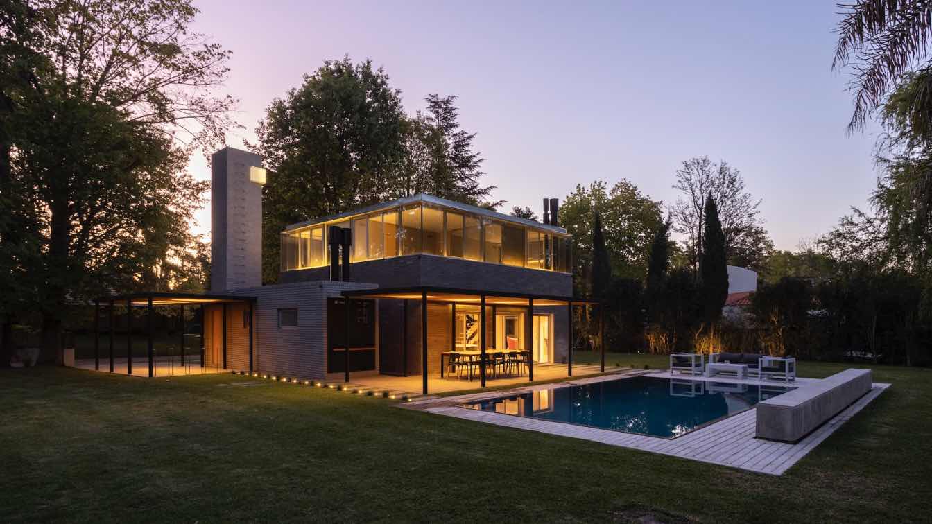
To prioritize and differentiate the main volume, a stone covering was used that takes up the dimensions of the exposed brick. Above this plinth rises a glazed box of absolute transparency. In the support volumes - the horizontal one for the service and the vertical one for the water tank - both in exposed brick, a gray palette was used to chromatically unify the whole.
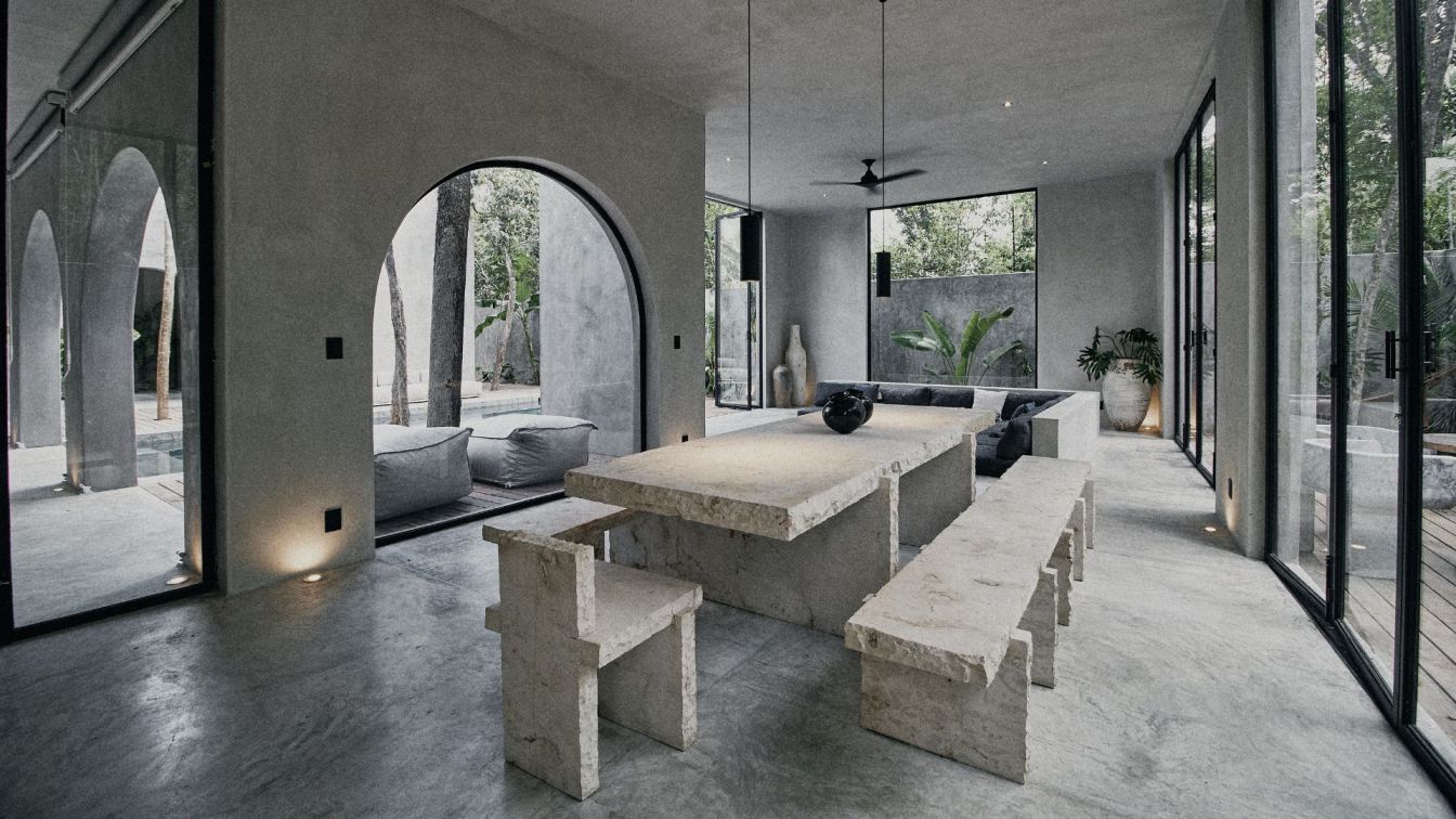
The interior spaces were sought to be fluid, simple and stripped down, with noble materials such as wood and concrete. Trying to keep a simple home, with a certain degree of austerity and in broad contact with nature. The Anglo-Saxon word Cabin1 perfectly fits that definition, so it was named Cabin 192 (plot number).
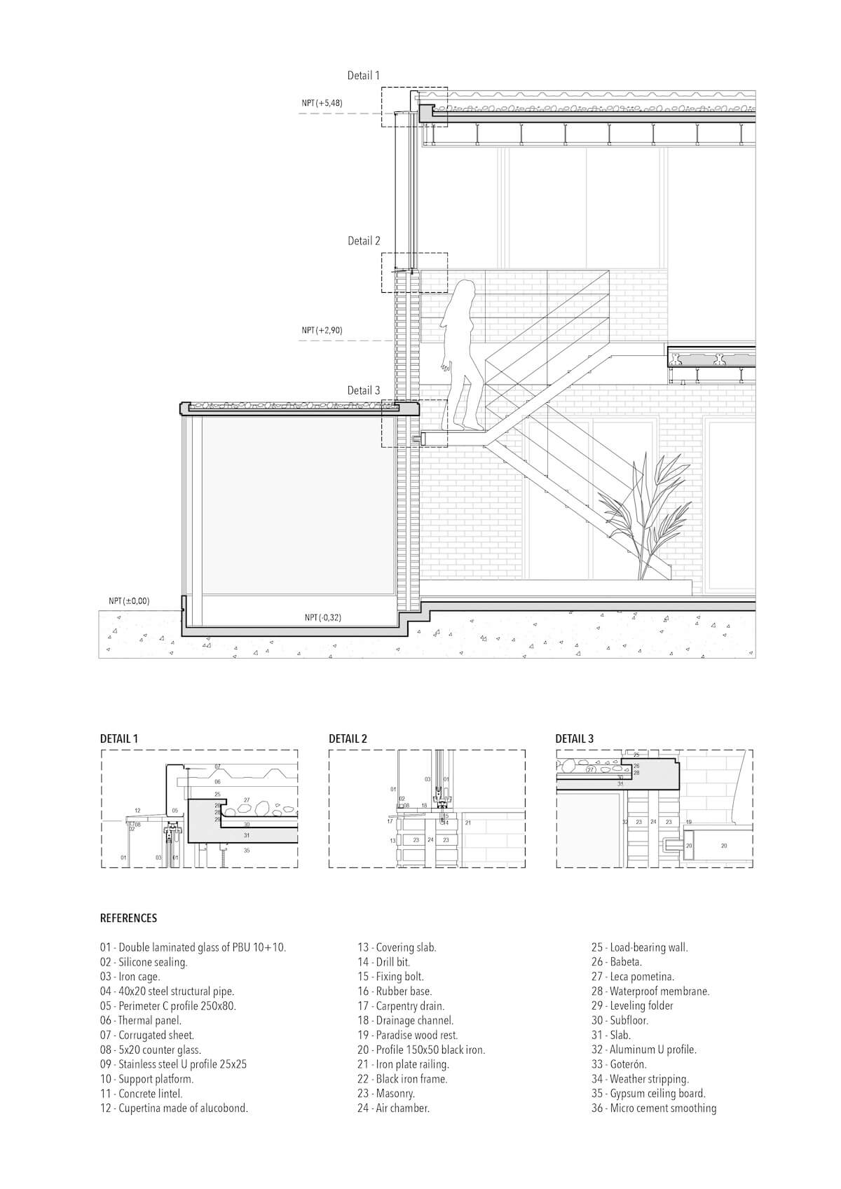
From a constructive point of view, to achieve a thermal efficiency equivalent to the masonry envelope of the lower floor, a double skin was materialized with a ventilated interior air chamber that preserves the thickness of the 30 cm wall box. The exterior side in tempered glass with solar treatment and the inner ones in hermetic double glazing. So, the set achieves adequate thermal and solar protection while maintaining the idea of transparency and extended visuals.


