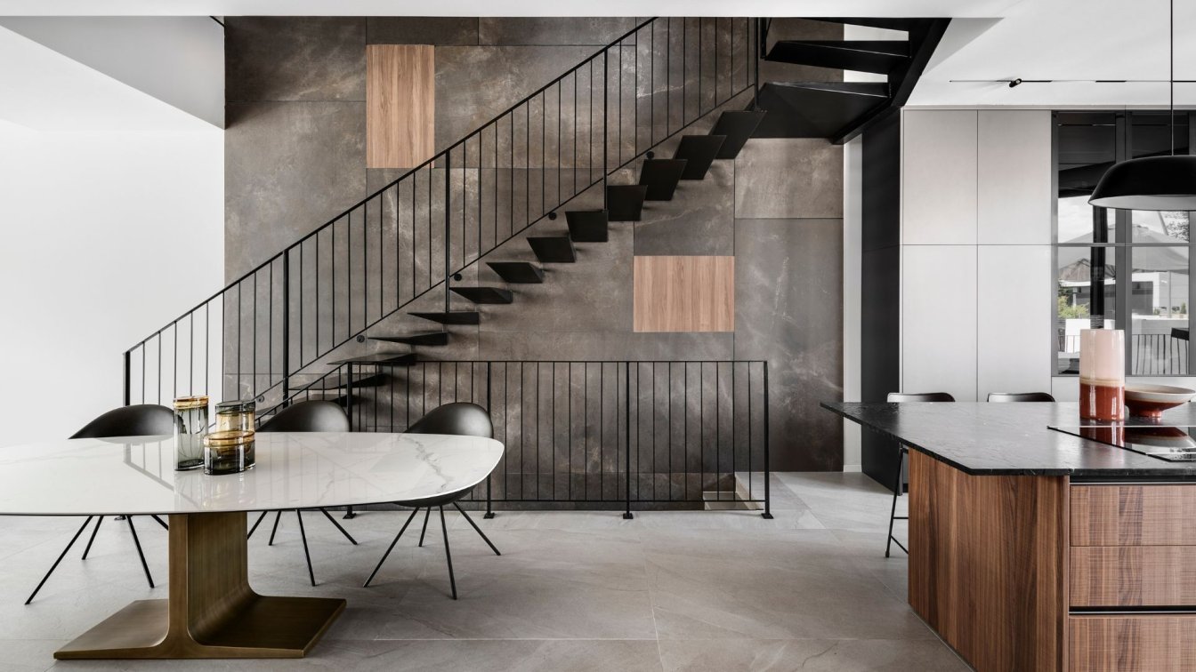
At one of the sought-after neighborhoods in Rishon LeZion stands a house that design enthusiasts would truly appreciate. Designed by Dorit Weinbren, the house is a showcase of meticulous interior planning that favors clean and challenging geometric lines, aesthetic devoid of compromises on the purity of natural and industrial materials, and powerful monochromatic tones. So here it is before you—a modern, precise, and sophisticated living environment that captures subtle emotions, centered around an architectural staircase connecting the four levels and creating a remarkable impact.
At first glance, the new home for the couple in their 50s and their three children seems to exude a light and simplistic charm, but delving into the details reveals a complete picture. The careful choice of materials, the precise color palette, and the optimal planning transform the structure into an inviting urban living space. Interior designer Dorit Weinbren, who has been working with the couple for nearly 25 years, shares her insights into the design process.
"I have been working with this couple for almost 25 years: I designed offices for them, their previous homes, and now their new home, which they purchased at the frame stage," she recalls. "The house is part of a duplex structure in one of the best neighborhoods in the city, surrounded by a large inviting courtyard. Across the four levels, we created a spacious floor that includes shared living functions, an upper level with equipped children's rooms, and a gallery floor dedicated to the couple."

The original envelope of the project was updated, and Weinbren chose to soften the diagonal lines with minimalist, clean facades, free of decorative elements. Broad stone steps lead to the entrance, flanked by elegant dark planters among the embracing columns. With the opening of the impressive iron door, visitors enter an intimate entryway into the public space. Despite the rectangular structure, the house exudes a pleasant and airy atmosphere, thanks to thoughtful space allocation: "I tried to open up the floor as much as possible, avoiding elements that would obstruct the flow in the space," explains Weinbren. "The three main functions—the kitchen, dining area, and living room—move on a continuous gradient, each receiving its characteristics, creating a conceptual division of separate yet interconnected experiential zones, especially in terms of material and color.
Large openings in the living room and kitchen bring in abundant light and air, establishing an almost seamless connection with the outside. The architectural staircase, on one hand, is impressive and prominent, and on the other hand, occupies minimal space in the room. The guest bathroom defines the space with a porcelain-clad floating volume—material we used in other areas throughout the house."
The hospitality floor is designed with a modern aesthetic, featuring touches of natural materials such as stone, wood, and metals, creating an elegant and luxurious ambiance. In the center of the parallel kitchen stands a large island: "The family enjoys spending quality time together and having family meals around it, just like in their previous homes that I designed for them," says the designer. "Since the family is generous and hospitable, I needed to create as much storage space as possible and provide comfortable and inviting seating. The fronts of the kitchen were painted with an advanced technology, giving the apron a unique and luxurious metallic appearance. On one side of the kitchen, I created tall cabinet fronts, incorporating a glass vitrine framed with aluminum and lighting for decorative items. In the center, there is a natural granite countertop under a large window overlooking the garden.

The large openings in the living room and kitchen introduce plenty of light and air, creating an almost unmediated connection with the outdoors. The architectural staircase also contributes to this, as it is both impressive and very present while taking up minimal space in the area. The guest bathroom also defines the space, wrapped in Canaletto walnut veneer—a material we used in other areas of the house."
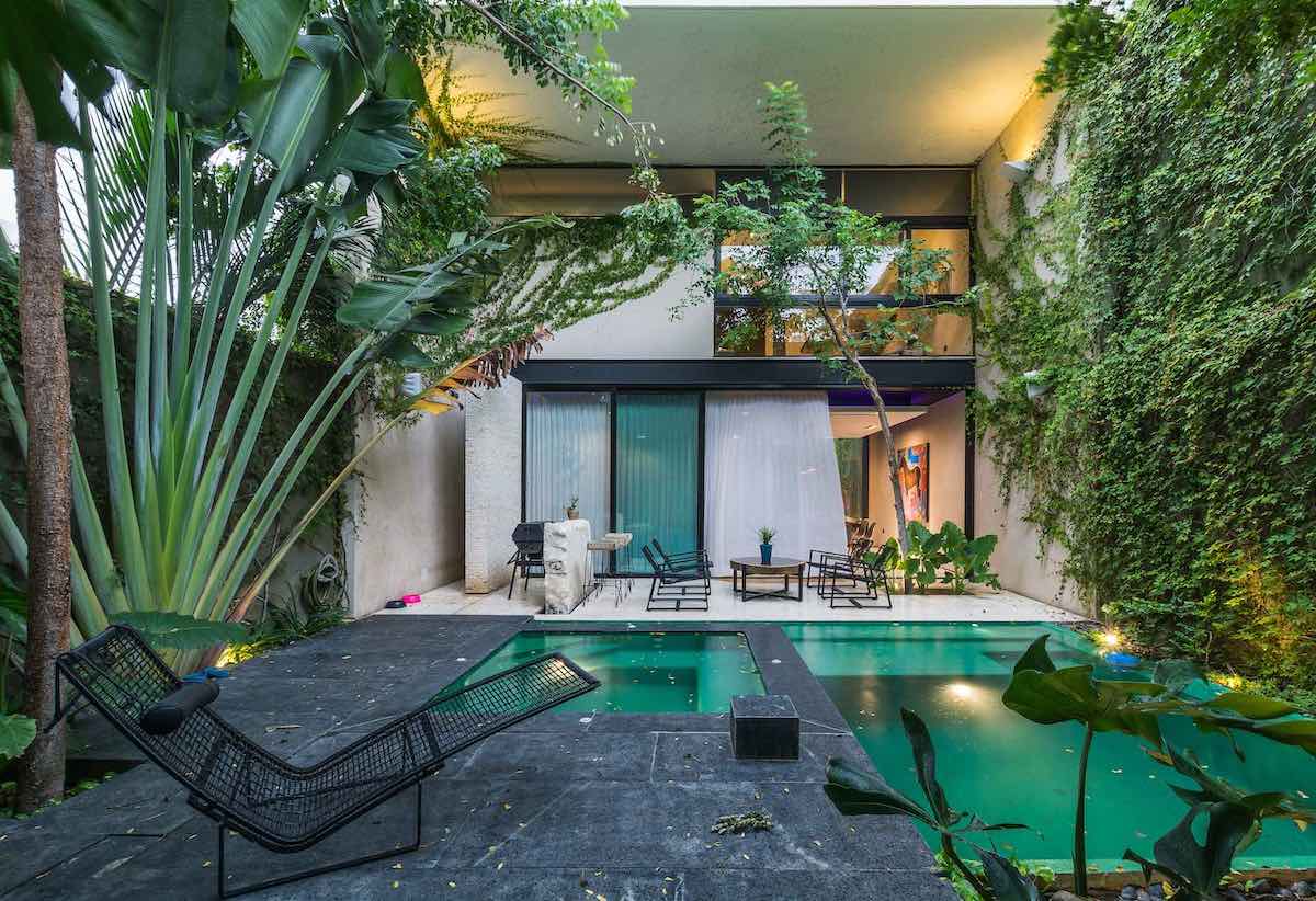
The living room is situated under the double-height space and overlooks the well-maintained garden, where the family and their guests can enjoy the swimming pool, outdoor kitchen, and dining and lounge areas. "Originally, there was a built-in TV wall planned there, which I insisted on opening to ventilate the space and provide an uninterrupted view from inside to the outdoor entertainment area and the pool. We opted for seating in a warm chocolate-brown shade that connects to the charcoal tones, and the straight lines break a minimalist abstract carpet underneath, complemented by a trio of delicate pendant lights in various sizes and angles, floating above. An original artwork by Kedishman hanging on the wall adds a burst of color, life, and humor."
The spacious guest bathrooms are an experience in themselves and are located in a wooden cube with a hidden door at ground level. The vanity fronts are clad in finely processed and delicate Canaletto walnut, and above them, a double sink made of cast aluminum is installed. The atmosphere is complemented by an advanced sound system operated on demand.

The basement floor is designed as a living unit for the eldest son (including a bedroom, living room, bathroom, and kitchenette), with a separate entrance from one of the English courtyards surrounding the floor, bringing in natural light and air. Additionally, on this level, there is a media room and a suite for another child, equipped with a kitchenette, seating area, and private bathroom.
"Above the entrance floor is a gallery floor overlooking the living room and garden. Here, in addition to a spacious equipped guest bathroom, the master suite is located: 'In contrast to most areas in the house, which were designed in relatively dark tones, the couple's realm is exceptionally bright, creating a reflection of light and a very clean feeling. For the bedroom, we chose natural oak parquet in a herringbone pattern. We created a large wall-mounted wardrobe that combines light fronts with aluminum and glass fronts. Near the bed, there is an exit door to an intimate balcony overlooking the pool. The resulting look is modern but spiced with eclectic elements and greenery."
"Even in the master bathroom, we used a light color palette: the walls are clad in large porcelain granite tiles with a natural marble pattern, and above the bathtub, we installed a double sink made of brushed cast aluminum. For the shower area, we created a particularly large shower with a built-in bench and niches, and we chose faucets in a brushed finish." "The upper floor is also dedicated to the children, and from each of their rooms, there is an exit to a perfect balcony where they often entertain friends. Each of their rooms was designed with care according to their age and taste." Weinbren concludes.


