Opened in 798 Art Zone, Beijing in 2009, PIFO GALLERY is one of the earliest major art intuitions in China dedicated to advancing the research and development of abstract art. After more than a decade of operation, the owner of the gallery invited ARCHSTUDIO to renovate the space, to improve its functions and adapt to future development demands.
798 Art Zone, where PIFO GALLERY is situated, houses a cluster of modern art spaces repurposed from electronics factories built in the 1950s. Distinct from those iconic buildings featuring concrete arched windows in the art zone, PIFO GALLERY is set in an ordinary industrial building — a regular closed concrete "box" with high ceilings and poor natural daylighting. For renovating the gallery, ARCHSTUDIO's primary consideration was to satisfy its functional demands while endowing the space with a captivating ambience and a unique visual identity, so as to improve the brand image of the gallery.

Based on the existing architectural form and structures, ARCHSTUDIO took "Funnel of Light" as the design concept. The design team opened the originally closed "box" to introduce multi-layer natural lights, and meanwhile reorganized circulation routes, structures and materials, thereby creating a natural, open and efficient space that integrates art exhibition, reception and office functions.
Two trapezoid-shaped volumes are added to the street-side facade, functioning as a window for opening the "box" outwards. One acts as an entrance foyer that links the building with the outdoor street, and the other serves as a bay window for bringing daylight and street view into the office area.
The foyer is constructed of fair-faced concrete. Its facade, made of translucent U-shaped glass, creates a haze and soft light-like effect, which defines the first impression when visitors enter the gallery. This new addition is enveloped by red bricks similar to that of the old building, to harmonize with the built environment of the surroundings.

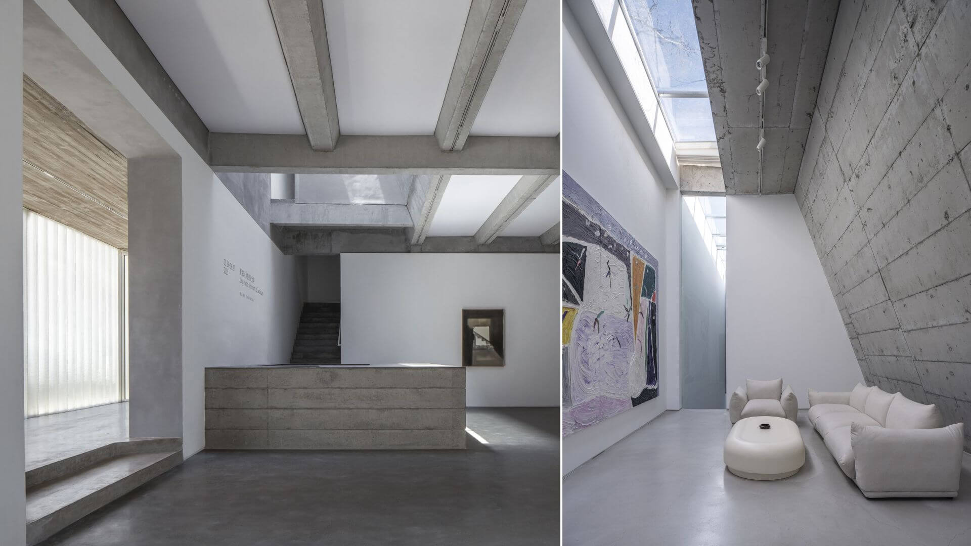
The exhibition space brings in daylight through several trapezoidal light wells. The design team removed some existing precast concrete roofing panels of the old building, and meanwhile added linear skylights.
The skylights are connected with oblique walls, thus forming three trapezoidal light wells of varied sizes, which bring soft natural light to exhibition halls and reception space beneath. The first floor includes three separate yet connected exhibition halls. The design team utilized dense concrete rib beams to enhance the height of the interior space to the greatest extent. The section of rib beams is in trapezoidal shape. Lighting membrane is inserted in between beams, which adds soft artificial light source to the exhibition space.
The slanting walls shape a trapezoidal reception hall on 2F. It is set up for receiving VIP art collectors, equipped with kitchen, bathroom, leisure and meeting facilities. Daylight penetrates the skylights, and spreads down onto the oblique walls, forming a unique ritualistic reception space.
The fixed furniture at front desk area, reception area and office area are constructed of fair-faced concrete. Sintered stones are used as tabletops. The design created a clear dialogue between furniture and space.


