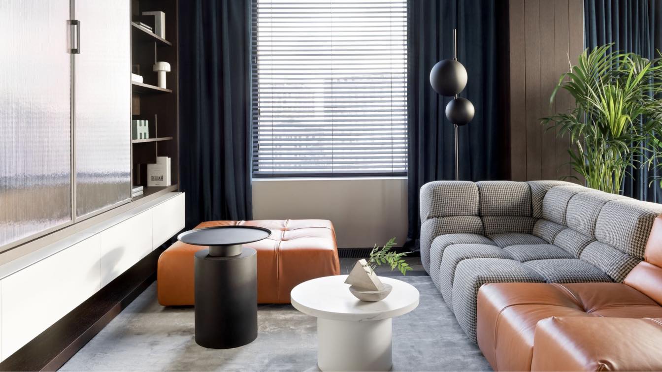
Original identity preserved, 120m² apartment gains a new layout to meet modern living needs.
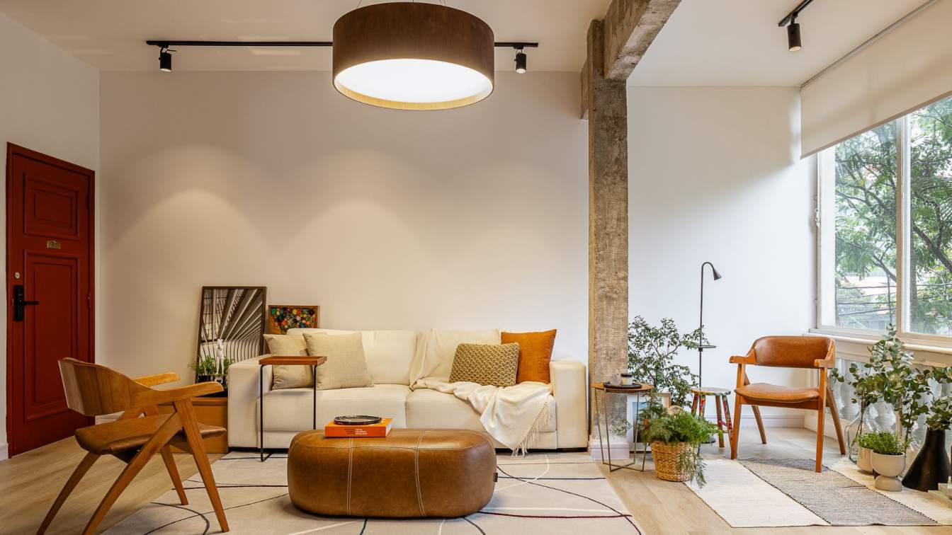
A renovation project that started before the pandemic underwent changes over time. Initially designed with a more contemporary pop style, the renovation paused at the resident's request, which led to adjustments in the design to adopt a more subdued aesthetic. This transition and blending of styles led Studio MEMM, headed by architect Marcelo Macedo, to create a unique and harmonious solution.
Located in a historic brick building with a concrete structure, in the Hípica de Pinheiros, the apartment featured period-specific characteristics in its windows and materials. The original layout was divided into 65% social areas and 35% service areas. This prompted the architects to rethink and reorganize the floor plan to accommodate a more contemporary way of living. At the time, the bathrooms, service area, and balcony were all facing the windows, allowing natural light in—a setup that no longer suited the current resident’s lifestyle. The new proposal moved these service areas to the interior of the apartment, freeing up prime spaces for the social areas.
Initially, the central core of the apartment was designed with an orange metal mesh, with glass panes and black frames—featuring bold tones inspired by pop culture. However, as a new resident joined the household, a more subdued and clean style was introduced. Strong colors were reserved for the doors, in a deep burgundy shade that echoed the reddish ceramic tiles used in wet areas, part of the original color palette. The striking appearance of the doors reflects the contrast between the different styles applied to the project, symbolizing the distinct personalities of the two residents.

The concept of an open floor plan is also evident, with the kitchen connecting seamlessly to the living room and balcony. The balcony preserved its original balustrade, allowing the apartment to maintain the building’s authentic character. Since the apartment is on the first floor, it also benefits from a visual connection with the tree canopies on the street, bringing the surrounding greenery into view. In nearly every room, the central core is visible. Though it houses the service areas, it plays a key role in optimizing the space near the windows. The floor plan includes a ring-like corridor that encircles the core, making all spaces easily accessible.
There are no isolated spaces connected by traditional hallways in Apartment PI. All rooms are linked through this circular pathway, which also facilitates the flow of natural light into the central core via the transom windows above the core’s walls.
What makes this design even more intriguing is how artificial lighting interacts with the space. When the lights inside the core are turned on, they illuminate the entire apartment with a diffuse yellowish glow that enhances and complements the project’s color palette, bringing the apartment to life through the lighting of this central element.


We combine the art of design with the technique and technology of construction to achieve the surprising. Through architecture, urbanism and design, we seek contemporary solutions for the different ways of living and using spaces. We count strategically with an internal team of designers and with external collaboration of draftsmen, engineering, legal, public relations, marketing, and administration, so that we can safely develop the best of each project.
To maintain the freshness of our artistic questioning and the originality of each work, we have developed our own platforms for debate and content creation, in which we bring creative minds also interested in taking a new step towards the future, inspiring us and collaborating to register knowledge open to all.

