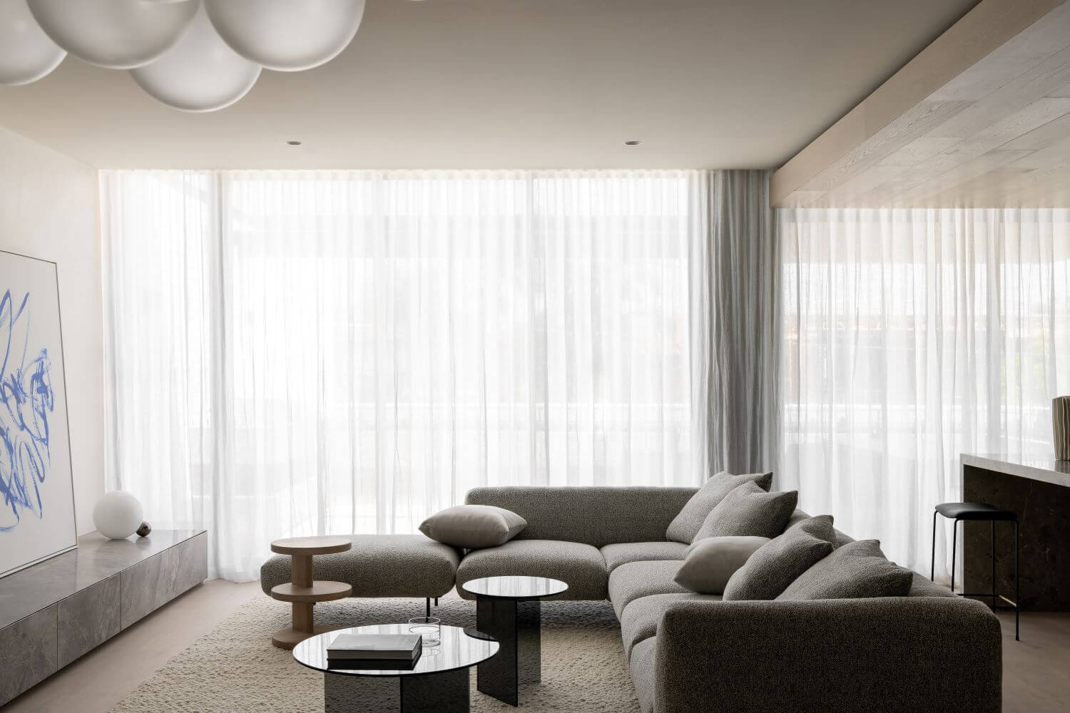
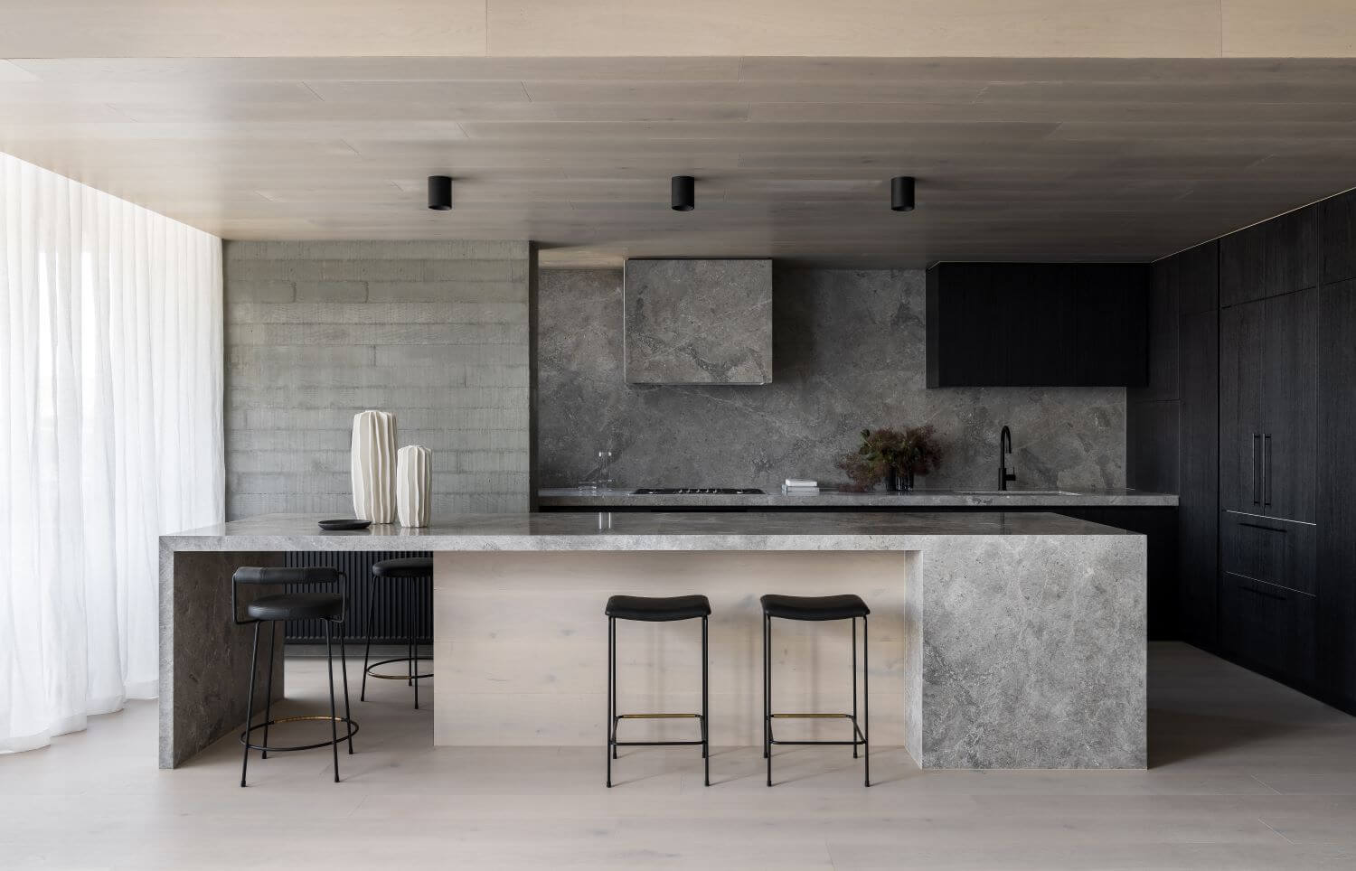
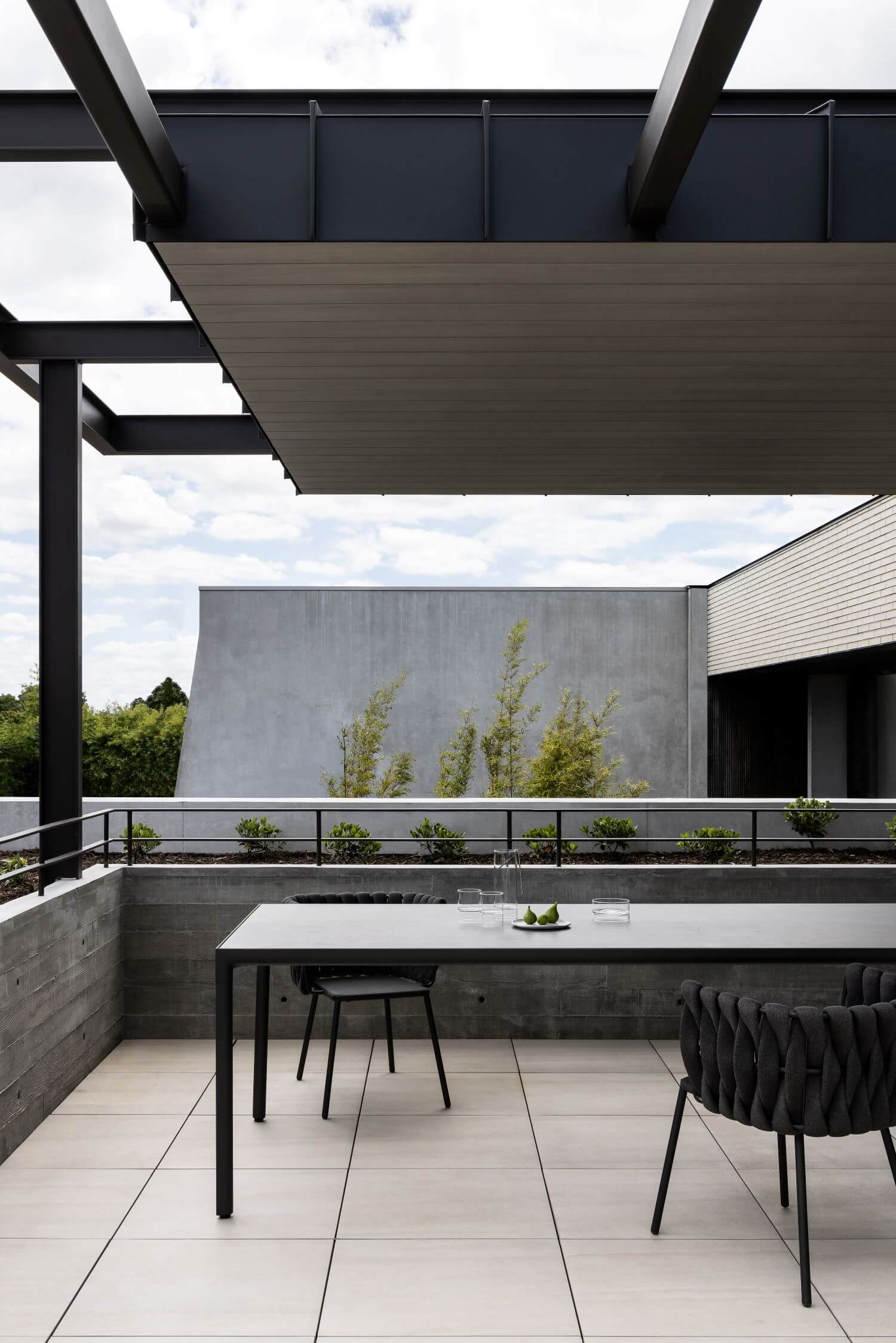
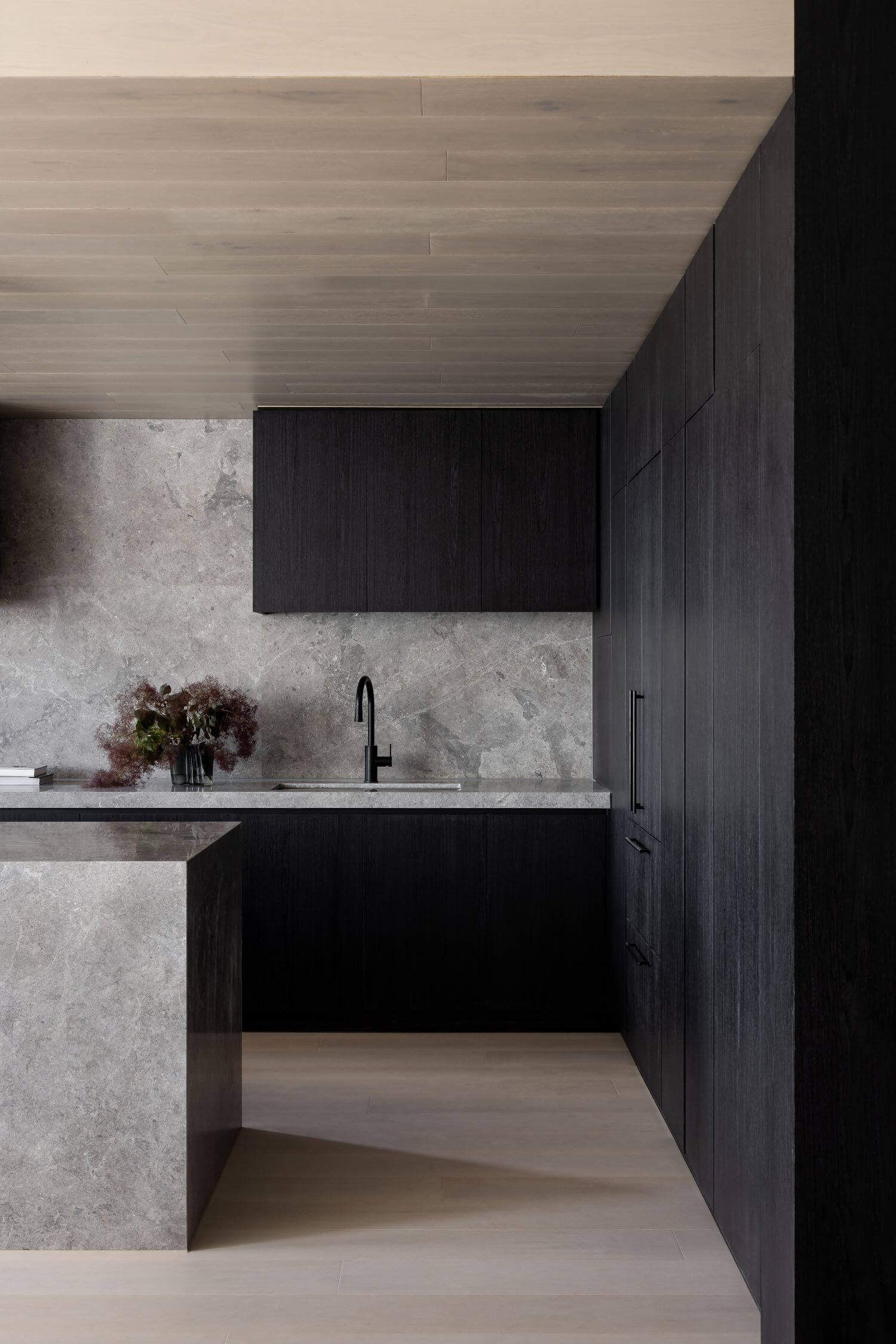
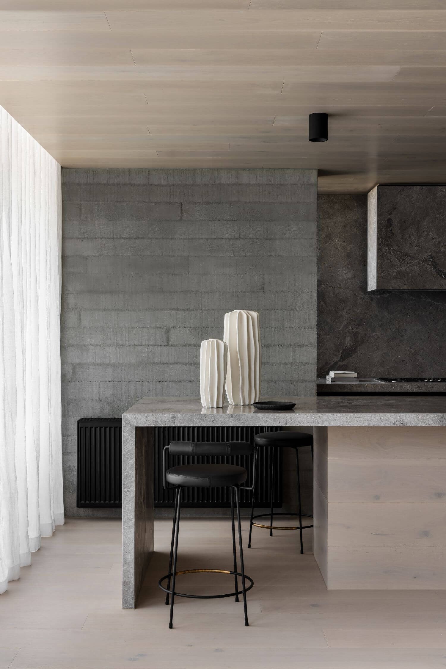
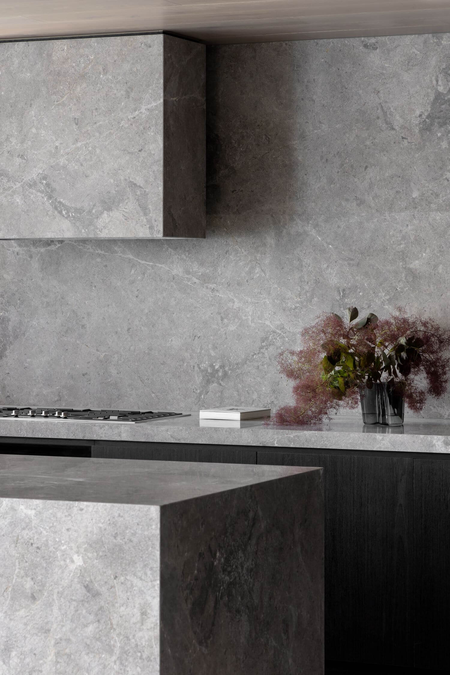
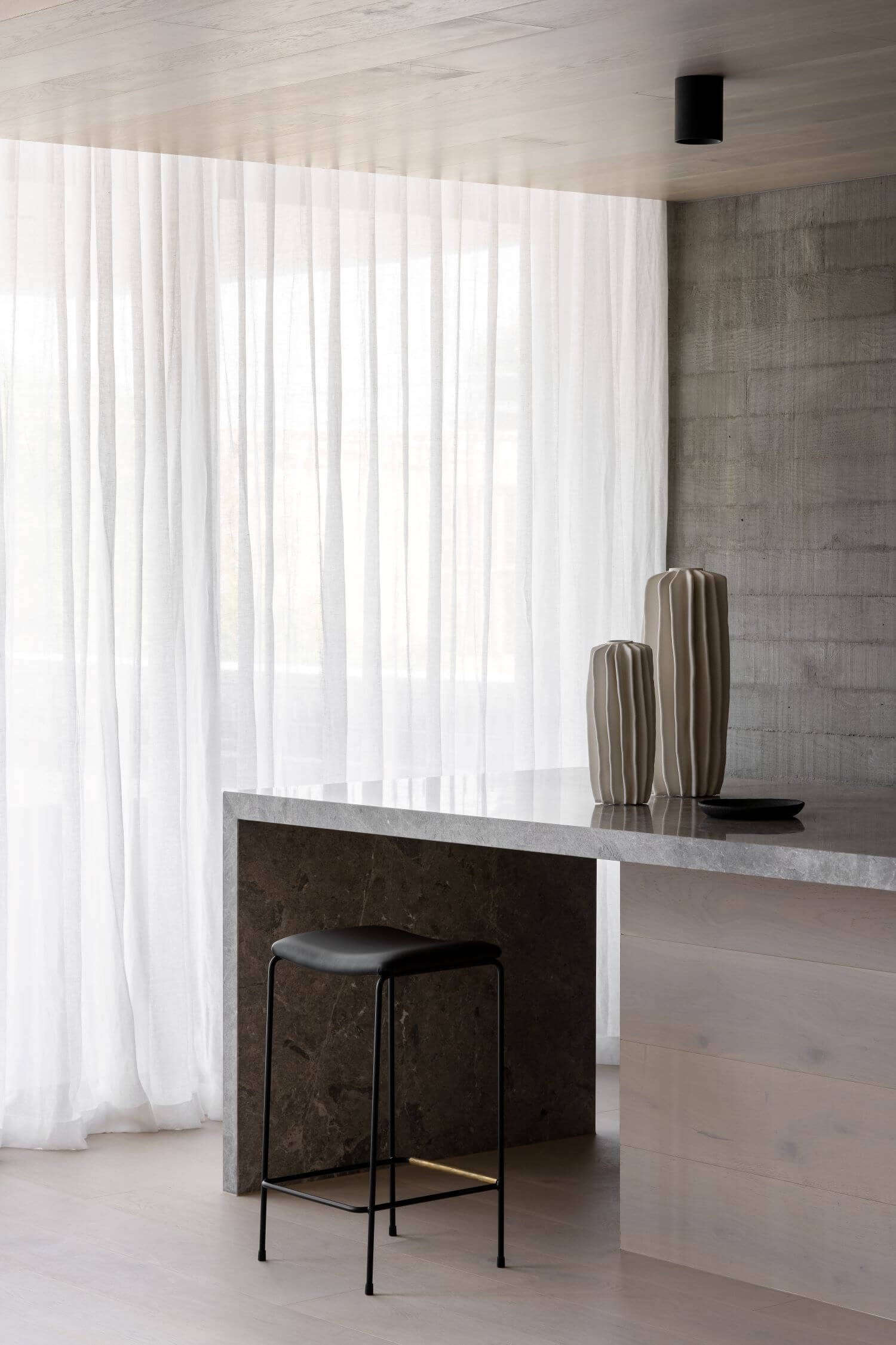
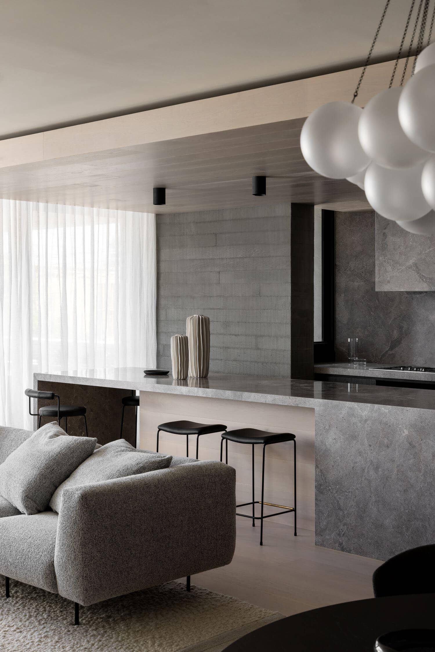
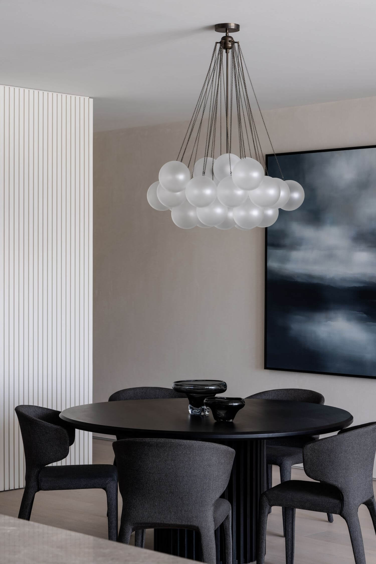
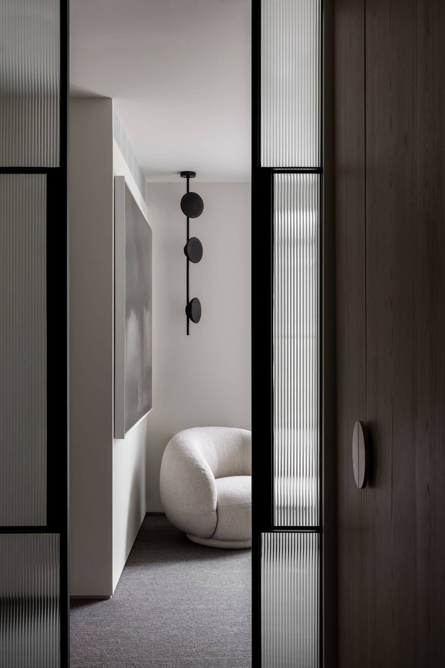
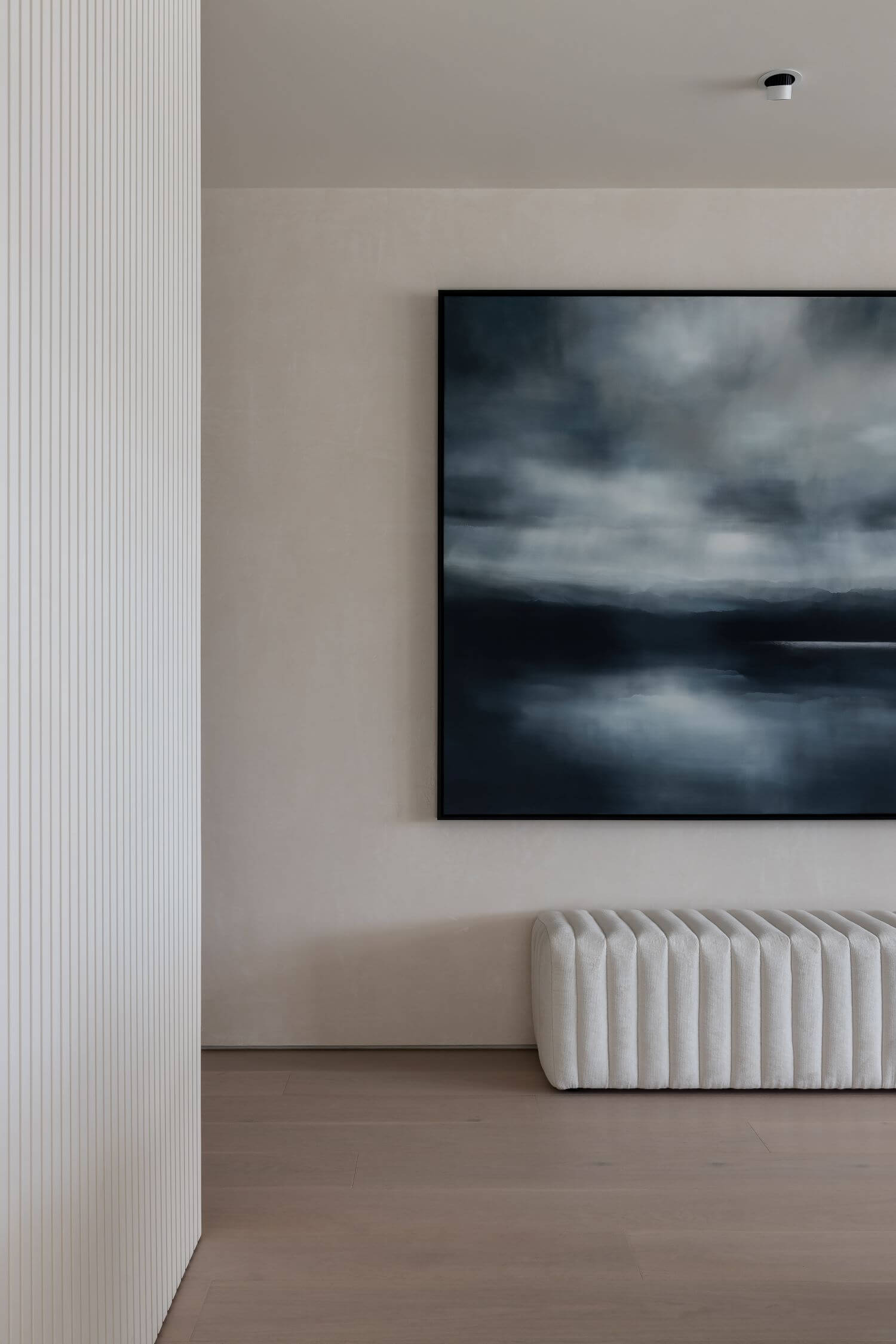
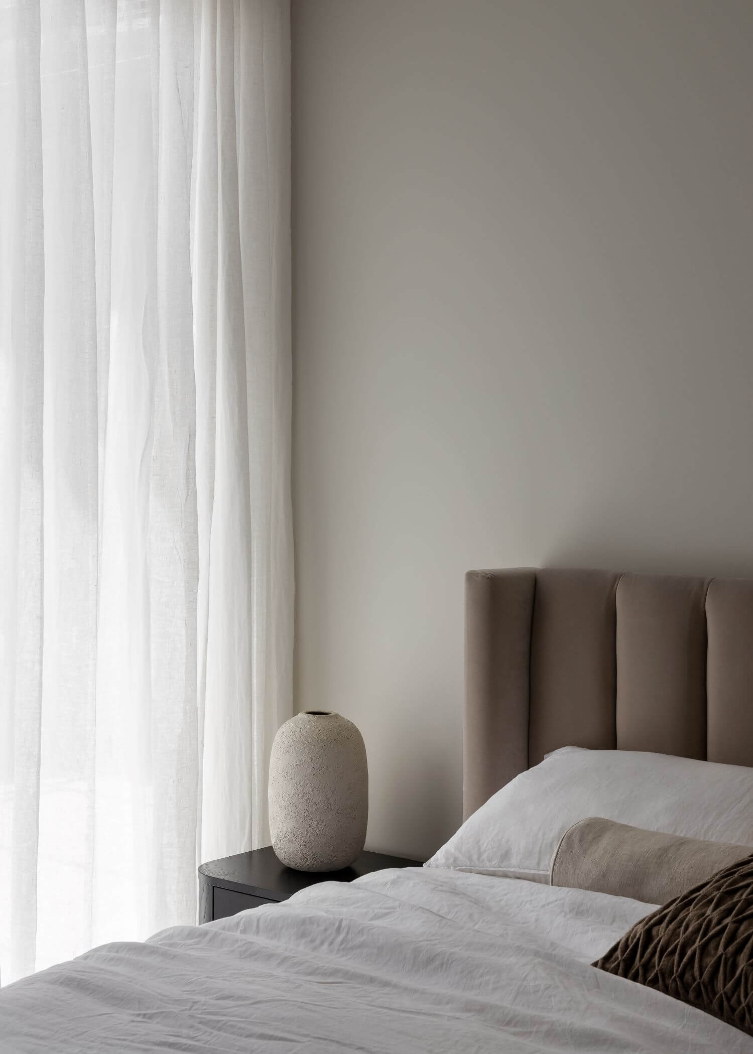
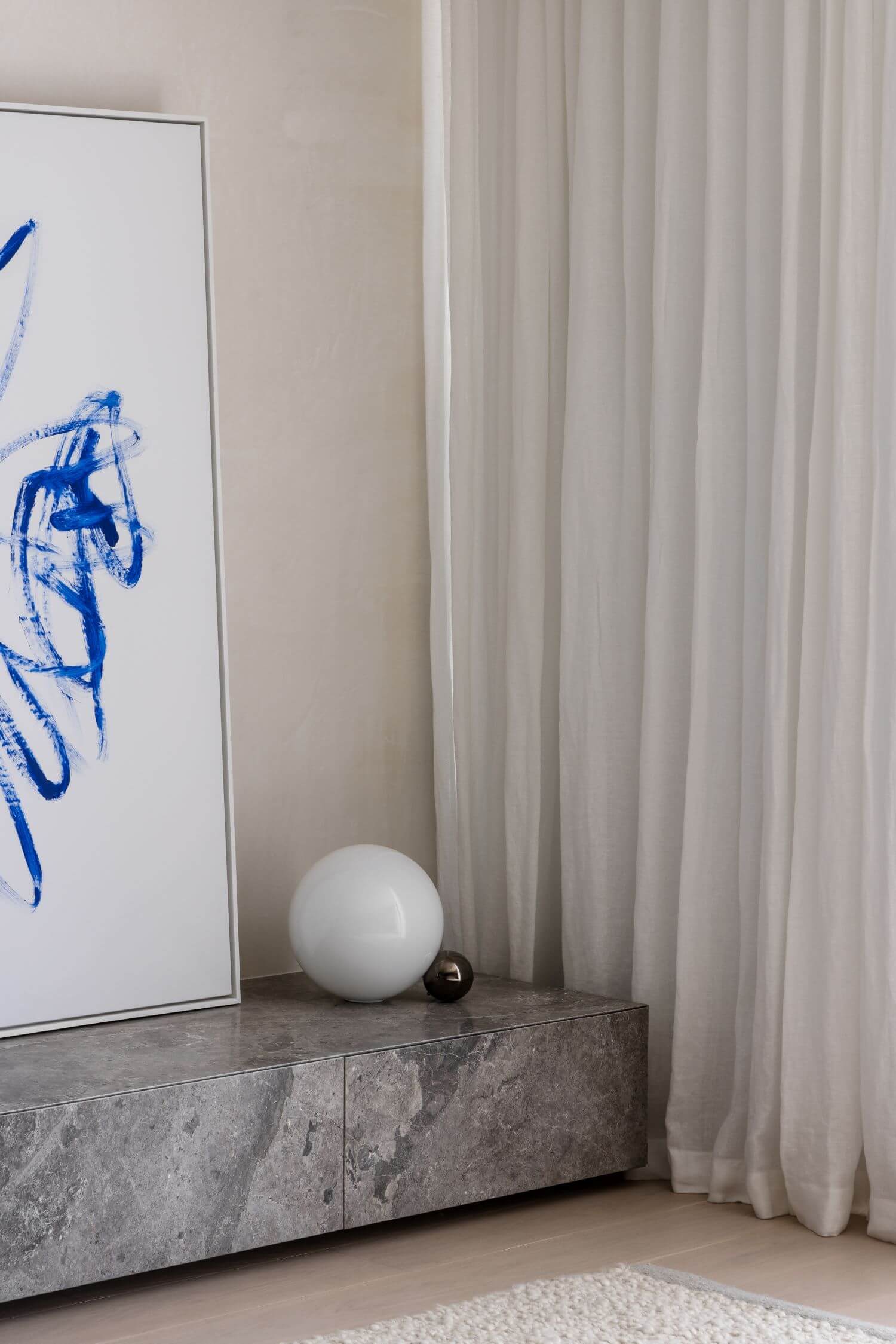
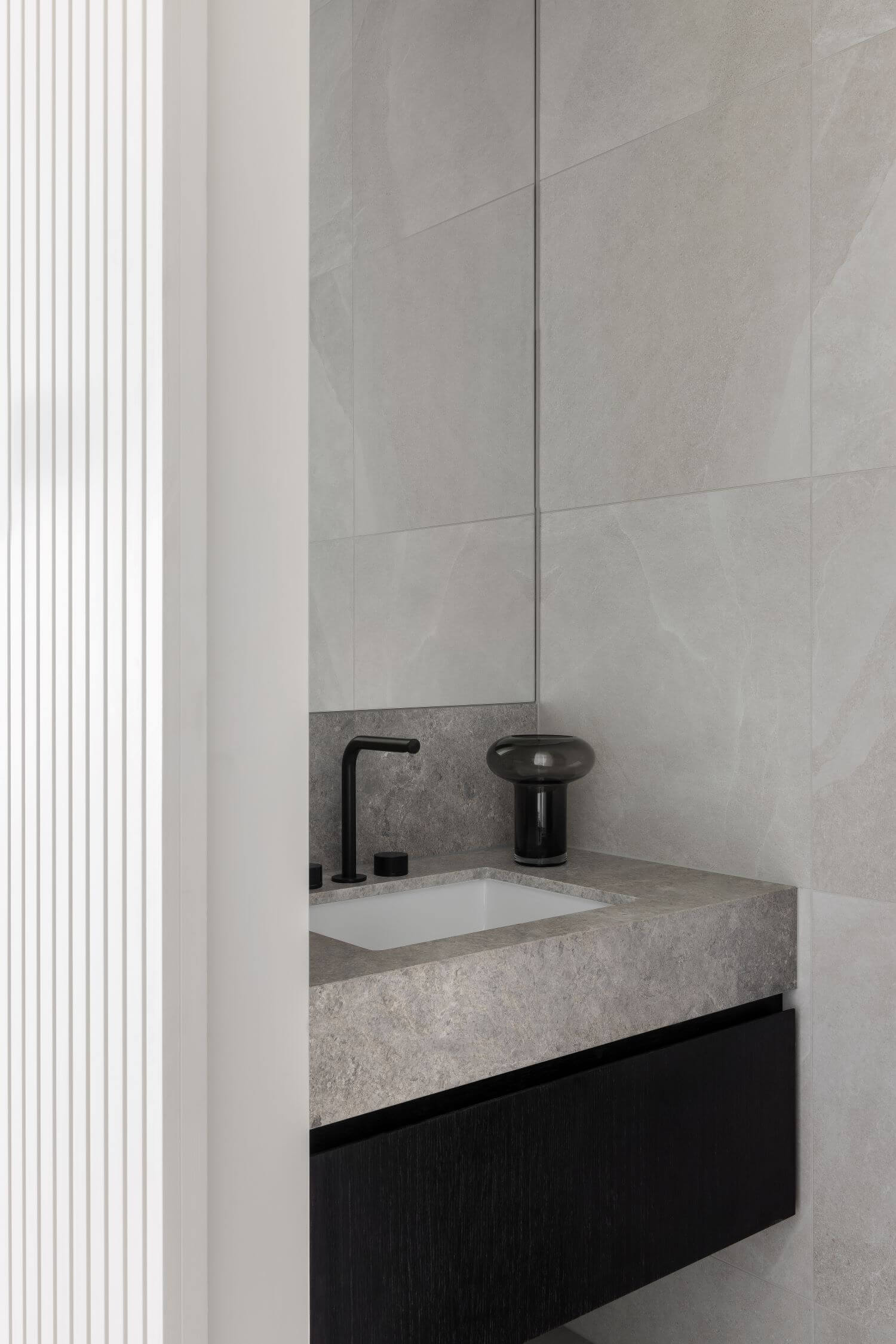
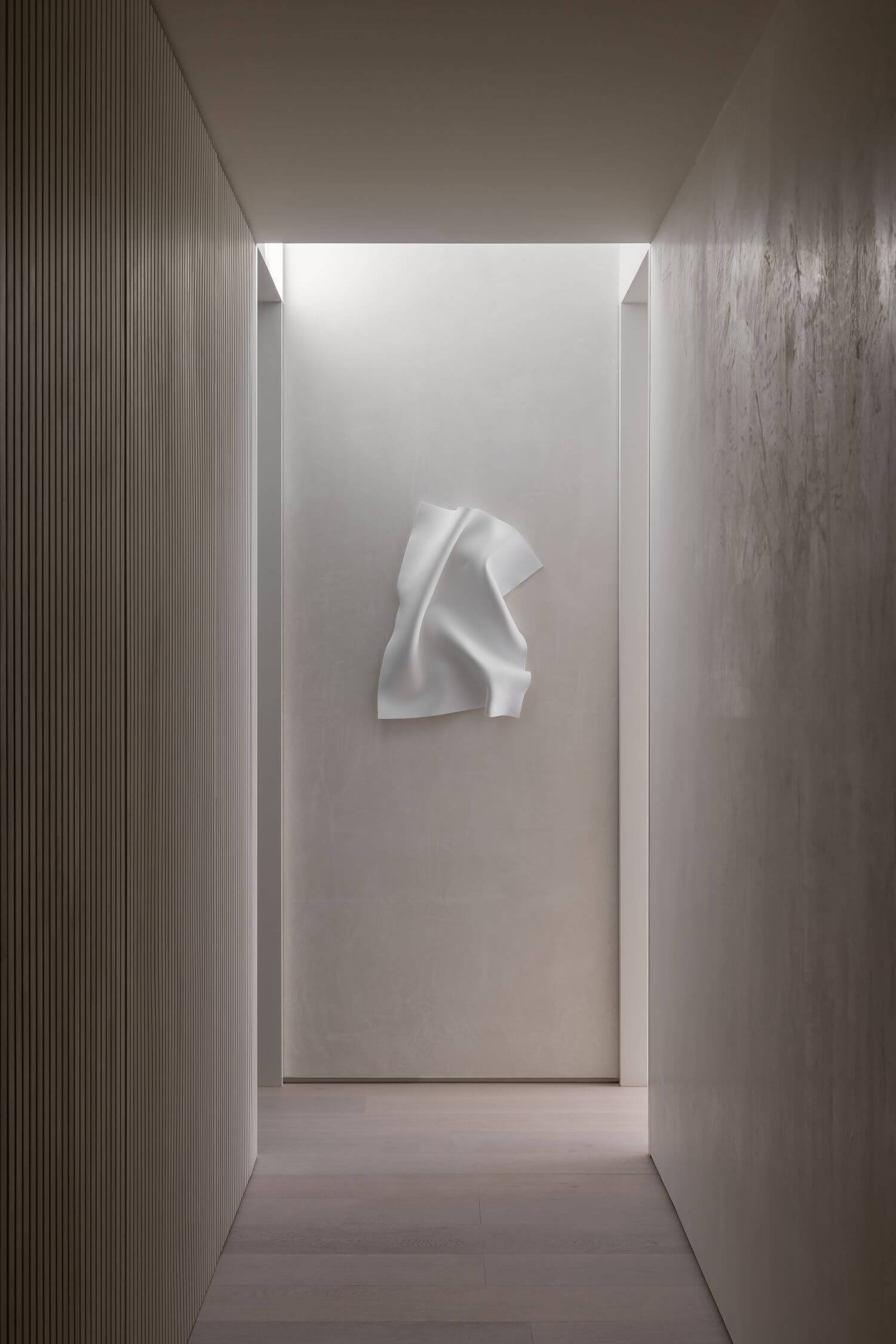
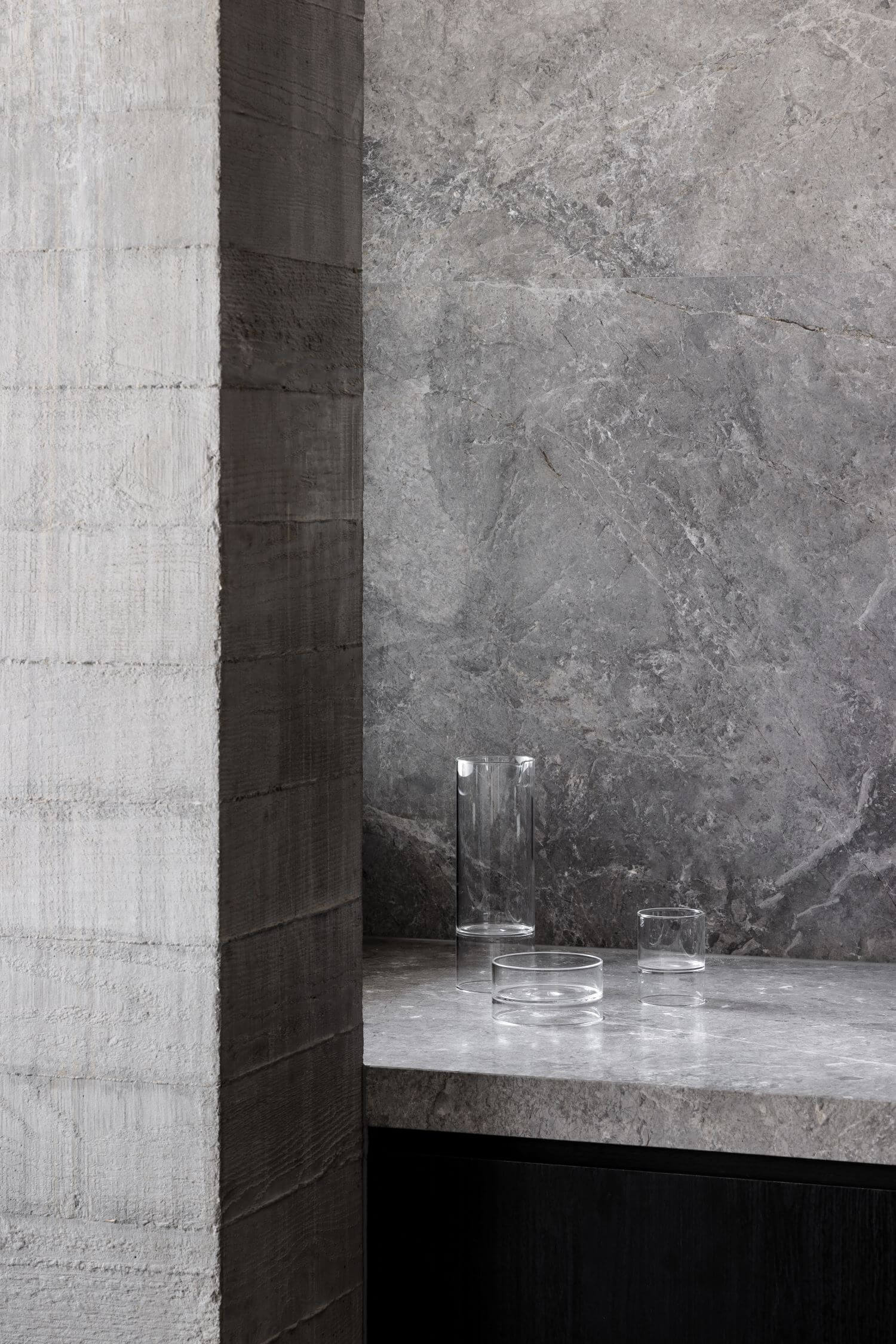
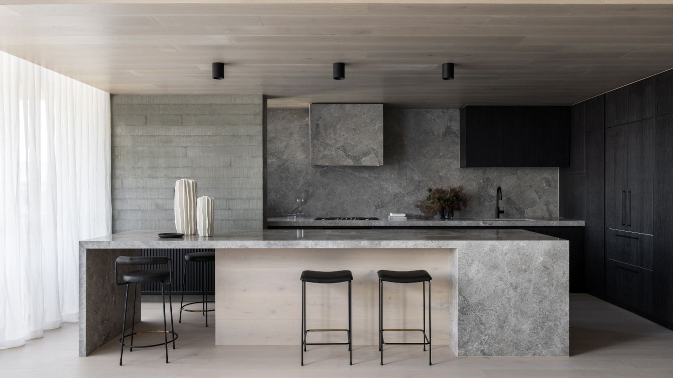
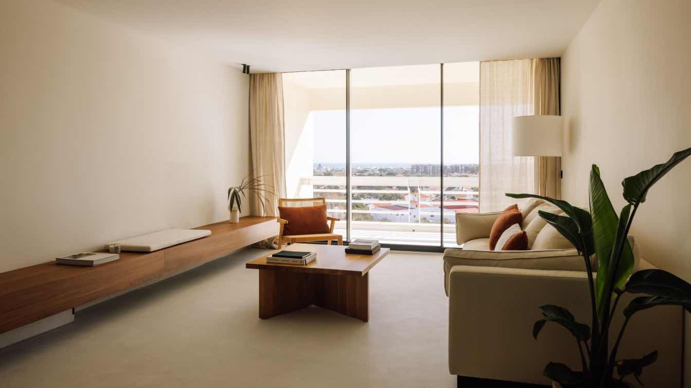
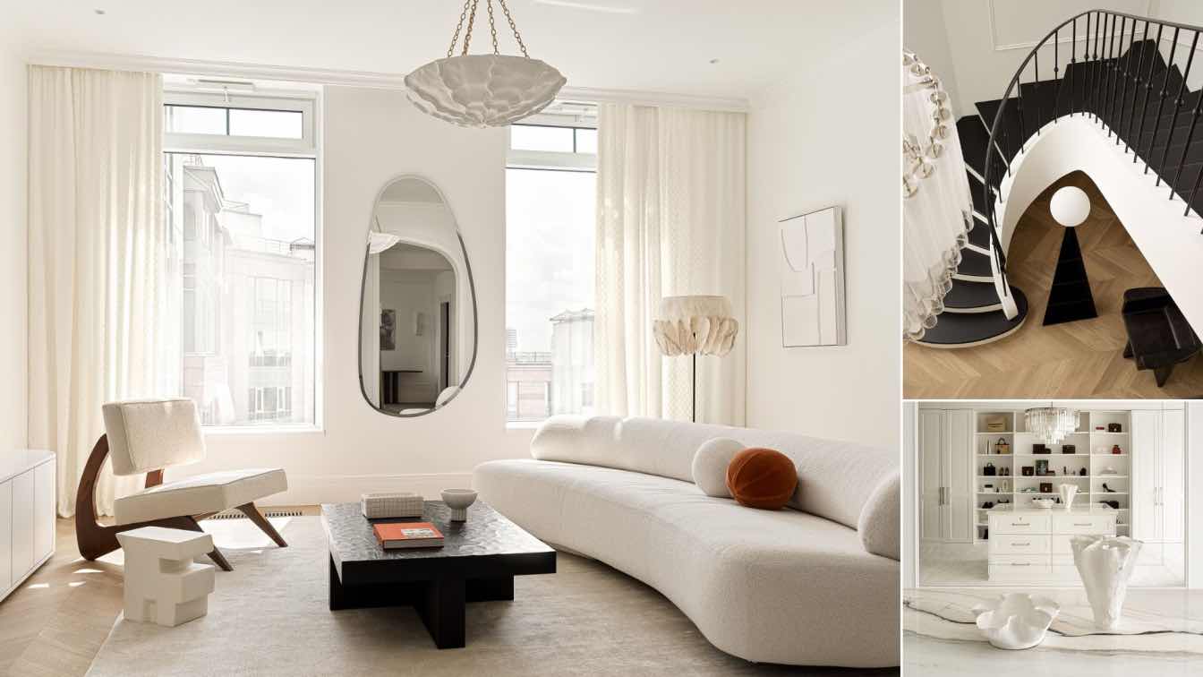
Mckimm: Moda Three is a light-filled apartment with an open floorplan for a family of three. The apartment features a studio style “out-house” bedroom plus ensuite, a wellness courtyard and wellness room, plus a timeless master suite – a sacred space.
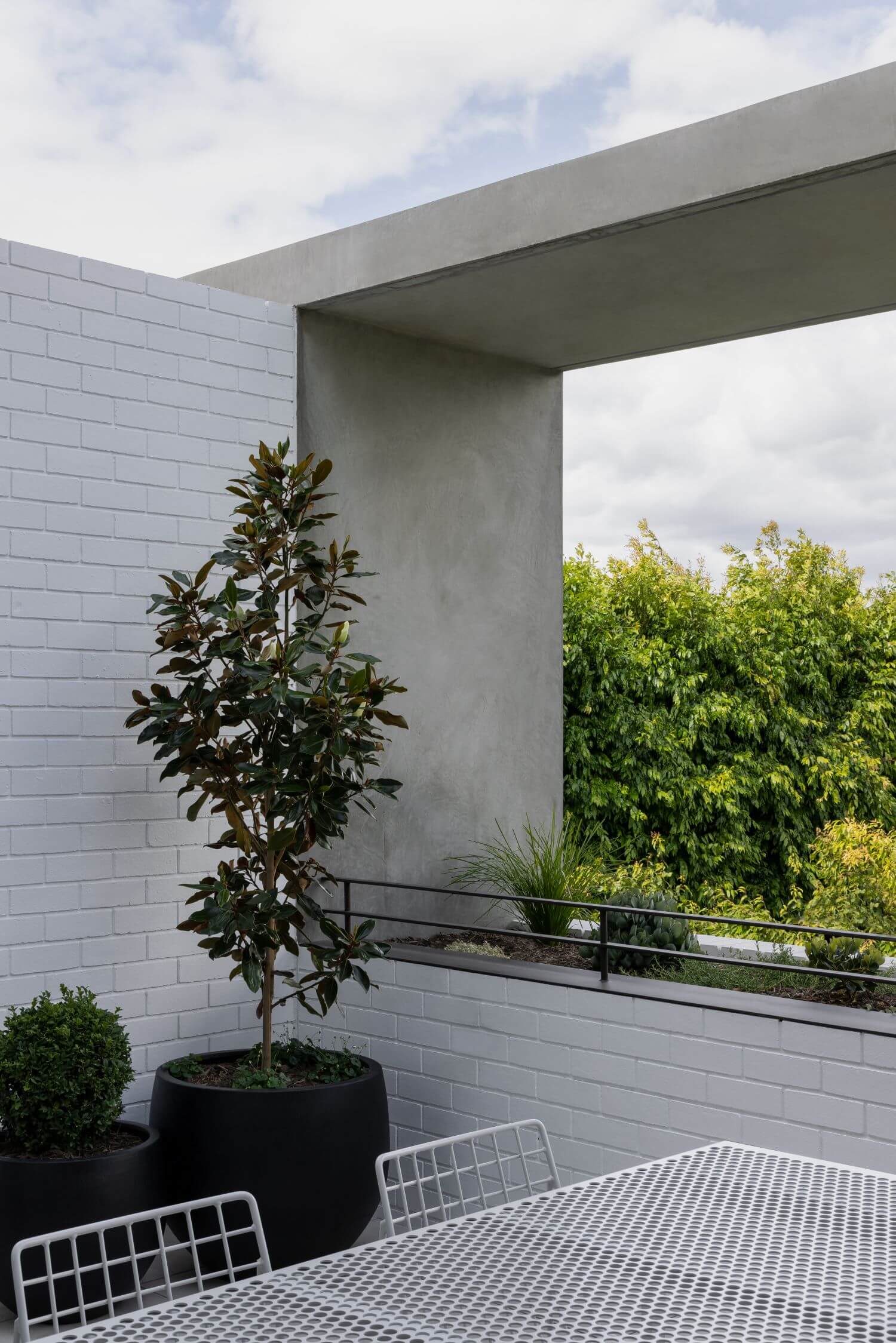
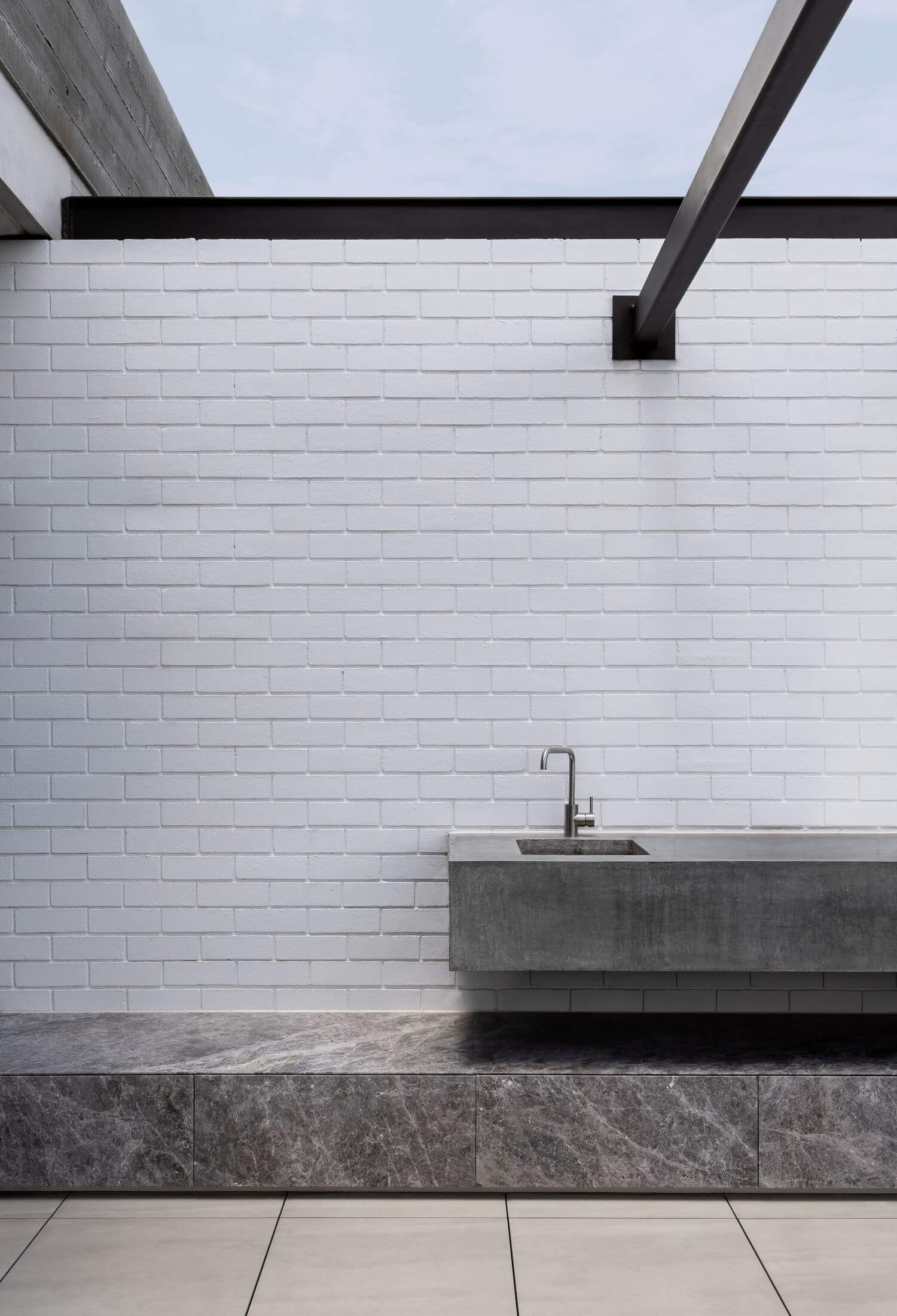
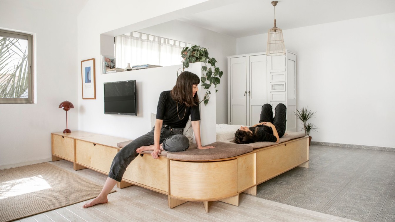
MODA Three was tailored to the client, an apartment bought off the plan which was then tailored to her specific brief. There was opportunity for her to grow the size of her apartment during the design phase. A third bedroom was added, which become a separate studio for one of her sons. Health and wellness is a big part of our clients life, so we created the perfect wellness room complete with Peleton bike, beautiful gym equipment from PENT fitness and a TV mirror that reflects the wellness courtyard. The wellness courtyard – a wholesome semi undercover space featuring an abundance of greenery, lounge setting plus an infrared sauna. The connection and flow between our clients master suite and wellness space was something our client fell in love with – this became a large focal point within the design. All furniture was then sourced and selected by us. Including a custom velvet ottoman designed purely for her cats – our client has 3 cats which she adores. The master walk in robe was another addition to her apartment. The brief was for it to feel like a luxurious dressing room, with ample display for her collection of designer collection of shoes and bags.
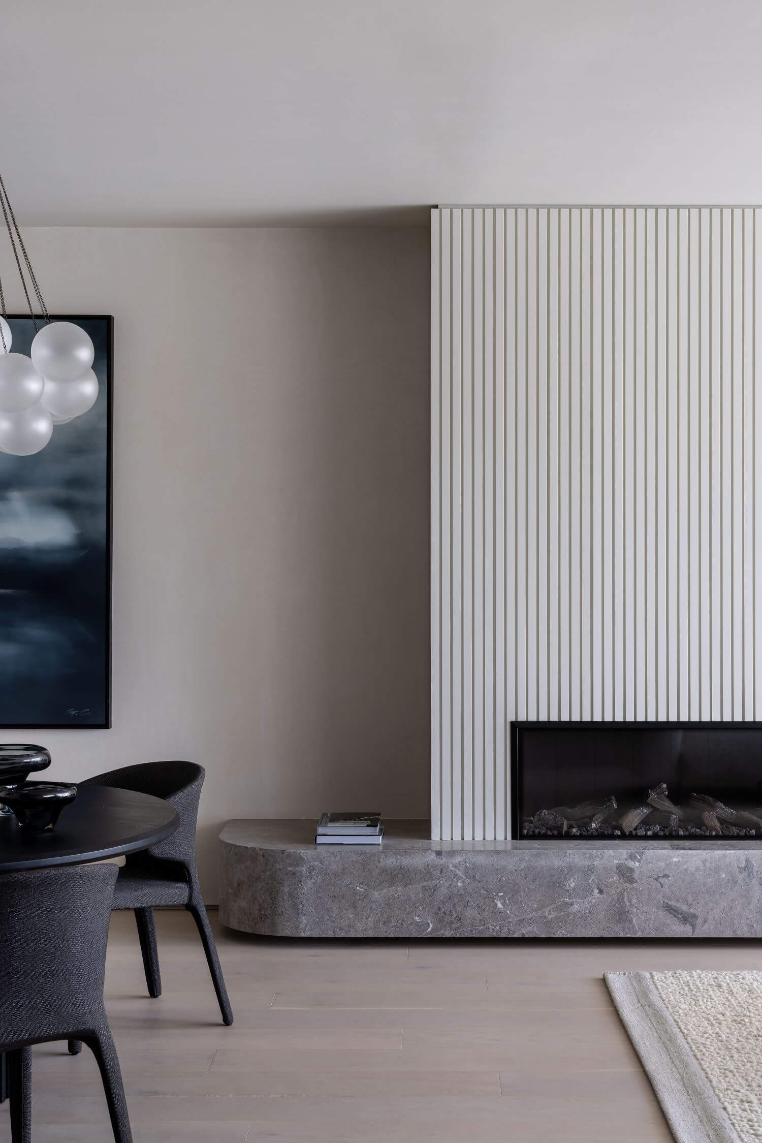
Timeless design – we were able to create a harmonic palette that feels creative and exciting but without being too bold that it will date quickly. Functional – each cupboard, shelf, drawer, ledge has a purpose – we maximised storage in clever ways where we used all voids, and negative spaces. All joinery remains decorative, with storage being discrete. For example using the space within the fireplace for storage, and using the corner of the kitchen next to the sink for a hidden microwave cupboard. The positioning of living an kitchen to the west allows full light to come through, with the bedrooms taking filtered light from the courtyards. Each space is zoned, and they way our client will use each space has been carefully thought through and reflected in our design.
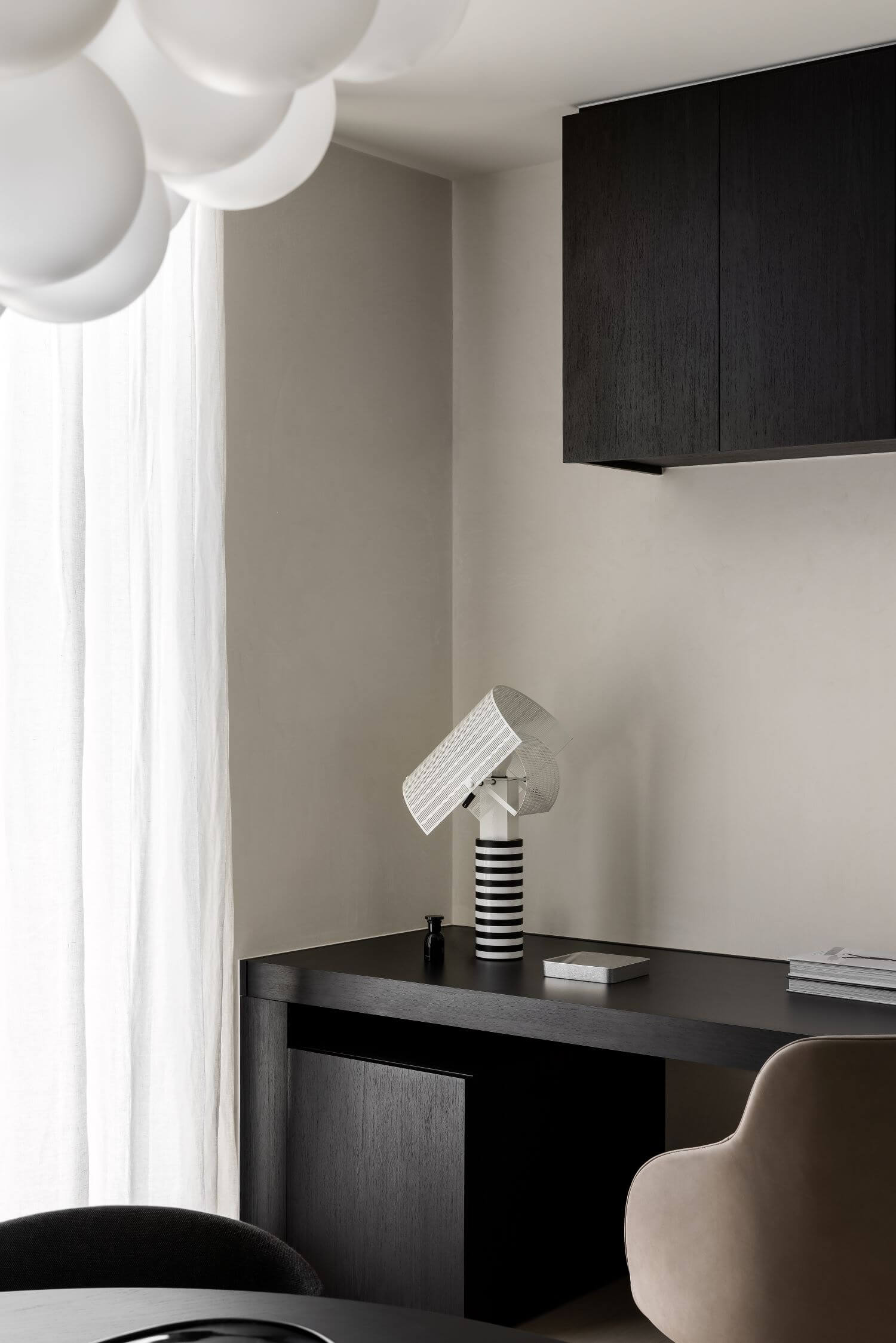
The apartment appears seamless and streamline, achieved through handless, concealed pivot doors to hallways and powder room door. Push catch cupboards also add this this minimalistic, clean feel. Our clients study features a custom automated stand up desk – discrete with mechanisms, so it remained aesthetically pleasing.
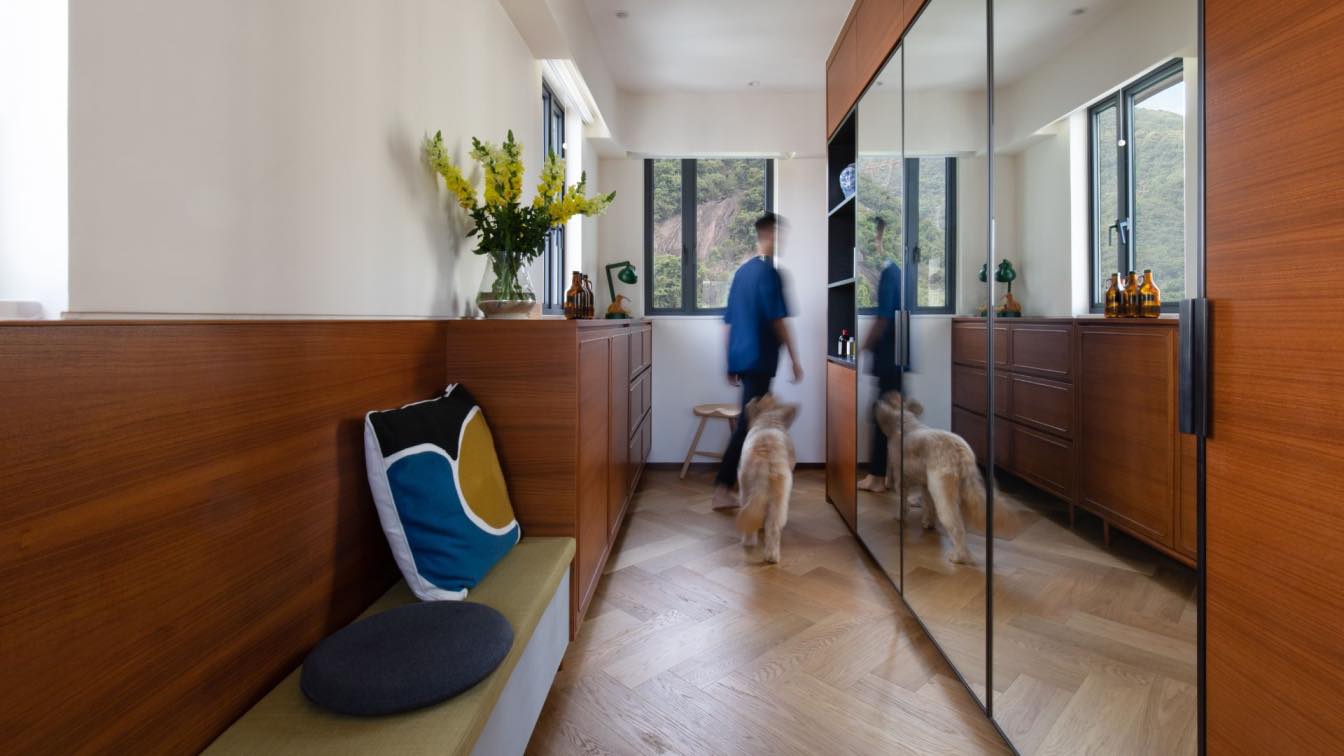
As you enter the apartment you look down the hallway to see a light filled living space. As you leave the apartment and exit through the main door – you walk towards a mirror wall which also reflects the light filled living space behind, crating end endless sense of open space.
