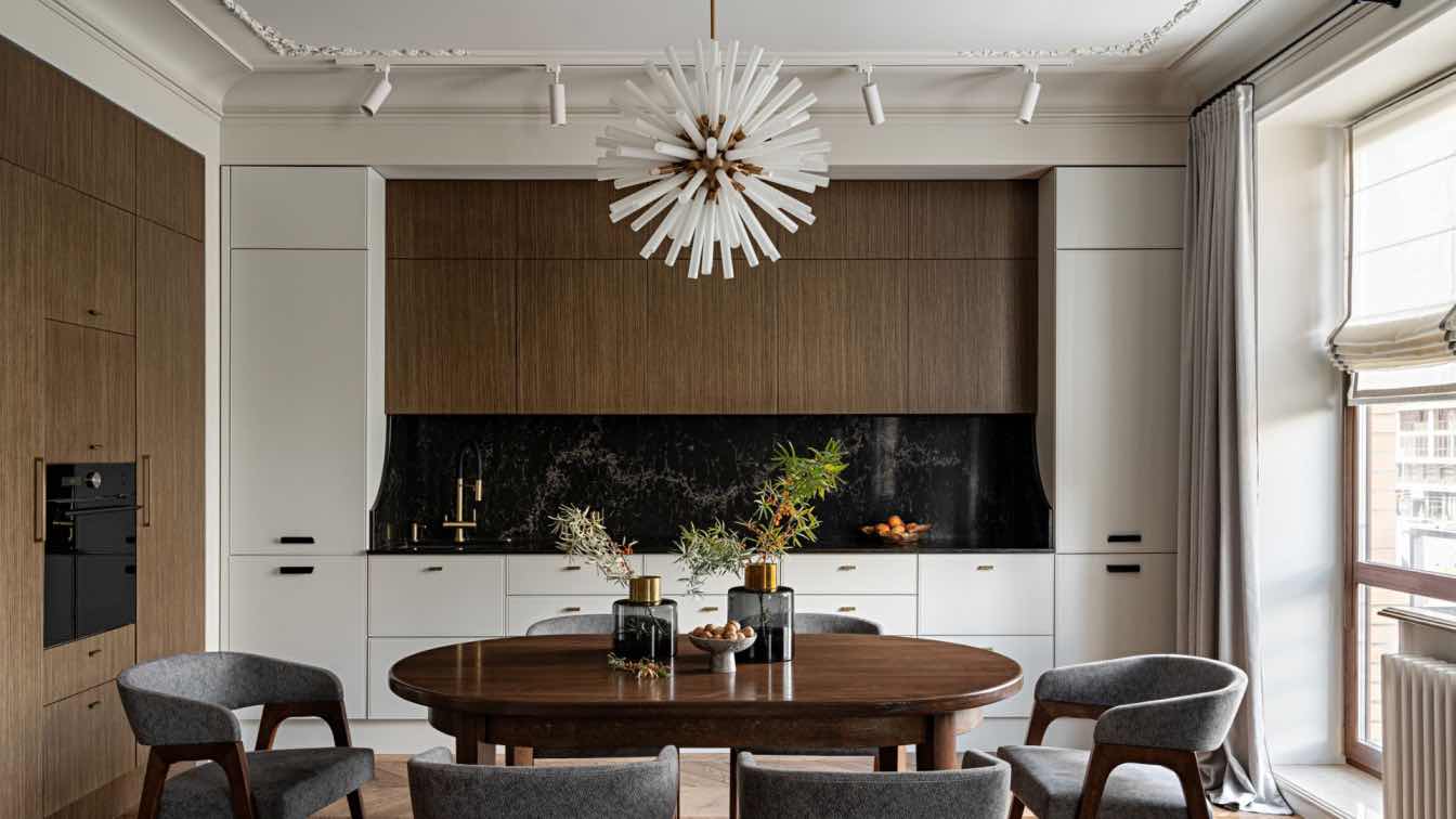
ART-UGOL: Interior of this three-room Novosibirsk apartment was designed for a family with two children. The owners wanted to get the ergonomic and functional space with calm and cozy atmosphere. The apartment consists of three main rooms, two bathrooms, and a detached clothesroom. The apartment's arrangement got some alterations. The bedroom was enlarged to comfortably add the study area. The bathrooms block was designed so to include two toilets with the laundry area, bath, and the shower.
The colour composition made the apartment quite calm in hushed tones. The grey color composition accompanied with “warm” wooden and dimmed green textile was selected to be the primary interior scheme. The interior combines various materials, such as light-colored engineered wood panels, milk tone of the painted walls and curtains, grey textile of the soft panels used in decorating walls and seating furniture; grey texture of the porcelain tiles in the hall and bathrooms; dark-brown colored veneer panels; and finally, white colored ceiling and furniture.
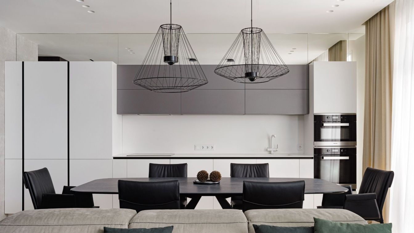
When entering the apartment, the first you see is the wall decorated with dark veneer panels, which hides the door to the guest bathroom. This space is subdivided into segments using ‘cutting’ the wall with vertical panels. Farther on they transform into doors of the multifunctional cabinet with additional storage space, which is in the sitting room. The dark color of the wood synergizes the total interior space and contrasts profitably with the general light-colored scheme. The dining furniture manufactured by Catellan and accompanied with six leather-covered black chairs is located in the dining room. The authors selected a table with a ceramic dark-grey tabletop. It is illuminated by two ambient lights. They are considerably big, however, look very light, and do not ballast the space.
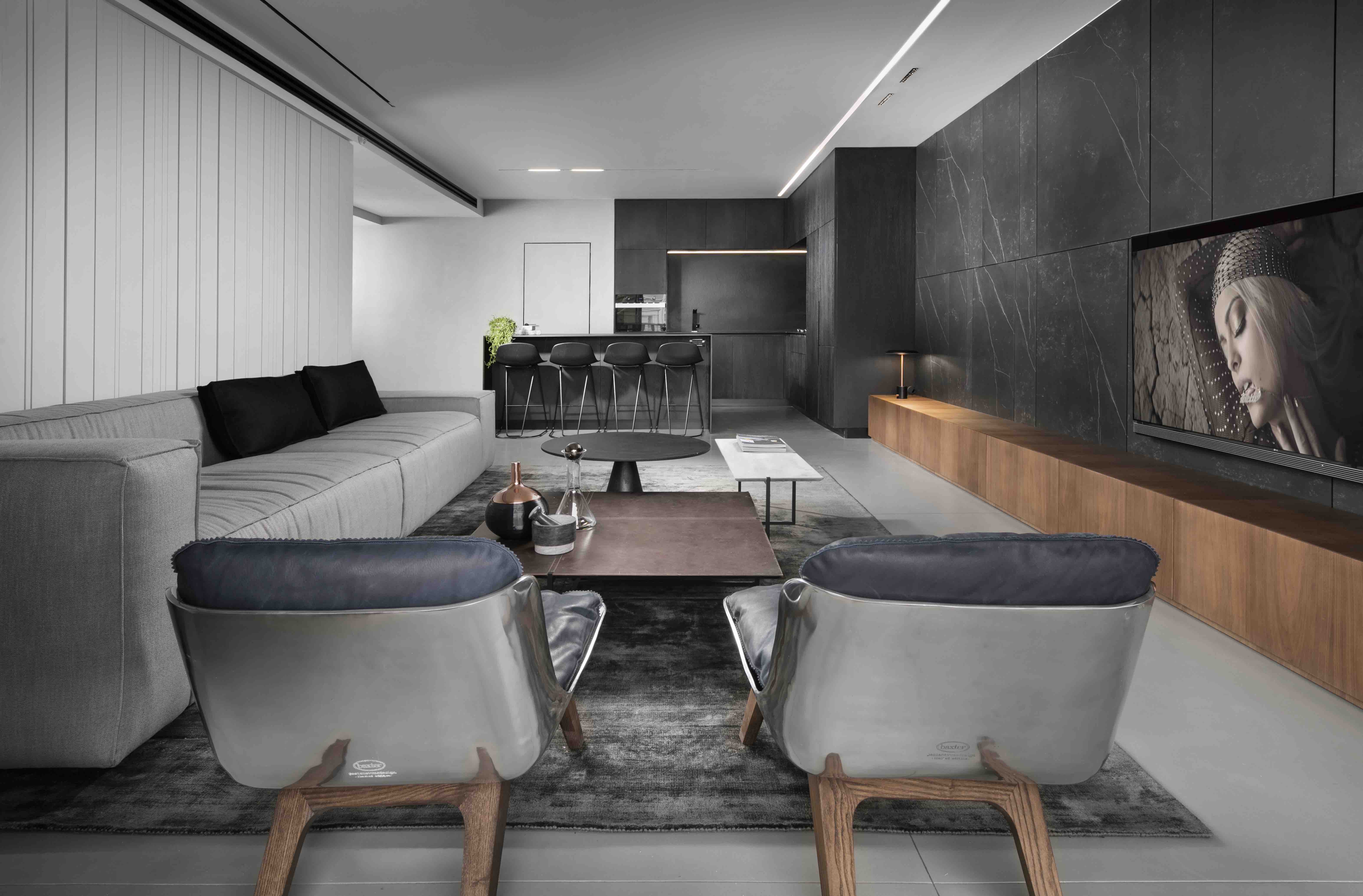
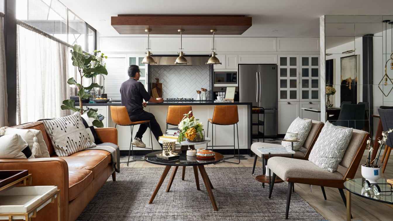
Linear-style kitchen was custom-made under individual drawings of the authors. As a result, it became quite commodious with two integrated fridges and all other necessary household appliances. The splashback, as well as the tabletop were decided to be decorated with artificial stone to provide more unity. The sofa zone received the bright-yellow accent due to the leather-covered ergonomic armchair. The general composition was completed by the couple coffee tables and the grey carpet. The TV-set zone was detached by the grey textile-covered panels decorated with green-colored inserts.

Visually, the bedroom harmonizes with the sitting room-kitchen. Here, the grey textile is represented by the bed’s covering, and the calm green color is on the Vitra boudoir chair and Vibia pendant lamps. The warm tone fabricated wood block flooring covers the whole bed head wall to unite the room and add more coziness. The owners’ demand was to arrange a large working area with a computer. To make this zone harmonized with the general interior, but looking unusually the authors decided to make the desk in the form of the veneer-covered object ‘floating’ between the room’s walls, while all the hardware, the monitor, printer, and other should be maximally invisible at the background of the dark colored plane. Thus, the Vitra leather armchair perfectly matches with the other furniture in color and does not fall down from the general concept.
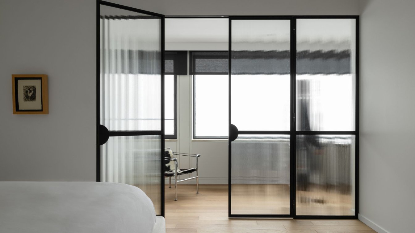
The clothersroom is located next to the bedroom, behind the sliding door. The storage area includes all three walls from the floor up to the very ceiling, and there are two sliding mirrors installed to the right and to the left from the doorway. The children’s room for two daughters. The room was equipped with two beds and a wardrobe with shelves for each child. The study area will be in future located by the window. The rime color scheme of this room is light-grey without adding any other colors, as the room became absolutely different and colorful after adding toys there.
The bathroom, in addition to its main functions, is also used as a laundry. So, to the right and to the left from the doorway there are mounted cabinets with a washing machine, a dryer, a heating boiler, and some extra storage area. All this does not arrest attention as just couple steps forward, it all remains behind, and you see a large mirror and the bath basin. The mirror hides LED backlights, which generate unusual illumination scenario of the room.
The guest bathroom is a bit darker than the main bathroom due to decorating the shower zone with the grey tiles. The shower was removed from the main bathroom to the guest’s specially to optimize functional zoning within the apartment. Illumination has several available scenarios. They include the general headlight, as well as the additional lightning represented by the LED backlights. The second scenario can be used to form a cozy and dimmed night atmosphere. Thus, illumination in each room can be adjusted according to the daytime or based on the mood.


