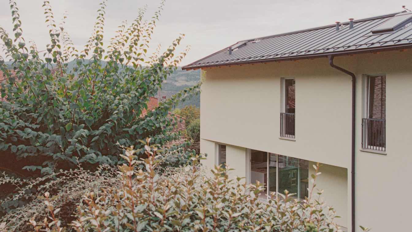
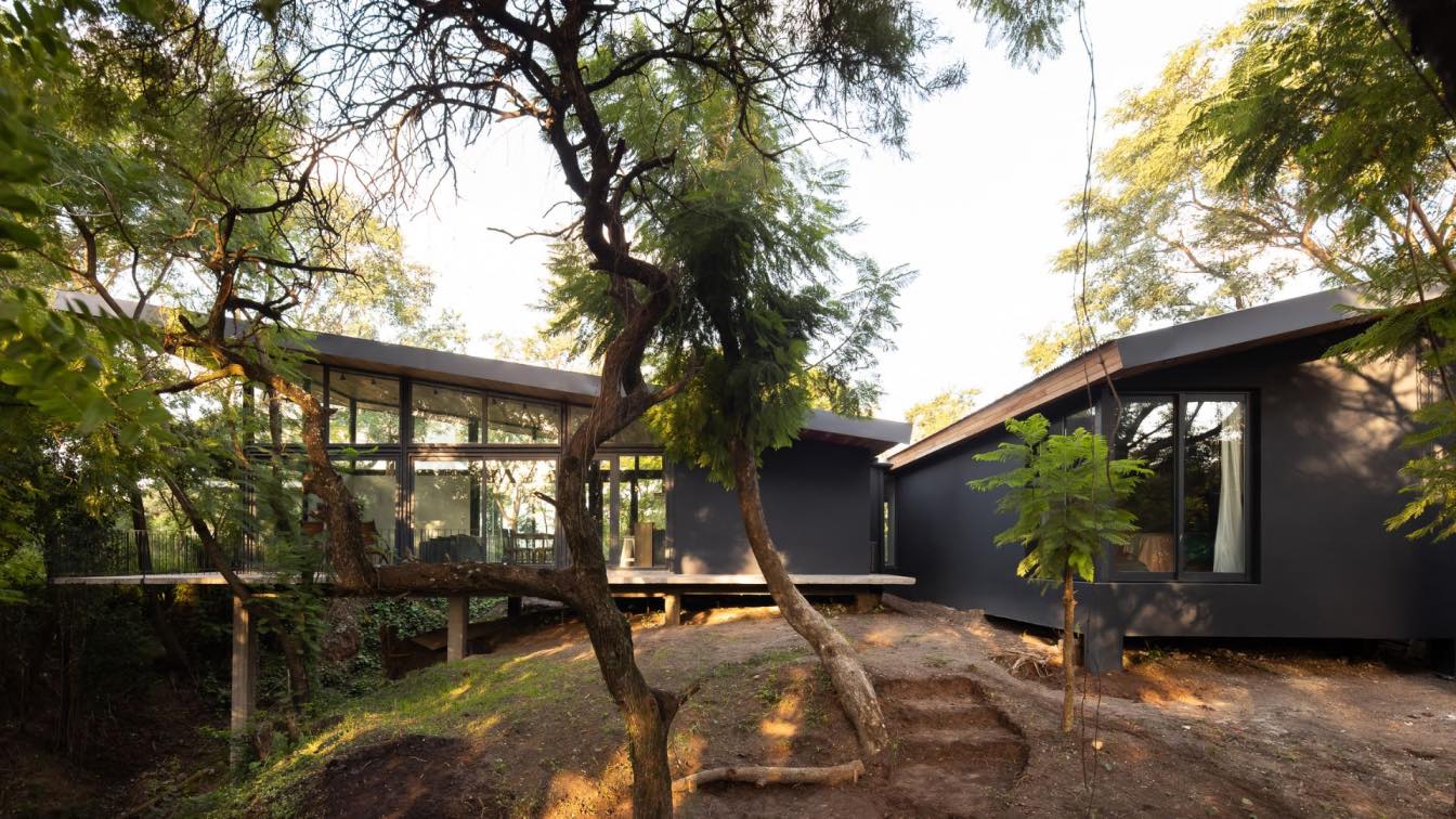
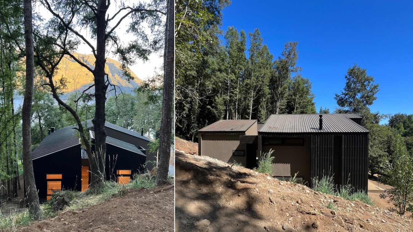
Casa Tres Árboles — developed by Mariana Morale’s design firm, dıreccıon — is a remodeling project on a 25 year old outdated weekend home in Valle de Bravo, Mexico. The starting point for the design was the client’s directive: to give the house a refreshed style with updated finishes to accommodate more frequent visits while maintaining the weekend getaway feel of the place.
From the parking lot at street level a downward stairway is the main access to the house. The steps skirt around a beautiful tree and stone planters full of green lead the way to a small patio. A bathroom and a slanted roof were removed for a clean and unified access and a new planter was built and covered with philodendron winterbourn, clove, blue fern, liriope grass and davallia fern. These elements together constitute the design of the primary outdoor porch.
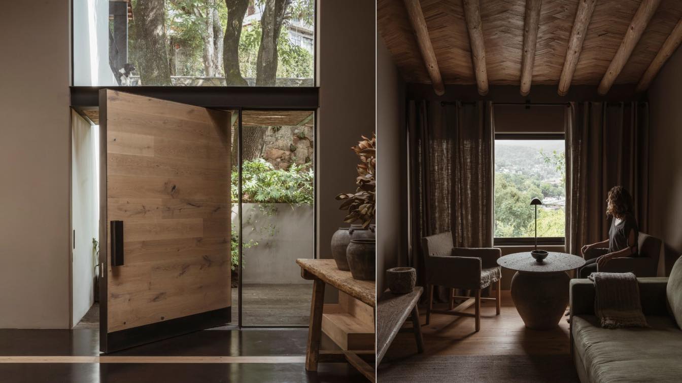
Once inside guests are greeted by a bright double height foyer filled with natural light coming from the glass dome atop. This decidedly sculptured hall is the prime space to pause and become surrounded by the material serenity of the house. The tree from the entrance can be seen through a large window. A tall wall was built to hide the stairway and on an opposite wall a black painting by Beatriz Zamora completes the design. A shift in floor level provides a threshold; the foyer serves as a gateway that connects the private – bedrooms on the upper floor, and common - and living area on the ground floor, spaces of the home.
The goal of this project was to create a space in natural and warm tones to convey a sense of refuge and retreat, of monastic sanctuary. The color palette integrates the flow of the elements and, with every piece and material carefully curated, creates a space for repose, meditation and balance.
What was the brief?
The starting point for the design was the client’s directive: to give the house a refreshed style with updated finishes to accommodate more frequent visits while maintaining the weekend getaway feel of the place.
What were the key challenges?
The greatest challenge facing the restructuring of the dwelling was the unleveled terrain with pronounced slope in which it sits. A few changes were made: walls were removed, levels evened, spaces cleared and openings broadened for a greater flow of natural light. The two new columns added, grounded 65 ft down, now hold the main beam on ground floor, allowing the dividing wall between dining and living rooms to be removed.
How is the project unique?
The goal of this project was to create a space in natural and warm tones to convey a sense of refuge and retreat, of monastic sanctuary. The color palette integrates the flow of the elements and, with every piece and material carefully curated, creates a space for repose, meditation and balance.
What were the solutions?
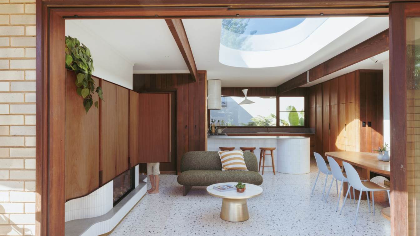
With the remodeling the living and dining rooms are now open to a new sundeck integrated with floor to ceiling openings, and they blend into one single living space. This joint common area becomes the center of energy of the house, where most of the home activities take place. On the outside, a stone fire pit custom made is the perfect night-time gathering spot for the family, and during rainy season, when seldom used, it double serves as a watering spot for local birds. All common and rest areas, both indoor and outdoor, offer an exceptional view of the lake.
What building methods were used?
The materials chosen for this project feel warm and natural to sight and touch. Upon express request from the client, the wooden andrion and roof shingles were preserved. The flooring for the foyer was specifically designed to integrate the two elements used throughout the house: wood – in the same shade as the ceiling – and black microcement. The walls were plaster and painted in a light brown-gray hue. The flooring of the porch, patios and sundeck are from textured tlalpujahua stone, custom cut designed by dıreccıon. The kitchen and bathrooms also reflect the serene and calm character of the natural elements that set the atmosphere of the house. Their design is dark and clean. The cold stone countertops stand in stark contrast with the smooth finish on the walls that shift in color as the light of the day changes, as pigments found in nature do - olive green, gray, ochre… In the bathrooms the light seeps through the andiron showering the black microcement floors and light gray walls.
Key products used:
Production of the furniture and selection of fabrics and fixtures were done in close collaboration with Habitación 116. All fixed furniture – closets, bookshelves, vanities – were designed by dıreccıon. The island in the kitchen is from Piacere; the tableware was handpicked by Mariana Morales from colectivo 1050 and the living room bench from txt.ure. The art selected for the walls is from the client’s private collection.


