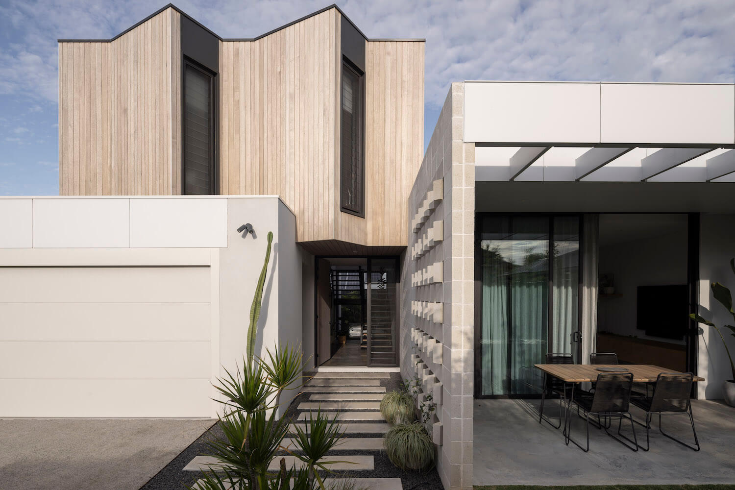
Robeson Architects: Unlike the majority of medium density infill in Perth, The Strand aims to maximise outdoor space and reduce the impact of the urban heat island effect. Much of Perth’s Urban infill has little regard to the site, orientation and the homes seek to maximise the footprint. This approach creates hot homes with dark outdoor living areas. However the Strand was designed around north facing livings areas, and reducing the ground floor footprint to maximise garden spaces.
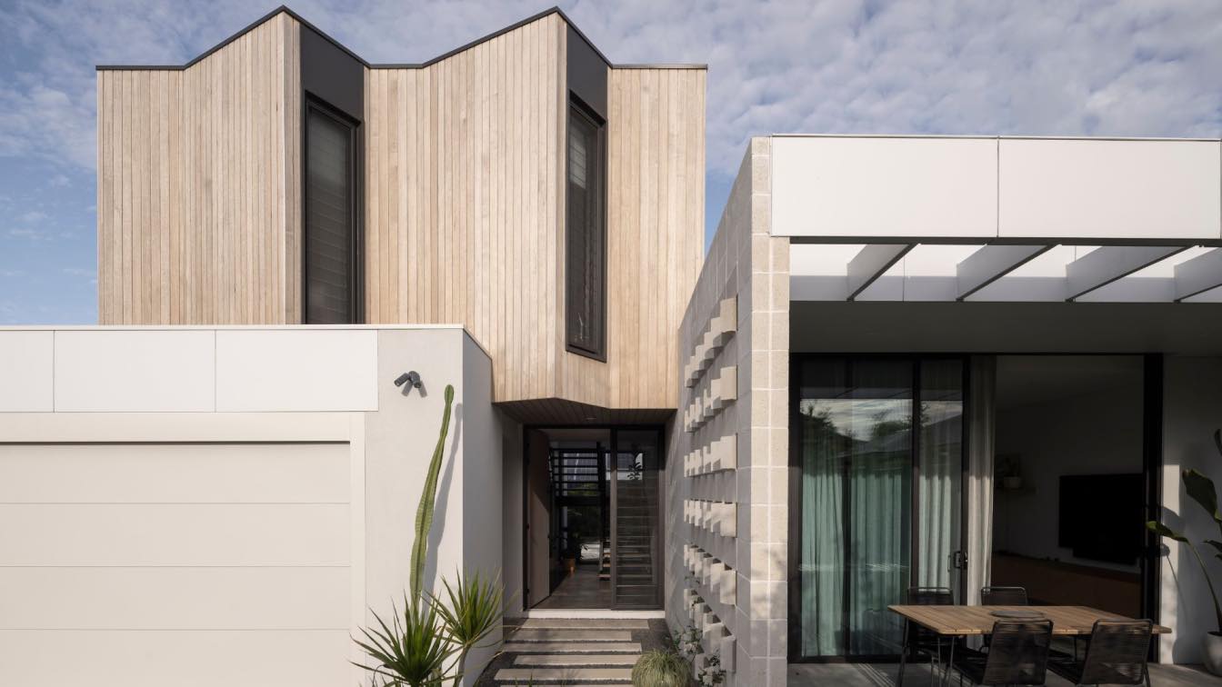
Built on a very tight budget, this infill development doesn’t feel cheap. Working to a ‘less is more’ approach, the reduced floor area allowed for a bigger garden and the budget to be stretched further. Local Australian timber and WA made masonry blocks were the main features of the home, with ivory render used elsewhere to keep costs down.
Sitting on an a rear battle axe block, the ground floor is split down the middle, creating a living wing and ‘back of house’ wing. The upper floor sits entirely over the back of house areas, allowing for higher ceilings to run the full length of the kitchen, living and dining wing. Full height glazing was strategically places at both ends of the living areas so users read the full width of the block, making the spaces feel larger. The masonry blocks bisect the length of the house, creating a continuous linear feature that separates the living areas from the back of house areas. The angled hit and miss was designed to allow for the owner to see guests walking down the driveway while still blocking views of parked cars. The upper floor sits over the garage and laundry and is clad in a Victorian Ash designed to grey off over time. The windows to the study & ensuite are angled north to capture more light during the winter months.
