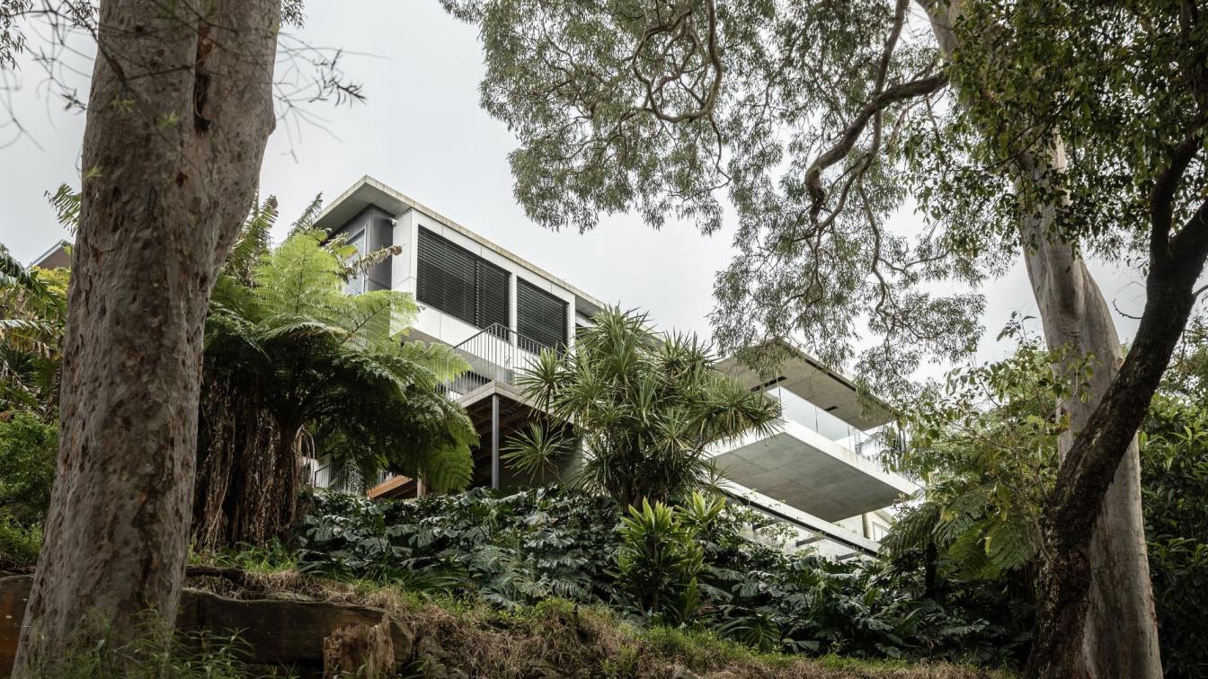
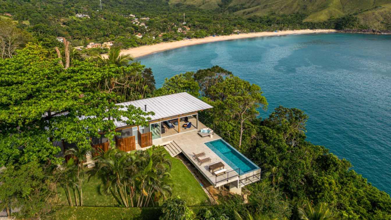
Castlepeake Architects: The site sits at the end of a narrow access lane well below the main street level. The terrain is steep and looks across Woodford Bay to uninterrupted views of the harbour bridge and city skyline. The existing house had a poor sense of entry and lacked efficient horizontal and vertical circulation paths. Its arrangement did not take full advantage of the attributes of the site including access to view and winter sunlight. The alterations address these issues through re-modelling the carport and entry which include the addition of an internal stair and a lift which efficiently access the lower sections of the house.
The main living level is elongated to the north and south; cantilevering from the existing masonry base below it so that views to the east are maximised. It is pulled away from the structure to the west to create a sunny and protected courtyard adjacent to the main living space. The alignment of this protected area continues southwards through the house to include stairs and an internal courtyard which provide light deep into the inside of the house. The roofs are landscaped to provide interest from above and a lap pool is elevated above the ground to be level with the bedroom and rumpus areas. Apart from providing the normal amenity of a pool, its form completes the horizontal composition of the house.

What was the brief?
Reconfigure the existing aged and poorly arranged structure to achieve four main requirements:
- provide complete accessibility throughout the house
- relate internal spaces to view, sunlight and adjacent external space
- provide the main living and sleeping space on one level. This level was to be 'apartment like' for ease of use by the owners who are a retired couple
- provide an accessible swimming pool at the lower level of the house
What were the key challenges?
- The site is very steep so that the vertical distance through the house is large
- The available space for cars and entry to the house at the top of the site is very limited by a shared driveway, height covenants protecting neighbour views and easements for neighbours' services and access. As a result there was much interaction with neighbours and council during the approval process in regard to height, view loss and building footprint.
- Maximising the view from the main living and sleeping level
- Providing accessible and protected external spaces adjacent to living areas on such a steep site
- Maximising winter sun access to internal areas
What were the solutions?
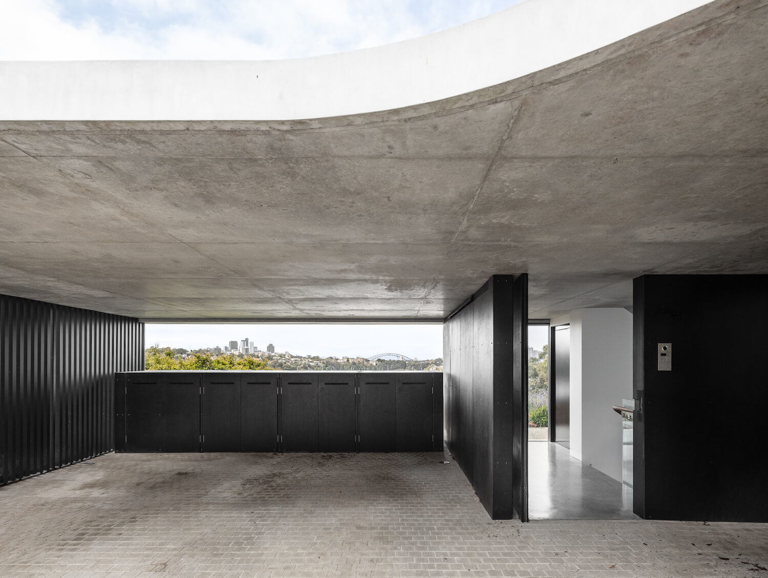
- An open carport doubles as an entry porch providing level access to a compact stair and lift down through the steep site. Harbour views are framed at the end of the carport and entry vestibule
- The entry ceiling heights are low below a shaped concrete roof structure to comply with height covenants to retain neighbours' views. The low height and small entry footprint also provides the feeling of 'compression' before 'release' into the generous / more open living spaces below
- The experience of the tall progression from entry down to the main level is enhanced by framed views to the harbour and views of the garden roof and courtyard spaces below along with areas to view the owner's art collection
- City / harbour views and space are maximised at the main living level by extruding the floor plate almost across the entire site. This required a concrete structure which cantilevers from either end of the existing masonry structure below it.
- The main concrete structure (roofed by the garden mentioned above) is pulled away from the entry structure creating a courtyard split by a secondary stair and glass walkway linking the two areas. The courtyard provides protected and level external space accessible from the main living space. The smaller portion of court which is cut away by the link provides a garden off the kitchen and study. These external spaces maximise winter sun and ventilation to the house.
- On the opposing / harbour side of the living space, a large concrete terrace (with concrete roof) is cantilevered from the main cantilevered form over the swimming pool area below.
How is the project unique?
It is unique through:
- its simple arrangement around a courtyard with integrated landscaped areas including a garden roof
- Its play of enclosure and openness, compression and release in regard to heights
- Its relationship outwardly to iconic city, harbour and waterfront reserve views and inwardly to smaller courtyard spaces
- Its sophisticated cantilevered structural system
- Expression of materials in their raw or largely natural state

Key products used:
External materials requiring minimal maintenance including:
- Off form concrete
- CSR barestone - raw fibre cement sheeting
- Kobe board - charcoal coloured oiled cement bonded wood composite sheeting
- Aluminium and timber windows and doors
- Limestone crazy paving to terrace floors
- Dry random Sydney sandstone garden and courtyard walls
'unadorned' Internal materials including:
- Polished concrete floors at the upper levels, timber floors to the lower level
- Off form concrete ceilings in the main areas, plaster bulkheads and lower ceilings in secondary areas
- Timber veneer, corian and dekton joinery
What are the sustainability features?
- Solar system and battery power the majority of the energy requirements of the house
- Narrow building forms allow effective cross ventilation and winter sun penetration
- Adjustable sunshading devices on the exterior of the building control sun penetration
- Rain water storage for reuse in and around the house
- Integrated garden areas provide edible garden options off the kitchen
- Retention of a large portion of existing structure at the base of the building


