Shulin Architectural Design: Liuba is located in the south of Qinling Mountains, experiencing four distinct seasons and pleasant weather. As the entrance to Liuba Mountain Scenic Area, the service center is located in a mountain lap in Liuba County. It mainly contains reception and consultation, public toilets, cultural and creative products sales, and a book bar not only providing a place for rest for the villagers, but also showcasing a strong sense of openness.
Site memory
The first arrival was on a cloudy day in April. With hazy mountains at distance, the two horizontal red brick houses were placed at 60 degrees on different elevations, while the mountains on both sides seem close, giving a strong feeling of being surrounded. Looking along the lap to afar from the open space in the site, there is only very simple view of the distant mountains above the roof. From the on-site memory, two key elements are extracted: the axis of the architecture and the visual angle of the mountain.
The new building inherits the original texture and axis, with the aim to retain the memory of the original site. A space is arranged along the axis of the mountain side as the toilet, and a special wall is used to separate the functional and spacial areas. The climbing road passes through the building along the wall for the convenience of tourists, and a reception area with semi outdoor public space are designed to the left side of the stone wall along the other axis. There are multiple motion lines in the building: one goes up directly along the left side of the building without passing the internal road of the building, while another enters the building before it diverses into multiple paths to go up to the mountain. The visual angle to the mountain is simple through a slanting rood, with a platform on the roof for those who climb high to look far into the surrounding mountains.

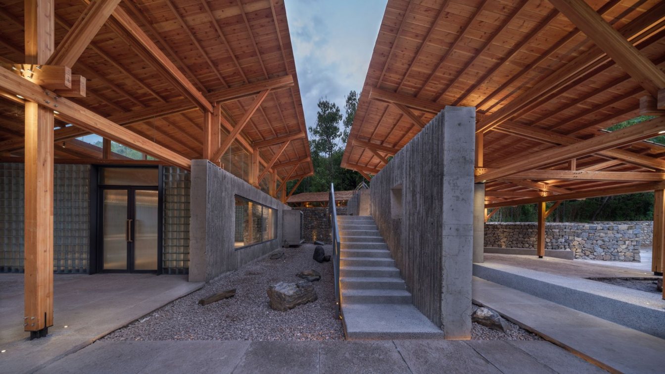
Three roofs, one roof truss and several walls
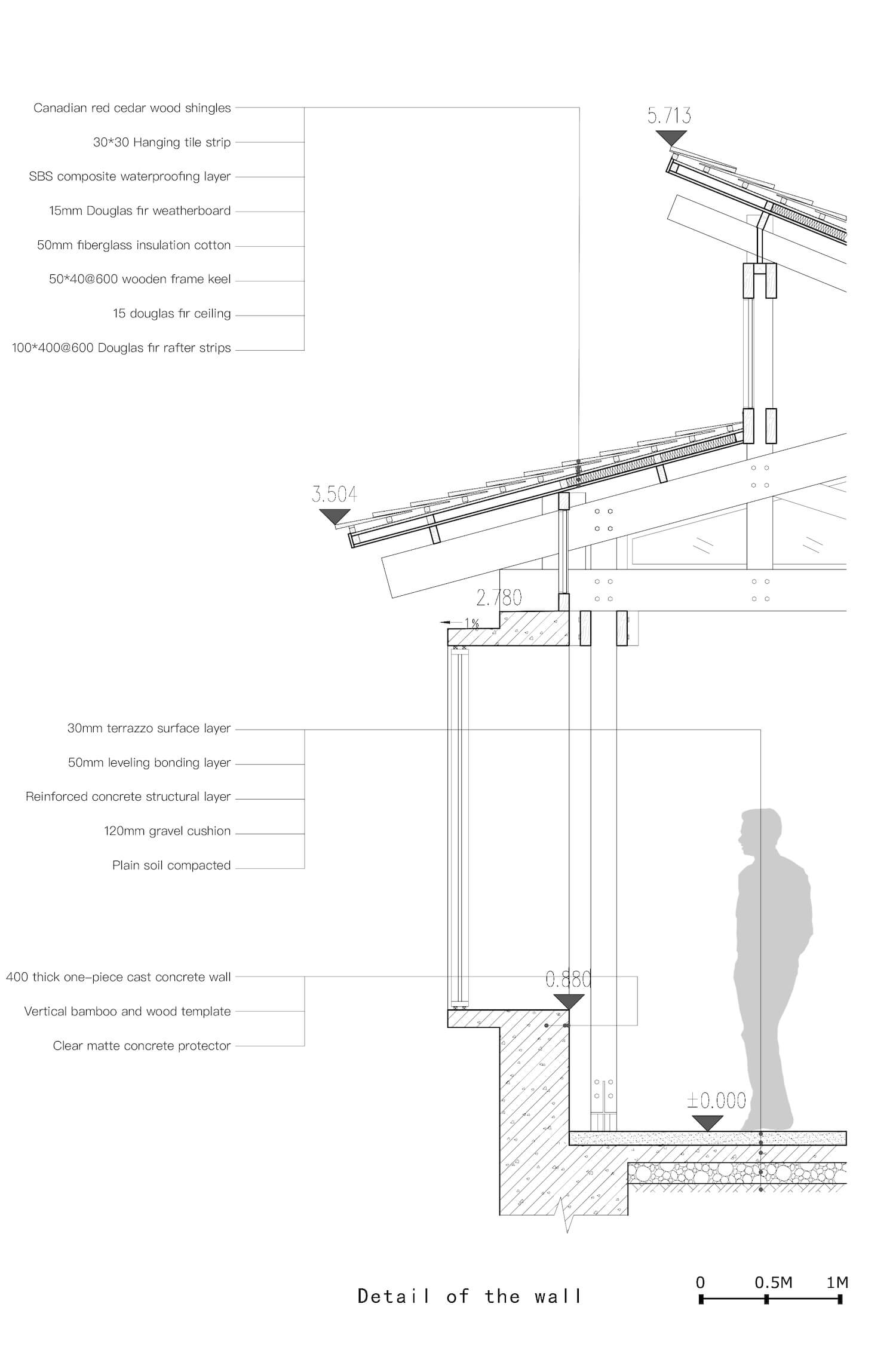
The architectural design clearly separates the basic elements of the house, the roof, the structure, the walls and the ground. The functional spaces are distributed under three big roofs, namely the public reception, open public space and the public toilet, which are both independent and interdependent, and are systematically organized. The big roof is built on prefabricated plywood roof truss at different scales that repeat and evolve from the coherent design logic and form, similar to the traditional Chinese wooden buildings, which changes within the continuous array of roof trusses.
A standard roof truss is designed and repeated to be arrayed for scale change according to the space, and therefore, a spatial relation of three basic wooden roof trusses is created. From the very beginning, I hope to design a clear structural logic for the architecture, including the platform, the walls, the wood structure, the stairs and the roof. The design restores the platform foundation as the basic element of the site, clarifies the relation between the wall and the wood structure, and aligns the stairs with the wall, which also designs the walls of three different texture along the direction of the roof.
The cast-in-place bamboo formwork concrete wall is horizontally arranged in accordance with the direction of the long side of the roof, while the short side is filled with translucent glass brick walls which retreats behind the concrete wall. All square holes and windows are on the cast-in-place bamboo formwork wall, the small square window glass is retreated with open leaves, the large square window protrudes, and fixed glass is installed on the outside. The doors, made of translucent Changhong glass, open on the glass brick wall. An oblique masonry rubble wall between the three roofs is connected into the interior of the reception, forming an interesting interwoven relationship.

There are three different internal and external connections between the wood structure columns and the walls. The columns in the reception area is on the inside and 400 away from the wall axis, while the wall is separated from the structure. The wood structure columns in the public toilet are all exposed outside of the wall, while the wood structure in the open public space is occluded with the same axis of the wall. All these relations bring more fun to the space,and explore the most basic elements of the building and the organizational logic between the structure and the wall. In fact, these kinds of organizational methods have been used in the traditional residential construction with clear relations in each system. We made attempts to combine these relations in this architecture.
Wander and time
When I first stepped into the house, I felt an unexpected excitement. It’s a very interesting experience to wander about aimlessly through various paths and different spaces, not knowing where to go at the intersections. The inspiration might come from the implicit memory of Suzhou garden I visited many years ago. Multiple paths in the building create a special walking experience. As the height difference set several spaces at different elevations, the space naturally forms slopes and stairs.
For better view of the distant mountains, we set a path to the roof interspersed between three roofs along the wall. The veranda goes up and down, passes an open roof entrance and extends to the overhead platform, which is deliberately limited and guided in the space, but also left with many choices at one time to erase the sense of time during wandering. The aimless wander can take many alternative paths, with changes in heights, combined by usefulness and uselessness to represent sense of time.

Fun
Fun is a widely discussed topic. As people's body and sight change with the turning and guidance of space, surprises will be generated uninterruptedly. The interwoven walls and roofs form an informal relation to create visual dislocation. From the hole between the two walls, different contents are presented. At a certain angle in the space, the windows will overlap diagonally, and the will be stacked layer by layer, which brings richer and more focused views. When these perspectives are notied, the fun arise.
Party of gray; Blending fineness and wildness
Warm colored wood and gray cement and stone are mainly chosen for materials. Warm color appears in the upper part of the building, and gray dominates in the lower part. The building mainly uses small size Douglas fir plywood, and the Douglas fir watch board and red cedar shingles for a roof system are all warm colors. The walls and the ground are gray. The bamboo formwork cast-in-place concrete wall, washed stone steps, old slate outdoor paving, and terrazzo indoor ground form a similar gray tone.
The glass brick wall is mixed with a little cold gray to balance the warmth of the color, as well as provide subtle changes of the similar materials and different texture. The iron railings for the window bookcases are also gray, which together build the texture and temperature of the building. We also hoped to present a contrast between the fine and the wild, harmony of the warm color and gray and combination of the light and the heavy to form the most basic material perception of the building.

The architecture influences people comprehensively through space, light and shadow, materials and experience. The collision between materials is not only in color, light and shadow, but also their texture and feel. I was a little disappointed when the bamboo formwork concrete was just removed, as it didn’t turn out to be what I expected, but I didn't rush to repair. As the wood structure and glass bricks were donw, the roughness of the bamboo formwork concrete went just fine.
After the rubble wall is built, the rough feeling of bamboo formwork concrete turned even better, with more layers of the textur and water line projections of light and shadows made it more vivid. As fineness and roughness go hand in hand, high density of delicacy is usually overwhelming, while roughness without details bores people. The proportion and the control of the relation as well as the architect’s personnal feeling are important, while every decision made on the site will affect the overall quality of the building after completion.
Sense and logic
The design didn’t take much time, but during the construction, we spent much time on the meterials and details, and sometimes the reality turned out different from what we expected. The language of design is based on logic with clear ideas and techniques, but also sense of fuzzy changes. We hope that the designs and connotations are sensed, not straight fowardly illustrated to the users. The clarity of design logic and the ambiguity of personal feeling coexist in this project. The design logic is rational, and the feeling of the space relates more to the emotion.

I put a lot of thoughts into the veranda railings, and simulated various forms during modeling, but ended up with light gray iron railings to weaken the sense of existence and integrate them into the overall gray background. I always go back and forth during the design and even the construction, but what is left would be the result of back and forth struggle between logic and feeling.
Used by the public
Being public is a constant concern and discussion in our works, and the same goes to this architecture. There are few areas outside, and most of the space is open for people to sit and chat or walk randomly around, with a public toilet that opens 24-7. In the evenings, many residents who live around would stay and chat. We want the completion of the building a commencement rather than a closure, and only frequent use can make it public.
Real construction
Real construction will surely impress people, which is a constant pursuit for our firm and has been realized in this architecture. Since the very beginning, I hoped that we could use the clearest thinking to design all the spaces, structural materials and relations to clearly present and express without any decoration the whole process of construction when people enter the space. Stones slowly pile up from bottom to top, concrete bamboo are cast on-site, wood structures are constructed on-site, old stone slabs are paved one after another and glass bricks are built one by one, which all help to restore the construction process. For me, the biggest achievement is exactly to provide such clear expression for the architecture.