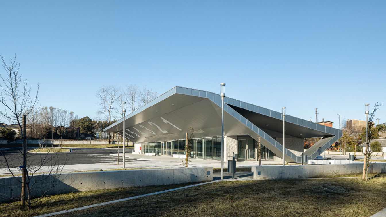
Transparent building that connects people to the bus network
Atelier d’Arquitectura Lopes da Costa: The Interface de Transportes Lourosa – Fiães is a transport interface, located on a plot of land with around 11,500 m² on the border between these two parishes, comprises a vast parking and manoeuvring area and a support building of around 500 m², which was chosen to be located perpendicular to the road that gives it access. This location allows a better integration into the existing topography, and also clearly separates the access to the car park at east from the buses access at west, so there are no crossroads or possible conflicts between cars and buses traffic.
The building with a rectangular plan and built in metal structure, has a dynamic volumetry and is covered with a skin that makes the transition from the user/pedestrian scale to the bus bay scale, to the west. This metal sheet roof contrasts with some parallelepiped volumes covered in cement mosaics that enliven the façades. At the front of the building, closer to the street, is the cafeteria, which has a terrace facing south and west. This space, due to its location, will not only serve the Interface, but will also be used by the passing public and the industries located nearby, thus enhancing and making the most of this facility. Users access the building from the east, from the car park, to an area where the extended roof shelters and marks the entrance. The building is very transparent both to the east and west, allowing the bus dock to be seen at all times.
The building rests on a pedestrianised and paved area animated by the inclusion of garden spaces, with a design referring to the building shape, and bicycle parking zones.The car park, located to the east, is divided into two areas, one closer to the entrance for short-term stops, dropping off passengers and passenger transport vehicles, and a second area, further north, which is mainly for longer-term parking. Bus access to the Interface is to the west, in an area duly dimensioned for the purpose, allowing easy circulation and manoeuvring for parking.


