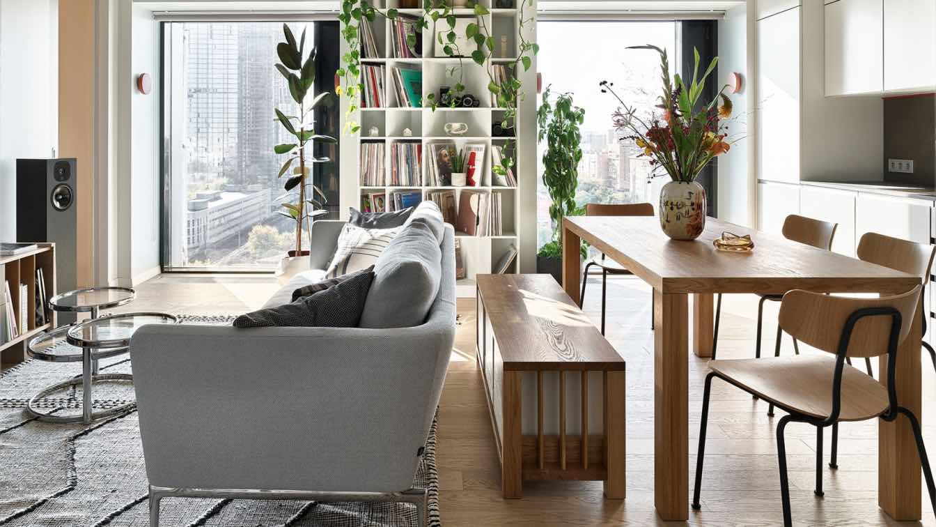
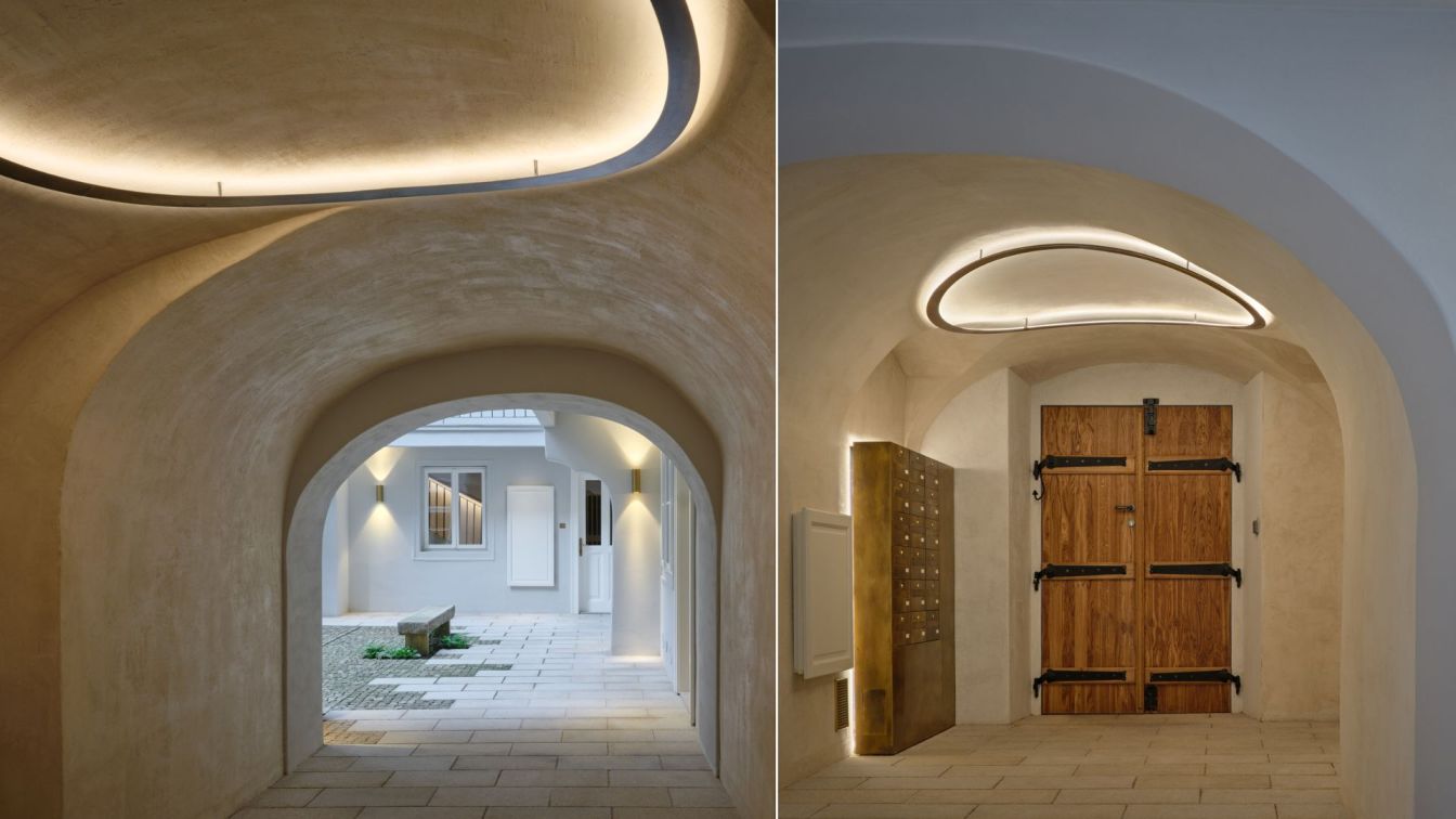
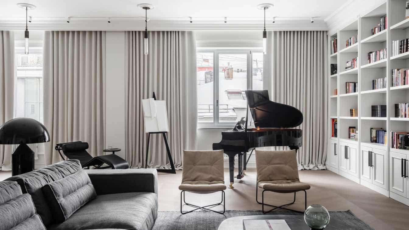
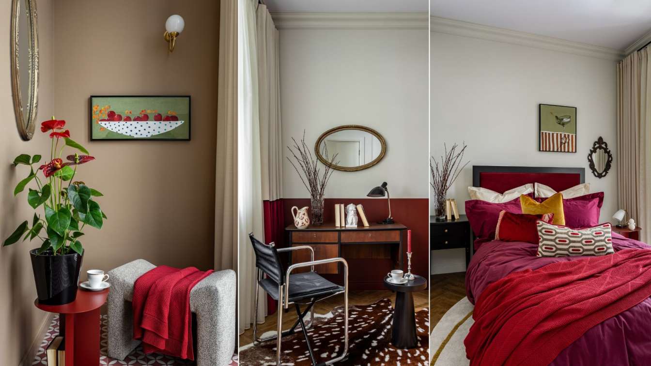
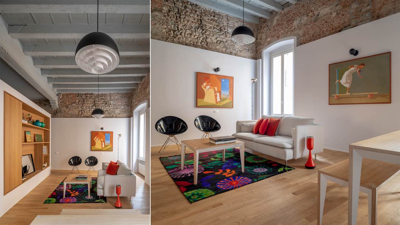
On the eve of their wedding, the newlyweds approached decorator Yulia Golavskaya to design their first home to reflect their tastes and accommodate their lifestyle. This compact, light-filled apartment with its sweeping panoramic windows is the first home of a pair of newlyweds. Just before their wedding, they turned to decorator Yulia Golavskaya to create an interior that would reflect their tastes and accommodate their lifestyle.
"I immediately liked the apartment owners; they are young yet mature, wonderful, and each passionate about their interests," shares Yulia. The young couple travels frequently, dresses elegantly, loves hosting guests and cooking, has a refined taste in wine, and boasts an impressive collection of vinyl records, a turntable with speakers, and a constantly growing library. All these details had to be considered, ensuring enough space for records and books, spacious wardrobes, a large dining table, and a practical, well-thought-out kitchen with a wine refrigerator. Yulia brilliantly met all these requirements, designing a highly comfortable and ergonomic space within 66 m².
Located on the 13th floor of a new high-rise building, the apartment features a small hallway that opens into the shared living, dining, and kitchen area with two large floor-to-ceiling panoramic windows offering a stunning view of the city. One window hosts the sofa area with a TV, while the other frames the kitchen and dining table. Doors on either side of the TV lead to the bedroom and the study. The study, with its semicircular wall, is designed to easily convert into a nursery in the future (the horizontal shelving converts to vertical, and a crib and wardrobe can be added). In the bedroom, the bed and surrounding wardrobes are designed as a cohesive unit. Opposite, there's another large built-in wardrobe with dark green fronts in slim wooden frames. The master bedroom has its bathroom, while another bathroom is accessible through a hidden door from the living room.
"The inspiration for the interior design came quickly: it's the views of the city and the sky above it that we see through the large windows. The apartment seems to extend beyond its plan, incorporating the urban landscape. The color scheme also developed from this impression," explains Yulia. The main color of the interior is a gentle gray blue, which transitions to a clear blue shade around the windows. In the bedroom, the wardrobe finish features a spruce green color, while the study walls are painted in a soft terracotta shade, with an orange chair and a bright orange lamp serving as accents. The terracotta color was chosen to echo the brick of the building opposite, visible from the study window.

Yulia showcased her creativity in the choice of materials to add variety to the interior. In the living room and study, the ceiling is covered with a thin layer of microcement with characteristic streaks. "This element of unpredictability in the material's behavior is very important; without it, the apartment would look too perfect," Yulia comments. Additionally, the decorator used large-format porcelain stoneware in chocolate, sand, and gray tones for the hallway, kitchen, and bathrooms. The fronts of the built-in wardrobes in the hallway and bedroom are finished with wallpaper from the French brand Casamance in slim oak frames.
There is also an architectural nuance in the interior that makes it more than just a "box with furniture," adding thoughtfulness and sophistication. The living room windows are set in 20 cm deep niches, with the recesses painted blue, giving the space texture and additional visual volume. Yulia chose all the finishing materials to ensure smooth but not monotonous transitions. Smooth wall paint, textured finishes on built-in furniture (you can see the texture of the wood under the paint), modern textured wallpaper on the wardrobe finishes, and Gigacer porcelain stoneware all come together to create a harmonious visual ensemble.
In this interior, many items were custom-made based on the decorator's sketches: kitchen and bedroom furniture, a dining table and bench with drawers, a media console, and bathroom furniture. These are complemented by high-quality designer items: a sofa, chair, pouf, and stool from Vitra, Alvar Aalto lights above the dining table, and Yaratam shelves in the living room.
The overall design is cohesive yet lively, reflecting the couple's dynamic lifestyle and diverse interests. Yulia Golavskaya has successfully created a harmonious space that combines practicality with elegance, making this apartment a truly welcoming and personalized sanctuary for its owners.


