About the area
Sobytie residential complex is the Sobytie park-quarter – a premium quarter in a historical location and in a high-trend place, among the greenery of parks in the prestigious west of Moscow.
Few words about customers
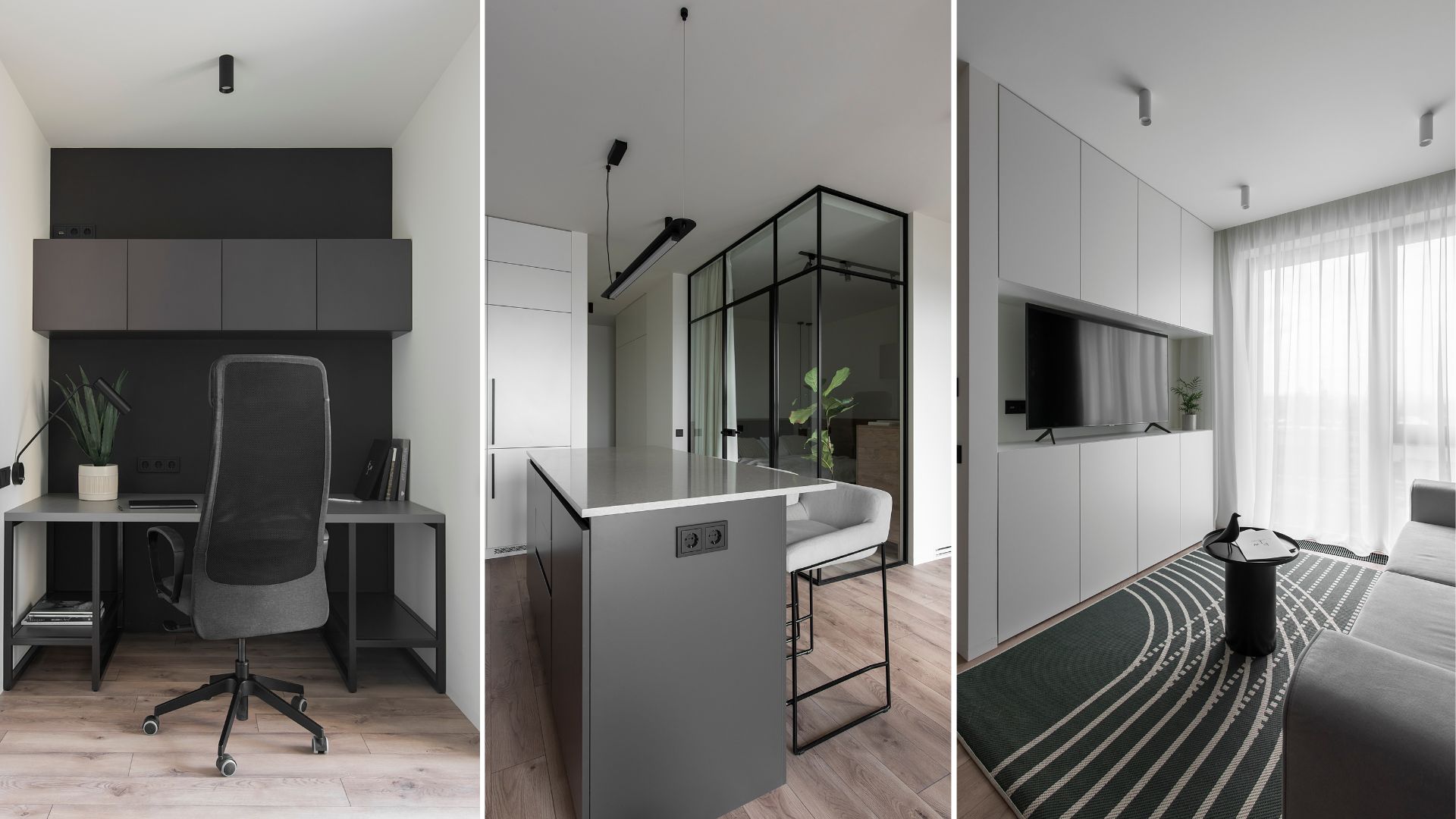
The customers contacted ART-UGOL Architecture and Design Studio with a request to make their apartment as cozy and bright as possible. The area of the apartment was 120 sq.m. In this area it was necessary to arrange a full-fledged master block, a future children's room, a bathroom, an entrance group and a joined kitchen-and-living room.
Project concept and features
For the SOBYFLAT project we used the most calm and moderate colors and combinations. The interior turned out to be quite comfortable and soft. The apartment is located in a new modern residential complex, so it has a fascinating panoramic glazing.
Hallway
When entering the apartment, you immediately see a little of the living room, so when entering this room, you do not feel like being in a closed space. It is also important to note that this space is illuminated with the natural lights. We built-in additional glass here, which ensures the flows of the natural light. It is slightly tinted, so the hallway is not visible from the other side.
Opposite the entrance we placed a small storage system. It is a specific architectural volume – a free-standing parallelepiped smoothly flowing into the living room, and is also observed there. More over, we mounted here a hanging console, which is both a soft pouf and a small table on which one can hold something. The key moment is that it has a fairly reliable structure inside. On the left side, there is a door behind which hides the dressing room. Here one can keep clothes or other things. We made the dressing room partly closed and partly open.

Kitchen - living room
Living room area
We were lucky to get a modern residential complex having panoramic windows, so this apartment has the maximum amount of natural light even when it is nasty and cloudy, due to the maximally possible large window area.
When entering the kitchen-living room, the first accent one see is the wall – the TV zone recessed into our favorite grayish textile panels with a so-called rhythmic breakdown. They make the space more cozy and generate a more pleasant acoustic effect. It connects ceiling tangentially – it is done specifically so visually develop a separate volume.
Usually, we mount built-in acoustic systems, but in this case, our clients asked for a separate system – speakers.
The living room area is decorated with grey armchair that fits perfectly into its interior.
The interior itself is quite muted and monochrome, so we chose a sofa with tones close to the interior. The color, similar to that of the sofa, will permeate the entire interior. The sofa is modular, so we placed the ottoman on the left side of the sofa to free up space for an armchair and a coffee table – a kind of dialogue with the sofa group was created.

Kitchen area
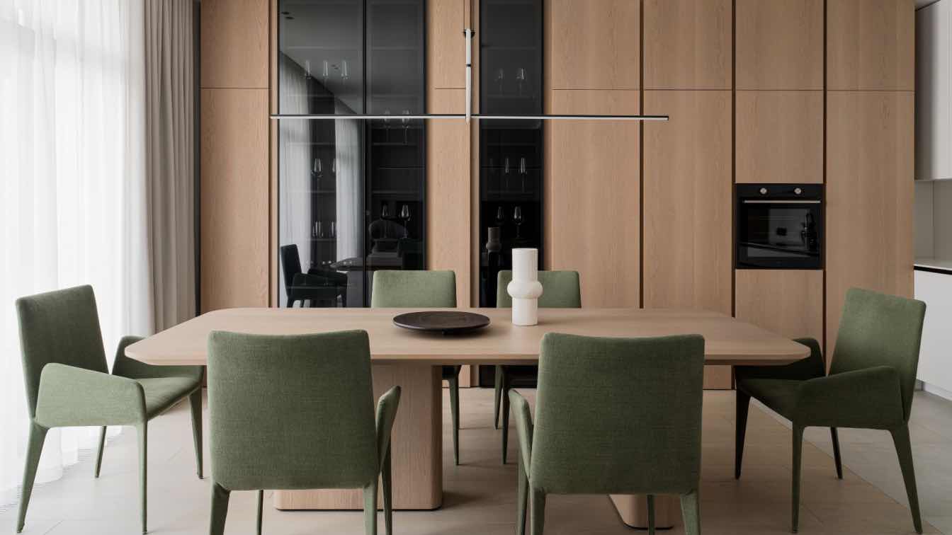
It is common for such a layout solution, that the sofa, table and kitchen are in parallel to each other, and the kitchen furniture set is arranged by the parallel wall. Here we decided to change things up a bit, so we placed the cooking area on the right side of the room hidden behind a solid veneered space. Thanks to this, when you enter the common space, you do not see the cooking area itself. Moreover, we placed the veneered tall cupboard with display shelves just behind the dining table; that is in parallel to the TV area.
We integrated aesthetic glass display shelves in the kitchen facades to add rhythm and dynamics to the interior. Of course, we also added lighting stylish both during the day and in the evening time. We could not miss any details – we made very neat handles and thin ends. Every small detail in all our projects is critically important to us.
Our dining set consists of a considerably large table and six chairs. We ordered the table individually to maximally approach the colors of the kitchen facades. The Flos pendant light is arranged above the table; it looks quite minimalistic and does not block the accent facade in the common space at all.
The customers asked to dilute the monochrome kitchen with some colored elements, and we decided to use the accent color in the chairs - a dense green shade.

Hallway
The hallway is decorated with a light backlight that softly illuminates the floor in the evening or at night (when there is no need to turn on the main light).
Bedroom
The main feature of the bedroom is its large panoramic windows.
We placed a console table without supports not to spoil the view opposite the bed. The table has a very reliable structure. Also, the right side has a hidden section of the wall, where one can hide various small items (cosmetics, etc.).
The bed was arranged against the wall, which is very similar to the wall of the living room. But in this case, the division is more detailed and generates a noticeable rhythm and light and shadow.
The Vibia lamp is mounted on the right side of the bed.
We often use veneered panels in our projects. This project was no exception. Here we used this type of panel to hide a wardrobe in the master bedroom.
The panels go onto the adjacent wall - this is a practical solution, since this is a fairly walk-through area of the room, and this material is quite hard to be stained or broken.

Bathroom
The master bathroom was no exception among the rooms with panoramic glazing.
On the window side we hung a white cabinet on which we installed two sinks. It looks quite airy and weightless.
Indeed, such glazing in a wet room has its disadvantages – the space gets very hot due to the sun, moreover there are some privacy issues at nighttime. Therefore, we have provided a system of blinds, which also forms fascinating light and shadow effects.
The mirrors in a thin metal frame are installed to the ceiling.
The shower is mounted on a small step – we made it more architectural by lengthening it and moving it under the countertop.
The veneered panels on the side of the entrance to the master bedroom also became a part of the bathroom interior. We managed to hide quite capacious storage systems behind them.
Children's room / office / guest room
One more room in the apartment, which currently plays a multifunctional role – the office and a guest room. In the future, this room can easily be transformed into a children's room.
We planned the room in such a way that when a child is born, there will be no need to somehow remodel it or re-do any extra repairs – everything is thought out in advance. The apartment is very neutral, so it is perfect for a child of any gender. It will be enough to add some colored accessories and decorations, which will create the relevant “kid’s” atmosphere.
The left wall from the entrance has a composition with a cabinet and a table, and the table is slightly so-called ‘cuts’ into the cabinet.
The bed is on the right side. We reserved some empty space near the bed on purpose to put a piano in the future.
A horizontal shelf containing specific closed cubic box-shaped storage spaces is mounted above the bed.

Bathroom
Another room in the apartment is the bathroom located opposite to the future children's room. The room’s entrance is equipped with a sink made of artificial stone based on to our drawings. The sink compositionally cuts into the cabinet and the mirror is installed at the junction of these two surfaces to visually extend the sink volume.
The batroom’s cabinet is deep for a reason – it hides the laundry unit.
The bathtub is located to the right of the entrance, and a black minimalistic shelf where you can put various hygiene products is amounted above it.
This bathtub has a folding glass door that can be unfolded if you want to take a shower.