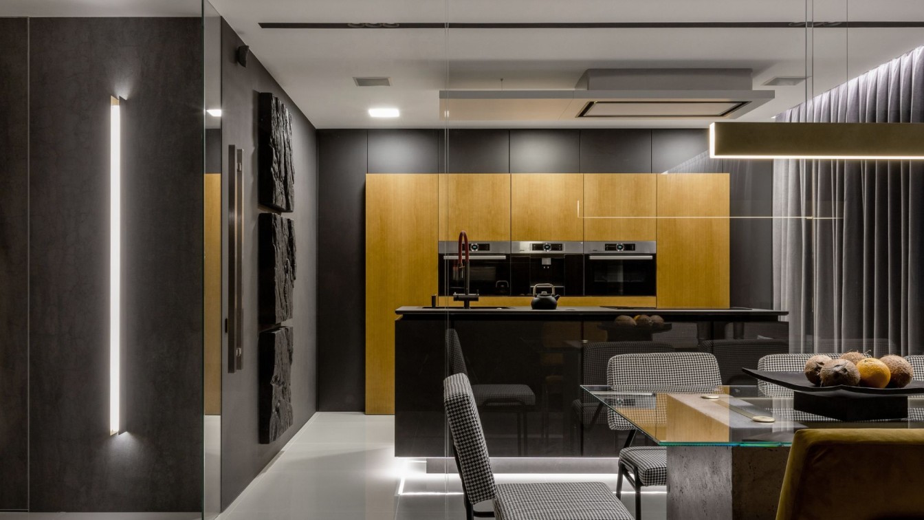
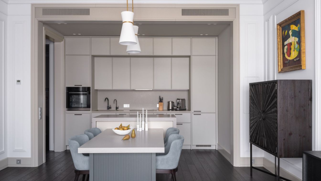
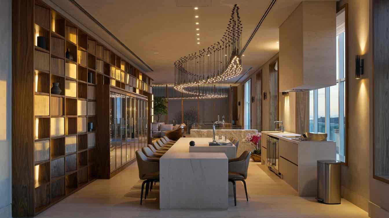
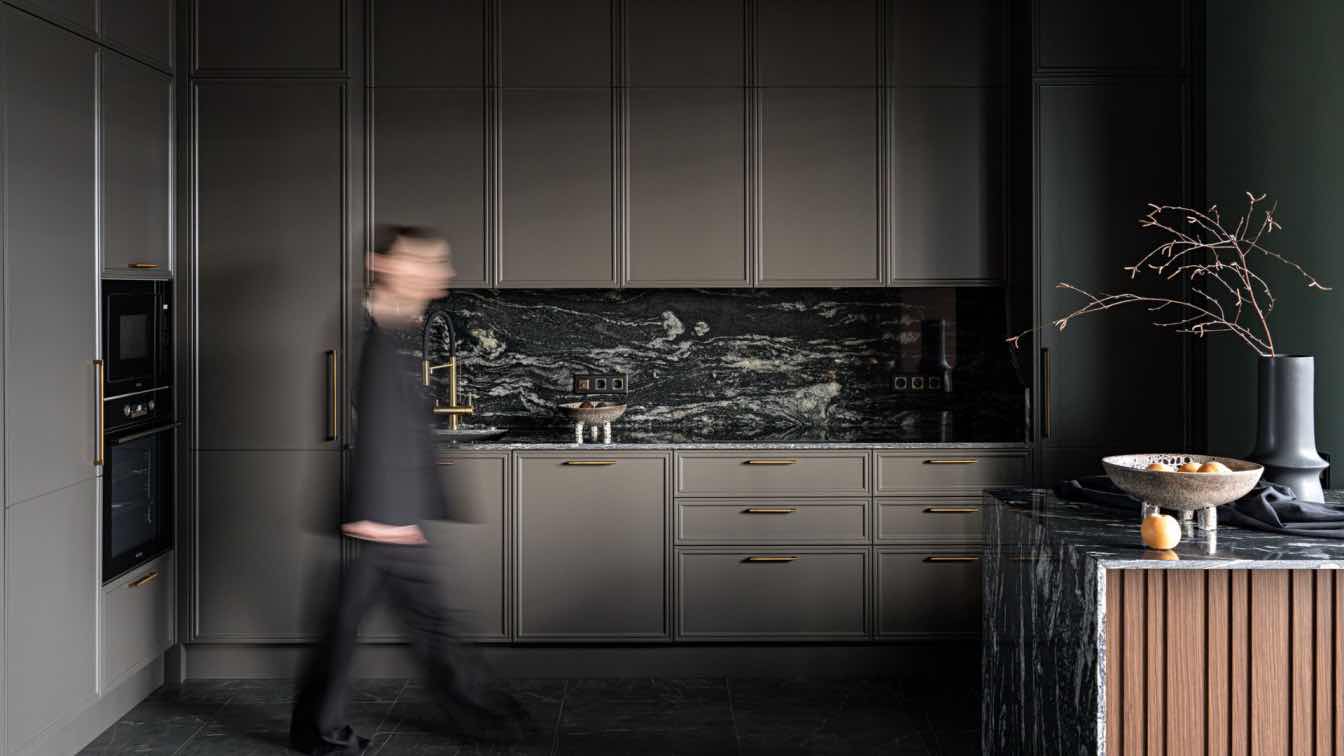
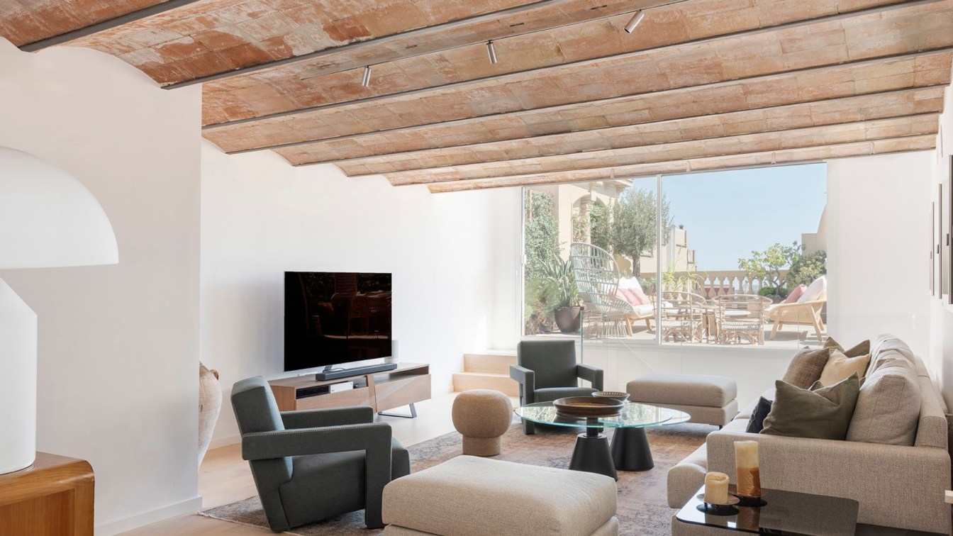
ZROBIM architects: RE apartment interior is about functionality, minimalism, and architecture. The client of the project is on the road all work week and visits the apartment occasionally on weekends. Therefore, the apartment space should be a place of rest and relaxation, including visually. The owner of the apartment draws an analogy with a beautiful expensive car, in which he moves on weekends after a week on the job car. One of the main features of the interior is the large corner fireplace that greets us upon entering the apartment. We purposely designed it so that from the hall area, from the dining room and from the living room the fireplace is the center of the composition.
The fireplace is finished in gray porcelain stoneware, which is softened by a warm honey-colored veneer that adds softness and coziness to this rather austere interior. Cabinet furniture, dining table, kitchen, bed - all were designed specifically for the project according to the sketches of the designers. The customer of the project likes very much the elegant details and levitating furniture, that is why the interior has a lot of glass, and that is why the highlight of the bedroom is the low bed with Japanese notes as if floating above the floor. Separate attention we paid to the bathrooms.
The project has two of them, and we divided them not by the usual principle: a guest bathroom and a master bathroom, but by their functional purpose. The bathroom at the entrance is compact with a shower to take a quick morning shower and recharge for the day ahead. The second bathroom, on the other hand, is spacious with a large freestanding tub in which to lay back and relax after a day's work. There is not a single random or unnecessary detail in this interior. The entire space is sharpened and organized for the lifestyle and character of its owner.


