Albina Mukhametshina: The project is located in Kazan, the capital of the Republic of Tatarstan (Russia). Kazan is a renowned city with its own traditions and unique culture, serving as one of the largest economic, scientific, educational, religious, cultural, and sports centers in the country. I did not have a specific task regarding the interior style. Initially, I understood that the scale of the apartment (220 square meters) reflects the scale of the owner's personality. I aimed to create a slightly monumental interior without making it too heavy.
My client is an entrepreneur who owns a large production facility in the northern region of the country, and her products contribute significantly to helping people. A person of such stature cannot and does not want to delve into the intricacies of design, let alone construction management. Her husband is also a businessman and preferred not to interfere with the interior design process. He only expressed his wishes regarding the apartment - an aquarium and a large armchair. At the time of working on the project, there were only two members in the family, as their adult son had already grown up and lived separately from his parents.
My firm took on the full range of activities for designing and implementing this project. Initially, there were many contentious issues in the geometry of the apartment, and two large load-bearing walls prevented significant changes to the layout. However, I managed to balance the space of the kitchen-dining room and living room. I slightly shifted the openings into the corridors, aligning them on one axis and adorning them with tall glass doors. I chose glass with a graphite tint to support the color concept.
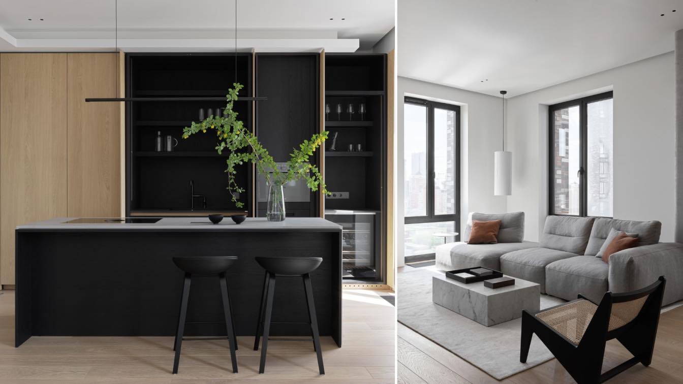
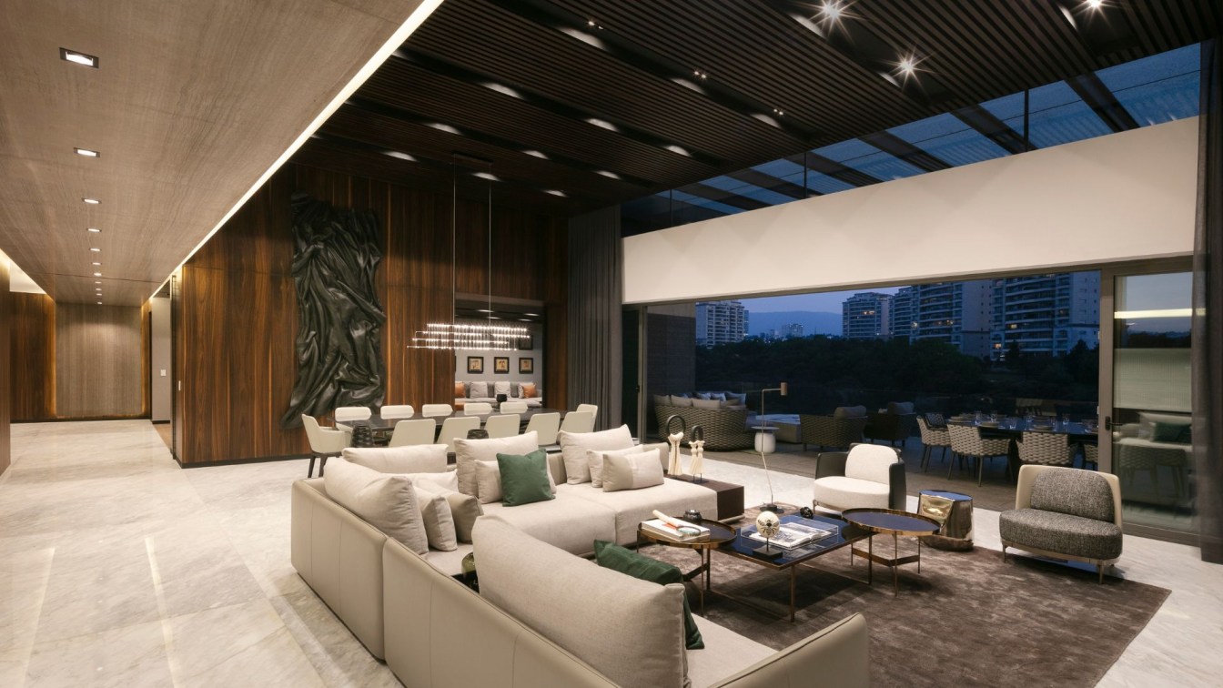
For the living room, kitchen, and dining area, I chose a unified color palette. The walls are painted with HYGGE Paint, and the color was carefully selected; it's unique and not part of the brand's standard palette. I wanted this shade to be distinctive and emphasize the noble color and texture of the parquet flooring.

The color scheme of the project was chosen deliberately. I knew that the apartment owners weren't afraid of color and leaned towards dark, rich hues. I personally love all of this, so I thoroughly enjoyed putting together the palette for this project. Subdued earthy tones, grays, and greens are complemented by warm tones of different wood species. The terracotta hue of the bar chairs, the copper color in the pendant lights, and the reddish tones of oak and walnut in the wooden surfaces engage in a dialogue without overwhelming the space. A touch of white and blue in the details adds freshness and lightness to the interior.
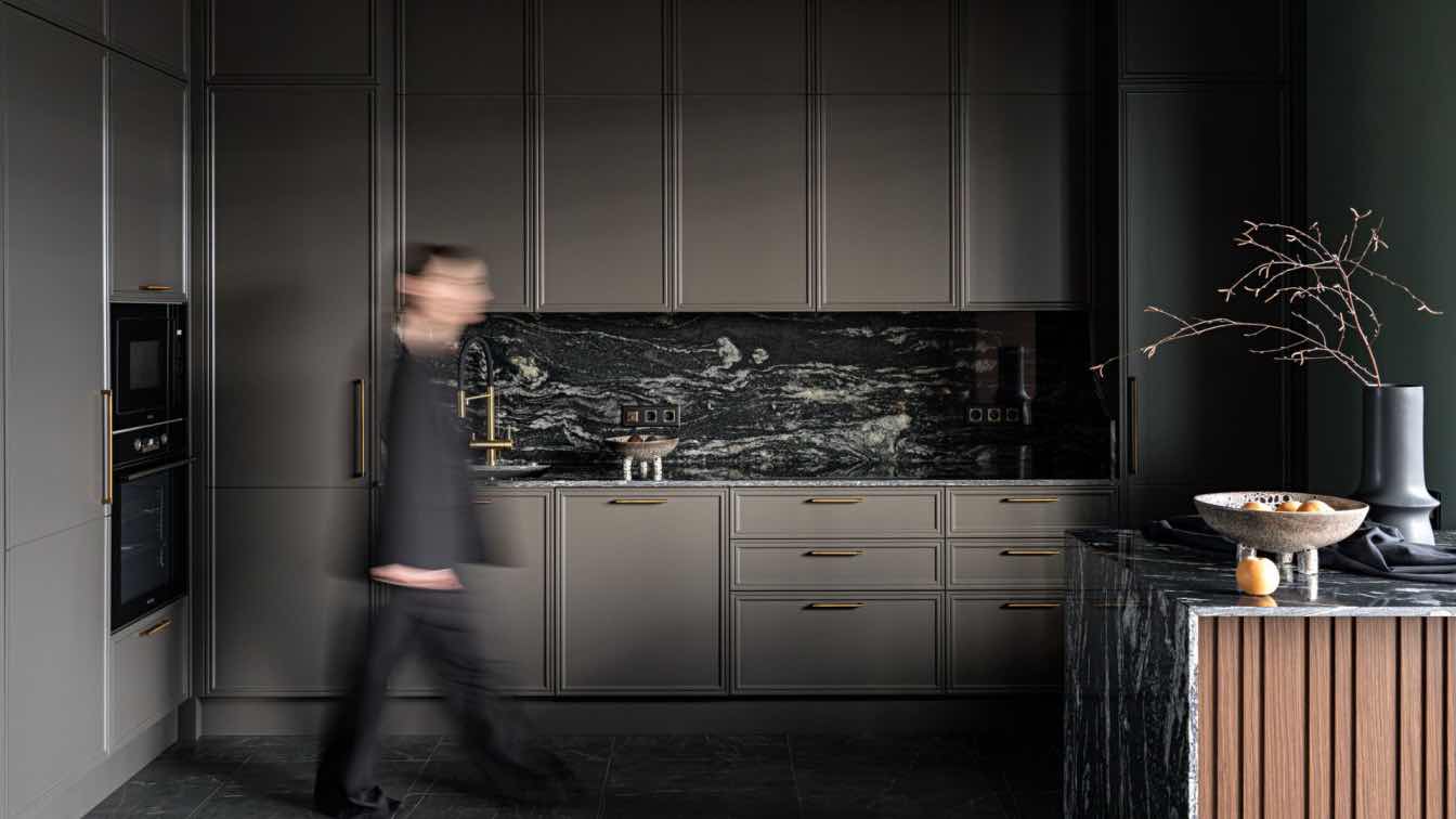
There was no chimney in the apartment, but my clients really wanted a fireplace. So, we decided to install a steam fireplace. Live fire will appear there thanks to candles. The fireplace shelf is made of natural Black Marquina granite, which is also used in the kitchen work areas. One of the living room walls features a handmade plaster panel covered with velvety decorative plaster.
Accompanying the fireplace in the living room is an IKEA Lunna stone armchair, vintage 1970s. After restoration and reupholstering, it found a new life and a new home. I found it online, and we didn't have the opportunity to assess its comfort in advance. But it turned out to be incredibly comfortable! By the way, after this project, I even entertained the idea of getting the same armchair for myself! :)
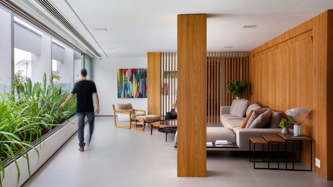
The painting in the living room was specially commissioned for this project, like most of the artwork here. This canvas depicts Mount Belukha and its surroundings in the Altai Mountains - a place of power for the apartment owner and a magnet for travelers from around the world. (Artist: Gala Erm olaeva).The sofa is upholstered in a natural light gray linen, echoing the plaster panel.

The PYRAMID console from CARIN CASA, belonging to the same collection as the dining table in the dining room, is made of oak wood. These pieces accentuate the scale of the apartment both in size and form. In the living room, we selected the textured designer rug "Piano" from Persepol, handwoven by Berber women in Morocco. In the dining room, a graphic modern flatweave rug, woven in the Atlas Mountains of Morocco by Persepol. Both rugs blend modern design with the interpretation of traditional Moroccan rugs, softening the strictness and restraint, while adding warmth and coziness.
The pendant lights made of matte glass are handcrafted by Studio Decorum artisans. They evoke the airy clouds above the rugged valleys of the Altai Mountains. The wall sconces in the living room, made of white and transparent glass, reminded me of the motifs of a mountain river and the sky simultaneously. The lights above the table are Viokef, while the wall sconces are ODEON LIGHT.
The coffee tables are made of walnut wood from La Redoute. The kitchen sink and faucet are from Omoikiri. The Kahrs parquet flooring, with its unusual shade and distinctly textured oak, brings life and depth to the interior. The clients' bedroom was the only room whose sketches weren't approved right away. Its color scheme echoes the rest of the interior while standing out. Inspired by stormy skies and the colors of nature before a spring storm, the delicate bell-shaped pendant lights from Vetvi Store serve as subtle feminine accents, enhancing the bedroom's minimalist style.
The carpet from the designer collection Twilight by Choudhary Exports creates a dramatic and luxurious atmosphere. Woven from New Zealand wool and silk by skilled Indian craftsmen and craftswomen, it's incredibly tactile. In general, all materials for this project were selected not only for their visual appeal but also for their texture and energy. There's not a single random item; each detail complements the others.

The plaster frieze, executed according to my sketches, accentuates the rounded forms in the wall decor, adding a sense of softness and promoting relaxation. The bedside tables are vintage walnut wood from the 1960s. The bed and bench, custom-made to emphasize the room's organic lines and curves.
The homeowner's study, combined with the home library, serves as a place of solitude and relaxation. An antique oak table from the 19th century was fully restored, preserving its authentic hardware and almost all of its elements. At this table, the apartment owner makes plans for the future and contemplates new ideas. The woolen cloth from Iwan Simonis on the work surface adds comfort during work and gives the table a touch of modernity.
We complemented the workspace with a fairly simple modern chair from La Redoute to avoid cluttering the room's atmosphere. However, we chose a vintage armchair for relaxation. It fits in beautifully with its large size and shape, providing incredible comfort for resting and reading books.
The walls are adorned with Harlequin Momentum wallpaper, setting an energetic rhythm and contrasting with items from past eras. In my opinion, it looks very unusual. The Come Around wool rug by Jaipur Rugs in the study adds color and dynamics. On one hand, it plays to modernity with its sleek form, and on the other hand, it pays homage to traditions with its ancient manufacturing technique.

The apartment owner always dreamed of having a large library. Some of the books were inherited, some were collected bit by bit, and others were purchased during the renovation process. I'm glad I could create a space for her that fosters both knowledge and relaxation.
From the study, we enter the relaxation and meditation room, where a large aquarium is situated. One can observe its inhabitants while reclining in very comfortable vintage armchairs. It was a stroke of luck to find them with authentic leather upholstery. In the workshop, we restored the wear and tear and refurbished the rocking mechanisms of the chairs. Additionally, this room features a TV area for watching favorite movies.
We divided the space with rugs of different sizes and from different collections, yet all echoing each other in style. These rugs are from the Sthir Stir by Jaipur Rugs collection, made of wool and silk, and the Bauhaus by Choudhary Exports collection. The rugs in the room served as unifying elements, making all accents and colors more expressive.
The master bathroom is divided into two zones. In the far part, there are the shower and bathtub, placed on an illuminated podium. The inner wall corners are smoothed, and the dome ceiling is handcrafted from plaster. This creates an enveloping, relaxing atmosphere during bath time. The "Hand of God" stool, brought by the apartment owners from Bali as a souvenir, fits perfectly into the room's interior, serving as a table for candles and towel holder while also performing a decorative function.

The countertops of the sinks are made of Black Galaxy labradorite, with barely noticeable sparkling particles of warm terracotta shade, echoing the texture of natural wood in the room. Adding a touch of magic to the bathroom is a vintage tin from the Sahara residents, a unique artifact endowed with totemic meanings (Ethno chic collection by Persepol).
The children's room was not initially planned in the project. It was supposed to be a guest room. But during the finishing works, I was asked to create a room for a little princess there. It was very exciting and unexpected. We had to change almost everything! I suggested dividing the room into two functional zones - common and private. In the common area, we placed a fold-out sofa for the nanny, a place for a writing desk, and shelves for toys and books. And in the far private part of the room - a bed and a wardrobe. We designed the room to be slightly scalable, so there would be no need for major changes before school starts.
The vintage 1950-60s lamps resembling dandelions with crystal elements sparked the idea for the room's decor. The hand-painted mural by artist Gala Ermolaeva on the walls depicts the atmosphere of a summer meadow and carefree childhood.
The apartment owners hardly visited the construction site and were not present during the implementation process. Only once did my client visit the site after the walls were painted. After standing silently for a few minutes, she suddenly said, "My Isaac!" In St. Petersburg, there is the Isaac Cathedral. It turned out that she was in love with this monumental, luxurious structure. And coincidentally, she intuitively felt the spirit of this cathedral in the atmosphere of the new apartment. Of course, I hastened to emphasize these feelings by finding a painting depicting the Isaac Cathedral for the interior.

The painting was found in St. Petersburg from a street artist and found its place in the apartment's hallway.he hallway, like the rest of the rooms, is built on details. The bench was conceived by me and crafted by artisans from SHIKANA Furniture Factory in a unique piece. The warm, slightly gleaming amber color of the velvet echoes the dome of the Isaac Cathedral in the painting, while the round shape of the bases complements the light fixtures.
The layout of the flooring is very unusual and striking. It engages in a dialogue with the graphic elements throughout the rest of the apartment.
The interior is woven from noble natural textures and tones. Moreover, each item here is imbued with special meaning; there's nothing random. Wood, natural stone, handmade wool and silk rugs, art, delicate plaster molding, linen, and cotton fabrics allow the space to unfold gradually, emphasizing its multi-layered nature.


