"Spaces are significant conveyors of brand values through carefully chosen materials, textures, and forms, creating a strong and cohesive brand identity."
— Bobo Chen
Instead of pursuing a specific design style, Bobo Chen, the founder of LubanEra·Design, seeks to infuse spaces with commercial value through aesthetics.
In this project, the design breaks through conventions, articulating the space's unique character and attitude, offering customers both spiritual and emotional fulfillment. Embracing uncertainties and possibilities, Bobo strives to empower the space beyond the boundaries of design and create unparalleled value for the client. He conveys the brand's story metaphorically through a lifestyle philosophy, crafting a space that is open, inclusive, unrestrained, and accessible. It exudes a sense of purity unique to the contemporary context, inviting visitors to experience the transformative power of fashion.
Bobo creates an inclusive and natural environment where space takes center stage, complemented by product displays. Through a concise yet thoughtful spatial layout, each exhibit reveals its unique beauty against a serene backdrop. The unique structural forms create partitions while maintaining a visual dialogue between the interior and exterior, blurring the boundaries. Through innovative design solutions, the project creates seamless integration between interior and exterior, and a delicate balance between atmosphere and style.
The Transformation of Fashion
This project, located on the rooftop terrace of an industrial park, was once an abandoned warehouse. During the site visit, stepping onto the rooftop revealed a barren, desolate scene under harsh sunlight. The client, seeking to upgrade their business model, decided to revitalized this neglected space. Despite the rooftop's expansive views, the intense sunlight made it inhospitable. Bobo Chen, creative director of LubanEra·Design, embraced the challenge, preserving the original structure while introducing elements of nature—building stairs and corridors, creating courtyard around water, and seamlessly integrating landscape with architecture. The result is a natural oasis that brings every inch of the rooftop to life. Whether for work or photography, the space offers a unique and serene experience, embodying the brand's spirit of adaptable transformation.
The Rhythm of Space
The design engages in a dialogue between structure and nature, introducing natural light and the changing seasons into the interior, creating a naturally comfortable atmosphere. The space opens outward along the path of light, showcasing an artistic beauty that contrasts with, yet complements, the rawness of nature. Through a window, the interior and exterior connect and blend, maintaining both independence and unity. This design goes beyond defining the structural contours, offering a deeper, spiritual sense of independence.
The design emphasizes fluidity and spatial division, balancing aesthetics with comfort to create a natural sense of space. The internal areas are thoughtfully organized, introducing natural textures and the contrast between light and dark, highlighting the passage of time.

Nature and Modernity
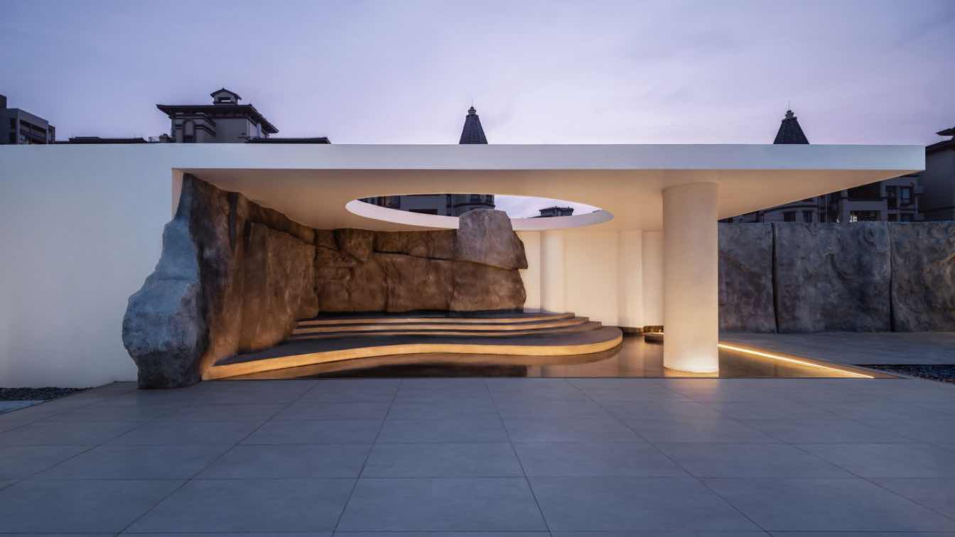
The stone patterns transcend mere form, carrying the textures shaped by time. These natural stones intertwine with other elements, creating contrasts between solidness and void, massiveness and lightness, nature and modernity. This interplay transitions from the exterior to the interior, gradually soothing and calming the atmosphere. The building's varying depths and the alteration of warm and cool tones highlight geometric relationships, distinguishing yet seamlessly connecting the interior and exterior.
By moving away from conventional showroom spaces defined by explicit branding elements, such as logos, Bobo shifts the focus to an artful, sensory experience. In this way, the brand's essence subtly permeates the space, fostering a deeper connection between people, space, and brand.
Fluid Circulation
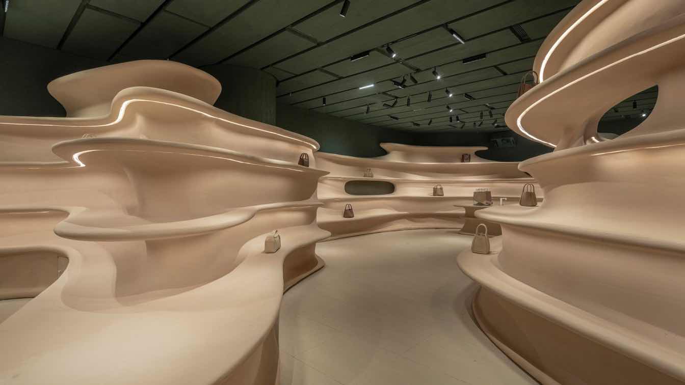
The flowing curves guide movement through the space, while soft lighting envelops the environment, directing the sightline across varied scenes. This expands the field of vision, inviting people to feel the rhythm of the space. The use of pure, restrained materials defines clean and delicate lines, crafting a serene and understated display space that offers visitors a leisurely experience.
Fusion and Symbiosis
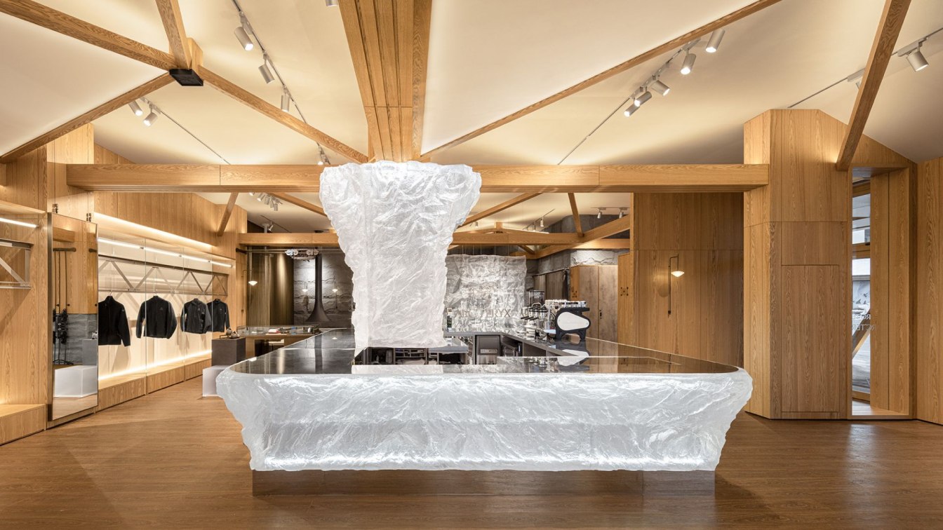
The interplay between different materials generates limitless possibilities. The thoughtful combination of smooth resin and rough natural stone creates a warm, natural shopping environment, enhanced by the play of light.
While expressing a spiritual and artistic sensibility, the space caters to the emotions and experiences of visitors with a tangible warmth. In the early stage of layout design, the design team carefully planned spaces for artistic experiences and functional scenarios. By connecting different areas with fluid circulation, the brand's products are seamlessly woven into the spatial narrative, with subtle shifts in scenes introducing a diverse environment.

Simple yet Powerful
Space construction begins with an exploration of specific functions, which then gives rise to the spirit of the space. These elements intertwine to create a three-dimensional, experiential environment. Simple yet powerful forms, along with regular and irregular geometric shapes, interlock to form a cohesive structure. The building's integrated structural design, with its staggered heights and dynamic lines, accentuates the shapes and contours, resulting in a compact and powerful overall spatial form.
The Rhythm of Time
The water yard, with its mirror-like reflections, amplifies the sense of scale and spatial presence of the building, while blurring the boundaries between spaces. The design of the rooftop breaks free from spatial limitations, revealing the changing clouds and light. This transition from the tangible to the intangible, from physical space to spiritual essence, reveals not just the sky and clouds, but also the passage of time. Through the interplay of space and function, an authentic and accessible brand experience is crafted.
Whiteness and Vitality
Without relying on vibrant colors or strong forms, the white space creates a serene ambience, where vigorous green plants seamlessly blend with the surrounding environment.
The choice of materials seeks a harmonious balance between texture and tactile sensation, with delicate grains echoing the vibrant plants. Sunlight cascades over the greenery and blank spatial surfaces, crafting a layered interplay of light and shadow. Each element's combination represents the ultimate pursuit of spatial aesthetics.
The corridor, defined by an array of cylindrical columns, transitions gracefully to the courtyard through natural stone steps, which define the boundaries of the courtyard space while offering a diverse spatial experience.

Fusion with Nature
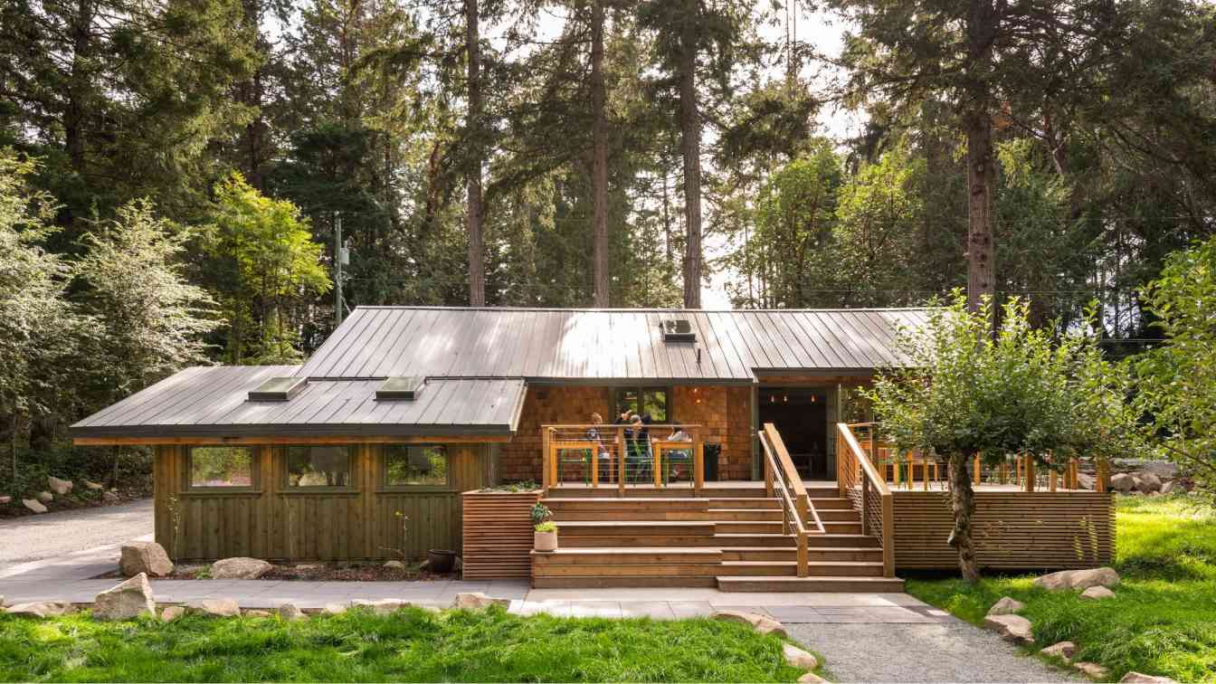
Floor-to-ceiling glass serves as a natural frame, bring in verdant scenery and extending the sightline beyond. The natural light spills throughout the space, merging views of the changing seasons into the interior. The office space and natural landscape exist in harmonious symbiosis. Various materials, in their changing forms, render each area distinct yet interconnected. Every scene within the space reflects the brand's ethos of natural symbiosis.
Through the subtle incorporation of nature, the interaction between greenery and space, and the graceful interplay of light and shadow, the boundary between interior and exterior blurs. Though enveloped, the serene interior seamlessly communes with nature.
The revolving door subtly partitions the space, while a touch of green, visible through the clear windows, softens the office, promoting relaxation and calmness.
A tea room, thoughtfully arranged as a sanctuary for rest and contemplation, invites visitors to immerse in its serene Zen atmosphere and explore its every corner.
Light in the Quiet Night
As night falls, ambient lighting enhances the building and space, generating a sense of expansiveness and openness. The ambient light, in harmony with the architectural structure, white space palette, and natural forms, creates an order-infused commercial space under the night sky.


