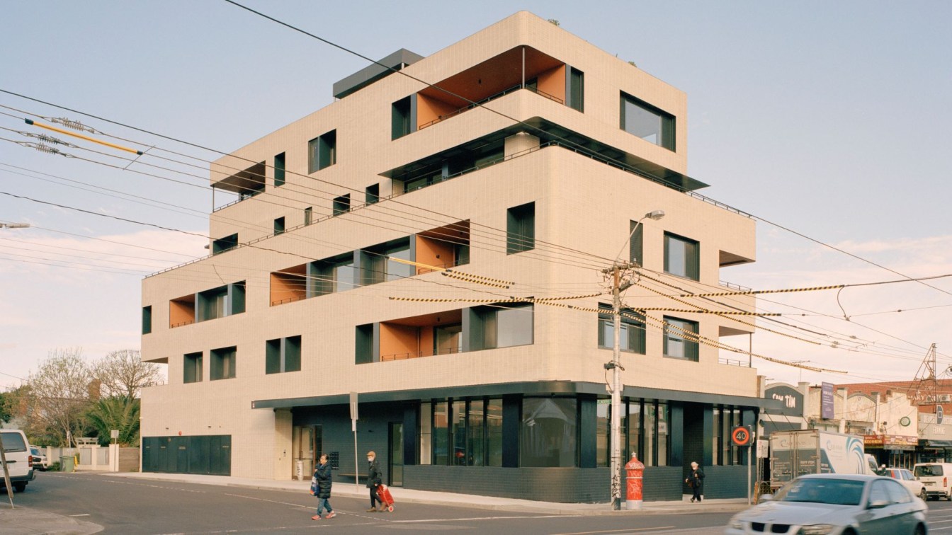
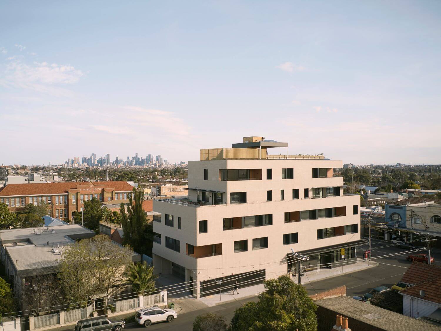
The High Street Apartments is Gardiner Architects’ first high-rise multi-residential project. Located in Thornbury, Melbourne, the project is a mixed-use building, with thirteen apartments above a ground floor carpark and restaurant fronting High Street.
Differing from your usual apartment development model, there was an imperative for our client to create something sustainable, robust and well-designed for the longer-term. The building employs prefabricated cross-laminated timber (CLT) construction to achieve a more sustainable outcome, with the apartments achieving an 8.4-star rating on average. This building methodology allowed for greater flexibility of layout, with each level and apartment a completely individual design responding to the varied orientation, size and aspect of each apartment.
The longevity of the apartments was important. We were interested in using materials in their natural form, rather than applying a surface treatment that might chip and wear poorly over time. We used timber where possible, especially in the corridors and lobbies, to be inviting and create warmth rather than a sterile white environment. A single central, open stairwell wraps around the lift. The south stair façade is built with glass bricks so that gentle natural light can wash into the space. Inside the apartments the palette is warm with splashes of colour, while still restrained enough to allow future residents to add their own style to the spaces. With long-term occupation in mind, opportunities for storage are maximised so that growing families can expand within the space.
The idea was to essentially make the project a collection of stacked homes, each with its own sense of presence, unique layout and designed to respond to its particular outlook and orientation. The unrepeated floor plans generate an irregular façade that breaks up the scale of the building and provides definition. The articulation of the form comes from the recessed balconies and the varied pattern of the windows – there was no need to apply decorative elements or a plethora of materials to break up the mass. The balconies are sculpted out of the building and then clad wall to ceiling in a contrasting terracotta tile. From the street you get a simple mix but some diversity in the palette. Even though it’s a big building, it fits into the urban context well.
Sustainability Statement
Timber is carbon neutral and generally has very good environmental credentials. Notably, replacing one cubic metre of concrete with timber, saves 1 tonne of carbon. The system developed saw a great reduction in the buildings carbon footprint as well as increased thermal performance. Upon assessment, the apartments have received an average star rating of 8.4. The prefabrication methodology also allowed for a lot less waste as the engineered timber elements are all cut accurately to size in the factory. Timber buildings are healthier buildings. The nature of prefabrication and assembly, means the building envelope is incredibly airtight. This vastly improves thermal and acoustic performance compared with typical construction methods, which tend to have lots of gaps between structural elements. When this is combined with an effective air exchange system, a timber building can maintain a constant fresh air supply, without leaks, which is healthier for occupants.
The project also employs a solar powered communal heat pump hot water system, solar powered communal areas including the lift and car stackers, and an underground rainwater tank that is used to flush all the toilets in the building.
Gardiner Architects recognise the need to be able to accommodate growing urban populations but are optimistic that new building systems could see a reduction in carbon emissions and a move towards healthier buildings. We hope to have the opportunity to build more with CLT in the future.

What is the history of the site and project?
The original art deco house on the site had been converted and used as a medical centre for many years before our client purchased it. The client had lived in the property for over 10 years when he originally came to us
We investigate several options for development including extending the old house, but over the course of the following years the planning scheme changed to allow for higher density. The proposal then changed again to be a mixed-use building with restaurant on the ground floor and thirteen apartments above.
What was the project brief?
Differing from your usual apartment developers, our client’s plan was to hold a significant part of the building. This meant a longer-term imperative for this client to create something sustainable, robust and well-designed. The idea was to essentially make the project a collection of stacked homes, each with its own sense of presence, unique layout and designed to respond to its particular outlook and orientation. The principle was always to make them as light and bright as possible, maximising access to the northern sun but recessing the windows into the form to create passive solar sun shading. This approach also provided an opportunity for additional storage in the recesses below the windows. The hope is that growing families can stay there for a long time because they can grow with the place, and with the amount of storage designed into each apartment, you don’t outgrow it as quickly.
The apartments all achieve an average energy rating of 8.4 star, making them more comfortable and affordable for the occupiers to live in.
This reflects a shift in the attitude towards rental properties as a more long-term choice in housing. Unsurprisingly, the rental apartments were leased in the first week they went on the market.

How does the project relate to its context?
High Street is very diverse with lots of activity, building types, colours and textures, and has seen a lot of growth in recent years.
The unrepeated floor plans generate an irregular façade that breaks up the scale of the building and provides definition. The articulation of the form comes from the recessed balconies and the varied pattern of the windows – there was no need to apply decorative elements or a plethora of materials to break up the mass. The balconies are sculpted out of the building and then clad wall to ceiling in a contrasting terracotta tile, referencing warmer toned colours seen on neighbouring buildings. From the street you get a simple mix but some diversity in the palette. Even though it’s a big building, it fits into the urban context well.
How do the spaces relate to one another?
It is interesting to question what role a building has in forming community and the extent of its capacity to do so. It was important to recognise that if you had 13 houses in a row in a street, the street is where you meet each other and socialise. When homes are stacked vertically, the stairwell and rooftop garden are places of impromptu interaction and community connection. We wanted to give each apartment a sense of address, with the idea that you are entering your house rather than a long corridor with repetitive doorways all facing each other. The entry points to each apartment are different and have their own presence. The fundamental part of the design was to have a single central, open stairwell wrapping around the lift with good to make it more attractive to use. A single central, open stairwell wraps around the lift. The south stair façade is built with glass bricks so that gentle natural light can wash into the space.

What influenced the material palette?
We were interested in using materials in their natural form where possible, rather than applying a surface treatment that might chip and wear poorly over time. The longevity of the apartments was important. We used timber where possible, especially in the corridors and lobbies, to be inviting and create warmth rather than a sterile, white environment.
The client was really supportive of creating apartment interiors that used some colour and texture. In spaces like the bathrooms, the same coloured tiles are applied to all surfaces, creating a solid block of colour similar to the treatment of the balconies. The palette is still restrained enough to allow future residents to add their own style to the spaces, which is always important in speculative projects where you don’t know the end user. Our aim was to create well-designed, timeless interiors that aren’t just responding to a recent trend that would date quickly.
What are you most proud of about the project?
Persevering through the technicalities of the CLT system paid off because it allowed us to build a much more environmentally friendly apartment building which gives a better quality to the spaces thermally and acoustically. The apartments achieve, on average, an 8.4 star energy rating. They have a generosity in the size of space and storage inside and usable private outdoor space. Overall, the High St Apartments sees a very liveable outcome, that responds to its context and exemplifies the need to test and develop new, more sustainable construction methods in Australia.

What was the biggest challenge during the project?
The project is a cross-laminated timber (CLT) structure, which was important to pursue from a sustainability perspective, however working with a ‘different’ building methodology was challenging in many ways. Engineered timber construction is still a fledgling industry in Australia and dealing with a prefabricated building process meant a different building procurement system that was less familiar to most people involved in the project.
Originally, the CLT was to be exposed internally on the ceilings rather than covering up the lovely warm tones of the timber. It was even tendered on that basis, however a change in fire regulations during the process meant that all of the CLT ended up needing to be concealed. Another huge challenge, that impacted the whole construction industry, was the Covid pandemic which occurred in the middle of the construction works.


About
Gardiner Architects is an established practice of six architects and ancillary staff. Founded over 30 years ago by director Paul Gardiner, they seek to create thoughtful and honest architecture that is sustainable and well-made.
Their practice works skilfully in a range of fields including residential, commercial, health, and education. They have local and international knowledge and experience, and offer a range of services to suit the unique needs of their individual clients.

