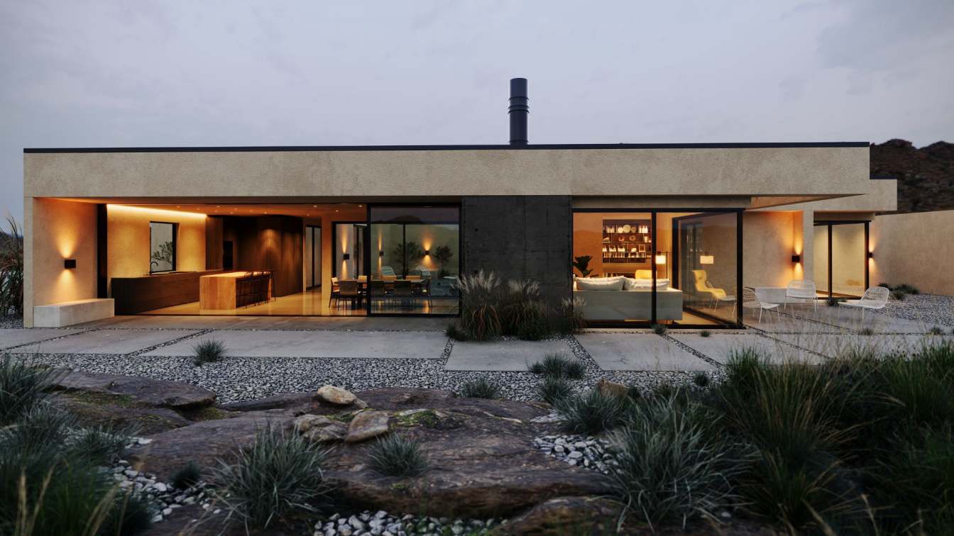
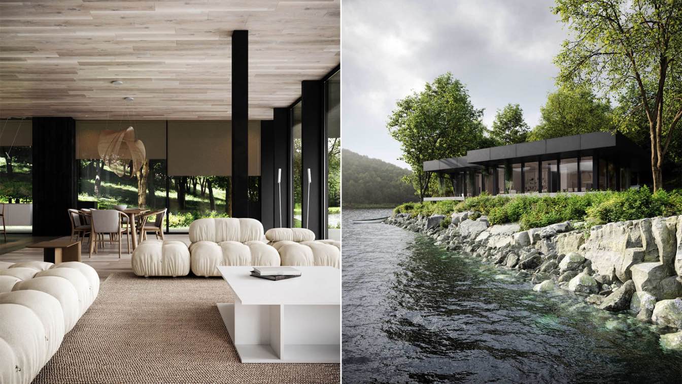
Men Bureau: When a few years ago a married couple found their charming old house not far from Kyiv, they only ever intended it to be a country retreat, a place to escape to and from the city on the weekends. Then came the pandemic and our customers discovered something of a taste for country life. That’s why they spend most of their time at the house.
The house is surrounded by the unique terrain and the colors of the house which blend with the environment. Being connected with nature again was what was the owners’ primary need, so it was also the primary purpose of the design. Each room takes natural light in a way to create a spacious atmosphere and maximize the outside view. Each room is picturesque in its way, yet still modest and connected to each other.

We reassessed how we used some of the rooms – we moved the living room to where the dining room is, for example, because it’s at the beginning of the house– and we could also see what suited where. For our studio, it’s important to get to know the house we’re working with, as it gives you some degree of guidance as to which direction to go in. But it’s important for it not to feel like a museum – this house might have been built 50 years ago, but we live in 2021. We have to balance preserving the history of the house with making it habitable and adapting it to fit the way our clients want to live. After all, that’s what interior design is for: improving people’s lives.
Therefore, we made several decisions to change the look of the interior of the house, for example - we added rounded corners to various areas and used a large number of circles and arcs. All of the colors we’ve used are quite neutral and warm. A subdued shade is sure to evoke a sense of calm and tranquility in the home.

Living Room:
The first thing that catches our eye is the “Bocci 57” pendant light - a distinctive statement piece that refracts light through its sinuous curves of white glass. A cluster of 25 lights dangle from the ceiling at different angles and shapes, yet despite their asymmetry, they afford the space a sense of balance.
To create timeless designs, we prefer natural materials and details form the basis. “Bardot” armchairs by Baxter and “Ghost 20” by Gervasoni are the details that make the design timeless. “Bocci 57” lamp in the living room and “Zeppelin” pendant lamp by Flos in the bedroom have been used mostly for decorative purposes because, on the other parts of the house, ceiling lamps appliques serve a functional purpose for lighting.
Thanks to thin metal legs, wide “Bardot” chairs by Baxter seem to float above the floor.
Our favorite “Roy Lettera” floor lamp by Mario Nanni is a timeless piece by Italian lighting brand Viabizzuno.

The structure of “Metrica Bookshelf” by Mogg is simple, the rhythm is punctuated by the iron rods fixed at different intervals on an openly rigorous structure within which the books and the inserted objects complete the shape by writing new compositions from time to time. “Cylinder Downlight” by New York-based design studio Apparatus.
We deliberately don’t have any electronics in there, so that’s a proper quiet room. The interior of the home has a strong focus on natural materials and texture. The floorboards are European Oak and were meticulously finished on-site with a black resin filling the knots. Deep timbers are the dominant flooring in this house.
The owner, who is an art collector, has artworks from all countries, including our native Ukrainian works by Faina. Here we can see a contrast of raw and glazed ceramics as a hallmark of the Wabi Sabi style. All these things share a certain roughness, simplicity, and uniqueness that makes them beautiful, despite their imperfect shape and texture.
Abstract painting over the fireplace by Ricky Hunt.

Kitchen:
Continuing the natural palette with touches of brass and walnut, our team made key contemporary design acquisitions like the “Arrow” and “Median Sconce” lamps by Apparatus, “Conference Chair” by Pierre Jeanneret, and “House chair” by Liam Mugavin to add personality.
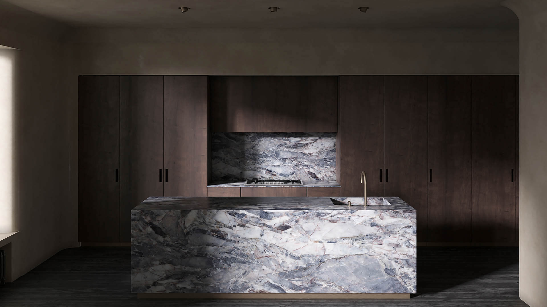
By enhancing the amount of natural light in the space, dark materials could then be selected. Our bureau selected a dark timber veneer for the kitchen cabinetry because of its striking color and beautiful natural grain. Integrated appliances were incorporated to ensure a seamless look, with a focus on the materials. The sleekness of the marble countertop in this space gives contrast in texture. Brass details can be seen throughout the home in the hardware and lighting fixtures.
The material palette – which includes dark stained walnut, antique brass, and natural textiles – was informed by the aesthetic of Wabi-Sabi philosophy. It was also important to reuse elements of the palette in interesting ways and make liaisons with it throughout, like the brass lights by Apparatus and the lower part of the kitchen island.
Our goal was to create a warm-minimalist and timeless house in tune with its past and the client’s needs. Composed of stone, wood, and brass, the home strikes a textural balance so often missing from obsessively clean-lined contemporary buildings.

Wardrobe:
Swathed in a muted material palette of marble and hand-brushed plaster, space is a place of serenity and reflection. The materiality of grey travertine that will weather over time and of timber boards that are oiled, not sealed, to keep their surface alive to their use - these are real materials that, unlike synthetics, will patina and become improved and more complex with time. They are also materials that are as old as the practice of building itself.
Our studio is not one for big splashes of saturated color. We much prefer neutral spaces into which you can inject warmth and interest through furniture and objects. Our real passion is for furniture with a unique history. Some of the pieces that are unique for the house are: “Capitol Complex” armchair by Cassina and “Horsehair Sconce” by Apparatus, which is combined with brass and etched glass. We used them to add personality.
The wardrobe area features a marble island and wood cabinetry to conceal possessions that aren’t necessary for display. Due to the small size of the house, we decided to have a wood floor, to eliminate barriers between different uses and create a spacious effect.

Bathroom:
For us it was important to create a time-less space with warm, rough, and tactile materials. This bathroom offers a rustic warmth, tranquility, and natural aesthetic. Like the rest of the apartment, the bathroom is not only beautiful but also functional. All taps and mixers in this house were designed by John Pawson for Cocoon company. “Slim Wall Sconce” lighting by Articolo.
Last year, in which we spent months at home, many people have been thinking about what home means for them: whether they’re happy or comfortable in their domestic environments. Here, in “WS house”, our customers came to discover the appeal of a slower, more contemplative approach to life.
Despite its rural look and feel, the apartment is equipped with contemporary amenities that guarantee a comfortable lifestyle for its inhabitants. These principles have produced a house of understated elegance and contemporary minimalism where everything is seamlessly integrated into the building fabric and where bold geometries are combined with materials in their natural unfinished state.

Bedroom:
The home needed to deliver a slower rhythm and tune in with the environment. The careful planning of the spaces, their volumes or lack of, the crunch of footfall on wood or the soft patter on solid stone, the degree of exposure to light and view... It’s these simple tools that we oriented, bringing into focus that which already existed.
Indeed, given how much time we are spending at home in recent months, the physical items we are constantly surrounded by have taken on a more prominent meaning in our lives. The spaces we create reflect us as people, but they also influence our moods and our experiences. The new is interesting and exciting, but we’re more excited by the extraordinary than we are by the new, and there are opportunities for the extraordinary buried all through our culture.
Homeowners love buying art, he’s that person who will always be returning home from a trip and brings something with him for his collection.
The “Brutus Chair” Designed by Kristian Sofus Hansen & Tommy Hyldahl for 101 Copenhagen company cast in lightweight fiber concrete, which creates a unique surface texture and emphasizes the fine balance between soft architectural lines and organic curves. “Column Sconce” in oxidized oak designed by New York-based design studio Workstead.


Connect with the Men Bureau

