Ilana Moskovitz Interior Architecture & Design recently completed the office design for ‘MITIGA’ a cybersecurity startup focused on cloud incident response, helping organizations recover quickly and efficiently from cyber-attacks. The office is in one of the newest office-buildings recently built in Tel Aviv and spans an area of 1200 sqm.
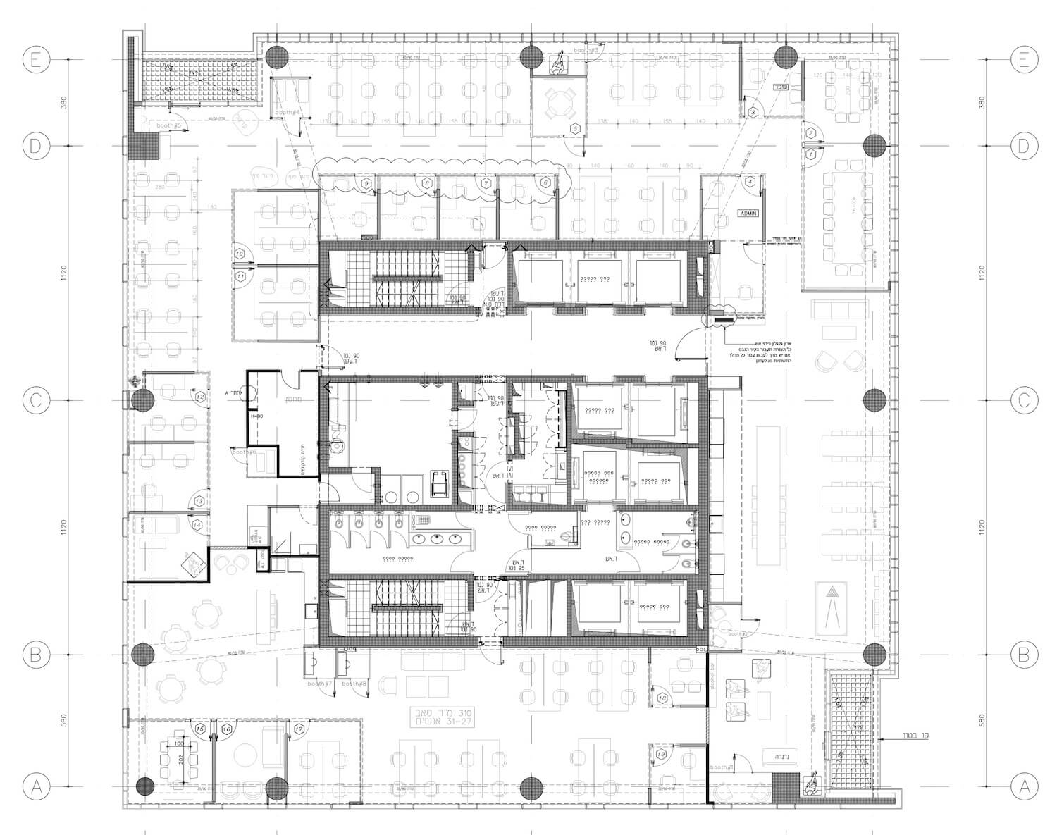
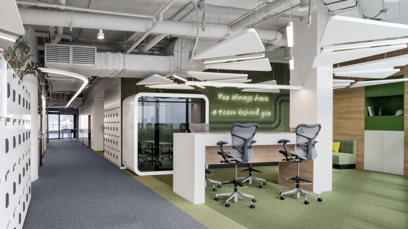
The office plan included extra large open space to accommodate the company's social and professional events, dining space and cafeteria, lounge spaces, music room, fun room, open workspaces for groups of 12-16 people, 13 rooms for 3-4 employees and a number of meeting rooms of various sizes. The recent pandemic era intensified the need for small spaces for meetings and private digital conversations, hence 8 uniquely designed booths were placed around the office space, each with a different colour palette.
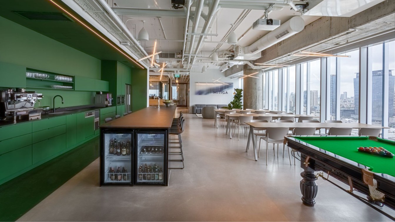
The entrance space extends over an open area of 200 square meters and overlooks a breath-taking urban landscape. In order to keep the open view to the unique landscape, all the collaborative functions including two lounge spaces, kitchen and cafeteria, billiard playing area and 2 private booths were planned to be in the interior. The two main meeting rooms were designed on the same side of the building as a continuation of the open public space enjoying the same urban view.

Total colour approach, natural wood and concrete are the foundations of the office’s design, yet the use of colour mass as a fundamental ‘design element’ is the project’s hallmark. The unique perception of 'colour as mass' is expressed predominantly in two separate spaces. The first and the most outstanding is the cafeteria’s open space which is experienced as one enters the office: a 12-meter-long kitchen wall painted all green -- floor, ceiling, and cabinets. Following the same kitchen wall, a single booth was designed using the same colour approach with a green carpet floor, green acoustic walls, green ceiling and green furniture.
The second space where the total-colour approach is prominently presented is the ’red-container open-space’. Since this space ןs not adjacent to an external glass wall, we aimed to give it a unique design that will differ it from the other open areas. In contrast to the modern office building, we designed workspace that simulates an industrial container using the same material and colour palette, all painted red: metal plates were installed on the walls, concrete floor painted red and an iron industrial mesh was installed in the ceiling exposing all the office functional systems.
The office was planned for 100 employees with the option for a hybrid work model and supports a non-hierarchical work environment optimized for productivity, flexibility, and a positive employee experience.


