DESIGN
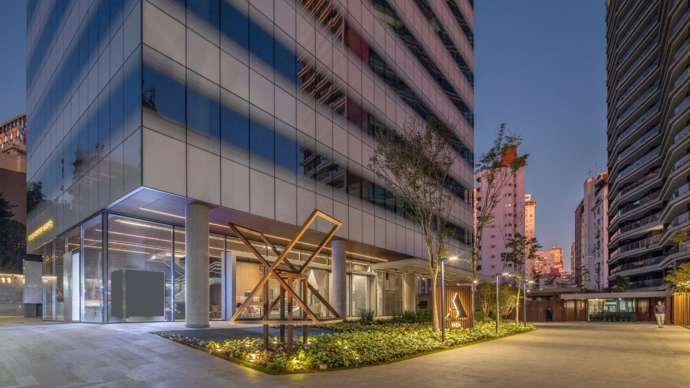
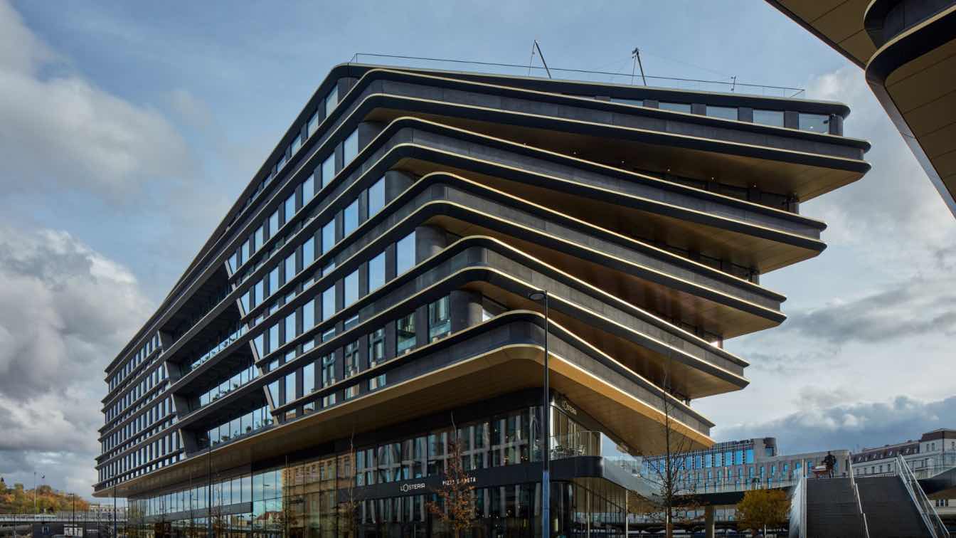
Built from the ground up as a structure and an interior ecosystem that breathes elemental life and traces veins of light, The Khayriya Building is an office space that defies commercial design. Hoping for a detachment from the humdrum of the city’s chaos, the space was designed with organic elements that made the modular elements from the Porcelanosa tiles to the Louis Poulsen lighting fixtures breathe. The integration of green spaces, natural plants, a lily pond and a centerpiece of a courtyard provided a sense of catharsis. Concept-Me’s main focus in creating this ethereal building was to translate light into a perspective-shifting element. The use of Corten metal, crafted in a Beirut atelier added a sense of organic weathering to the building whilst also casting sharp shadows that spoke of time and calculated contrasts. Transparency, openness and contrasted touches of teal blue evoked a sense of life in the monolithic structure. All of these elements aimed to invoke a sense of holistic nobility in design.
BRIEF
The brief for this project was constructed around its environment and its utility. The client, a business group, aimed to create a space for its upper management that served as an elegant haven for productive work. This project was built around the idea of escaping the heat and hassle of Jeddah, Saudi Arabia – where it is located. This inspired the integration of an indoors, green-filled courtyard that added an organic sense of vitality to the space. The client also wanted the place to reflect a sense of elegance that suited the scope of their work. Seeing as the office occupants would spend a lot of their time in the space, the brief denoted that a sense of openness and peace would highlight the space itself. Moreover, the idea was to have a testament of a building that integrated well into its environment but stood apart from its loudness, heat and rushed business. Centered around the themes of serenity, productivity and escapism from the outdoor hum drum, this project was constructed to suit the type of people that would work within it whilst also offering them the type of environment adorned with functional beauty and organized peace.
DESIGN INSPIRATION
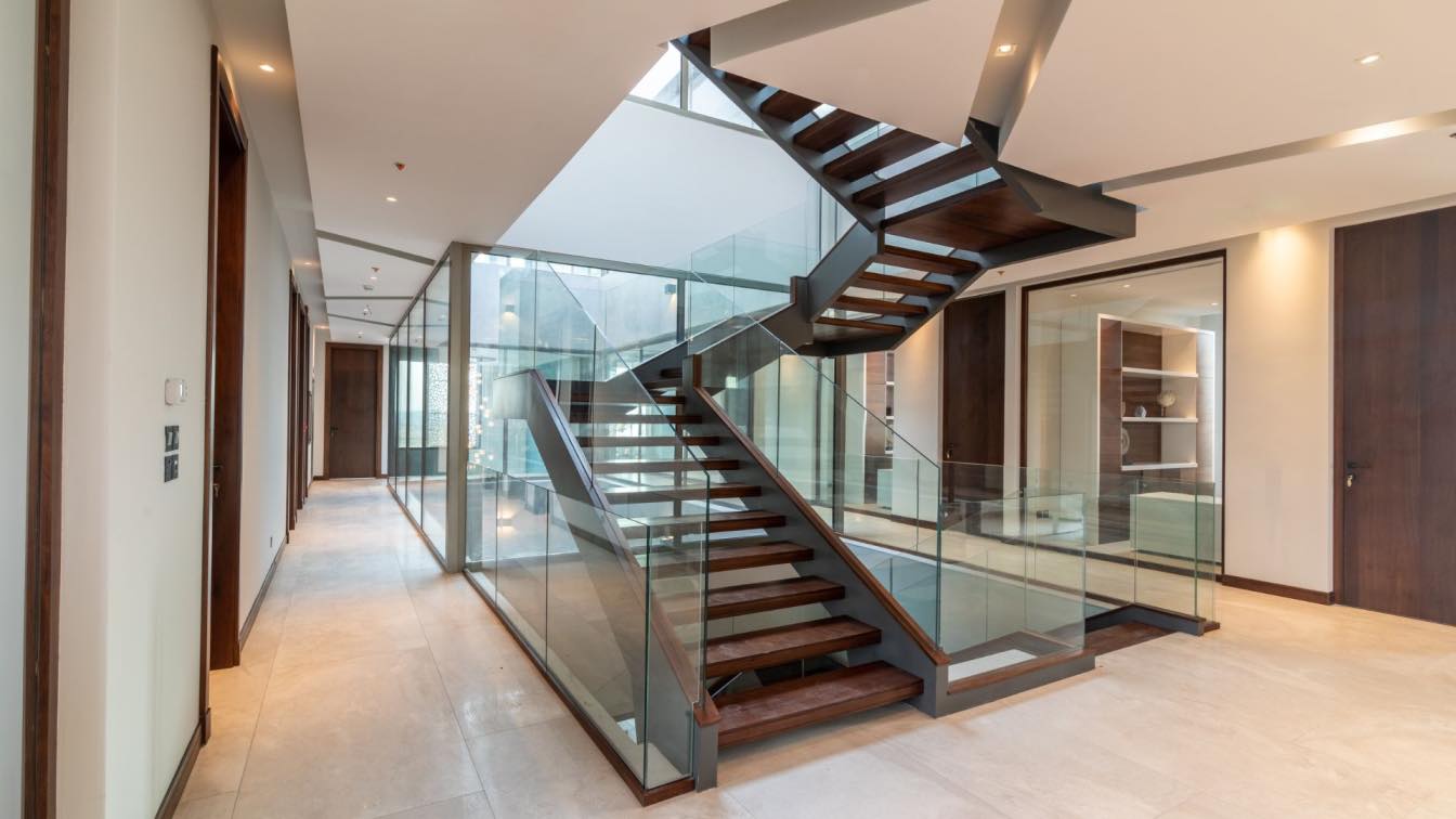
Concept-Me’s commitment to a theme can be seen in the over-sized, ceramic tiles that clad the building’s façade and the curated selection of accessories on the tables and the countertops. The perception-shifting, walnut staircase is a vertical circulation that allows one to float across the luminous interior. With light being the main component of the building’s perspective, the idea of having this building turn into itself and appear as a self-sustaining structure was brought to life. All of this serves a purpose, not a mere metaphor. And that purpose is to provide a mindful and natural perspective to spatial existence which dictates the rhythm of our inspiration for this building.
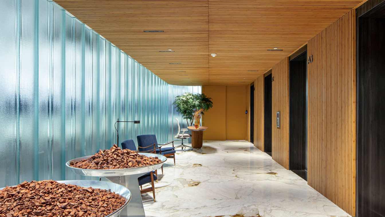
Keeping in line with the concept of serene harmony, the choice of the materials was focused on providing the project with an organic look that also appeared sleek. This was accomplished through a juxtaposition of warm elements such as the medium-toned walnut wood of the floating staircase and the pivot doors. The marriage of the cold and warm elements is apparent in the amalgamation of the stone-like ceramic tiles with the Corten metal panels and the touches of golden Calacatta marble. The harmony is clear in the interaction of the subtle and clear material from the sleekness of the marble to the liveliness of the greenery – an intrinsic part in our design.
MAIN DESIGN FEATURES
When we handle a brief, we always make sure to integrate a wow factor that is consistent with the project. For this organic haven of a corporate headquarters, we decided to invite the element of light and greenery into the space itself. We made sure that transparency, clarity and openness denoted every element of it – including its centerpiece of a courtyard which opened the whole place from every side and every floor onto itself, giving it a sense of vibrancy and clarity. Walking into the space, one can see the other end of it and look up to see its openness and glass bringing in floods of light. This courtyard adorned with greenery was encapsulated by a floating walnut staircase that gave the whole space an ethereal feeling while also serving its function, never compromising it. This main feature invites a holistic and urban statement into the project. While it stands out with its warmth and organic definition, it also blends in well with the project's other elements, color palette, and purpose. It is the wow factor that’s centered around a peaceful outlook whilst bringing serene brightness into a corporate headquarter that opens up onto itself.
SUSTAINABILITY
Sustainability and its practices came into this project due to the nature of its brief and the vision we had for it. In creating an organic, haven of a place away from the loudness of the city, we wanted to make sure that it was a building that invited serenity to it through its greenery-filled courtyard and its reflection of natural light. Through our use of non-glazed ceramic tiles, we ensured that the project was capable of insulating itself with a minimized use of air conditioning during colder days. Moreover, we intentionally invited light through the openness of the structure and the use of glass to deem electric lights unnecessary across the course of the day. And finally, we integrated greenery not only in the courtyard but across the upper level of the building where we created a relaxed, green garden for the people that use the office to enjoy a little touch of the things that count: nature and its scenic serenity.

NINA’S STORY
A creative dictator at heart and a go-getter by nature, Nina Parvaresh has a tendency to break through the boundaries of design’s conservative and boxed-in traditions. Her loud and singular vision has driven Nina’s process from her studying Architecture at the École d’Architecture de Paris-Malaquais in the distinguished Les Beaux-Arts site in Paris to her executing projects in different countries and regions. A resourceful attitude, an ability to navigate through obstacles, a people-centric personaand a wildly imaginative mind allowed Nina to blaze a trail on how design, creation and execution should function as a cohesive process. Sleepless nights, a dedicated vision towards shifting and redefining ‘design practices’ along with her fiery entrepreneurial spirit led this creative perfectionist to establish her own practice, Concept Me. The proof of intangible vision being transformed into solid reality is reflected in Nina’s projects. Perusing her work leaves one marveling at the polarizing details, the scope of the execution and the unconventional process. Nina, a connector of design and people, continues to challenge the status quo, to take the bull by the horns and to sketch her story one project and statement at a time.


