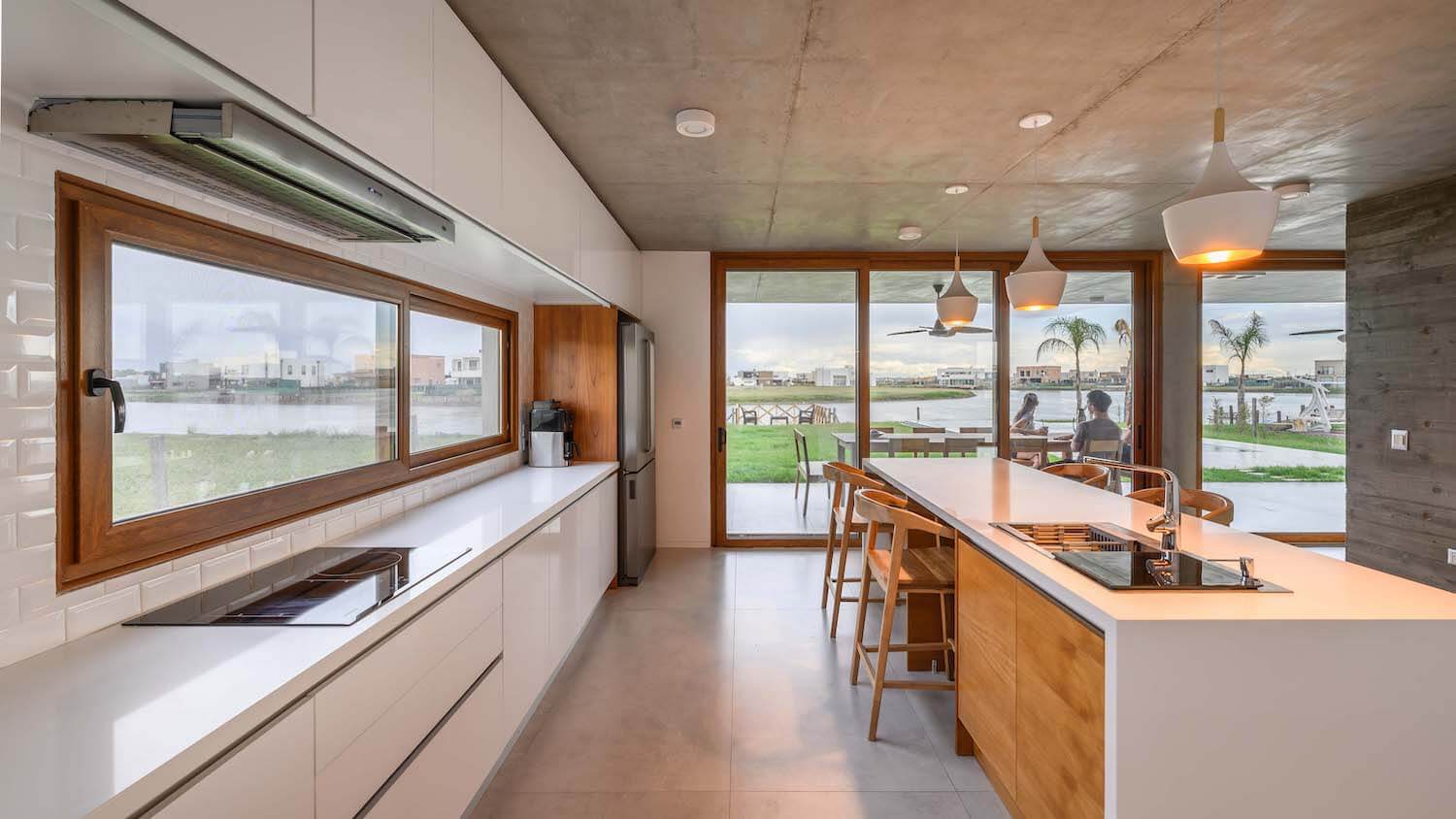
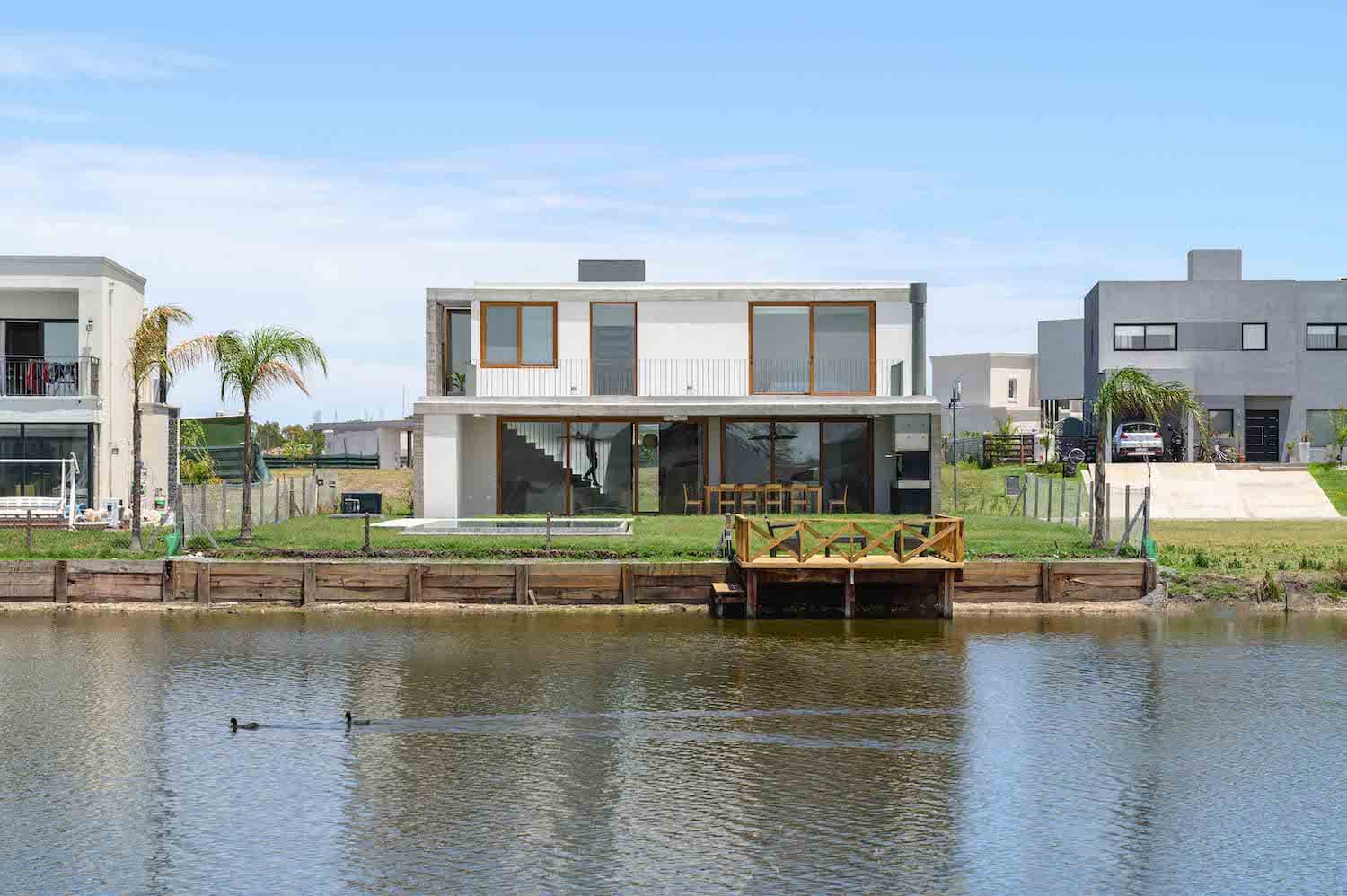
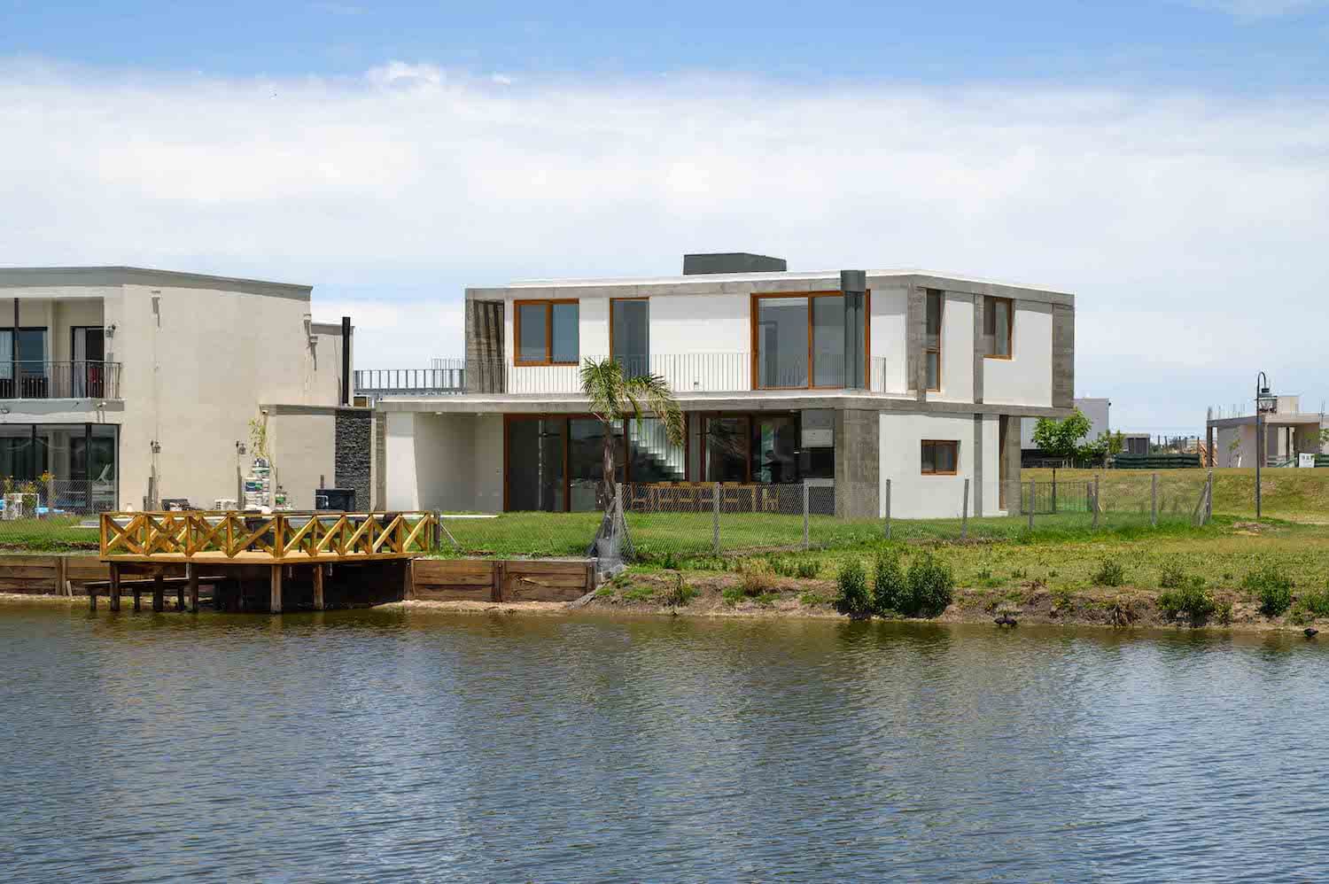
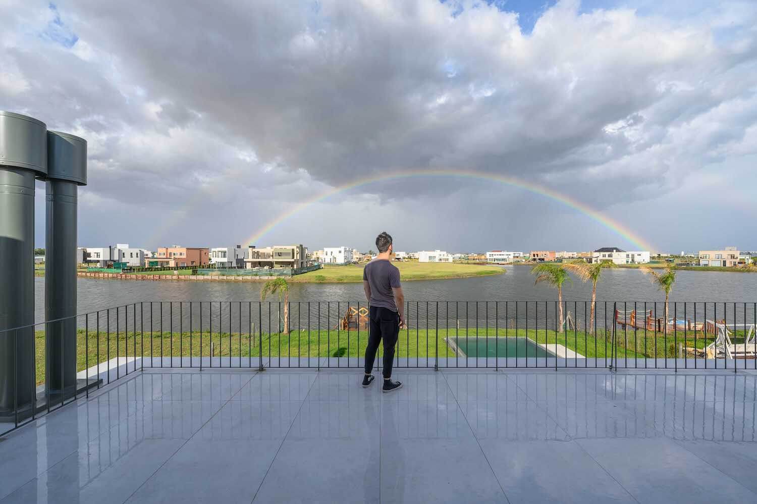
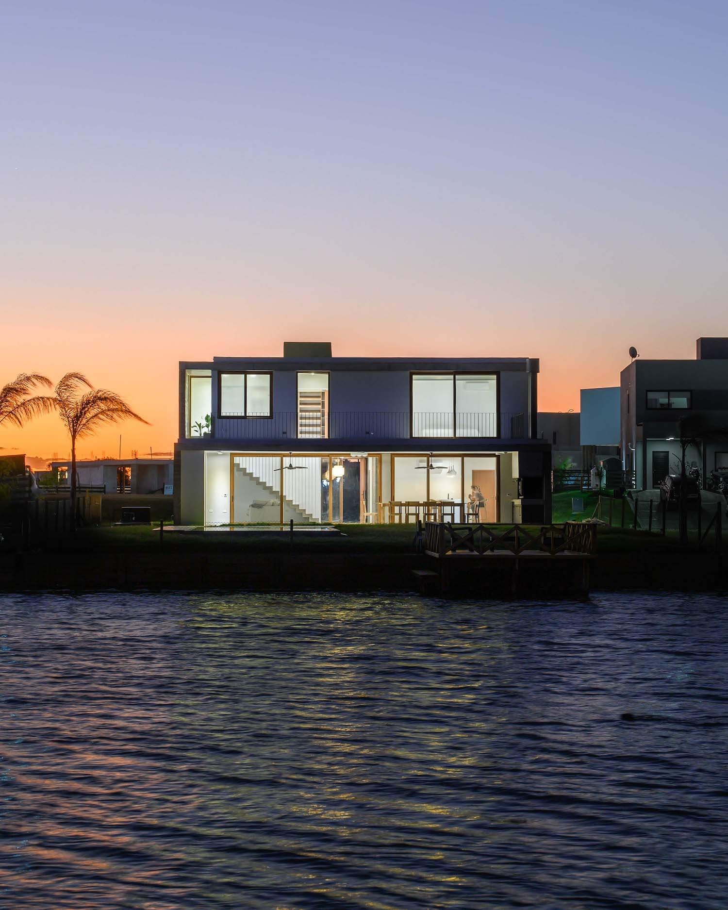
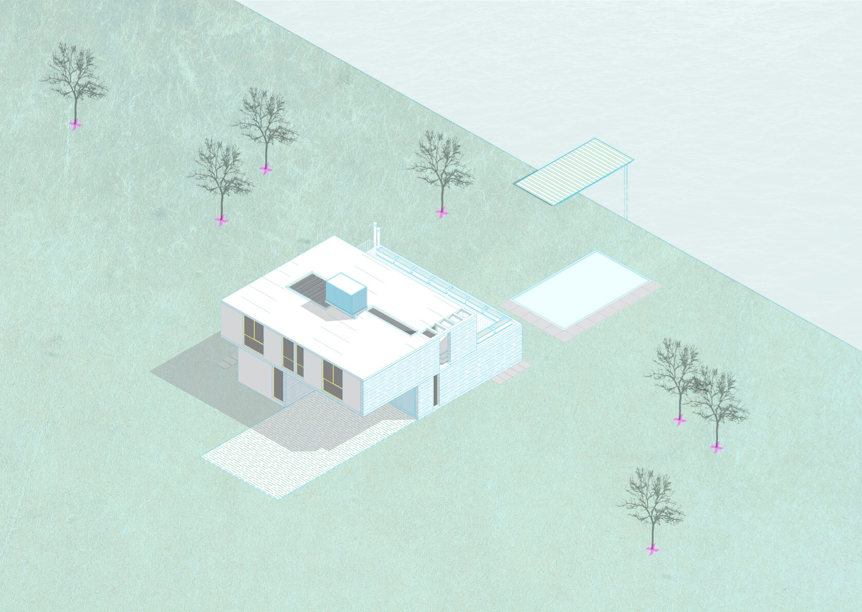
Además Arquitectura: This house arises to order on a weekend house. Like any weekend house, the initial requirement is low maintenance and functionality, that is, well-connected spaces, especially taking advantage of the immediate views towards the lagoon.
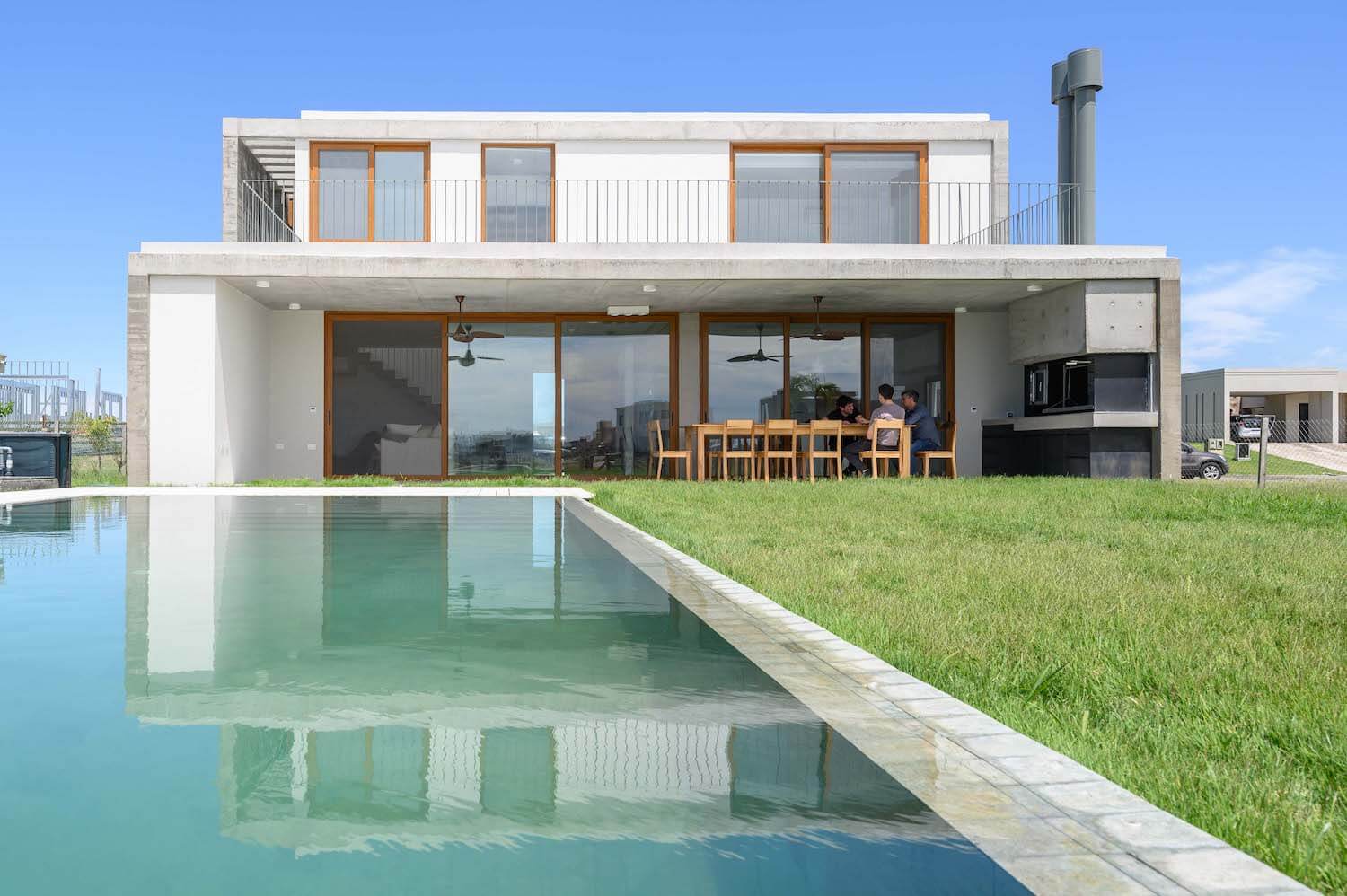
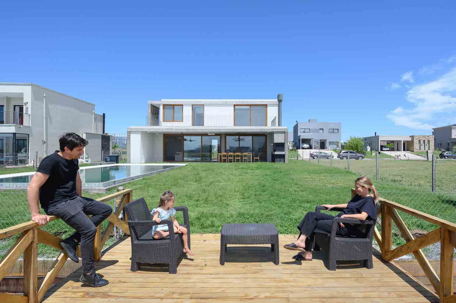
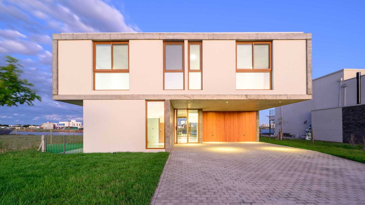
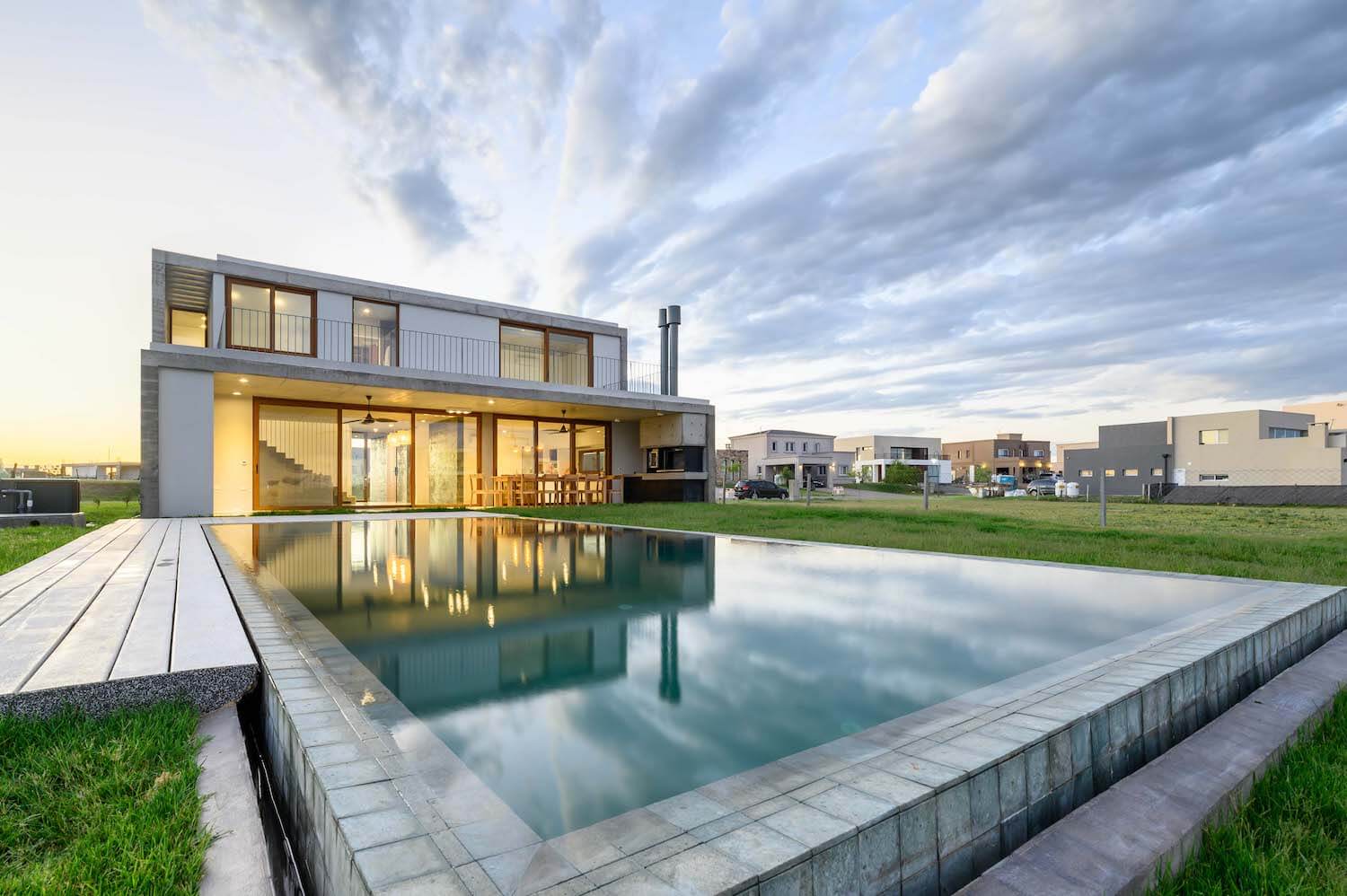
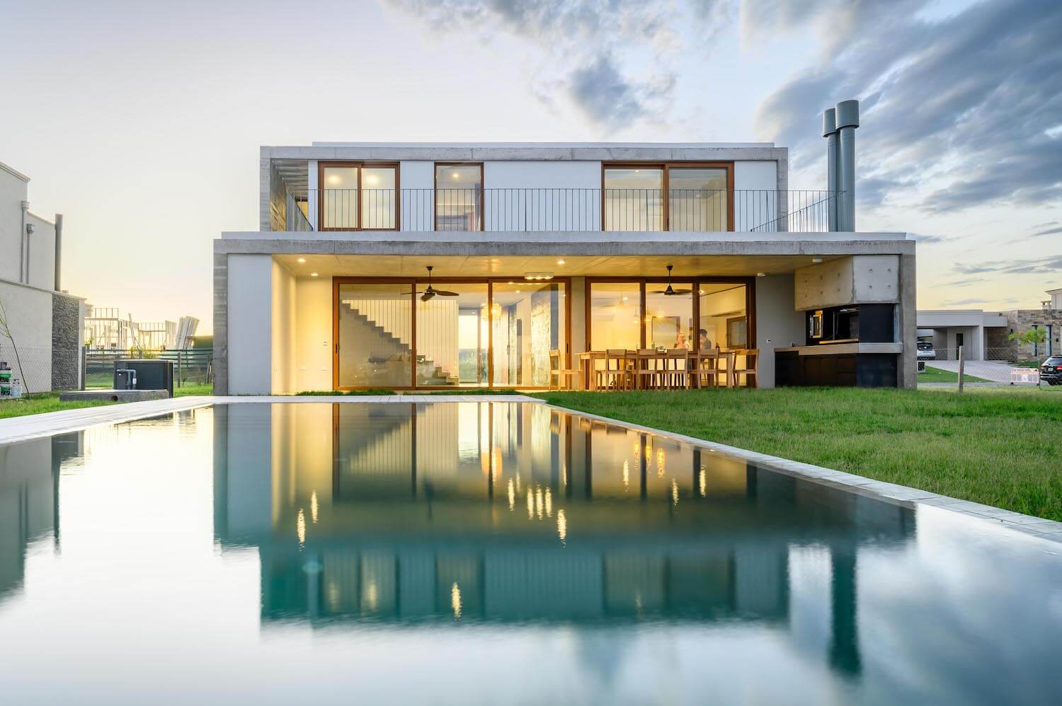
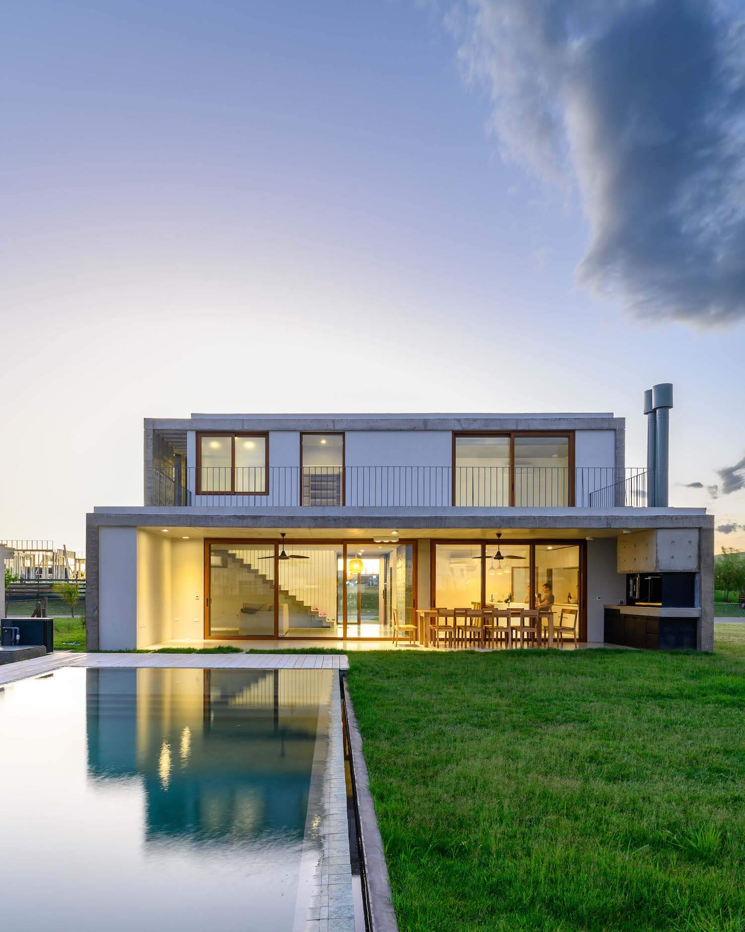
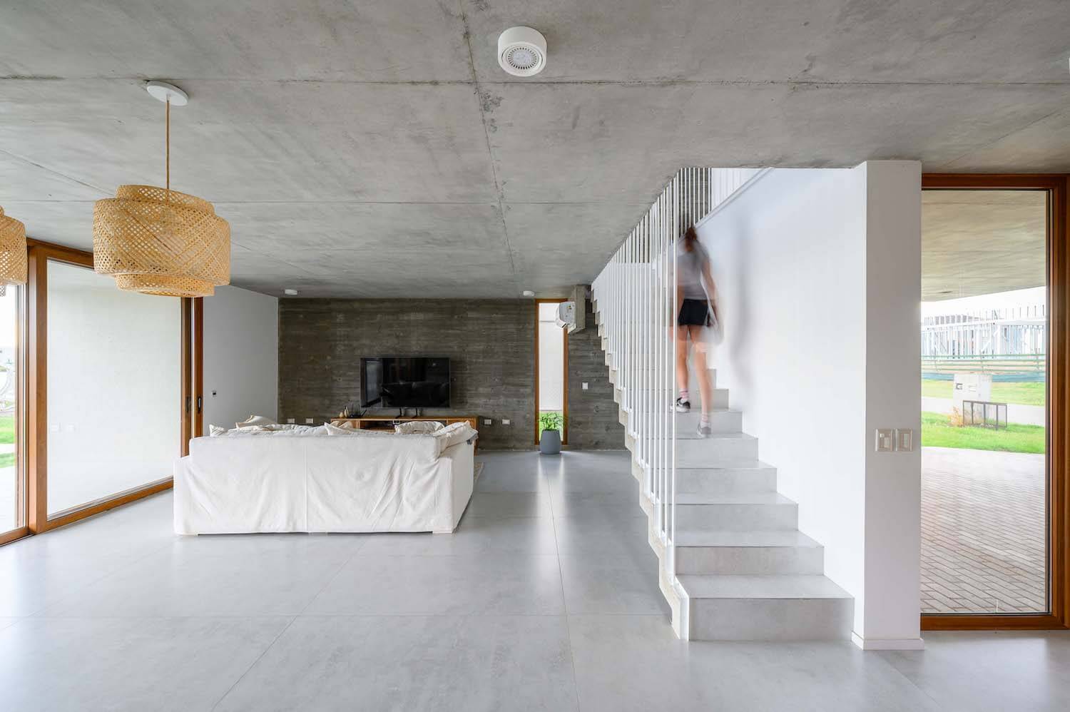
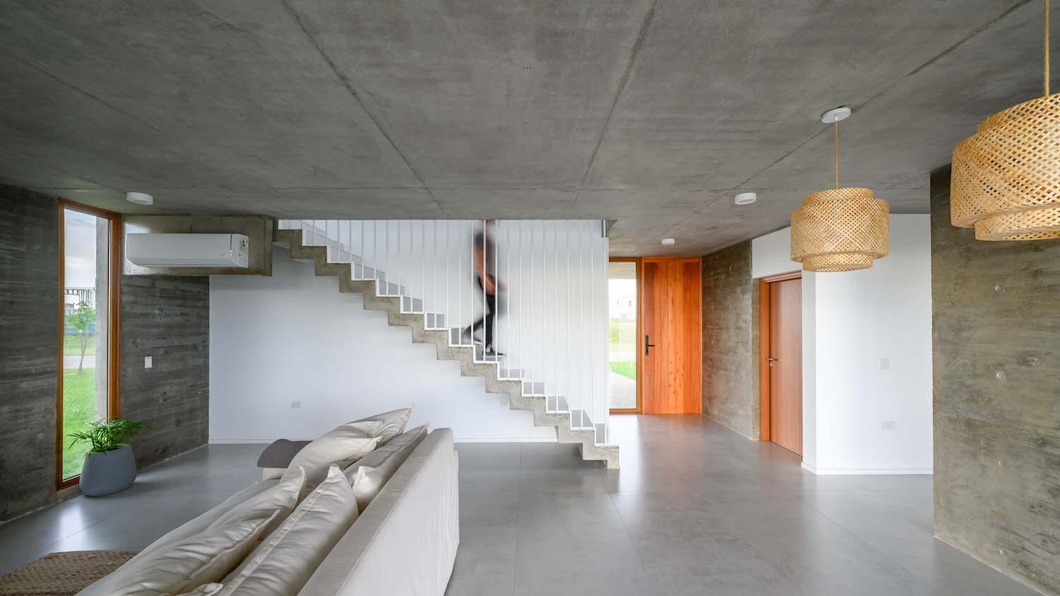
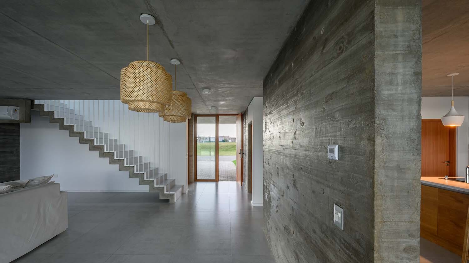
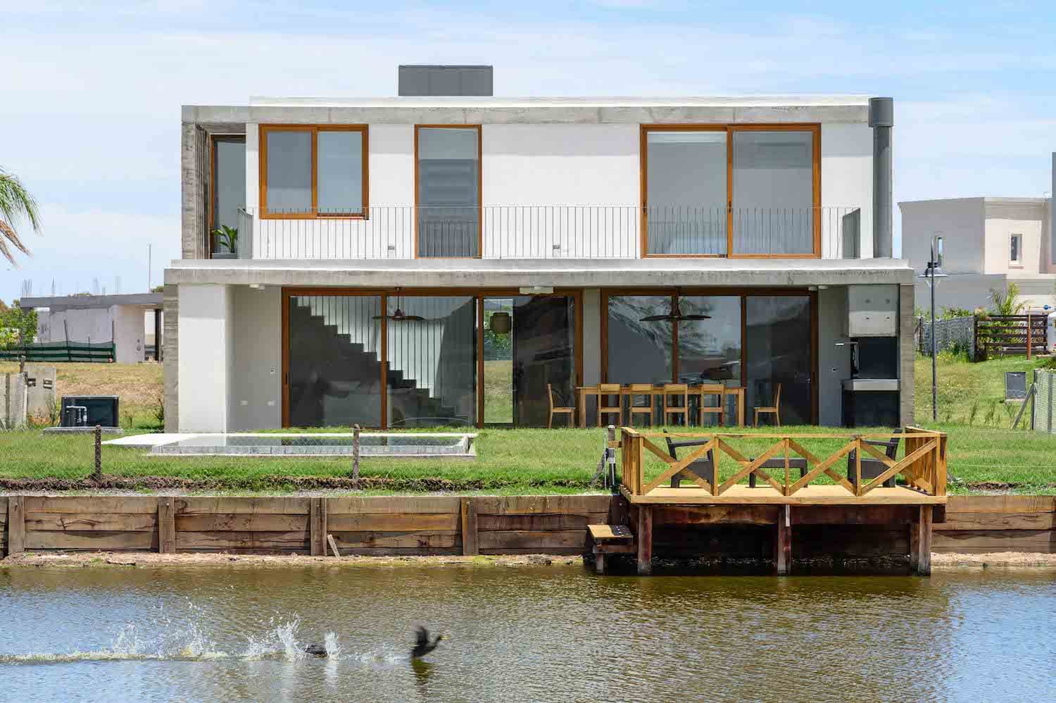
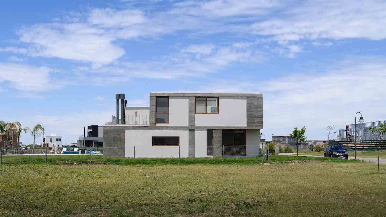
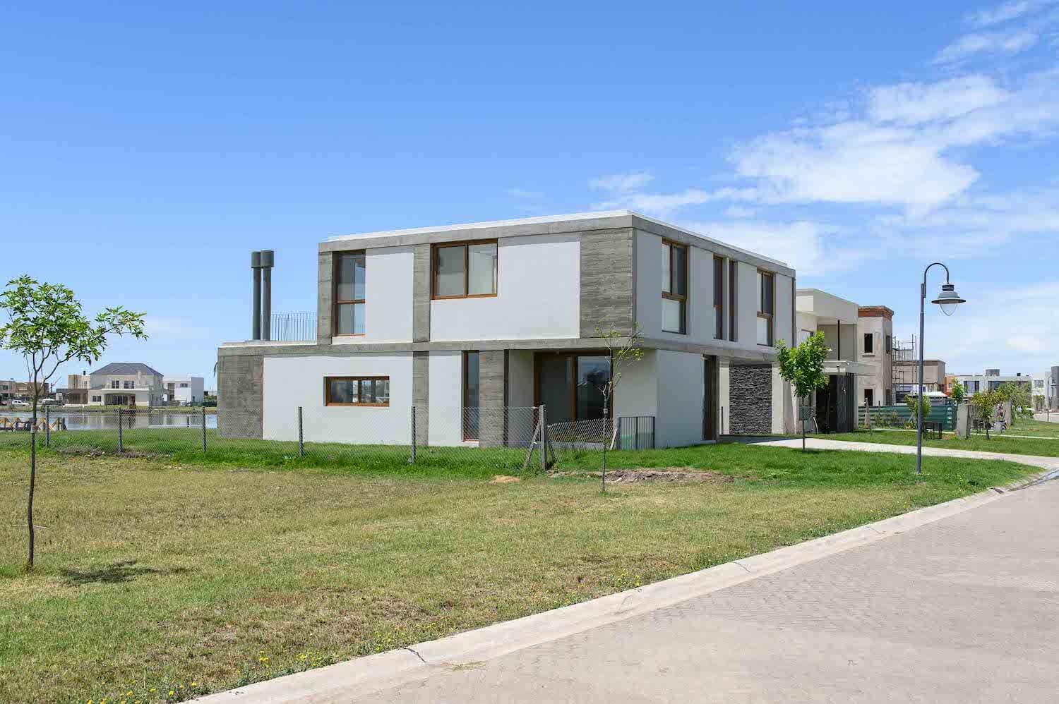
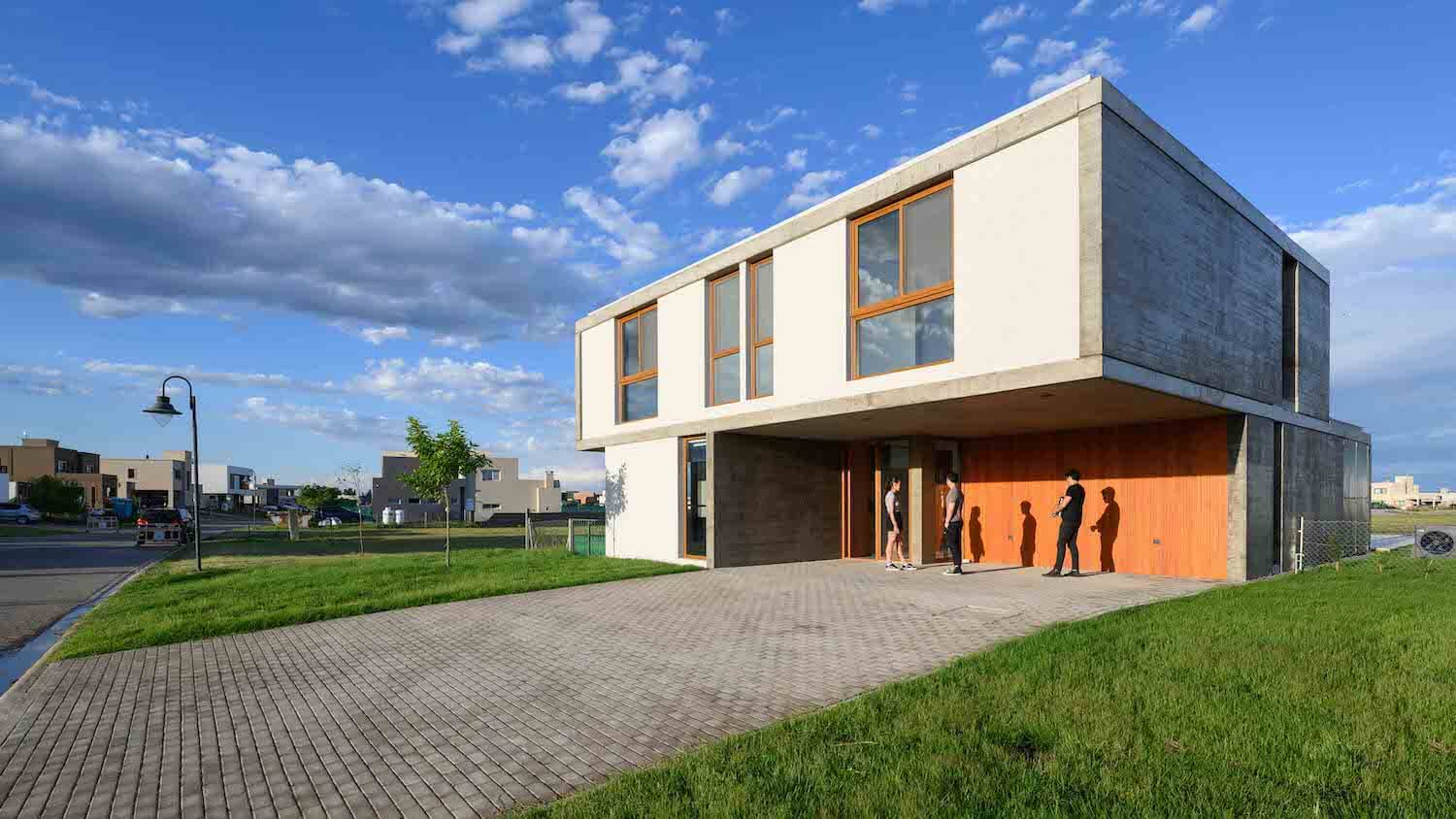
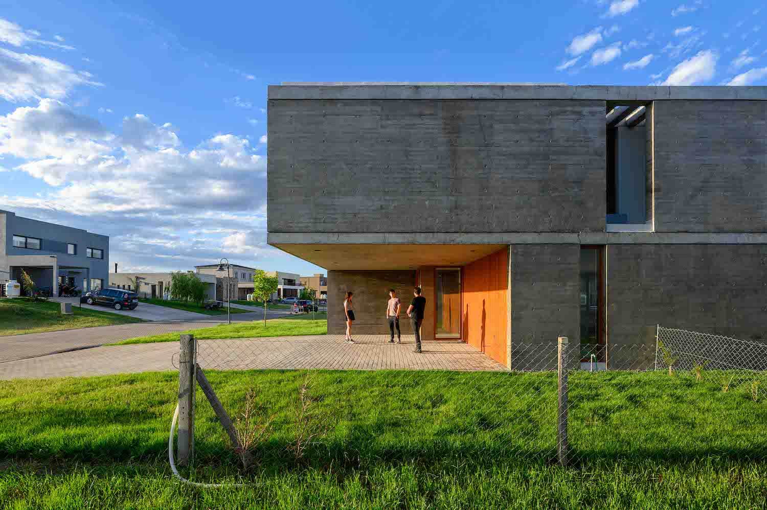
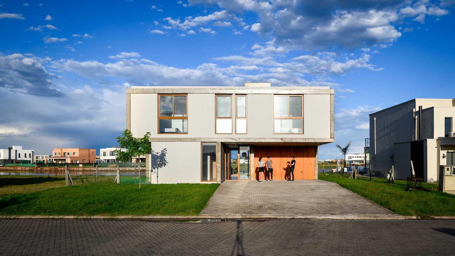
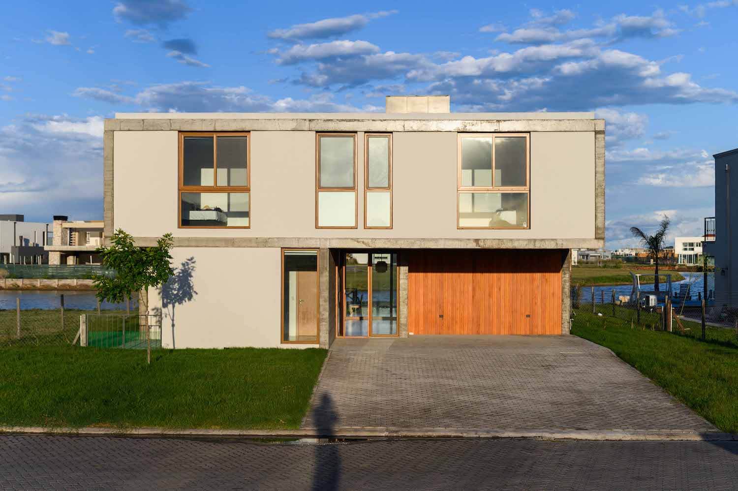
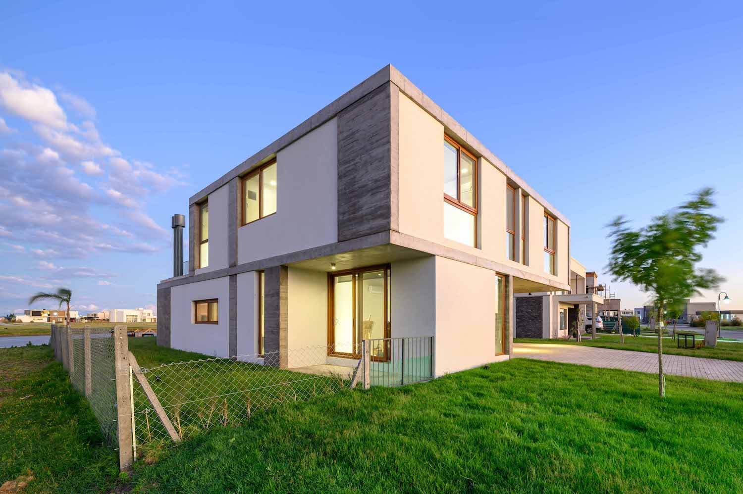
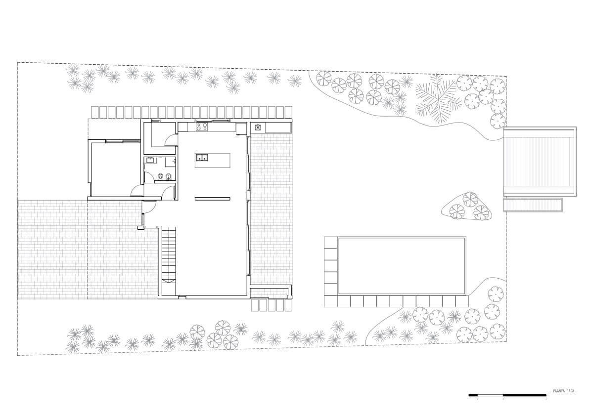
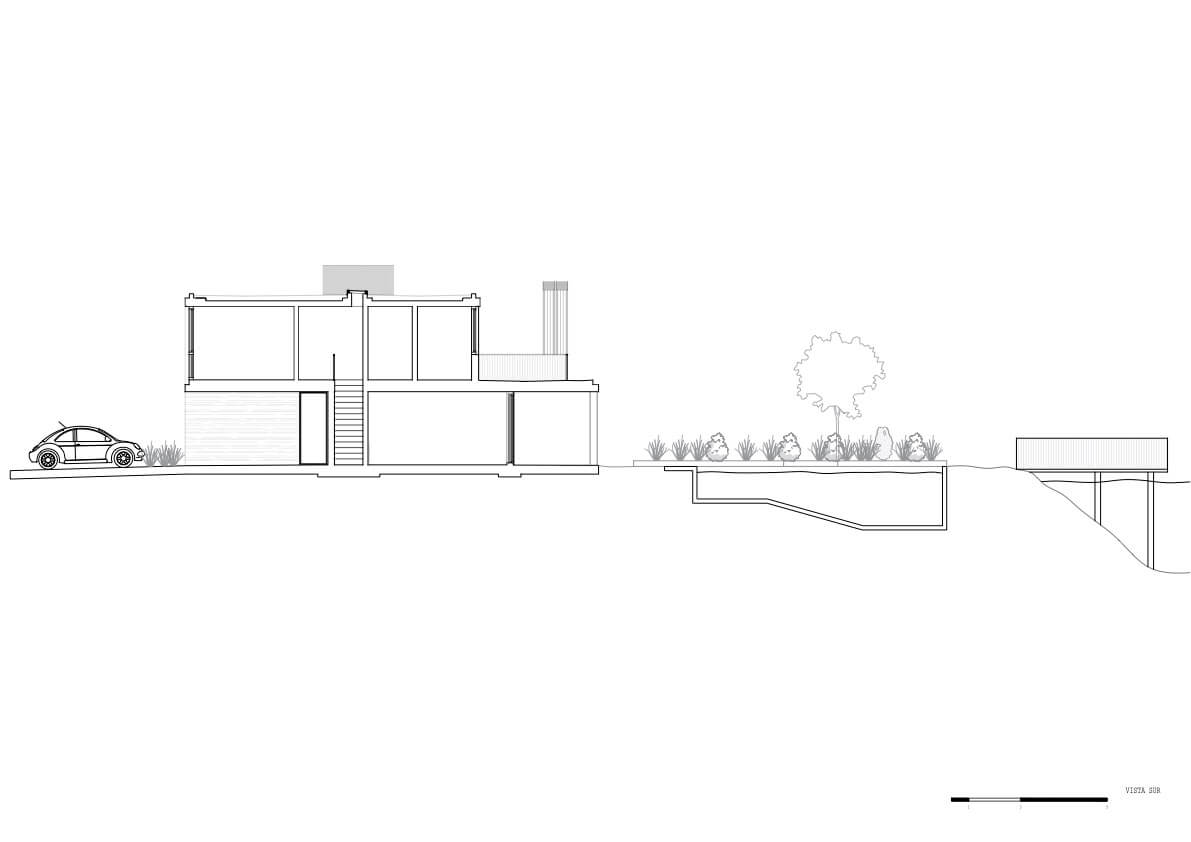
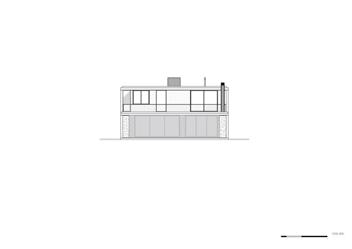
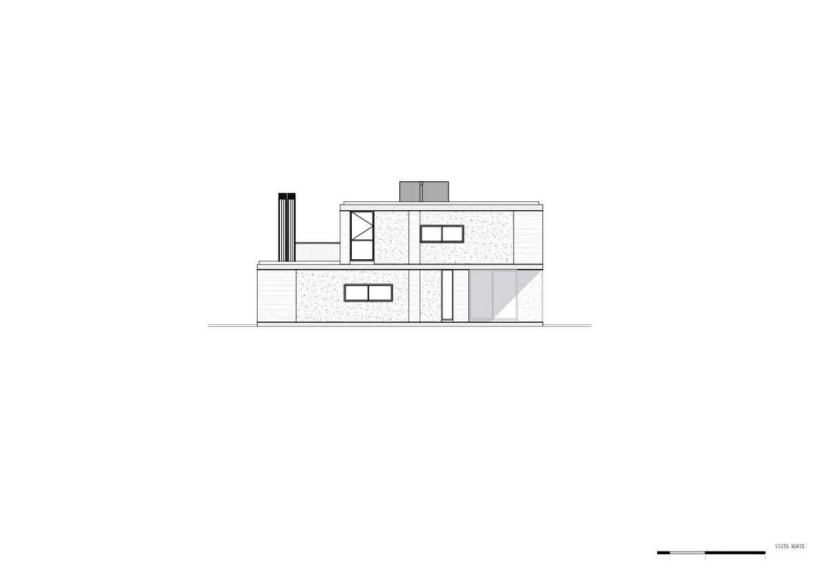
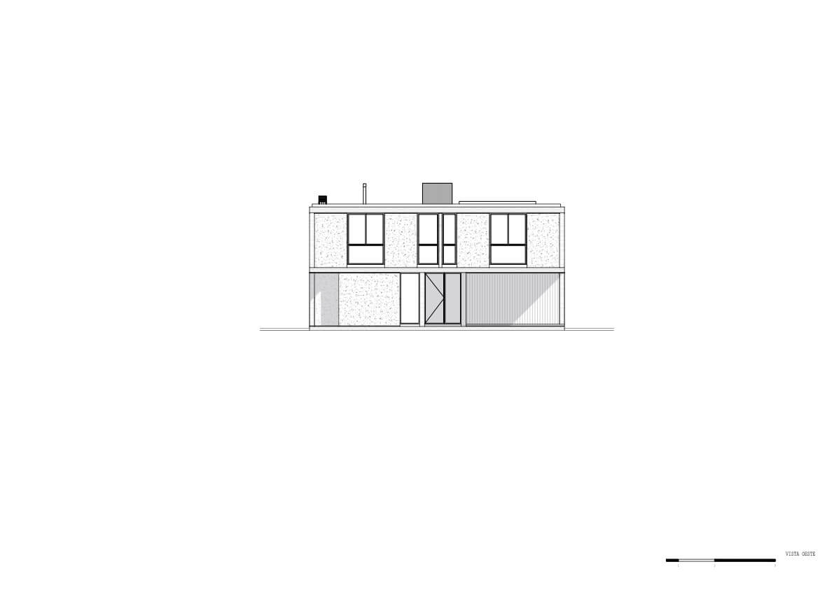
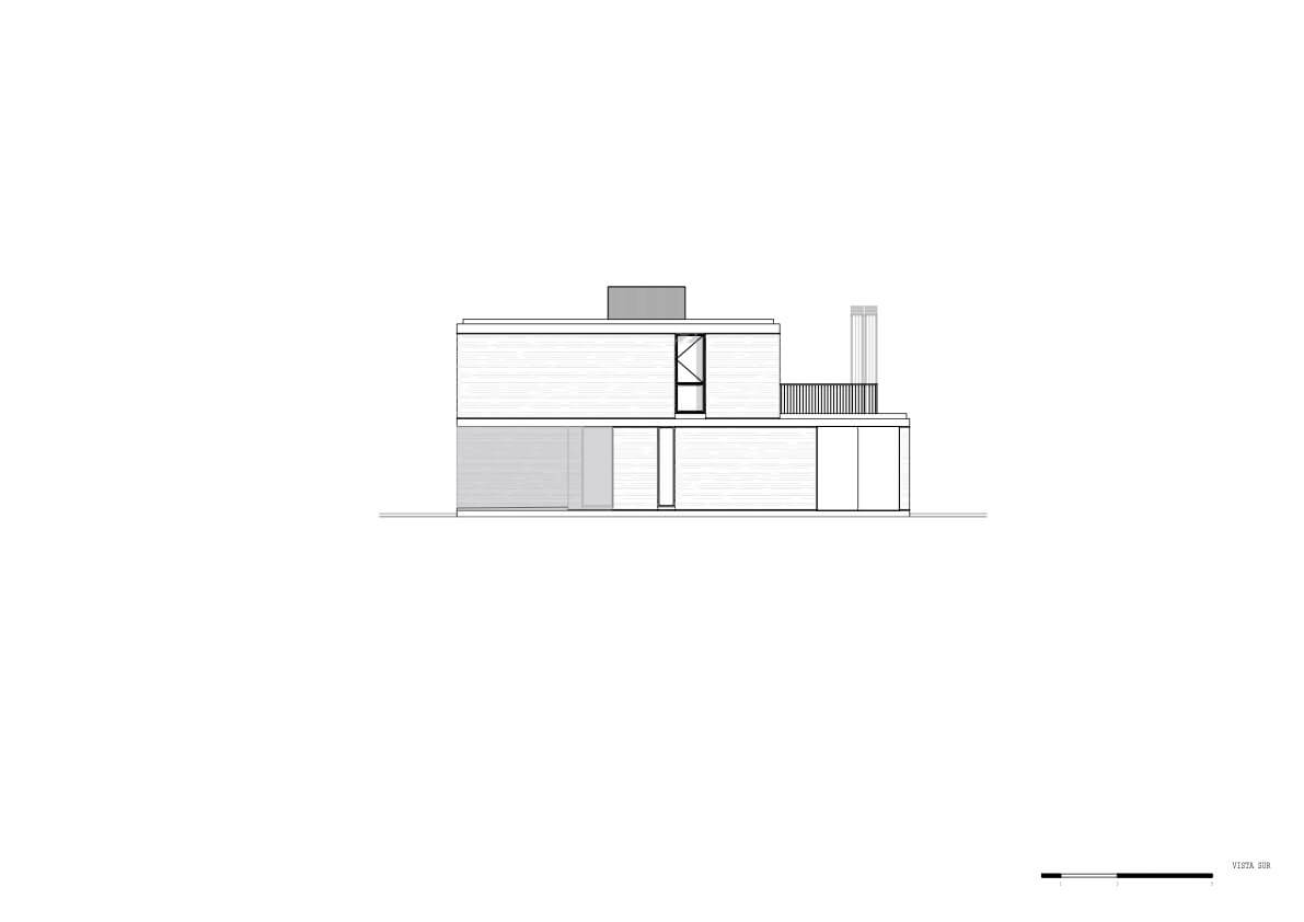
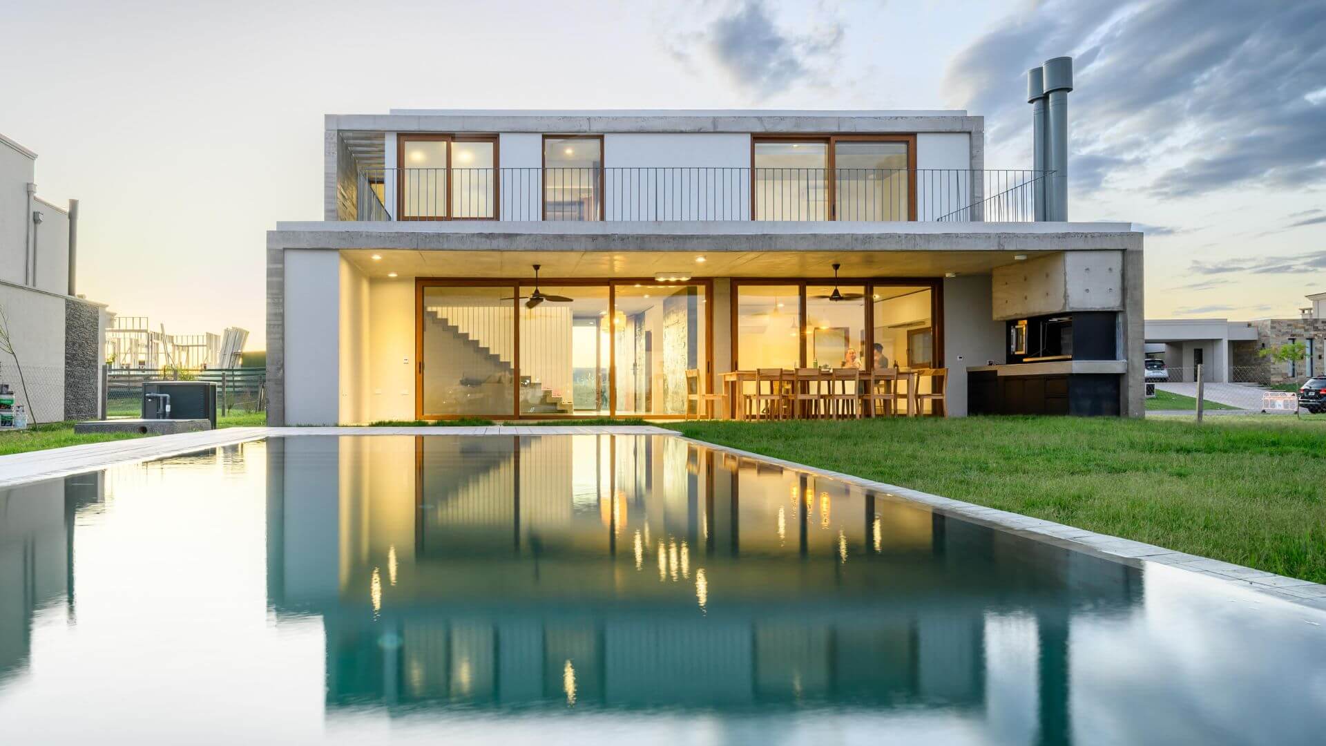
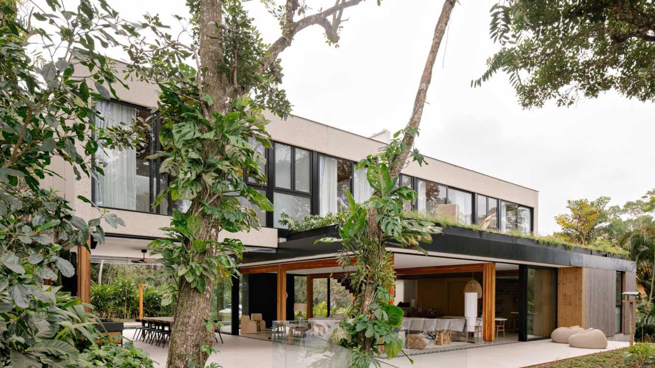
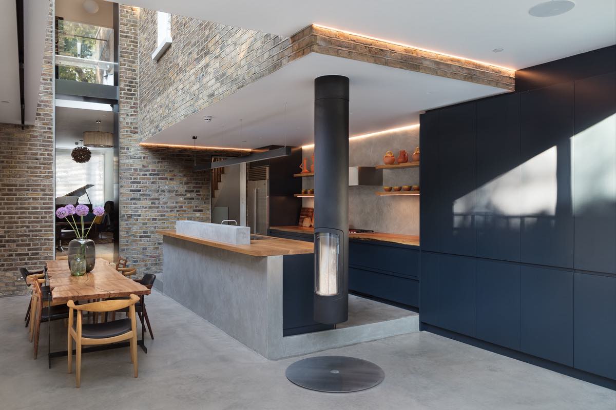
Located in Hudson, on the outskirts of the city of Buenos Aires, this house is resolved on two floors. On the access floor, access is resolved through a semi-covered area with space for two garages. There is immediate access to the most public space, the dining room and the living room. A concrete partition serves as both a structure and a container for the kitchen space. Everything is related to large windows to a gallery that serves as a barbecue area towards the garden that, above all, frames the view towards the lagoon.
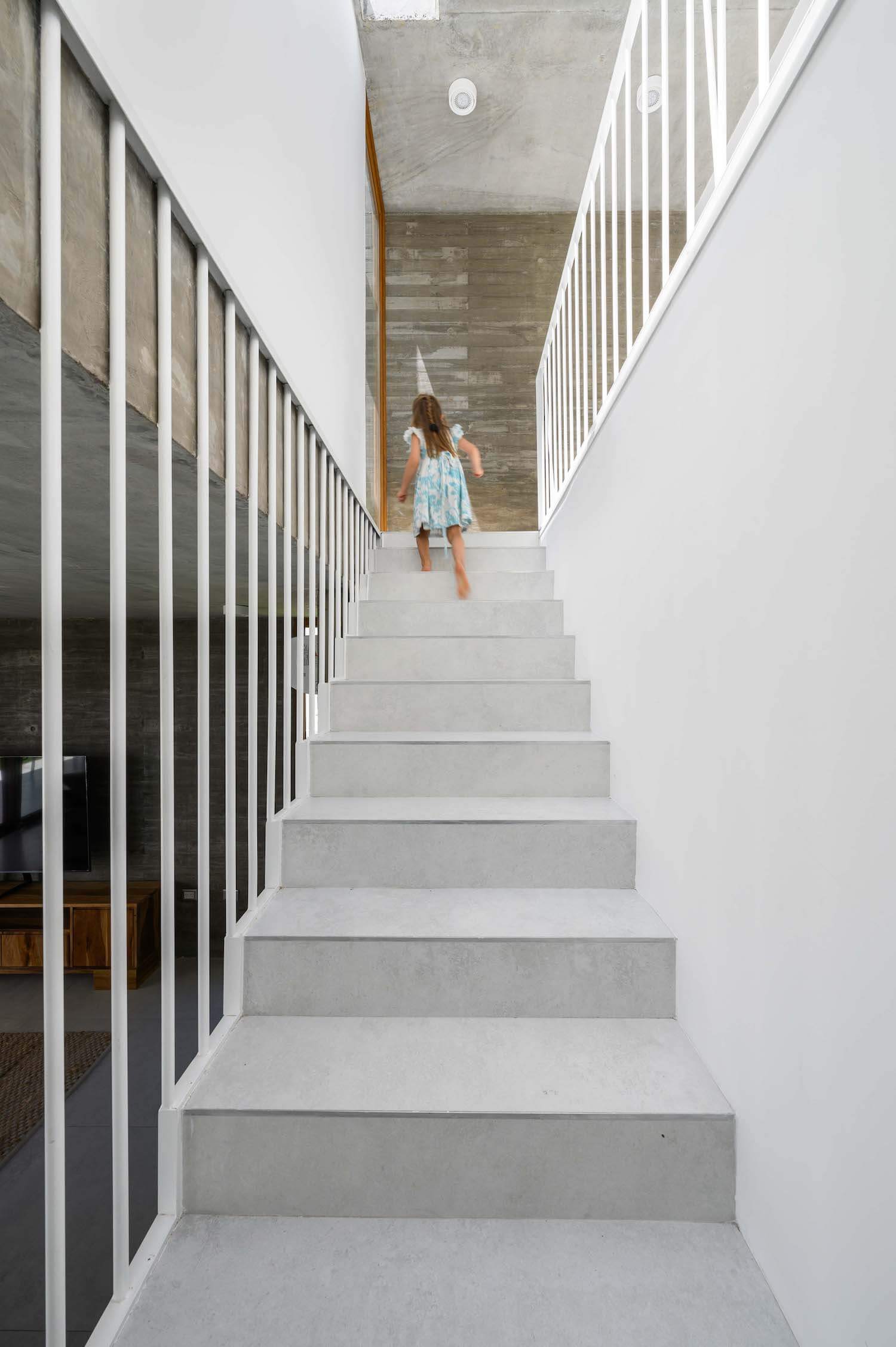
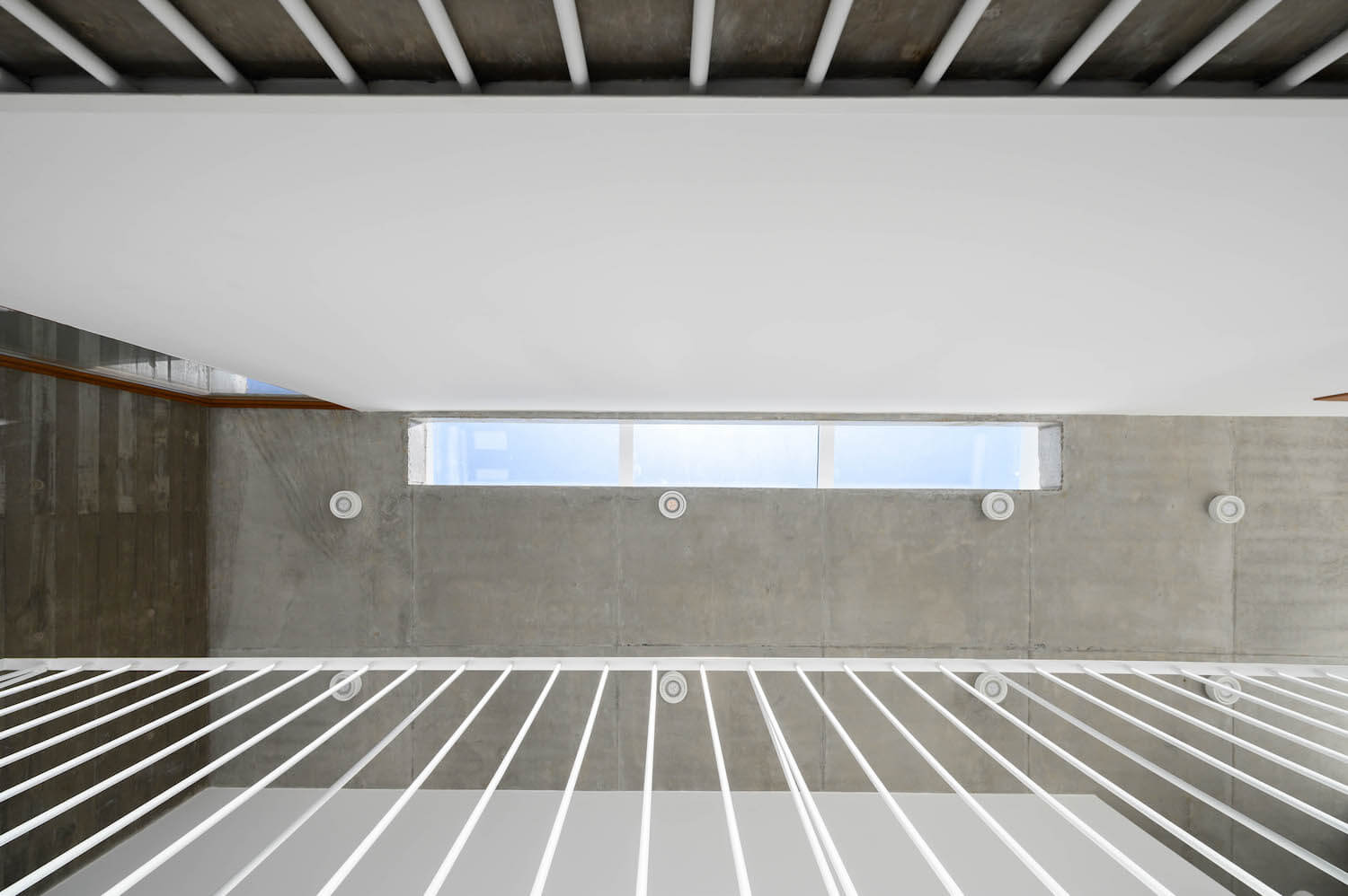
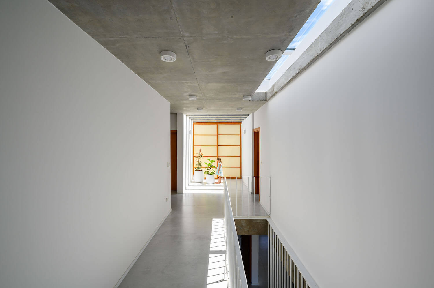
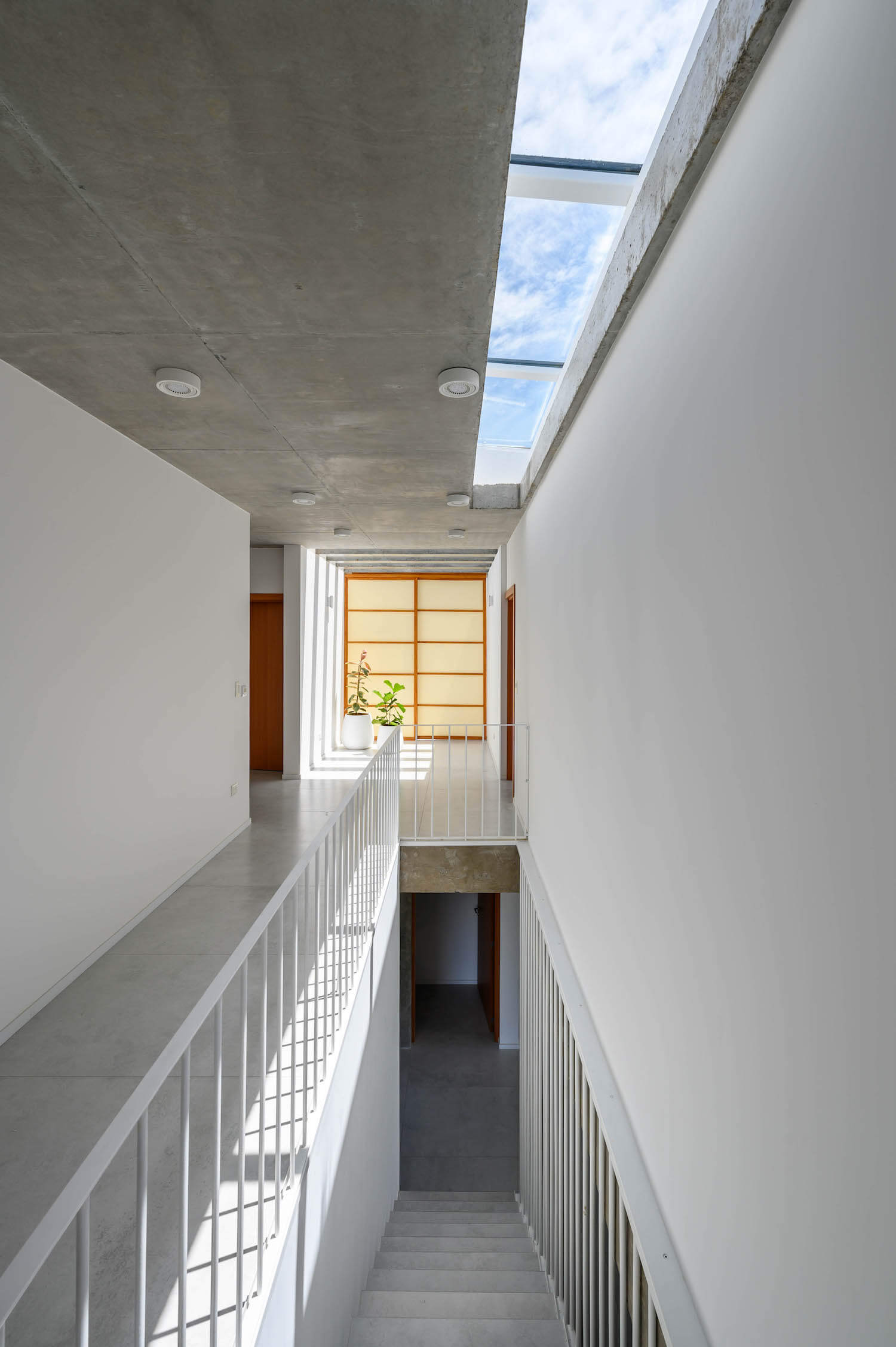
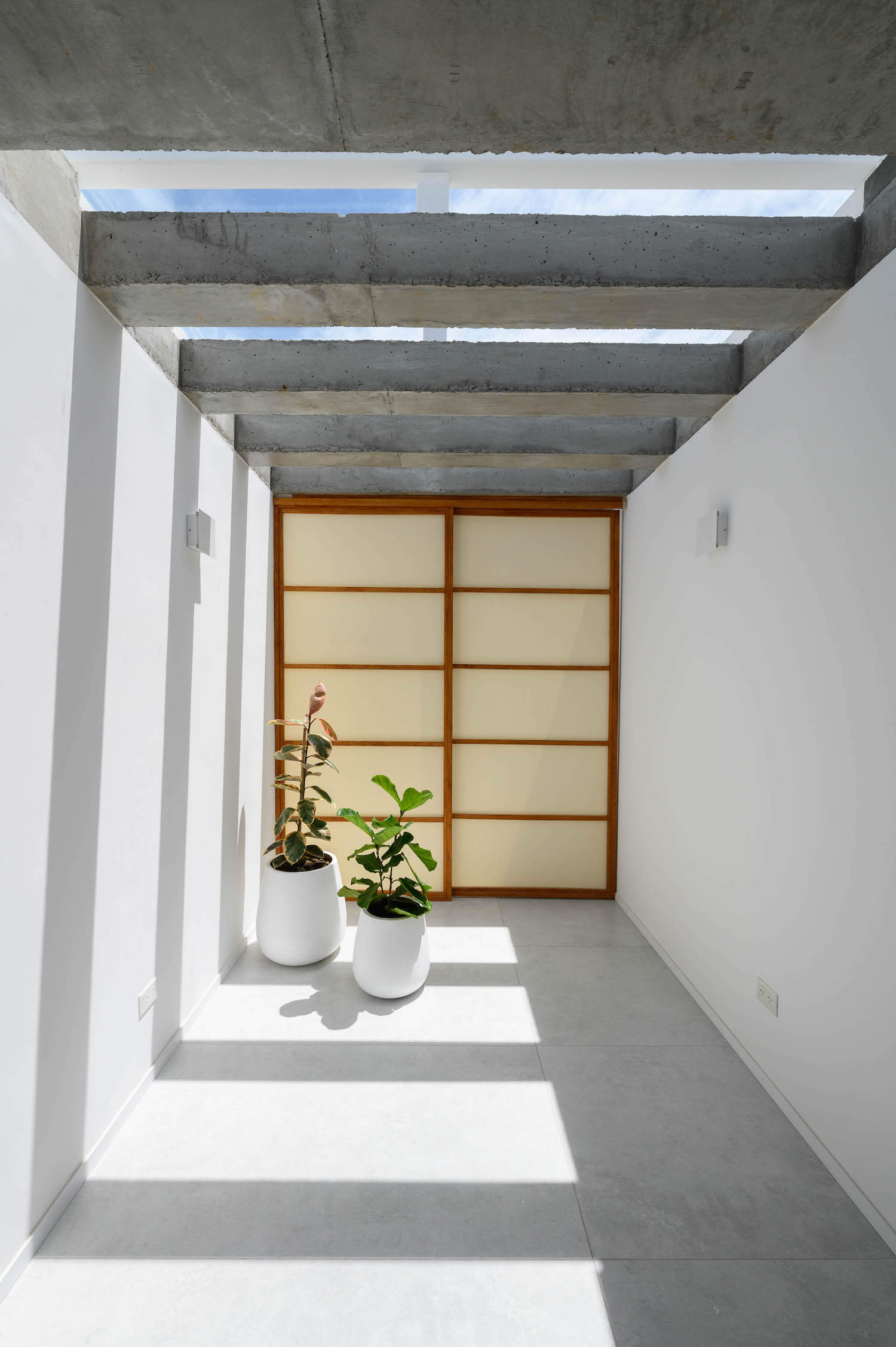
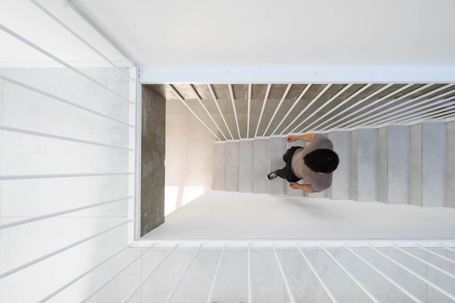
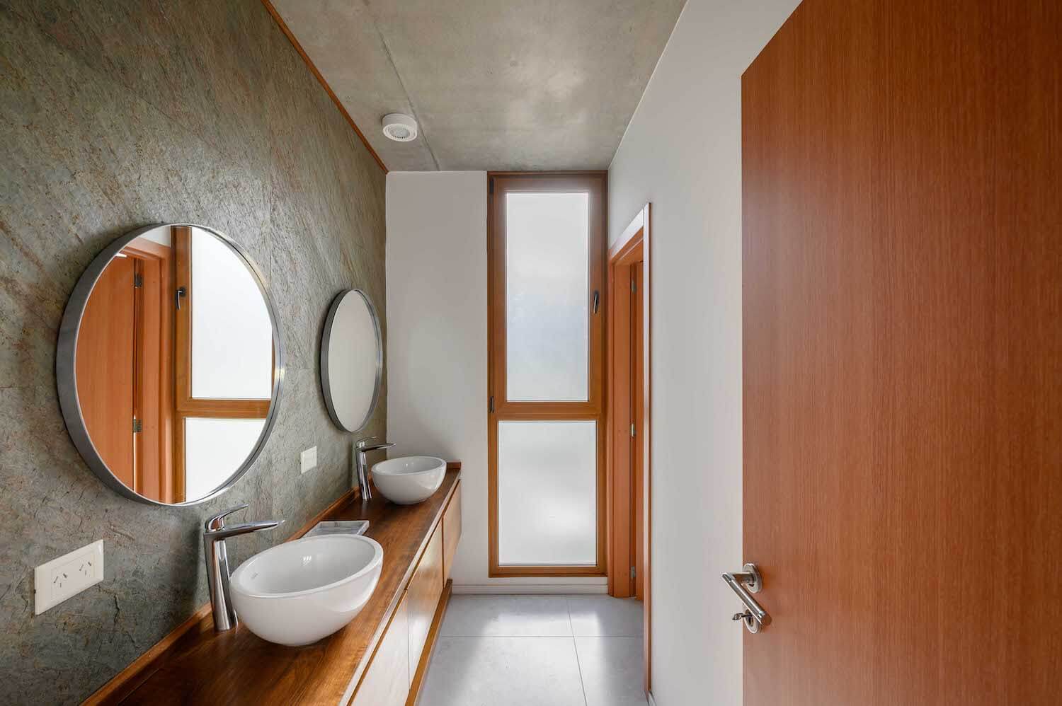
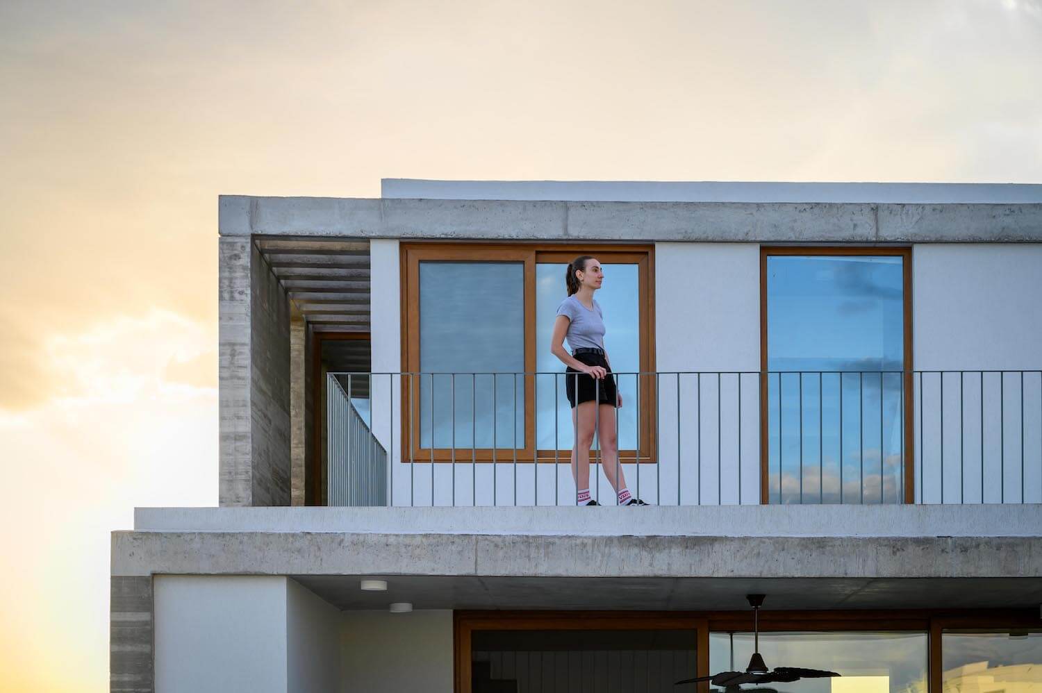
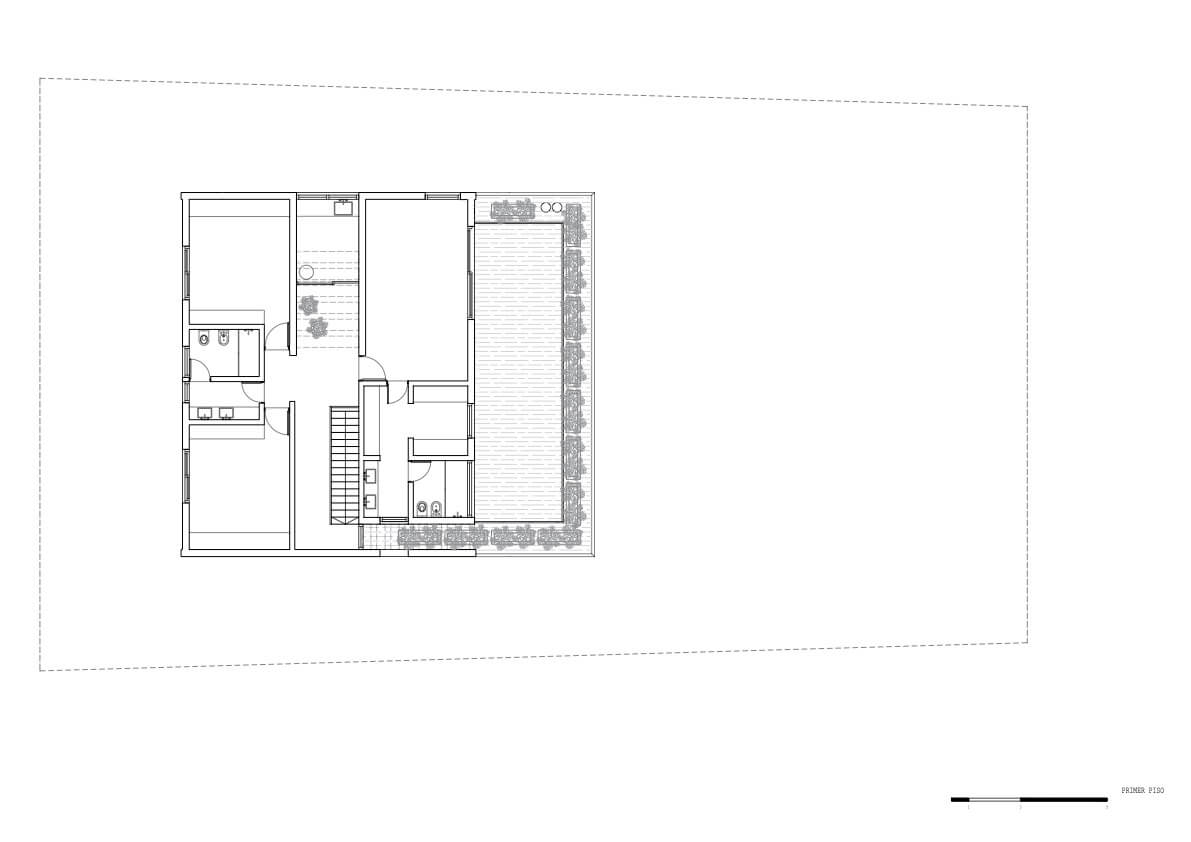
The upper floor consists of two bedrooms towards the front with a shared bathroom, while the quiet part of the building, towards the lagoon, is available for the entire master suite. In the center of
the upper floor is resolved as bellows, circulation and a winter garden.
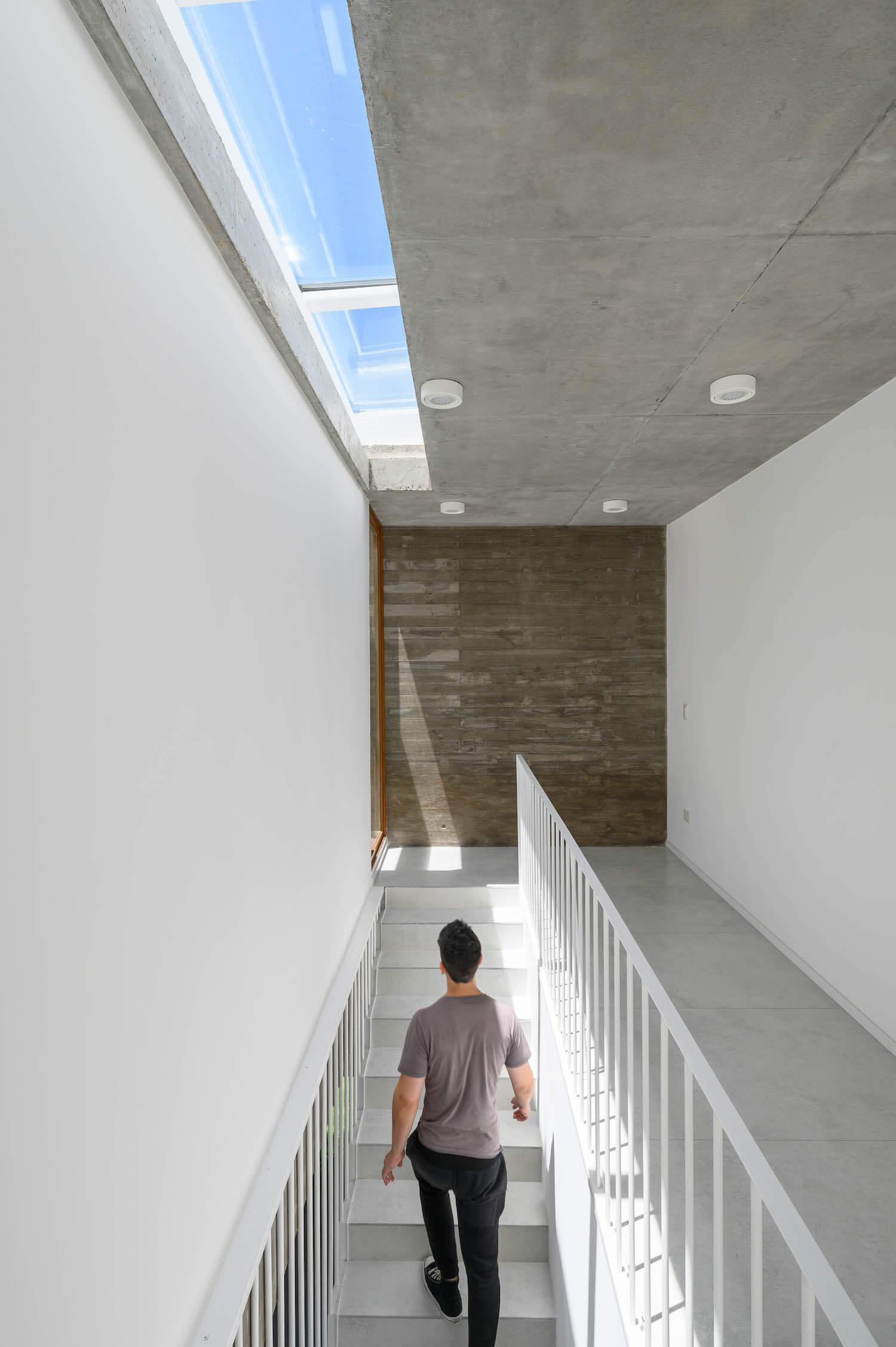
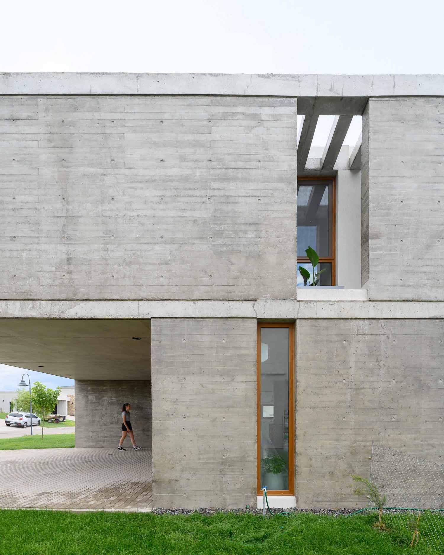
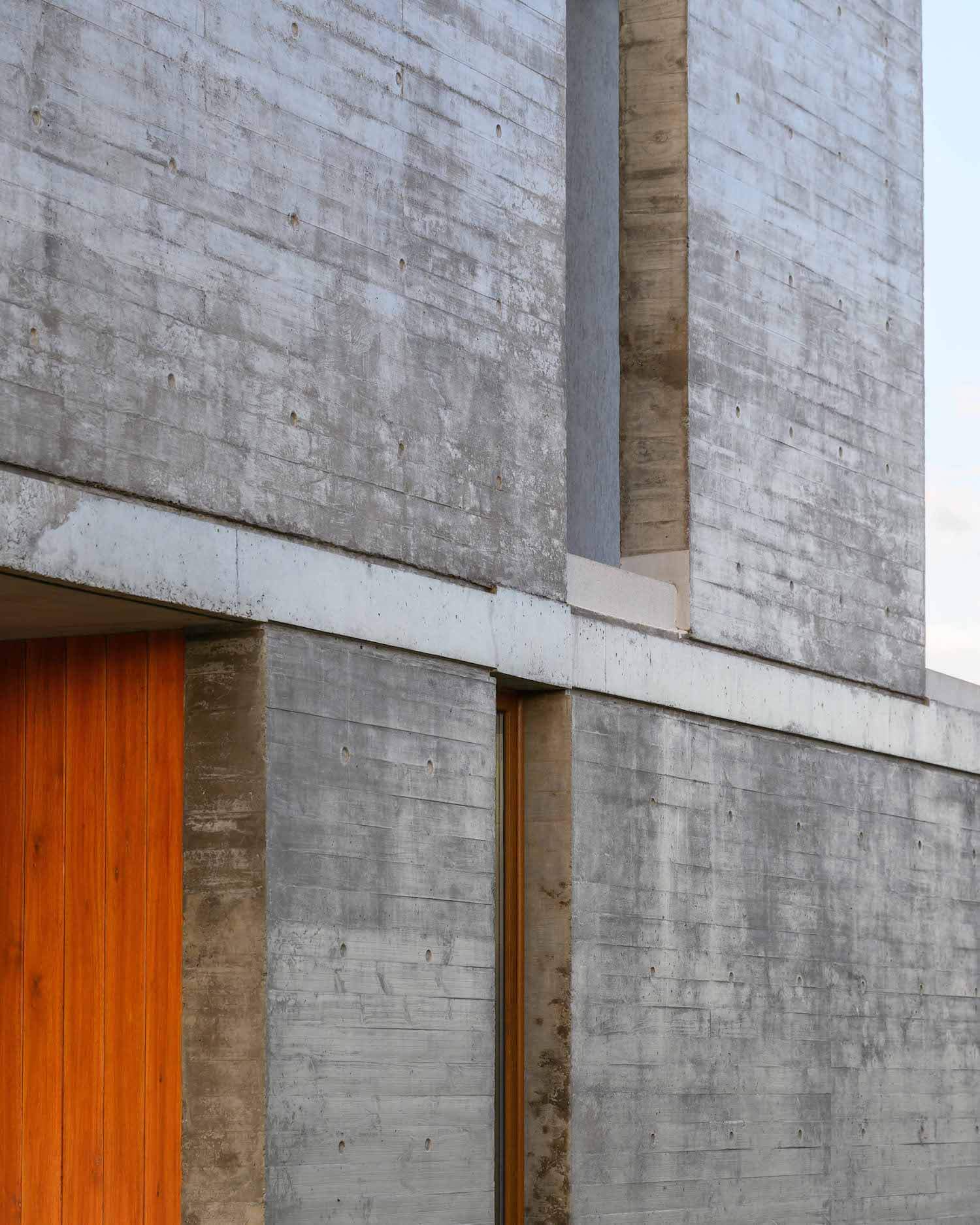
The main materiality of the house is reinforced concrete, while for the façade that receives more sunlight, a brick wall with plaster was chosen to avoid the damage caused by the behavior of the concrete in the face of direct solar incidence.
The gray of the concrete and the plasters predominate over the image both externally and internally, highlighting a language of simple geometries but above all providing austerity to the house.
