Atlas Architects: The Seat was not just affected by the global pandemic, it was born of it. Our clients, a semi-retired couple who bought the property on a whim, were seeking a weekender on the coast with room to breathe – a safe place for their grown family to escape, gather and relax. When the pandemic hit, the couple found themselves unexpectedly spending more and more time at their new retreat, and decided they needed a home to match the stunning coastal landscape.
Spurred on by their son’s impending wedding in March 2022, our clients wanted a one-of-a-kind family home that could also serve as a stunning wedding venue, designed and delivered in a constricted timeframe and budget. They entrusted the project to Atlas following a string of successful previous projects and a valued, longstanding relationship. Conceived in 2020 and completed in 2021, The Seat met the brief in spades.
The wedding was hosted in the hills looking back at the house − a tree-lined esplanade connects the two locations. The house became the stylish yet unpretentious reception venue. The front paddock (which used to house horses) became the temporary car park for guests. The tiered lawns hosted cocktails. All elements of The Seat, from the built fabric to the landscape, enable the house to transform from cosy family home to private wedding venue, a breathtaking events space set on a picturesque coastal farm. Our creative clients conceived something truly special during an exceptionally challenging time, giving Atlas the opportunity to create our own extraordinary silver lining. The Seat was an extremely rewarding project, requiring us to go back to basics and rediscover how architecture can genuinely integrate with landscape.

What was the purpose of the project? Eg. building the client's dream home or renovating for a growing family
This brown-brick, pitched-roof farmhouse was built in the 1980s. It’s set on a stunning block amid rolling hills on Melbourne’s picturesque Mornington Peninsula, but the orientation of the building meant that, particularly from the west, the house turned its back on some of the best views in Victoria. Our clients wanted to insert a new dimension that embraced, celebrated and centred the view so that no matter where you are in the house, you are connected to nature. Our clients, a semi-retired couple with many children and now grandchildren, also desired a home that was unapologetically for living – where living areas are prioritised above all else, creating a space that welcomes family in and encourages connection, reunion and shared experiences.
What was the brief?
Our clients wanted to renovate the existing home and build a large family room extension embodying a new living, kitchen and dining area. The home needed to connect with the panoramic landscape, bringing it inside as the focal point of every moment.
A new entry and point of arrival was requested, one that not only welcomed the family home, but created a sense of flow through the house, drawing you through to the landscape view. It was essential to our clients that the existing house and the new areas be seamlessly integrated, inside and out. Existing service areas had to be maintained, but the existing building needed to be reskinned to create a new exterior appearance that melded flawlessly with the new living areas. While opening the house up was key, it was still a family home where spaces for private family moments were essential. Parts of the building were to be completely shielded from sight, while the extension was to be orientated to the valley and unique site contours.

How would you describe the look of the home e.g. modern, Hamptons etc.?
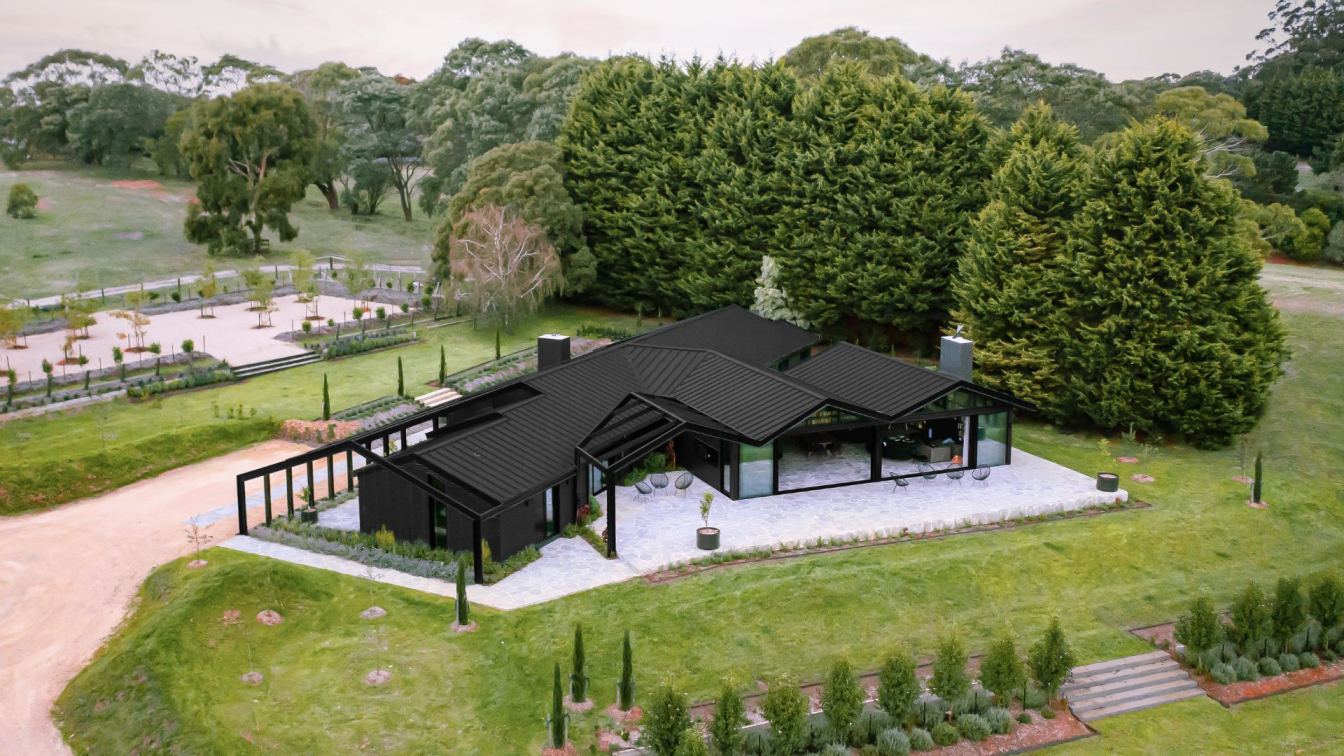
While it has been modernised and completely reimagined, The Seat is still at heart a farmhouse; it’s highly adaptable and centred around family, utilising practical, honest materials in an elegant yet simple design. It incorporates strong, bold structures that speak of the strength and angularity of the surrounding landscape, and draws on a soothing charcoal palette that echoes the richness of the local loam soils, enveloping and calming those welcomed in. Despite being anchored in the landscape, there is an overwhelming feeling of purposeful permeability. It’s comfortable and cosy while maintaining a minimalist aesthetic throughout.
Please list the key materials used to bring the look to life
As a contemporary interpretation of a country house, we’ve used bluestone crazy paving to create a rawness and roughness that bring a sense of continuity from the rural surrounds. The materials flow from the large terraces into the home. The bold, textured stone surface creates unity inside and out, between old and new, fostering an understanding that though modern and considered, this is not a precious building but a cosy, well-used home. The sensation of raw material is also felt in the leather texture of the stone benchtop and fireplace.
The lining board ceiling that follows the undulating roof line is a reference to the coastal cladding characteristic of homes in this area and accentuates the sculptural form of the old building blending with the new. The metal roof and light yet strong steel pergola give the house presence, but in a minimalist, understated way – this is echoed throughout the dark interior colour palette.

What are the key details that bring the look to fruition?
We worked extremely hard to create something that looks effortless. Though the brief was multifaceted, our key driver was to blur the line − between old and new, between inside and outside, between simplicity and complexity. To achieve this level of integration, we hand-picked and tested every tiny element, from materials to colour palettes; every shade of grey, every surface and texture, every last detail was tried and tested.
This project was really about how we allow architecture to truly integrate with the landscape – people forget how important this is. In The Seat, the landscape flows effortlessly, fluidly into and through the building and becomes the focal point, the nucleus connecting all elements; the dark interior creates a dramatic yet unpretentious stage for nature.
The pergola frame is one of the most remarkable elements; it’s both complex and understated, a skeletal abstraction of the roof form, integrating new with old by encaging rather than plugging in. The frame covers and envelops the existing structure, so that the space outside is framed like an artwork and exterior spaces are defined by the pergola’s strong lines.

What were the key challenges?
Building new, contemporary areas and structures that seamlessly integrated with an old farmhouse was no mean feat. It forced us to consider not just how a building sits in its landscape, but how it can evolve over time, with new dimensions and additions, and how the different elements can all work in concert to create a calm, considered, unified space rather than a building that feels iterated, divided or over-engineered.
The existing roofline was bitsy and messy. We had to figure out a way to modify and evolve it without disturbing the building’s form. Our solution was to create a steel fascia pergola structure that enveloped the existing building so it still reads as one solid line. While effectively encaging the house, it allows an extension of the roofline and provides privacy where it shelters the open space at the entrance, creating a northern courtyard. Over time, the plants at its base will grow, creeping up to the roofline and enhancing the home’s privacy with flora so it feels contained but never confined.
The pergola’s skeleton structure suggests an overall simple gable, while the folding origami roofline represents the undulating hills and valleys of the site. The roof – now contemporary metal standing seam rather than tiled – appears to float above the home, projecting towards the landscape.

What was your vision for this house?
Given its stunning location and sizeable block, we wanted the new volume to be inserted and rotated so it faced the panoramic view and directly framed horizon – this rotation would also create pockets of open spaces. Our vision was that wherever you went in the home, you would be drawn to the landscape beyond through windows or door openings. It was essential that the indoor spaces related to the landscape and outside spaces so there is always a sense of connection with nature.
While the indoor spaces have been zoned into different living wings with associated bedrooms, the outdoor spaces have been zoned to work with the sun orientation, prevailing winds and views. The western facade opens up to the panoramic view of the rolling hills, dam and tree-lined horizon. The roof form frames the landscape, making it the masterpiece that draws our attention and encourages us through the space. The way the new extension shifts away from being orthogonal to the existing building and orientates itself towards the view creates a pocket of outdoor space for intimate family gatherings, directly accessible from the kitchen servery window.
The southwest courtyard plays a more domestic service role with access to the laundry, vegetable garden, and a cooler, more shaded outdoor space for summer. The eastern vista is a vast field of trees and curated landscape which can be seen on arrival and from the southern living room. The building skeleton (the new pergola) frames a courtyard on the northern side of the building, which has a direct relationship with the northern living room. Though it is visible through the layer of creeper and structural frames from the driveway, the courtyard is perceived as an outdoor room with permeable green walls and roof. In this truly nature-focused home, the landscape acts as the arrival hall.

How is the home organised to define spaces without walls?
The three distinct living areas branch off the foyer and are defined by the turn of the walls, the increase in ceiling space and form (from flat ceiling to cathedral ceiling) and through the subtle, tonal shift in ceiling colours. In the family area, the folding cathedral ceiling and the angled walls create a clear definition between the living area and dining area. The apex of the ceiling junction presents itself as the transition between the foyer and the family area.
Unquestionably the heart of the house, the kitchen is defined by the generous bar-like benchtop and shelves. Centrally located to the west, north and south wings, this is where all members of the family are naturally brought together, which explains its functional yet upbeat entertainment zone design and ambiance.
The bedrooms are located in the north and south wings. Each wing has its own living room looking out to a courtyard. The western living and dining room is the new extension and functions as the main family room.

Describe the interior concept and colour palette
The interior concept evolves around the idea of a contemporary country home. The design retains some characteristics of a farmhouse, yet it adapts to the urban family lifestyle. The kitchen and pantry are practical and service oriented, but they are also part of the social and entertaining hub. Designed as a full-sized bar, this functional zone has a gentleman’s club aesthetic, accommodating family gatherings and myriad social events.
As with the exterior themes, everything inside the home is seamless and integrated. The stone surround fireplace is elegantly inset so it effortlessly forms part of the vast walled bookcase, and there is a natural flow (and view) from the kitchen to the BBQ and outdoor entertainment area beyond.
The colour palette is dark, muted and calm – greys, charcoals and bluestone. It limits light reflection, creating less strain on the eyes and elevating the expansive windows, views and natural light to centre stage. The colour scheme strikes a clever balance with the full-length and full height windows and doors, achieving a cosy, grounded feeling. It creates seclusion where desired, such as the more private living spaces in the northern and southern wings, and feels expansive in other moments, as when the foyer opens up into the home’s dramatic cathedral ceilings.

Are there any environmentally sustainable design principles used in the design?
Although the new extension faces west, the large eave helps block out majority of the summer sun. The bluestone floor is an excellent thermal mass during winter and the large door openings on the west and northwest generate a cross-breeze that cools down the house during summer.
What is your favourite part of the finished project?
Both from the outside and inside, the existing building fabric blends flawlessly with the new. It’s hard to know where the original building stops and the new extension begins: it’s an inventive yet organic meeting of building, site and lifestyle. The colour theme, bluestone floor, roof and the expression of the building skeleton work in concert to unify old and new, which was the design intention.


