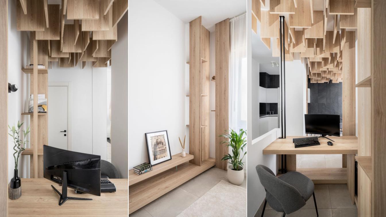
Sipal-Wafai Architecture: This renovation project transforms a modest 70 square meter house into a modernhome that accommodates a comfortable lifestyle for the client and family. Theremodeling was carried out to reveal the true potential of the house, byreorganizing its spaces to create open-plan layout that avoid rigidity and bringin ample natural light. A significant premise of the renewed project was toestablish visual relations within the living areas while maintaining privacy andintimacy in the living quarters.
Worthily named the “Post-Pandemic House”, the new design allows the occupants toadjust to the post-pandemic lifestyle of balancing home life with working fromhome. The original floor plan consisted of many internal walls and joinery, whichcreated a compacted volume that did not share openings to receive enough naturallighting and ventilation (especially for the entrée), thus creating dark andstagnant spaces that were heavily dependent on artificial lighting and mechanicalventilation. Moreover, the arrangements of spaces compromised the privacy of itsoccupants as the position of the main entryway opens up to the living quarters.The living room and the kitchen were too small, while the bedrooms were bigger inunproportioned way, storaage room taking a lot of space and its full of uselessthings. Therefore, alterations were made to convert the house into a comfortable single-family home with an optimized layout that tackled these issues. Certain wallswere demolished to create space for additional amenities, while still maintainingspacious, voluminous livable spaces.

The living, dining and kitchen areas are articulated in a continuous, open plan,which includes a cozy alcove as an office space, the new arrangement provides theprivacy for the office space and maintains the visiual connection of it with therest of the the open space. A parametric timber ceiling pattern made of 101 pieces (45X30X2)cm, starts fromthe office and stretch out to emulate the sense of connection between the office,and the living space, thus maintaining the integrity of an open layout thatencourage interactions between the family members. It also provides soundinsulation, so that the family can freely enjoy their time together without thefear of causing inconvenience to the neighbours. Some pieces of the ceiling pattern extend to reach the floor creating a verticallibraries that are integrated totally with the pattern flow as they emerge fromit. The private quarters boast 2 bedrooms and a bathroom, including a separatelaundry area. Both bedrooms have dedicated porches that extend the space to theoutdoors, allowing the occupants to enjoy relaxing views from the solitude oftheir bedroom. The extreme linearity of the original bathroom was reduced bysegregating it into two spaces using a wall 220cm hight so it dosnt reach to theceiling which maintains the natural light/ventelation of the bathroom thatequiped with modern fittings, and a small laundry room. This created dual spacesthat can be used simultaneously.

The new layout includes generously allocated circulation spaces to ensure thatthe flow of everyday movement is not restricted, and all rooms include adequatestorage areas. The material palette combines light timber tones and textures with monochromatichighlights to accentuate this modest spatial configuration. The interiors arefurnished with hues of white, black and grey, which emphasizes the recurringtimber tones. Great consideration was given to choosing slender timber sections,so that the details appear lightweight, and ensure that the interiors do notappear cluttered.With its modern architectural style and refined details, the Post-Pandemic Housebreathes a new life into the design and brings a new sense of identity to itsoccupants, becoming a luxurious reinterpretation of a humble urban condominium.


