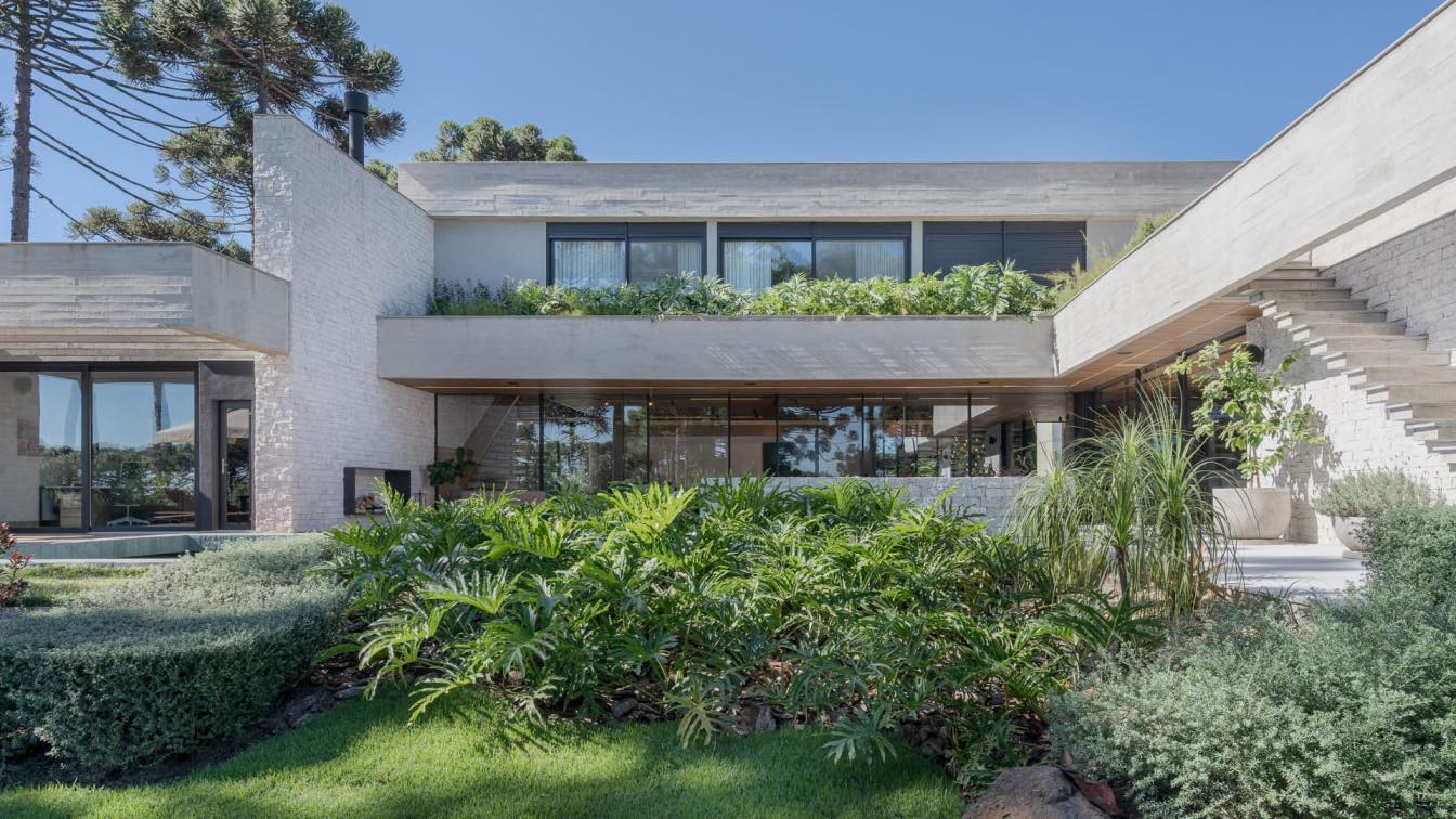
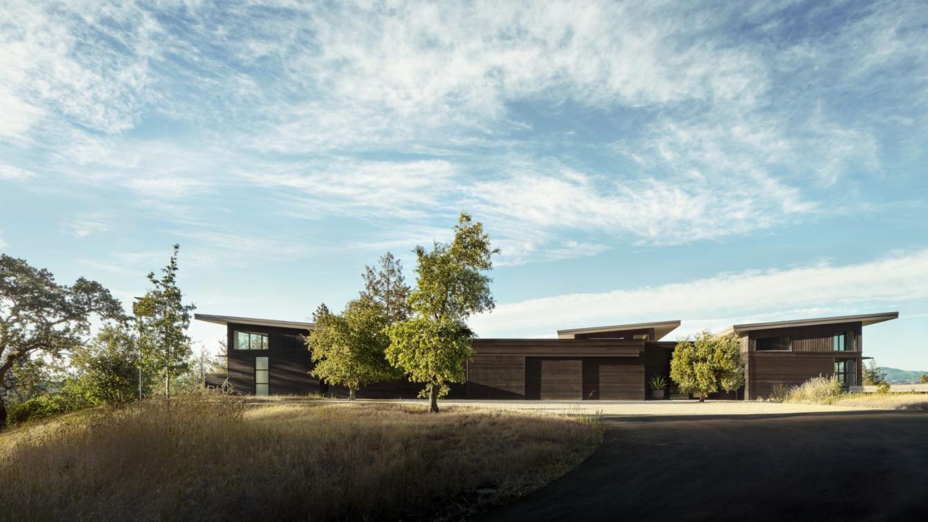
Studiocolnaghi: The landscape was an essential element to develop this project along with the site topography. The main concept to this design was to keep privacy while to explore visual amplitude and nature connection. The ground floor projective intention is a U-shaped form that surrounds the pool and it is surrounded by the landscape. On this floor, the main spaces and uses are integrated, and there are between them, living, dining, gourmet area. Around those uses previous related, on this floor, there are kitchen, laundry, cinema and office, they, together, help to guarantee privacy.
On the second floor, the architecture shape follows a linear bar that accommodates all the bedrooms which are opened to the valley view, while, this volume front façade is mainly closed, and it has only a single horizontal glass surface. Backing to the ground floor, the different uses show the integration potential to the site area. Along with the gourmet area, the wine cellar creates a background which is possible to see thought it the landscape. The wood ceiling maximize the space amplitude and it creates a coziness sensation to the space as long as it spreads throughout social area.

It was a challenge to combine extend glass openings at the same time to solutions that could guarantee privacy. At this central courtyard, where the pool is located, the minimalist openings potentialize the connection between interior and exterior spaces. The side façades are mainly solid and closed. In summary, the architecture result is a well-integrated shape to the nature, in a cozy house using natural materials.
Between the chosen materials, there are concrete, wood and natural stone. Those are the mainly composition elements. But, as a good site-specific project, vegetation becomes an additional element to the chosen materials. It appears at flower boxes and it also traces the house entrance, helping to a dynamic color palette during the entire year, when different shades matches the architecture materials.
Inside the house, the natural wood blade is used in a lighted finishing, which creates a sophisticated aspect and it contrasts to solid wood ceiling. The space amplitude enriches the furniture curating, which the finishing connects to the other architecture elements. As an architecture studio, we seek to an authentic, a timeless and a coziness result. The balance between well finished materials to some industrial ones is an interesting point of the project, as it is possible to recognize at the gourmet space, where stainless steel appears.


